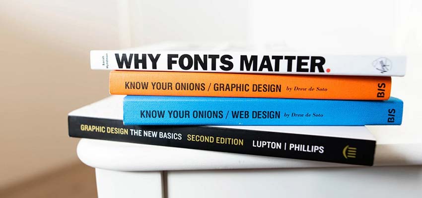
With thousands of fonts out there, it can be difficult to find one suitable font – much less pairs that look good together! When you’re building a website, how and where can you find fonts that fit its aesthetic? If you’re stuck and not sure where to begin, this guide will give you some tips on choosing the perfect font, no matter what kind of site you’re creating.
The Four Font Types
Fonts, in general, have four types: serif, sans-serif, script and decorative. Understanding these fonts, their uses, and what feelings they’re associated with will help you make the right choice for your website.
Serif
Serif fonts are the first choice of businesses, newspapers and blogs. Because of this, it’s seen as professional, traditional and reliable. If you’re creating a site that involves a lot of reading, it’s best to use a legible serif font. Serifs are best for the site that wants to be taken seriously! Those little lines can make a big difference.

Sans-Serif
Simple and minimalistic, sans-serif text is great for businesses that want to give off a modern air. Sans-serif can be more legible in some cases, such as for shorter passages of text, or when designing for young children. Sans-serif headers and serif body text is a popular combination.

Script
An elegant script font, while unsuitable for body text, is a great way to add a creative touch to your website. Perfect for fashion businesses, creatives, blogs and more!

Decorative
Finally, decorative text falls into a category of its own. While it should be used sparingly, it can be a great way to stylize your website. However, unlike script fonts, it should almost never be used for a professional website.

Consider your target audience. Are you targeting children with eye-grabbing decorative fonts? A modern audience that responds to sans-serif and script, or one that appreciates the traditional sans-serif? Remember your audience and choose the most appropriate font.
Limit Your Choices
When building a website, it’s best to have a limited “font palette”. Like an artist’s color palette, too many fonts can look cluttered – so pick 1-4 good fonts!
Be consistent with their usage. Have one font for the main text, one for headers, one for text navigation – and so on.
But how to pair them? It’s true some fonts look better together than others. There are two good ways to pair fonts: based on similar features, or on contrast.
You could use fonts that are both tall, soft-looking, or sans-serif. You could also use contrast as the deciding factor; use sans-serif for headlines and serif for the body, or pick one with a heavier weight and line thickness for your bolder text.
Experiment, and see what fonts are harmonious!

Header vs. Body Text
There’s a time and place for every font. Different fonts work for different occasions, but this is most pronounced in headlines vs. body text.
Readability is essential for the majority of text on a website. For body text, serif or sans-serif is always the best – especially for longer passages. But in a headline, logo, or other short pieces of text, it may be better to pick a bolder, taller, more expressive font that would be unsuitable for longer reading.
Script and decorative fonts can be used only in the header or in brief blurbs, as their legibility is low.
Pick the Perfect Font
It may be difficult to find the perfect font combination, but it isn’t difficult to find something that works. Typography isn’t difficult to get into, but it’s a subtle art. The best thing you can do is try everything.
Figure out what works and what doesn’t, and why. Study websites’ text and learn what methods are being used. Soon you’ll have a better understanding of typography, and you’ll be able to choose the best fonts in any situation.
This post may contain affiliate links. See our disclosure about affiliate links here.


