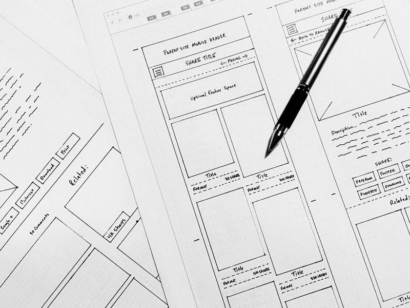
For most web designers the first phase of any given web project is wireframing. It allows the designer to map out exactly how the structure of the website can work, as well as the general layout direction of important elements such as navigations, forms, and content sections.
Each designer often has their own unique way of producing these wireframes. Many work off paper, while others prefer to go straight into creating them on a computer using tools like Balsamiq, Figma or Sketch. Either way, the results are often fascinating, and more often than not are visually impressive despite their supposed roughness and simplicity.
Your Web Designer Toolbox
Unlimited Downloads: 500,000+ Web Templates, Icon Sets, Themes & Design Assets

Wireframes by Brandon Wimberly
Brandon uses a web browser template printed onto dot grid paper. From there he uses carefully constructed lines to build very uniform and accurate wireframes for exploring how a website will scale from desktop to mobile devices.
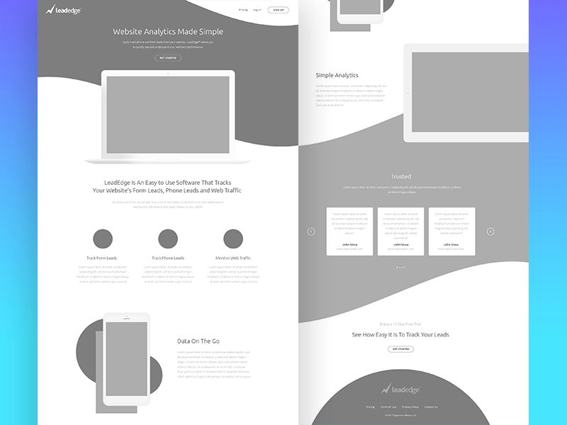
Lead Edge Hi-Fi Wireframe by Vando Sanchez
Vando’s wireframes for Lead Edge Hi-Fi have been created on a computer and use mainly dummy text with just the primary titles and taglines filled in accurately. Simple 2D mockups are used in place of realistic device mockups, and background and visual elements are filled with a block color at this stage.
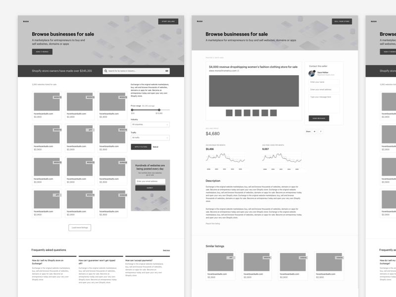
Shopify Exploratory Wireframes by Janna Hagan
Janna Hagan’s beautiful wireframes for Shopify are higher fidelity with most of the layout design finalized and even some visuals beginning to be introduced.
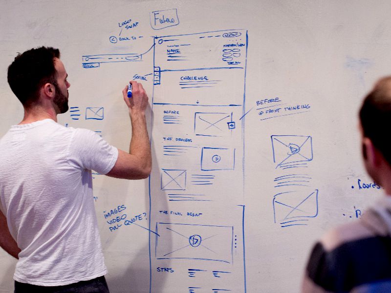
Wireframes by Andre Picard
Andre Picard looks to a whiteboard when working on the initial wireframing stage of a web design project. This allows for quick and easy edits as well as easy feedback and collaboration around the office.
Wireframe x 78 by Melody Rose
Melody’s 78 wireframes for this web design project are incredibly cohesive through the consistent use of shapes to define different content types and elements such as user avatars. The palette is kept within two to three simple gray tones.
Sketching a New Project by Tim Knight
Tim Knight’s wireframes are toward the more simple and high-speed wireframing approach – very useful when approaching the foremost stages of a project or mapping ideas out for a client in a meeting or on a call.
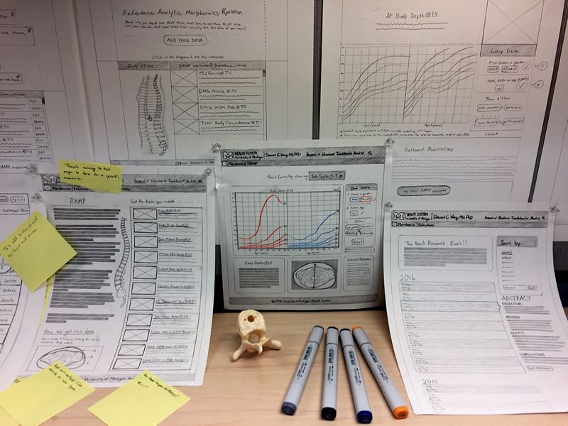
Morphomics Website Mid Fidelity Wireframe by Lauren League
Lauren’s mid-fidelity wireframes for the morphomics website are considerably complex in having to solve a data visualization problem. They use a well-structured template with filled-in content blocks and crossed rectangles for image placeholders.
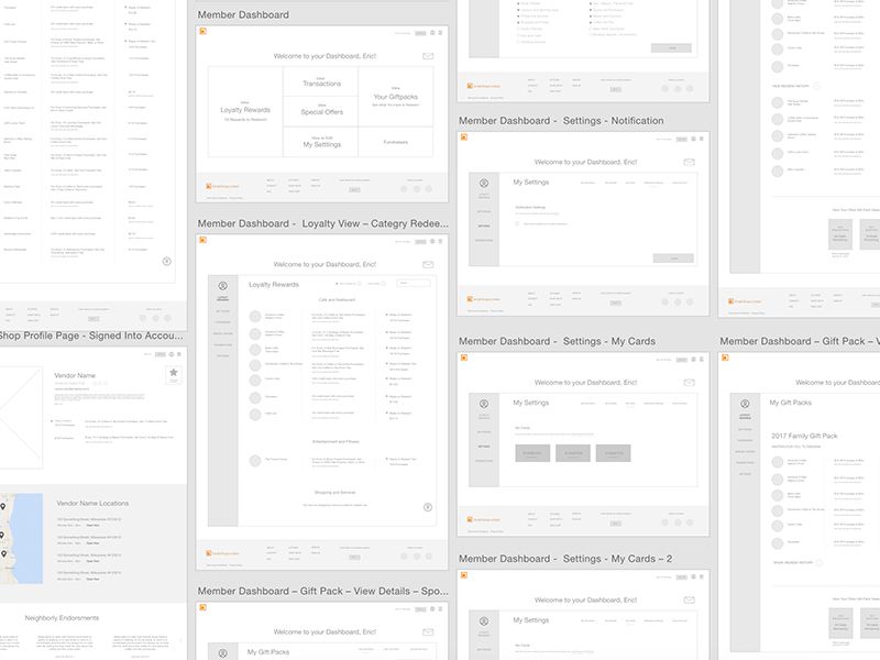
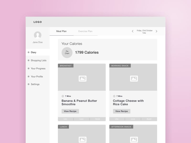
Back To My Body Dashboard Diary Wireframe by Alyoop
The Back To My Body Wireframes by Alyoop are toward the more simple style of digital mockups. They use a simple gray color palette and icon placeholders for user avatar and content imagery. Text placeholders are used throughout for elements such as the logo and pie chart.
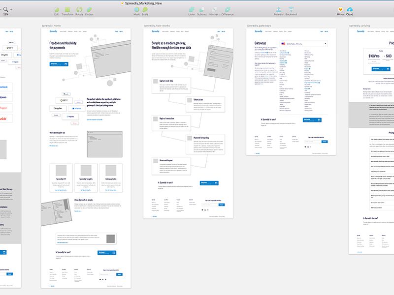
Spreedly Marketing Website Wireframes by Dane Wesolko
Spreedly’s marketing website uses a high-fidelity digital wireframe in Sketch app which has defined most of the content layout and color, leaving only the visuals and imagery to be integrated.
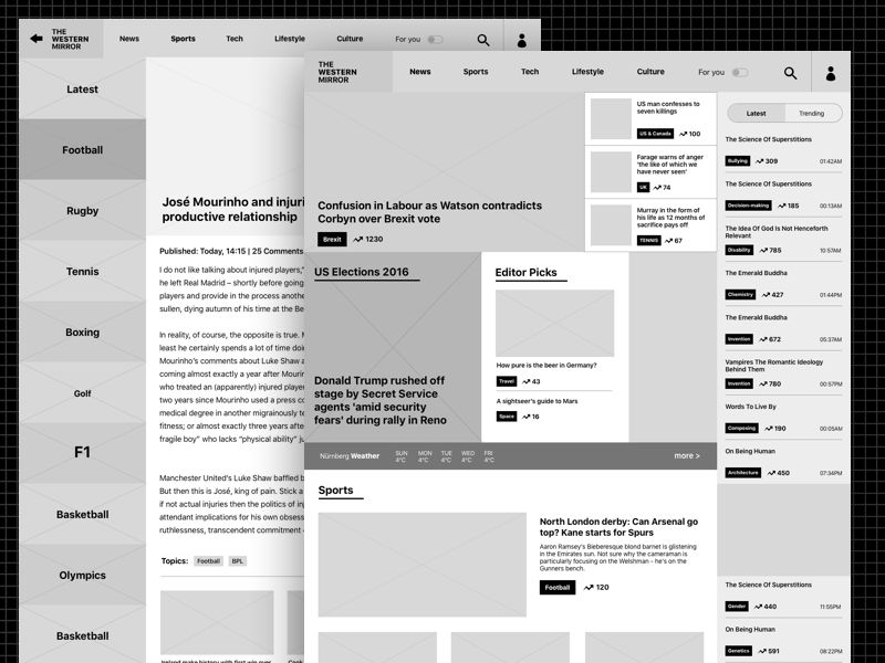
Newspaper Website Wireframe by Ziya Fenn
Ziya’s newspaper website mid-fidelity wireframe is very well-refined and one of the most visually attractive wireframes I have come across. Much of the typographic elements and direction have been defined, and the layout is visually impressive in its structure and tessellating block form.
This post may contain affiliate links. See our disclosure about affiliate links here.