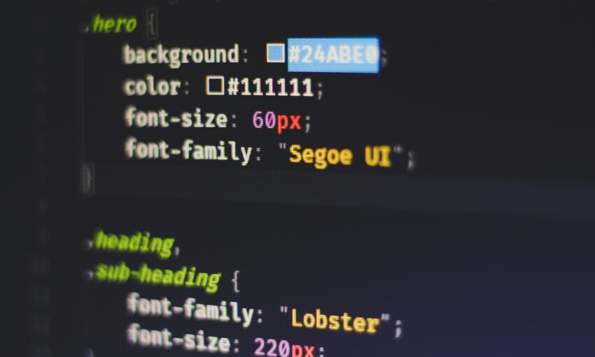
In the field of design, simplicity can often eclipse complexity. Minimalist design principles echo across varied creative fields — from architecture to product design, and notably, typography. Our overview takes you on a journey through the landscape of fonts, highlighting ten free Google Fonts that encapsulate minimalist design principles. Featuring both trusted favorites and potential new go-to’s, these fonts can enhance your designs with their clean lines, clear visuals, excellent readability, and contemporary appeal.
Your Web Designer Toolbox
Unlimited Downloads: 500,000+ Web Templates, Icon Sets, Themes & Design Assets

Understanding Minimalist Typography
At its core, minimalist typography embraces simplicity. It drops unnecessary decorations, focusing on visual appeal and functional design that boosts readability. Sans-serif typefaces, appreciated for their clean lines and generous white space, are a frequent choice in minimalist typography. This focus on functionality and elegance ensures the design’s core message and content shines through, unhindered and dominant.
Now, let’s take a closer look at our top 10 minimalist font recommendations.
Roboto
Roboto, a font you’ve likely encountered on the web or in apps, combines mechanical and geometric forms. Its 12 distinct styles make it a versatile choice for an array of minimalist designs, from website headers to the UIs of mobile applications. Its universal appeal and wide language support make Roboto a popular choice for digital design.
Open Sans
Open Sans, another ubiquitous font, stands out with upright stress and open forms, conveying a friendly yet neutral demeanor. Its extensive character set enhances readability at small sizes, cementing its status as a reliable choice for body text in minimalist designs.
Lato
Lato, with semi-rounded details in its letters, communicates warmth without losing its professional essence. The font family’s ten styles offer designers flexibility to meet various design needs, from commanding headlines to nuanced captions.
Montserrat
Inspired by the geometric sans-serif style, Montserrat offers modern, clean character designs. With 18 styles, from thin to black, it caters to a broad spectrum of minimalist designs, be it unobtrusive body text or bold headlines.
Raleway
Raleway’s elegance and sophistication are accentuated by its distinctive ‘w’ and ‘k’ characters, adding visual interest without compromising readability. With nine weights, this font is especially well-suited for headers and large text in minimalist designs.
Arimo
Designed by Steve Matteson, Arimo is a breath of fresh air with its crisp sans-serif design. It stands out with enhanced on-screen readability characteristics, making it an excellent choice for cross-platform document portability.
Poppins
With its geometric sans-serif design, Poppins exudes a clean, modern aesthetic. Its balanced letterforms, available in nine weights, support high readability at both large and small sizes, making it a versatile addition to any minimalist design toolkit.
Oswald
By reinterpreting the classic gothic type style for the digital age, Oswald’s condensed letterforms create a versatile typeface. Offering six weights, Oswald lends itself to a variety of minimalist design applications, from dense body text to airy headers.
Fira Sans
Designed for Mozilla, Fira Sans is a humanist sans-serif typeface. It boasts excellent readability across sizes, thanks to its generous x-height and open apertures. Its broad range of weights make it adaptable for diverse design needs.
Noto Sans
Noto Sans, a part of Google’s mission to support all languages with a harmonious typeface, impresses with its clean, simple forms. Available in regular and bold weights, its unfussy design is a perfect fit for minimalist aesthetics.
While these fonts are free and ready for download on Google Fonts, making them accessible for designers on any budget, they offer significant advantages. They are open-source, web-optimized, and incredibly versatile, catering to an extensive array of design needs and platforms.
Final Thoughts
Typography underpins minimalist design, and your font selections can significantly influence the viewer’s perception.
As a designer, you should consider factors like UX, the overarching design system, font pairing, and hierarchy when selecting fonts for your minimalist design. Fonts that integrate seamlessly into your design system, adhere to UX principles, and respect font hierarchy can result in visually coherent, minimalist aesthetics.
In addition, the process of testing and finalizing fonts can be iterative, requiring you to test different font combinations, review them in various contexts (like different browsers or screen sizes), and gather user feedback. Analytical tools, usability tests, or A/B testing can provide invaluable insights into how your typography choices impact user engagement and accessibility.
Minimalist design is not about restrictions but about thoughtful reduction and focus. Your choice of typography should reflect that ethos.
Bonus💡: 11 Typography Styles to Consider for Your Next Design
This post may contain affiliate links. See our disclosure about affiliate links here.


