When it comes to typography, there’s a seemingly infinite number of styles to choose from. But which one is the right one for your next design?
That is the ultimate question when it comes to typography. And, unfortunately, there is no one-size-fits-all answer. It all depends on the specific project you’re working on and what kind of message you’re trying to communicate.
However, we can narrow it down to a few general categories.
Here are 11 popular typography styles to consider for your next project.

1. Serif
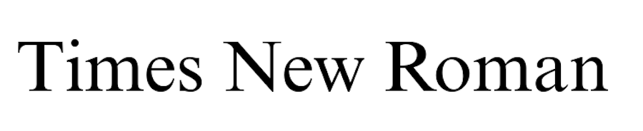
Serif fonts are the ones with the little feet (serifs) on the end of each letter. They are classic and elegant, and they have been around for centuries. Think of Times New Roman or Garamond – these are both serif fonts.
Serif fonts are generally seen as being more formal and traditional than other types of fonts. They are often used for headlines, logos, and other high-impact pieces.
2. Sans Serif
Sans serif fonts are the exact opposite of serif fonts. They have no little feet on the end of the letters, hence the name “sans serif.”
Sans serif fonts are generally seen as being more modern and clean than serif fonts. They are often used for body copy, menus, and other pieces where readability is key.
3. Script
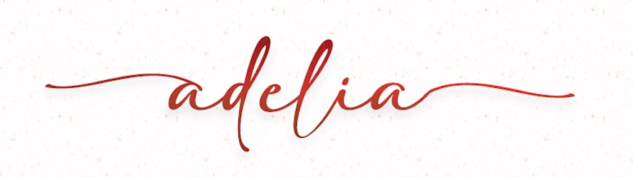
Script fonts are designed to look like they were written by hand. They are usually very flowing and cursive, and they can be difficult to read if they are used for large blocks of text.
Script fonts are best used for small pieces, such as headlines or logos. They can also be used for body copy, but only if the design is very simple and easy to read. A good example would be the Adelia Font.
4. Display
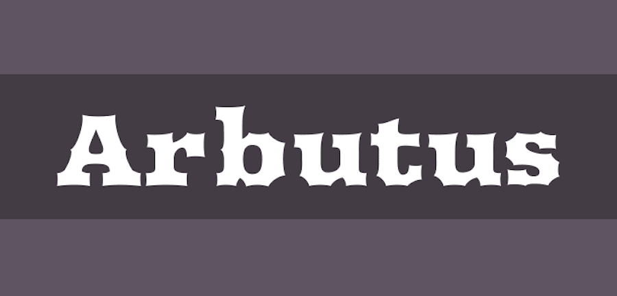
Display fonts are any type of font that is designed to be used at large sizes. They are often very bold and eye-catching, and they can be difficult to read at smaller sizes.
Display fonts are best used for headlines, logos, and other short pieces of text. They should not be used for body copy or any other type of long-form text. A good example that shows how bold these fonts can be is Arbutus.
5. Decorative

Decorative fonts are just what they sound like – they are designed to be used for decorative purposes only. They are often very ornate and can be difficult to read.
Decorative fonts should only be used sparingly, if at all. They can be used for headlines or logos, but they should never be used for body copy. They are a lot of fun though. Just check out the Space Time font.
6. Blackletter
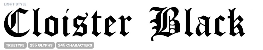
Blackletter fonts are a type of serif font that is designed to look like it was written in the Middle Ages. They are very ornate and can be difficult to read. It also goes by the name of gothic script or Old English.
Cloister Black is a great example of a blackletter font that encapsulates this old-fashioned style.
7. Handwritten
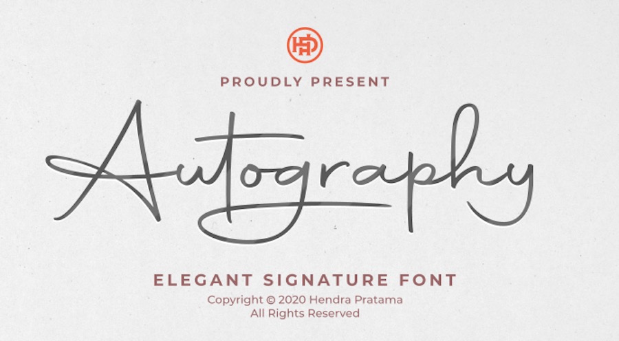
Handwritten fonts are designed to look like they were written by hand. They can be either serif or sans serif, but they usually have a more organic feel than other types of fonts.
Handwritten fonts are best used for small pieces, such as headlines or logos. The Autography Font illustrates this typography style well.
8. Slab Serif
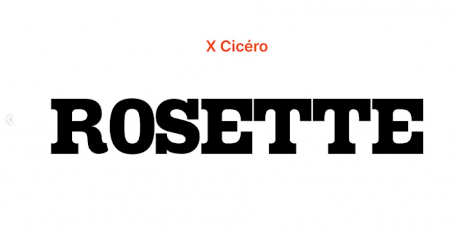
Slab serif fonts are a type of serif font that is designed to be used at large sizes. They are often very bold and eye-catching, and they can be difficult to read at smaller sizes.
Slab serif fonts are ideal for headlines, logos, and titles. They should not be used for body copy or any other type of long-form text though as the line weight is too thick for the confined spaces of paragraphs. The Rosette Font has a chunky look that serves as a good example of a slab serif.
9. Geometric
Geometric fonts are designed to be very clean and simple. They often have straight lines and angles and rely on a geometric construction to achieve their letter shapes.
This kind of font is best used for headlines or logos, or any other spot where just a few words are needed. They can also be used for body copy, but only if the design is very simple, large, and easy to read.
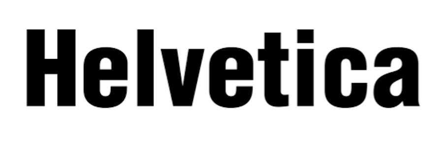
10. Grotesque
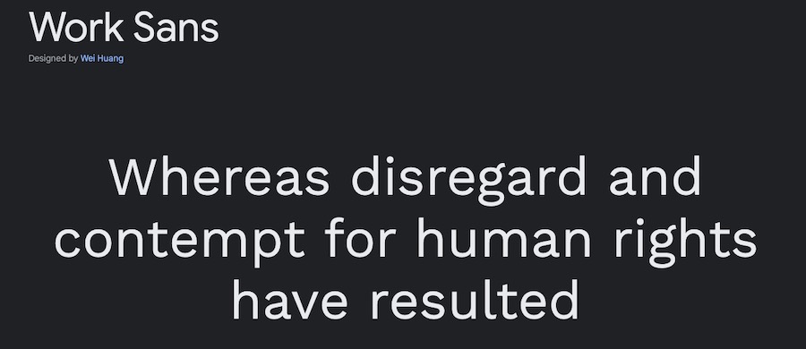
Grotesque fonts are a type of sans serif font that is designed to be used at large sizes. Historically, they’re known for looking a bit awkward and unusual.
It is advisable to only use grotesque fonts for headlines, logos, and other brief pieces of text. They are not meant to be used for paragraphs or long stretches of text. Work Sans is a great example of a neo-grotesque style.
11. Humanistic
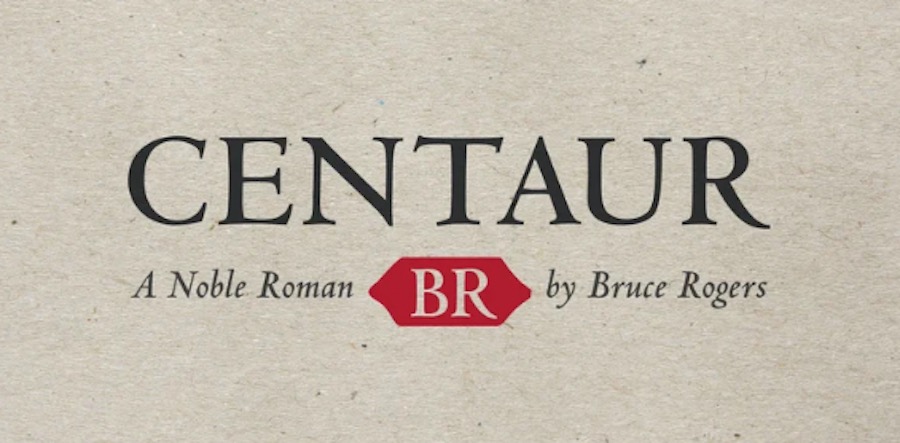
Humanistic fonts are sans serif fonts as well that are designed to look very natural and organic. They often have curved lines and softened edges.
Humanistic fonts are most successful when used for titles, headlines, or logos. They can also be readable if used sparingly in body copy with a simple design layout. You can look to the Centaur Font as a good example of this classic font style.
Let Typography Style Options Inspire You
There you have it! These are the 11 most common types of fonts that you’ll see used in graphic design. As you can see, each one has its own unique purpose and should be used accordingly.
When it comes to choosing the right font for your project, it’s important to think about the overall style you’re going for. Do you want something clean and modern? Or are you going for a more vintage or retro feel?
Once you have a general idea of the style you’re after, you can start browsing through different font options until you find one that fits your vision. Good luck!
This post may contain affiliate links. See our disclosure about affiliate links here.