Colors play such a huge part in branding and logo design. They have the power to evoke emotion, attract attention, and present a recognizable brand to the world.
Almost every prominent logo design incorporates some element of color that is synonymous with their company. Think McDonald’s, Coca-Cola, Microsoft, YouTube – the list goes on. The way in which color is applied ranges anywhere from a small splash of color, to a gradient-heavy, multicolored design.
The Logo Designer's Toolbox
Unlimited Downloads: 500,000+ Logo Templates, Print Templates, PSD Templates and Design Assets.
Wherever they lie in between these two extremes, there are a wide range of inspiring and differing examples that have been carefully executed to provide a unique identity.
In this article, we’re going to look at a selection of ten of the most impressive and well-executed examples of these colorful logo designs.
1. 14 Islands
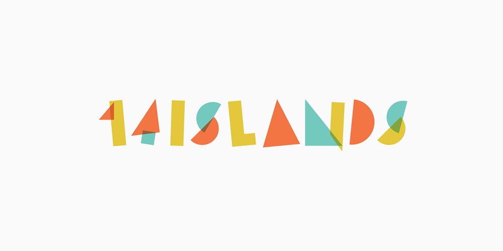
By applying opacity techniques and bright, positive colors, 14 Islands’ logo has encompassed an upbeat and playful style for the brand.
2. January Moon
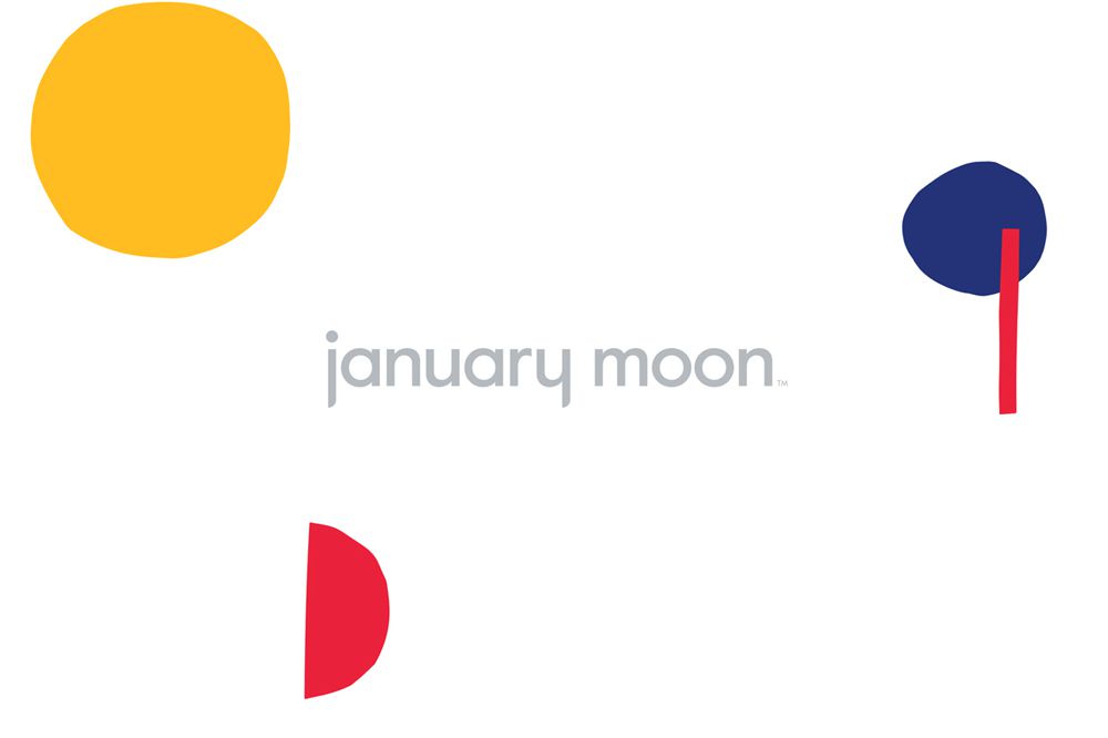
Utilizing primary colors against mundane grey, January Moon has produced a beautiful logo design which is eye-catching with juxtaposition throughout.
3. Petals
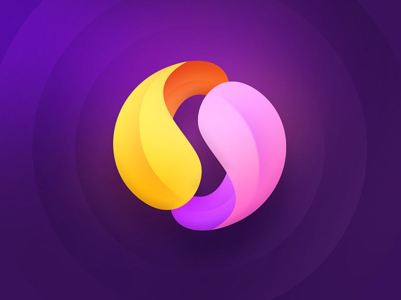
Using unusual color combinations, heavy gradients and three-dimensional techniques, this logo design is incredibly eye-catching and visually impressive.
4. Vi Novell
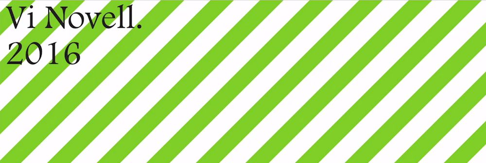
Vi Novell’s logotype is fairly simple. However, the way in which it’s combined with colorful visuals and packaging makes it impressive.
5. Queuing App
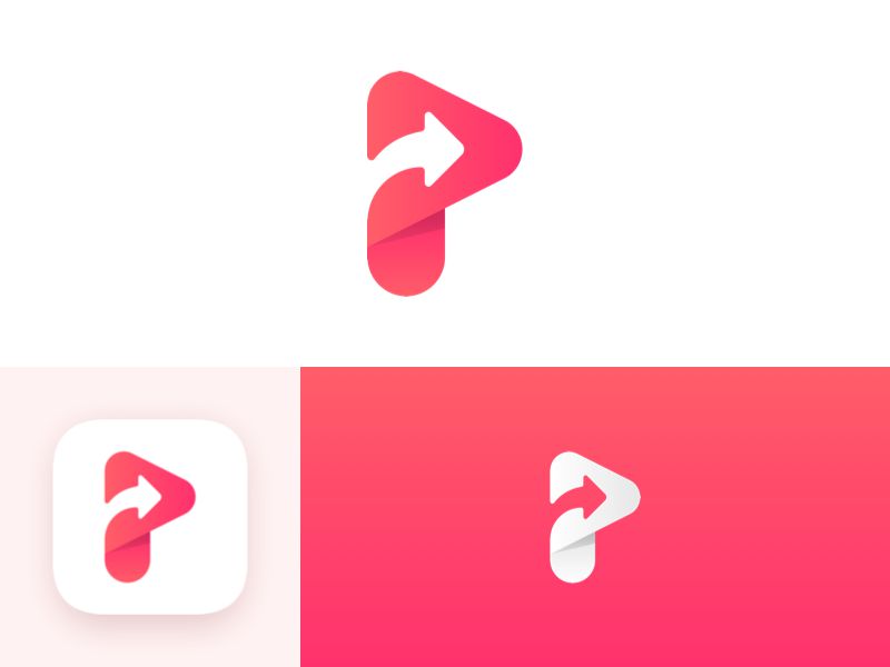
This logo for Queuing app uses a beautiful, subtle red to pink gradient. It blends seamlessly with the curved logo mark and works perfectly on the app icon and in inverted form.
6. ShopAround
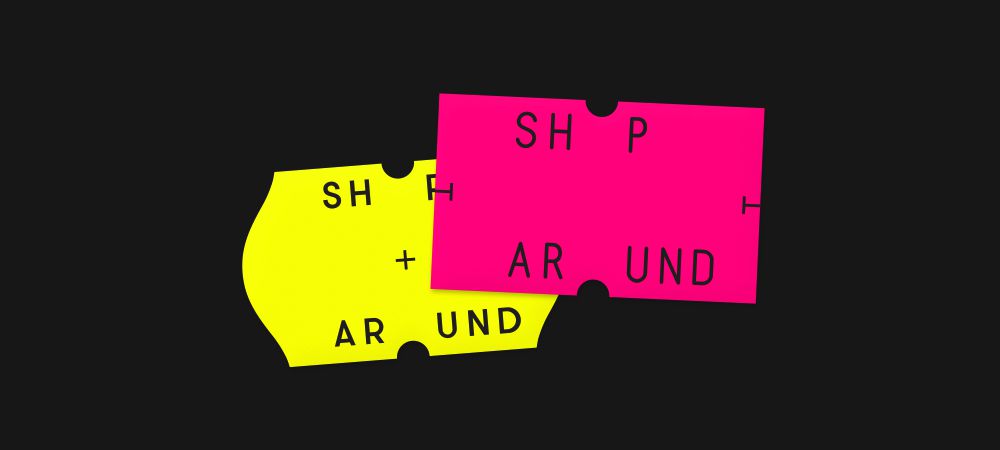
Using a striking color combination of bright yellow and pink, ShopAround has created a logo which is impactful and follows a unique direction in terms of layout and composition.
7. Primary
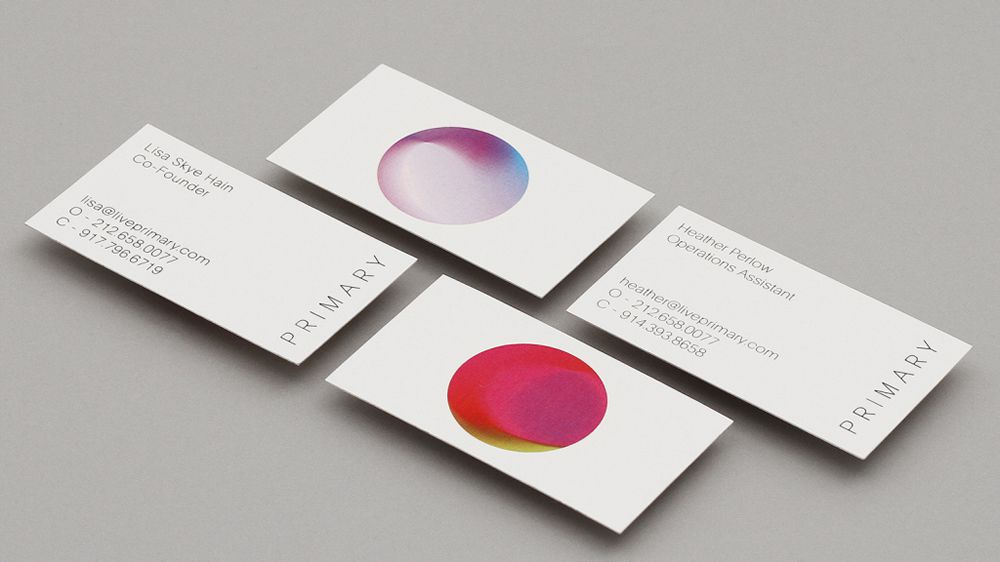
Primary’s logo mark is almost reminiscent of a marble or piece of artwork. It blends a number of colors and gradients to create a dynamic logo which pairs beautifully with the simple typography.
8. Z Logo
The simple vector strokes of this Z logo are perfectly accentuated by the pink-to-purple gradient against the black background.
9. Neighbourhood
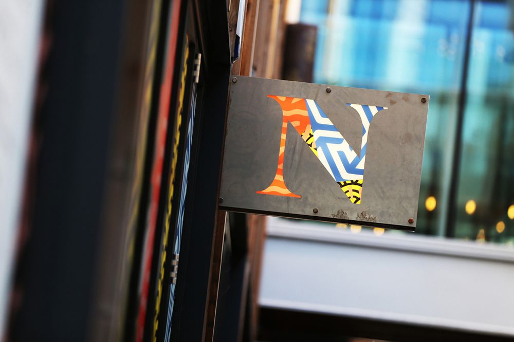
Almost erring on the side of the brutalism trend, Neighbourhood’s logo uses bright graphics and colors, all overlapping and contained within the serif typographic mark.
10. Popfn

Popfn’s logo uses bold colors and subtle gradients to produce a stunning neon-style mark with both depth and visual interaction in the form of an impossible triangle.
This post may contain affiliate links. See our disclosure about affiliate links here.

