Most of us do not realize how it works and only a few probably pay attention. Though the influence of the colors may be some what overestimated, we can obviously feel it in some situations (imagine yourself in a dark red room or in the room in the sky colors).
Today we’ll be talking about color psychology in website design, the way different brands use colors and what’s their message.
Your Web Designer Toolbox
Unlimited Downloads: 500,000+ Web Templates, Icon Sets, Themes & Design Assets
You might also like to read about Color Perception, the Color Schemes that Stimulate Human Senses, or how to Choose the Best Color Scheme for Your Site.
How Does Psychology of Colors Work?
The colors are divided into two basic groups – colors in the red area of the color spectrum known as warm colors (red, orange and yellow) and colors in the blue area known as cool colors (blue, purple and green).
The warm colors evoke emotions ranging from feelings of warmth, comfort and coziness (the fire burning in the rainy cold evening) to anger and aggression. Cool colors are as a rule described as calm and tranquil but can also be associated with sadness (being in blues) or indifference.
In the ancient times people believed that colors can cure from different diseases. This science was called Chemotherapy, and some of the basics were as following:
- Red increases blood circulation and thus stimulates the body and mind
- Yellow stimulates the nerves and purifies the body
- Orange increases your energy
- Blue treats pain
- Indigo alleviates skin problems
Though the majority of psychologists take color therapy sceptically big brands don’t seem to agree with that. They create huge marketing campaigns based on the way we perceive the colors and make people buy.
Below is the table with the colors and emotions/feelings they are widely associated with. Let’s try to analyze the websites of some world-known companies and see how they implement color techniques.
| Color | Emotions |
|---|---|
| Black | Symbol of menace or evil, popular as an indicator of power. Associated with death and mourning, unhappiness, sexuality, formality, and sophistication. |
| White | Purity or innocence. Cold, bland, and sterile. |
| Red | Evokes strong emotions, associated with love, warmth, and comfort. Still considered an intense and angry color that creates feelings of excitement, intensity, sexuality. |
| Blue | A favorite color for many people and the color most preferred by men. Gives the feelings of calmness or serenity. Described as peaceful, tranquil, secure, and orderly. |
| Green | Symbolizes nature and the natural world. Represents tranquility, good luck, health, and jealousy. Symbol of fertility, has a calming effect and relieves stress. |
| Yellow | Cheery and warm, but can also create feelings of frustration and anger. Most fatiguing to the eye (that’s why you’ll rarely see a bright yellow website or a room painted with yellow with the exception of playrooms for kids) yet most attention-getting color (so great color for important details or calls to action- remember the yellow stop/caution color). |
| Purple | Royalty and wealth, wisdom and spirituality, sex and relationships, exotic and special. |
| Brown | Natural color that evokes a sense of strength and reliability, warmth, comfort, and security. |
| Orange | Blatant and vulgar color, makes you feel excitement, enthusiasm, and warmth. As a combination of red and yellow it’s often used to draw attention. |
| Pink | Associated with love, romance, youth, freshness and may have a calming effect. Pink effect depends on the type of pink (strong, light, deep etc). |
Now when we know what colors mean and what feelings they evoke, let’s try to make a simple analysis of the color schemes used by 20 world-known brands on their corporate websites. That’s really exciting and you start taking things differently.
1. Coca-Cola
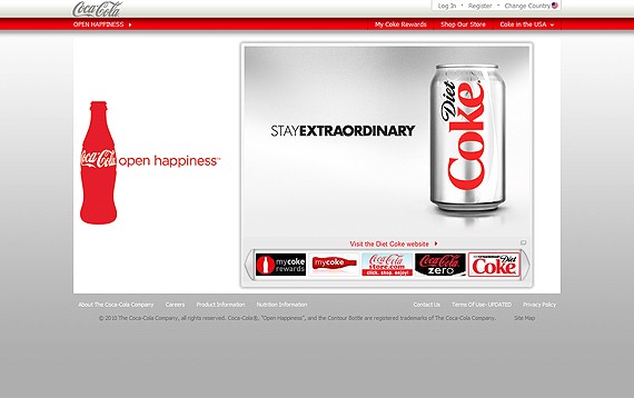
Primary color is red on a white and light gray background for better visibility and contrast. The red is supposed to create the feeling of excitement and energy. “Open happiness” text in the main menu corresponds to the color perception.
Though the white is probably used to make an accent on red, as a cold color it’s supposed to give the feeling of coolness “For refreshing ideas” as they say in the moto. An excellent job!
2. McDonalds
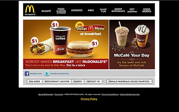
Though the McDonalds restaurant colors we are used to are yellow and red (to cause children excitement, a bit of irritation and craziness), the website looks pretty formal in black and white.
And no wonder, being visited by parents who would like to know what their kids eat and how fat is that, black and white is the perfect solution to make the website look strict, formal, informative, clean and somewhat sterile.
Now imagine it would be mainly in yellow and red (causing excitement and the most fatiguing to the eye)- that would make parents mad. Frustrated parents = Less money
3. M&M’s
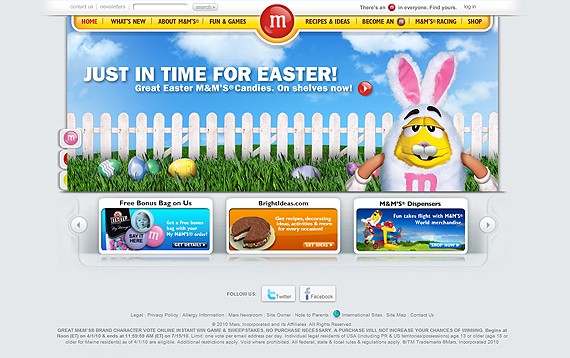
The M&M’s colors that we usually see in the TV/bigboard ads are yellow and red (double excitement). The website itself is a mix of all possible colors, from light blue on the background to dark-blue, purple, green, yellow, orange, red in the banners and header area.
The M&M’s guys are extremely smart, everyone can choose a candy to his liking :) There’s one problem though- the website looks very clumsy and kinda created from pieces that do not match.
4. Colgate
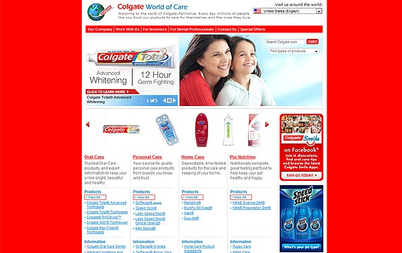
Red, white and blue- the colors of world-famous 3-colored toothpaste and the only colors used on the website (even mother and kid on the photo in the header area are dressed in red and white on the blue sky background!).
Red for energy and happiness, white for shine and sterility, blue for cold freshness of stream water and confidence. Though I like the toothpaste, the website color scheme is not pleasant to my eyes. The abundance of bright red makes me feel uncomfortable and makes it almost not possible for me to focus on the texts and information.
5. Nestle
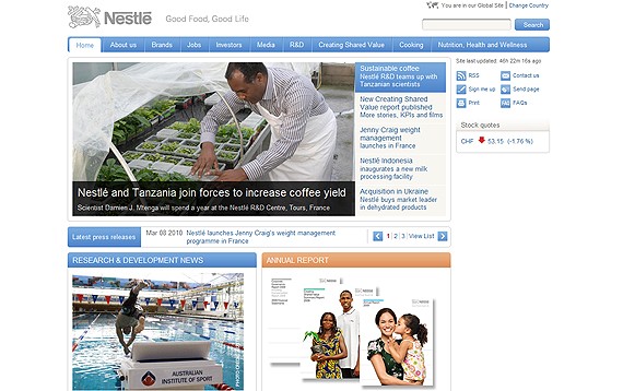
Nestle slogan says “Good Food, Good Life” and the white-gray-blue color-scheme makes you feel calm, secure and in some way sure that’s everything is gonna be okay.
You will remember this feeling subliminally and buying something produced by Nestle next time you’ll be thinking “somehow I know this is a reliable company producing good products, I might have read this somewhere”. Another great example how marketing is closely connected with the color perception.
6. Nescafe
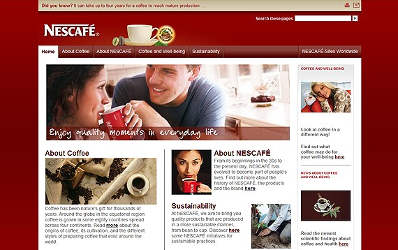
A product of Nestle company, Nescafe website is however designed in deep plum colors- a mix of red associated with the cozy warmth, energy and power and purple- making you feel so special, exclusive and unique.
I love this color scheme, it’s not so annoying as red and not so exquisite as purple, it makes you feel special yet very comfy.
7. Cadbury
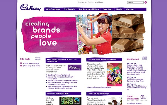
A website made of all shades of purple. I guess it is supposed to say that Cadbury products are very special, but it makes me feel playful for some reason. That’s an interesting approach, while the chocolate is usually associated with energy (like Snikers) or sex (dark black chocolate) the playful approach definitely makes the brand stand out from the crowd. Or am I the only one taking it like this?
8. Nokia
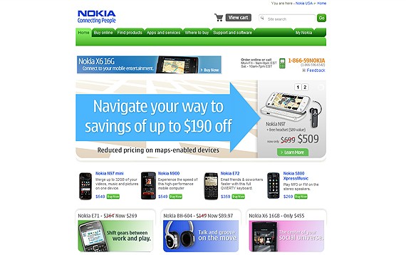
Blue, green, gray, white and a little bit of pink. Blue for serenity, green for tranquility and nature, gray to nicely mix blue and green, white for clarity, pink is probably to attract girls.The website is designed in the colors to make you feel sure of the quality, yet they stay away from the standard blue-gray-white color scheme.
Green is knows to relieve stress and will have a calming effect on somewhat frustrated with daily heap of things to do business people who have come to check for the updates.
9. Kodak
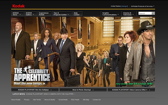
Though the Kodak products are usually associated with yellow (yeah, they catch the attention) the website is designed in the classic gray-white-blue color scheme, so pleasant to the eye and allowing to focus on texts and information.
You feel that you will get all the info that you need in a clear way, yet you do not feel too formal, just professional approach to things.
10. Gillette
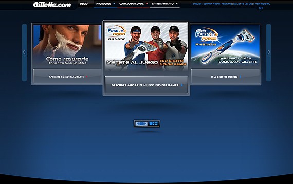
Blue is the color most preferred by men and guys at Gillette perfectly know this. “The Best a man can get”- the favorite men color and a bit of red and orange on promotions to catch attention.
They know what you like guys and they know how to sell their products to you.
11. Marlboro
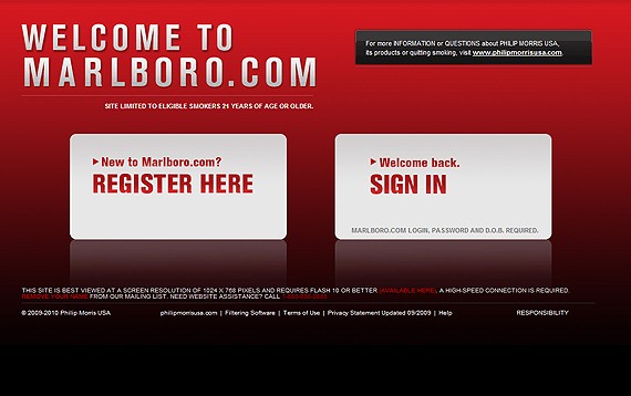
Red, black and gray- power, sophistication, sexuality and strong emotions- features of a “real” man. However if you visit philipmorrisusa you will notice that the company corporate website is designed in blue color scheme- peaceful, tranquil, secure.
That’s an excellent example how the colors work, if you still don’t believe it, let’s move forward.
12. Ikea
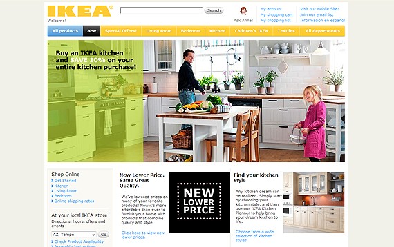
The header of the website is designed in bright colors- yellow, yellowish-green and sky-buy – which makes your feel somewhat excited (and willing to buy something?). The photos used in flash animation are bright as well which makes you even more excited.
The website body is pretty simple- black and blue text on a white background to give you full access to the information.
The special offers page has a huge red banner on top and you can’t keep your eyes from it! That same moment your brain keeps reading “special offers” over and over again … and Ikea has you.
13. Budweiser
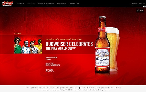
Same as the Marlboro the Budweiser website main promotional page is designed in red and black colors, meaning “Hey Dude- drink Budweiser and you’ll be a “Man”. The inside pages all have different backgrounds- white, red, black, gray.
I don’t think that there’s some separate marketing campaign behind this but rather a non-standard design approach (though most of the pages still remain in red).
14. L’oreal
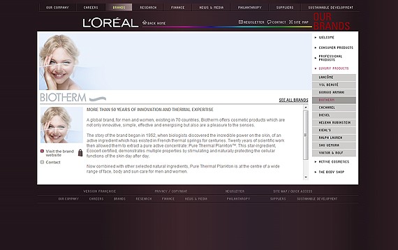
Not much to say about L’oreal website- being designed in all possible shades of purple it makes you feel really special. With L’oreal products you’ll be sexy, stylish, sure of yourself, and really-really special.
15. Kellogg’s
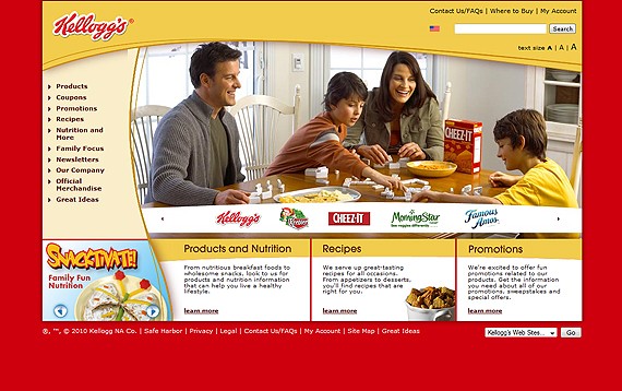
Since 1906 people have known Kellogg as a company they can rely on for great-tasting, high-quality foods. All the website speaks of fun and excitement (lots of yellow and red) and the smiling families on the photos in the header area make you feel even happier.
Yeah, your kids gonna love Kellogg’s they are so fun and cool! Even the text on the website speaks about it “We’re excited to offer fun promotions related to our products.” It’s fun, fun, fun!
16. Gucci
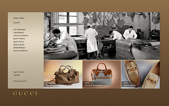
Natural light brown colors make you think of the Gucci products as very natural (and in some meaning they are since they are made from leather). Similar to L’oreal, the website is designed in a single color where different shades are used to make accents.
Though I’m against killing animals for fur and leather, I like Gucci website, it’s so exquisite and natural.
17. Heinz
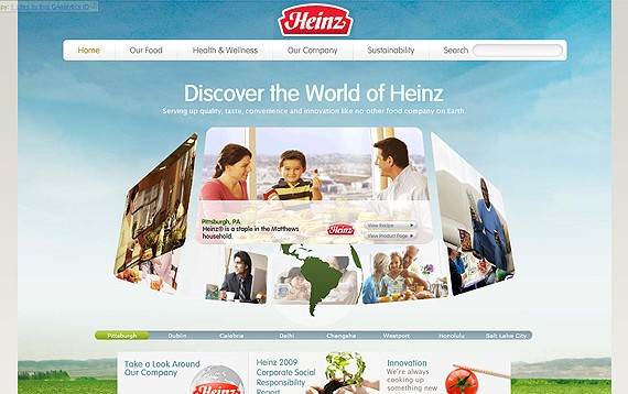
The website home page has a huge photo used as the background, and you can see the sky, the field and tasty tomatoes- simple yet effective. The background of the website inside pages changes from page to page: brown which resembles of land, blue which resembles the sky and the gray like the sky before the rain.
Heinz guys are using colors very effectively, since the core of their product is what they grow (or buy from third party) they use all the natural colors and photos to show that the product is the essence of what beautiful nature gives us.
18. Converse
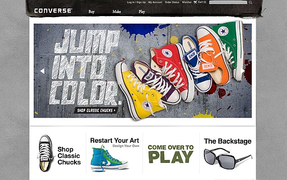
While the converse products are available in all possible colors, the website is designed in grunge style and colors resembling the pavement and old jeans.
The accent here is made not on the colors but the audience which should be attracted by the according design style, hand-drawn elements and the seeming carelessness.
19. Kleenex
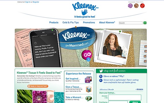
Kleenex is another great example of the website designed in the natural blue/green colorscheme (to make you feel confident the product is natural and reliable) with the orange elements to grab attention.
It’s pretty interesting that I have never paid attention earlier how many of big corporate websites are using this same colorscheme and still don’t resemble each other. Probably that’s because we do perceive the colors in some other way than just knowing and recognizing what color is that, I think that we see it as an integral part of some system.
20. Duracell
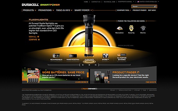
Duracell website is designed in 3 main colors and their shades: black, orange and green. Black- to make more contrast for the orange and to add some formality and solidity. Orange- power, energy, joy. Green is natural and works great with the orange.
“Smart power” as they say in the product, and the whole website makes you feel as if Duracell products are just what you need, the batteries are powerful and you can rely on them in any situation. BTW, I do buy Duracell :)
What colors do you use in website design? What are your favorite colors? Waiting on your comments guys!
This post may contain affiliate links. See our disclosure about affiliate links here.

