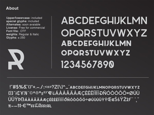
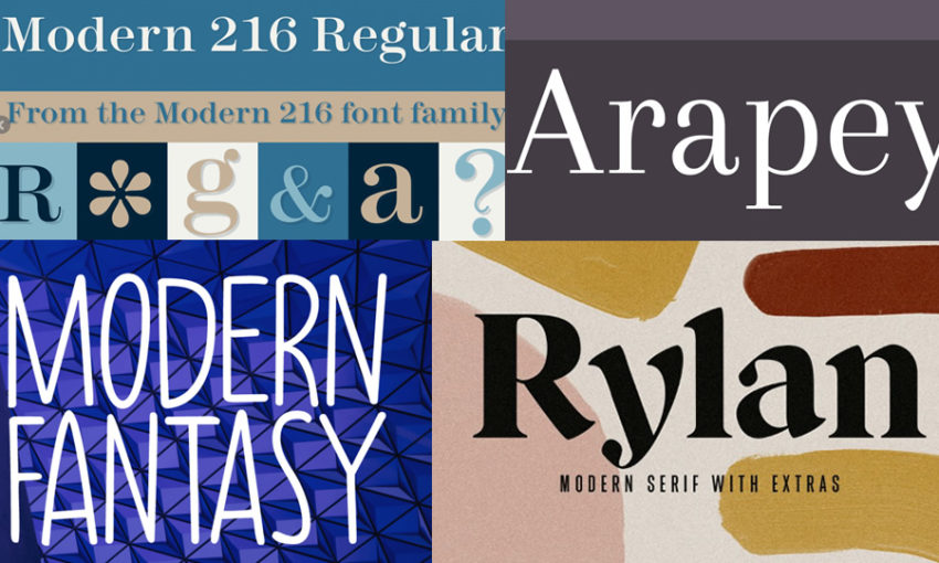
The importance of fonts to designers has always been emphasized. Many design blogs also agree that, as designers, choosing high quality fonts should be like choosing your clothes. People will think of you differently if you sport the wrong one.
This article is all about fonts. We are presenting 10 unbelievable professional fonts, that will blow your mind. We have also included a great guide on how to combine multiple fonts and why fonts are so expensive.
Table of Contents:
- Professional Fonts Collection
- Why Are Fonts So Expensive?
- Beginner’s Guide to Combining Multiple Fonts
- Adobe Edge Web Fonts – Adding Charm to Words
Professional Fonts Collection
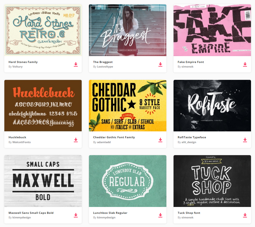
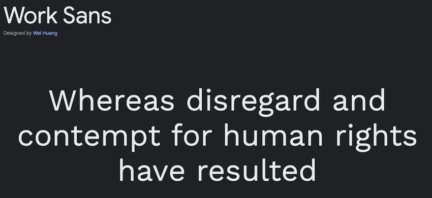
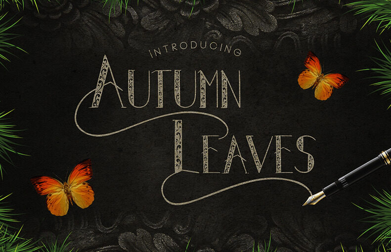
We have collected ten beautiful fonts for you that you will never hesitate to use. They are fonts that will both complement your body texts and titles. They are very flexible and trendy, so you will have no problem using them in your designs!
24,500+ Fonts, Website Templates, CMS Templates, and Landing page Templates are now available for just $29 per month with Envato Elements
By joining Envato Elements you gain access to plenty of Fonts, as well as many other useful design elements. All of this is available for a single monthly subscription to Envato Elements. Join today, and gain access to a massive and growing library of 24,500+ creative assets with unlimited downloads.
I will not make you wait any longer, so here are the the best professional fonts for you:
Myriad Pro

Ubuntu

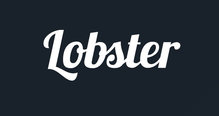
Lobster
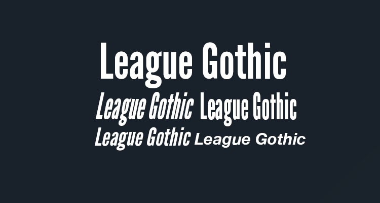
League Gothic
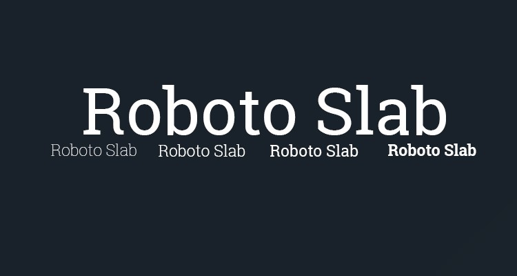
Roboto Slab
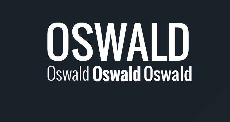
Oswald
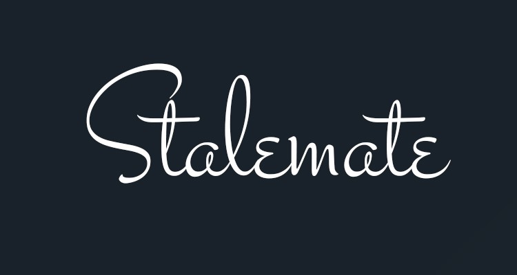
Stalemate
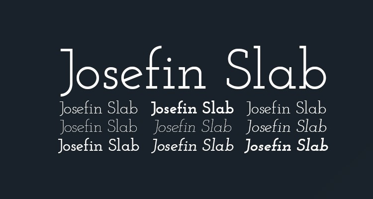
Josefin Slab
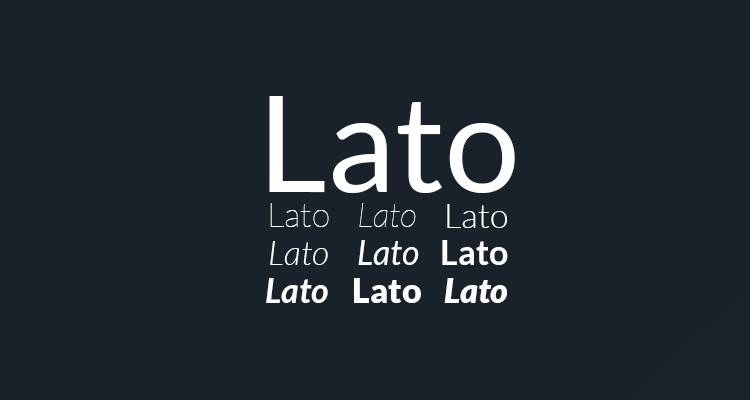
Lato
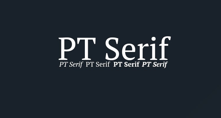
Pt Serif
Every designer has their own say on things, and we would love to hear what you think about this collection! And if you have a favourite font that you regularly use and recommend to people, feel free to post it below!
And don’t forget to check our latest modern fonts collection..in case you didn’t find the font you were looking for in this article!
Why Are Fonts So Expensive?
Everywhere you look on the internet there is a freeware option available that easily competes with its licensed premium version. This competition can get so close that the question of why the premium option is even a possible choice often arises. The comparisons of productivity suites like Microsoft Office and freeware open source options like Open Office and LibreOffice are a great example of this predicament. This positive change for consumers of course isn’t just for applications. This freeware shift has found its way into every aspect of all content one can find on the internet, of course the font world is not excluded.
Let me attempt to paint a common scenario for you. Imagine that you are starting on a new project, and have come across two fonts. One is a premium licensed font, and the other is a free font. Now the typical answer to this situation would be to go for the free font, save some money on the project, and the client really won’t know the difference so no complaints there. However, is the typical answer the choice that is always right? Is there any additional value that can be gained by going with the premium font option versus choosing the free option? Let’s take a look a look at some reasons why fonts cost so much.
Quality
When a creative goes looking for a resource to help improve a project they are working on, the quality of the said resource should be at the highest they can find. Well in the font world, like anywhere else, you get what you pay for. The issue with dealing with free fonts is that one really has to do a lot of searching to find one that is of nice high quality. Don’t get me wrong, there are a lot of nice fonts out there that were created by good typeface designers for free public use. However, there are a lot more in the free font market that are not of high quality. There are many cases in which free fonts have glaring flaws that make you wonder why a designer would release them to the public. Such as:
- Inconsistency in style with all letters
- Botchy curves
- Missing letters
- Not completely crisp throughout
Now, a premium font will rarely ever have these types of issues. This is so because like anything with a price tag, in an area where there are multiple alternatives available freely, a higher standard of quality is the only thing that matters.
Digital Rights and Usage Licensing
Okay let’s be honest here, how many people can actually say that they have gone through the license and usage agreements every font has before putting it to use? Especially for fonts you find for free? That is a big problem because that font that you find for free and say is a steal, could land you and your client that you used it for into some legal issues. When using a free font, people always assume that being able to download them free of charge means they can use them however they want without any problems?
This couldn’t be more wrong. The majority of free fonts, especially the ones of higher quality, are only okay to use for personal implementation. Anything outside of personal use is a violation of the agreement you agreed to before downloading them, and will cost you some money and a shot to your reputation as a designer to get out of. I don’t think the legal headaches and lower standing with your clients is really worth it.
Premium fonts however when purchased, can be used for commercial use like in client work, web use, etc. In many instances with some fonts, that is the whole purpose behind their price.
Exclusivity
The most annoying thing any designer dealing with free fonts has to go through is that as soon as you find one that you really like, you realize its been used everywhere! That once great find is now the poster child for creative overkill in the community. You can look at Helvetica, Impact, Times, or Comic Sans for great examples of this.
Fonts that are free for use, always come with this nagging issue. This issue can lower the overall view placed on your work, and its originality. Let’s be honest how many times have you seen a design with a font that has been used too much and that fact alone didn’t take away from the overall design?
Font Families
Typically with free fonts, they don’t come as a true font family. The only option you have is that one, or two in some instances, style. That is okay for some forms of graphic work, but for the most part it is a challenging thing to overcome. Font families gives you choices and options for different looks and better results for different instances. It also gives you a better font hierarchy in your designs, if that one font is the only one you are using.
Premium fonts always come as font families with different styles and font weights to choose from, giving you the options you need to make your design all the better.
Stolen Designs
It is a sad world that we live in where the truth is that if you create something remarkably astonishing, it will be reproduced and sold at a lower price, maybe even given away for free. Well, typeface designers know this disappointing truth all too well. Typeface designers spend a lot of time designing the fonts they create to be of high quality and originality, and quite often you’ll find the designer underselling his work so that it can be more accessible for us in the community.
Then after all that work put into it, to only find out that it only to be duplicated in lesser quality and being offered up for a lower price. Let alone finding out it is being offered for free.
Conclusion
The debate between which is better for use, or is there even really a difference, between free fonts and premium fonts will never end. They both have qualities that are going to be appealing and one will be better than the other in certain circumstances. Here is a summary of what we covered.
Premium
- Better Quality
- Multiple font styles to choose from in the font family
- Additional licensing may be needed for commercial use, or exclusive use
- Won’t be seen everywhere
- No worries of lawsuits coming your way, or your client’s way for its use
Free Fonts
- Does not include all characters
- Occasional lack of consistency
- May require additional licensing to be used commercially, or for the web
- May be a stolen design of a premium font
- Possibly will be seen in many other places
- Lacks font style options
Now after taking in all that information about fonts, and learning the benefits of using a premium font or a free font, you’re probably asking yourself which one would be better for your next project. We’ll let’s make that decision a little easier for you, below you can find a breakdown of the instances in which each category of fonts have their advantages.
Free Fonts
- Personal Use
- Non-Commercial Work
- Personal Logo, or branding(if okay with its designer)
Premium Fonts
- Commercial Work
- Client Work
- Web use
- Anything where its implementation gains you any monetary earnings.
However now that you have a better understanding of why fonts may seem to have a hefty price tag at first glance, you’ll rethink that thought and see all the benefits associated with using them. Below, you can find a few high quality free and premium fonts that will surely intrigue your creative spirit.
Free Fonts
Code Pro Light
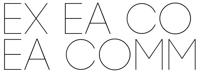
Code Pro Light
Weston Font
![newfreefonts04[1]](https://1stwebdesigner.com/wp-content/uploads/2011/11/newfreefonts041.jpg)
Weston
HERO
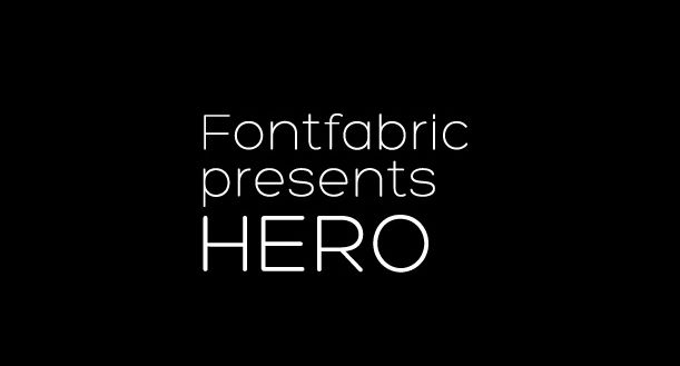
HERO
Coamei
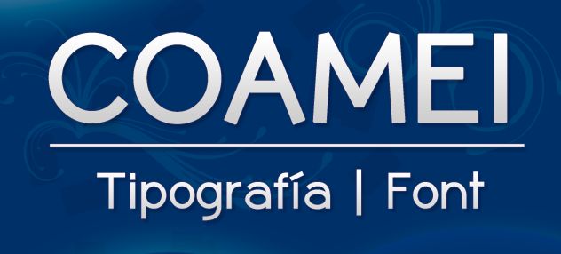
Coamei
Infinity
![8dc87584a16830f041641cb6a18fb9a2[1]](https://1stwebdesigner.com/wp-content/uploads/2011/11/8dc87584a16830f041641cb6a18fb9a21.png)
Infinity
Premium Fonts
Gabriel Sans
![53672[1]](https://1stwebdesigner.com/wp-content/uploads/2011/11/536721.png)
Gabriel Sans
Mija
![67680[1]](https://1stwebdesigner.com/wp-content/uploads/2011/11/676801.png)
Mija
Ratio OT

Ratio OT
Jannon Pro
![ee5e1944a4a496a16de6829c027539[1]](https://1stwebdesigner.com/wp-content/uploads/2011/11/ee5e1944a4a496a16de6829c0275391.gif)
Jannon Pro
Van Condensed
![van-condensed[1]](https://1stwebdesigner.com/wp-content/uploads/2011/11/van-condensed1.gif)
Van Condensed
Beginner’s Guide to Combining Multiple Fonts
Using multiple fonts in the same design can get tricky if you don’t have knowledge of basic theories and good practices. In my opinion pairing fonts is one of the most difficult parts of the design process. If you have no idea where to begin, then this article will guide you through the knowledge you need for now. Browsing the internet for tips about pairing fonts can get confusing, because there are many practices designers use. Therefore I researched a lot in the past couple of weeks and I will present you what is, in my opinion, the right way of doing this.
The question I get asked the most is “how many fonts should I use?” I always tell people this depends a lot on their aim and general design patterns, but usually I do not recommend more than two. In my opinion two is what you should go for, not more. This is because all fonts, like people, have a personality and an overall effect. If you use two fonts with total opposite effects, they will clash and this will kill your design. Too many strong personalities together can create an awkward atmosphere, it is the same with fonts.
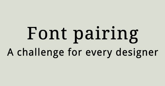
However, even if I usually say two, there are no rules that say how many different fonts you can use. You just go for as many as you think it’s appropriate for your design. The biggest challenge is creating harmony between different typefaces, so the less fonts you use, the easier is going to be to achieve this harmony and create a powerful effect. You can always go for fonts with multiple weights and variants, but they also need to compliment each other at the same time.
Another question is “to buy or not to buy?”. It depends on the project. There is a reason why some fonts are free and some cost $100 for 10-12 variants. Quality is the main advantage of a premium font. Maybe some will not notice the differences, but experts will definitely appreciate a premium font more than a freebie. Now don’t get me wrong, I am not saying free fonts are bad, but there is a difference in quality. The difference is in the small details such as thickness, forms, white space and kerning.
Kerning may not be perfect in free fonts, because font developers do not put as much work into it – and why would they, as long as it’s for free and they don’t get anything out of it? There might be some tools out there, such as kern.js, which might help improve the kerning, but it is not very practical to do this for large bodies of text.
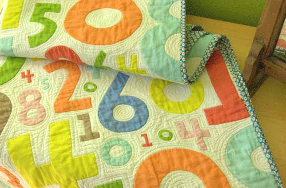
Although a limited number is recommended, if you can create harmony, use as many fonts as you wish.
Image by stitchindye.
Another advantage of using a premium font is the originality. If you pay for your fonts, there is a higher chance not many have and use that one, while using Arial or Verdana is something most beginner designers go for. Another thing worth mentioning is that by paying for fonts you also encourage the community and keep it going. Font designers will only continue their work if they can get something out of it and you are one of the ones who can pay.
If you ask me, I think you should buy fonts instead of using free ones. Quality has always been important to me – and I suppose it is to you too – therefore such a financial investment would make sense.
You should also think about what fonts you want to use before you go and buy them. If you use a typeface for headings on your home page, don’t use another one for headings on another page. Think of the main reason you choose a font for. Is it mainly body text or headings? Is it maybe a magazine for young people? All these details should be spottable in your font choice.
How to achieve it
Achieving proper font pairing relies on concord or contrast, but not on conflict. The fonts need to work well together thanks to some shared qualities or need to be different between some boundaries. Conflicts between them can be created if the typefaces are too similar and look just like one or are way too different.
To achieve contrast you will have to look for style (Blackletter, Monospace, Slab Serif, Script and so on), size, weight, form (proportions of a typeface are equally important – the length of the descenders, the curvature of the shoulders, the movement and its direction etc.) and color.
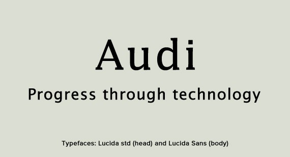
As in the example above, two fonts of different variants work really well together. Lucida std and Lucida Sans, developed by the same designer, work really well when combined. This is simply a classic one. A decorative font for the heading and a legible and simple one for the body – no way to fail here.
Let’s see some other good combinations.
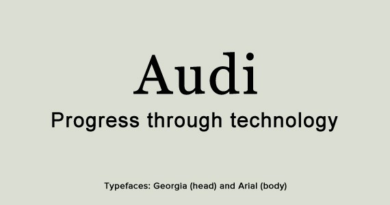
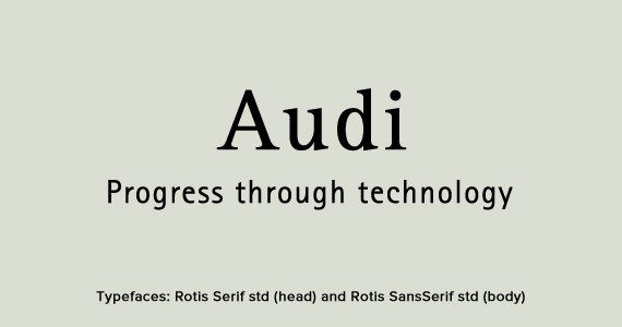
Rotis Serif and SansSerif, typefaces by the same designer, work really well together as well.
You can see in the above examples where hierarchy is shown through size, but there are also other ways of doing it. Just look at the examples below.
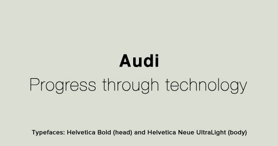
Here the hierarchy is shown through weight, while both fonts have a 35pt size.
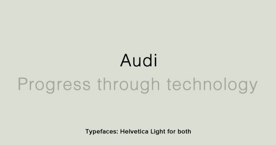
Both fonts have a size of 35pt and the same weight, but the color is different.
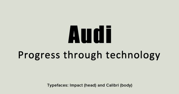
Impact and Calibri show a clear difference and create a visible hierarchy.
Now enough with the contrast. Let’s see what concord is about. Two elements with concordance suggest that a trait is noticeable in both typefaces. It can be the kerning, proportions, cap height and so on. The easiest way to create concordance is to use fonts from the same family. You can see an example above with Helvetica used in both heading and body. A great typeface with concordance between variants is the Droid family.
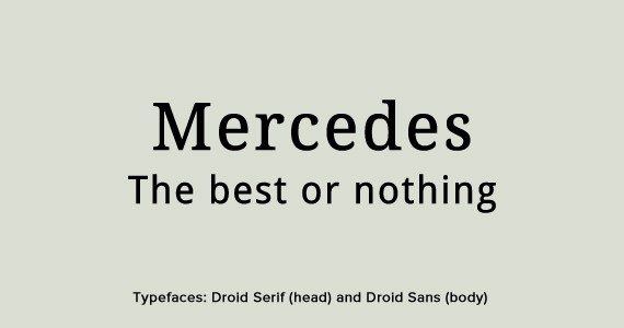
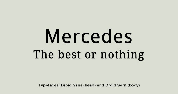
It is quite easy to play around with the same typeface. Fonts from the same family create harmony together and this is also where I advise you to start playing and experimenting.
Now let’s see what conflict is. It’s name says it all; as said earlier, it is something you should avoid doing – pairing conflicting fonts will kill your design. The example below illustrates this concept perfectly.
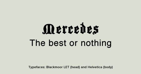
Although they create contrast, as they should, this contrast is way too much. This is because the heading typeface is a Blackletter, while Helvetica is a neo-grotesque typeface. When combining fonts, they should always be from the same classification. I’ve seen some examples ignoring this rule which worked just fine, but let’s face it, it doesn’t happen too often. The proportions, weight and size are different. The curvature doesn’t look the same at all and the axes are off. Something quite easy to notice is the direction of the letters. While Blackletter fonts have a diagonal direction, the more modern ones are built vertically. There are just too many elements not working well with each other, the fonts are just not congruent enough, so in conclusion they do not work well together.
Bottom line
This article should be enough for becoming accustomed to the rules. It is only a beginner course presenting you the three most important concepts in font pairing. Always keep in mind that us designers have to be creative and breaking the rules now and then does not do any harm, but don’t overdo it. Try being creative, but if you see it is not working, reverse back to something more simple and effective.
Font pairing is not easy. It required many of us years to master and some other ones even more than that. But it is from these three concepts we all started. Make sure you know them and are able to apply them in the field. Then, learning to combine multiple fonts for a desired effect will be a piece of cake for you.
Adobe Edge Web Fonts – Adding Charm to Words
If you have anything to do with the design industry, whether you are an outright typographer, designer, or even someone with a keen eye for all things that look beautiful (ahem!), good looking words will never fail to impress your eyes. Keeping in sync with your affection for good typography, Adobe has come up with their own font library, Adobe Edge Web Fonts.
For ages, calligraphy and typography have been treated as something that should not be overlooked — both in visual and aesthetic senses. In this digital age, we have fonts that deserve a special mention and have the power to attract (or repel) one’s attention.
Introduction
As we know, most designers and digital artists are always on the lookout for awesome fonts to include in their projects. What’s more? With the advent of web fonts, you do not even need to download TBs of fonts (though seriously, if you have a font collection spanning TBs, you’ve taken it to a new extreme). Just add few lines of code, and wookie-dookie! You are good to go!
Speaking of web fonts, Google has dominated the scene so far with their impressive collection of web fonts. However, last week, we witnessed the entry of a new player in this segment: Adobe.
Yes, that’s right. Adobe has come up with its own library of web fonts: Adobe Edge Web Fonts. In this article, we shall take a look at the new service.
Okay, What Exactly Is Adobe Edge Web Fonts?
Basically, Adobe Edge Web Fonts is an altogether new font service for you to use and add awesomeness to your projects! Remember Typekit? As we all know, Typekit has now belonged to Adobe for quite sometime already. Edge Web Fonts relies on the Typekit standards and font serving network to provide you with awesome letters. What makes it different then? To begin with, you no longer need an account or a configuration kit. Just pick your favorite font, and off you go! Totally free!
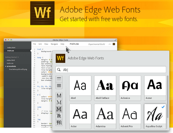
Beyond that, Adobe is also talking about a collaborative effort with Google Web Fonts for the creation and optimization of better fonts, both new and existing ones. You can learn about Google’s enthusiasm about this venture here. Just in case you are wondering, this entire project is open source! Yes, absolutely free to use and build upon. By the time of writing this article, Adobe has already come up with two awesome open source fonts (available both via Edge Web Fonts and Google Web Fonts) — Source Sans Pro and Source Code Pro. Go check ‘em out, but before you go, do finish reading this article; we’ve got plenty more to explore!
Can I Have More Details, Please?
Adobe Edge Web Fonts library is a part of Adobe Edge Tools and Services. Among other awesome things on offer, you have a code editor in the likes of Edge Code and other projects that are yet to be released, such as Edge Reflow that lets you create responsive CSS layouts.
So, coming to Edge Web Fonts. The hosted library contains hundreds of fonts brought to you by Adobe, Google and many other designers from all around the world, all for free! The fonts have already been integrated into Adobe services such as Edge Code and Adobe Muse.
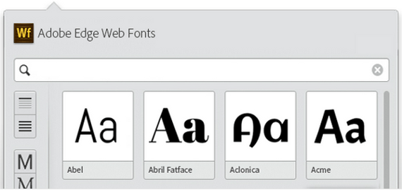
However, don’t be alarmed after reading “integration into Adobe services”: if you are not a lover of proprietary Adobe services (such as myself), you can still make use of the font library in your projects.
Among other finer details, Edge Fonts library, as already mentioned, makes use of Typekit’s font serving prowess and relies on JavaScript libraries for browser compatibility and other font events.
Alright, This is Awesome. How Do I Employ Them?
Can’t wait to use them, can you? Well, using Edge Web Fonts is pretty simple. For example, let us say, we wish to use Playball on our website.

First of all, we will need to copy and paste this embed code in the head section of the HTML file:
<script src="<a href="http://use.edgefonts.net/playball.js">http://use.edgefonts.net/playball.js</a>"></script>
Thereafter, in the CSS file, all we need to do is to use the font family name, as follows:
h1 {
font-family: playball, serif;
}
And, we are done! Cool, eh?
For instance, this is what the code for a simple web page will look like:
<!doctype html>
 <html>
 <head>
 <script src="<a href="http://use.edgefonts.net/playball.js">http://use.edgefonts.net/playball.js</a>"></script>


<style>
 h1 {
 font-family: playball, serif;
 font-style: normal;
 font-weight: 400;
 }
 </style>


 </head>
 <body>


<h1>"Sufyan bin Uzayr"</h1>


 </body>
 </html>
You can check out the full documentation here, for details such as supported protocols, URL specifications and complete list of fonts.
Wrap Up
As of now, Adobe Edge Web Fonts has nearly 500 font families for you to choose from. For a project still in its infancy, 500 is an impressive number. With time, this number is likely to expand and considering the fact that unlike Typekit, Edge Web Fonts is open source and non-commercial in nature, it will surely be loved and adopted by more and more users all around the world.
Since this is not a commercial venture, and both Google and Adobe have talked about collaboration, I do not see any sort of competition between Edge Web Fonts and Google Fonts Library. Instead, such collaborative innovations will definitely prove very useful for the community.
What do you think of Adobe Edge Web Fonts? Have you given the font library a try? Feel free to share your thoughts with us in the comments below!
Conclusion
You can now see why fonts cost so much and how to combine them, so you can achieve a pleasing effect and compliment your design. Hopefully, you have found some good professional fonts to use. If not, Adobe Edge Font library should also be a good answer. Tell us what you think about these subjects, and keep learning!
This post may contain affiliate links. See our disclosure about affiliate links here.

