Many onboarding flows also cover any user input that needs to be obtained for the app to function properly. For example, an eCommerce may ask for some details from the user, and to enable push notifications.
Since onboarding is the first and foremost interaction with a new user, it’s essential it is well designed and visually appealing. The last thing a company wants is to lose new users through a less than satisfactory onboarding experience.
Below we are going to look at some excellent examples of user onboarding and discuss what makes them so useful.
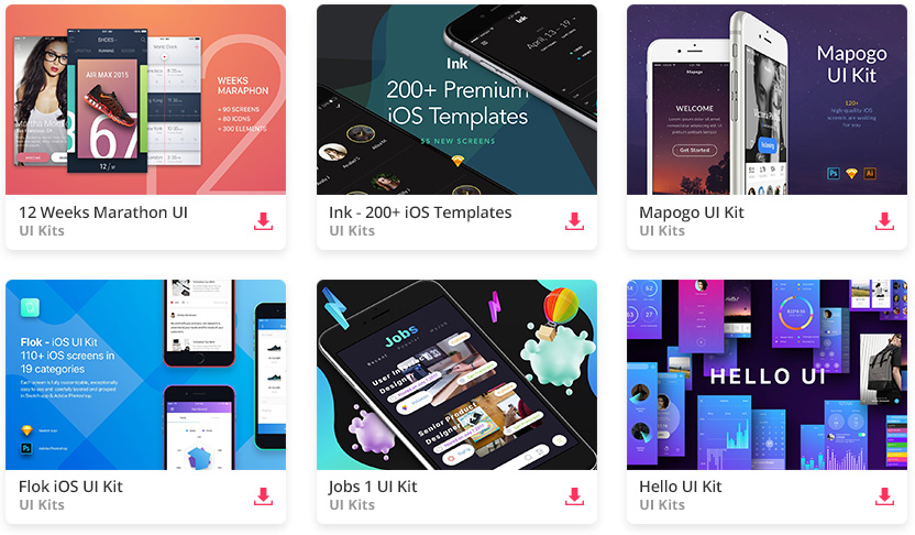
All the Mobile UI Kits You Could Ask For
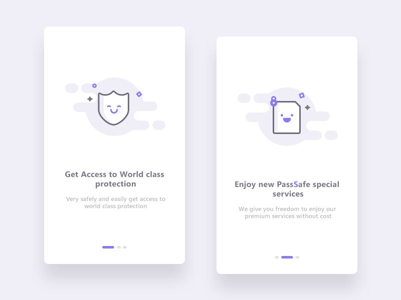
PassSafe’s onboarding is delightful. It uses a continuation of a character face while transforming the elements around it to describe each step. The colors are muted but cohesive, and the progress bar is imaginative and easy to understand.
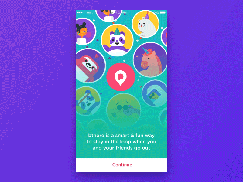
The colors and iconography in this example are incredibly fun and also abstract. It also executes animations perfectly and contributes to what is one of the most colorful and fascinating onboarding designs around. The background provides excellent contrast to the main action button and makes it simple for the user to flow through the onboarding with ease.
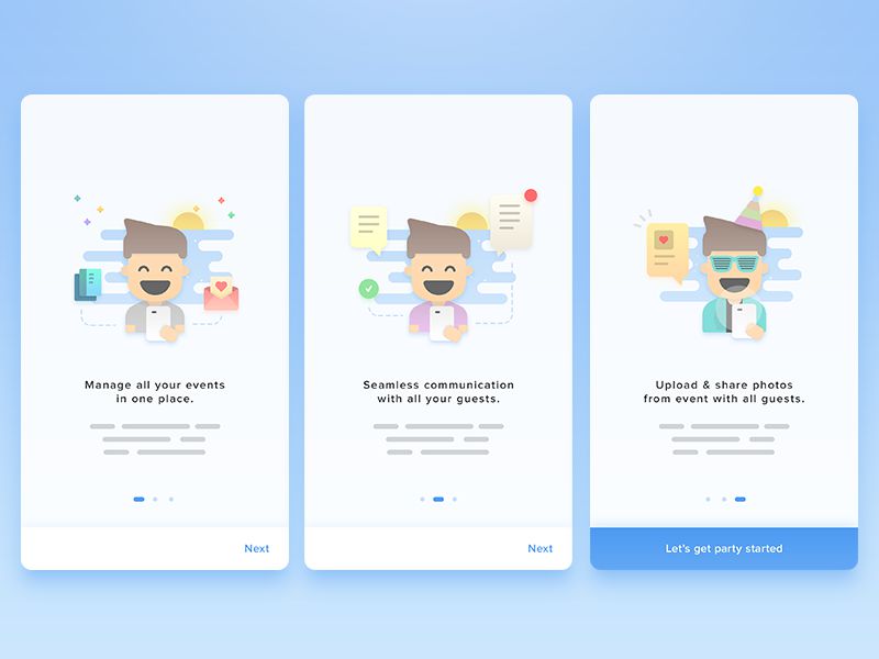
One of my favorite examples, in most part due to the iconography. It’s incredibly well executed in terms of color, detail, and playfulness. It includes multiple visual cues on each icon to give the user a better understanding of the step.
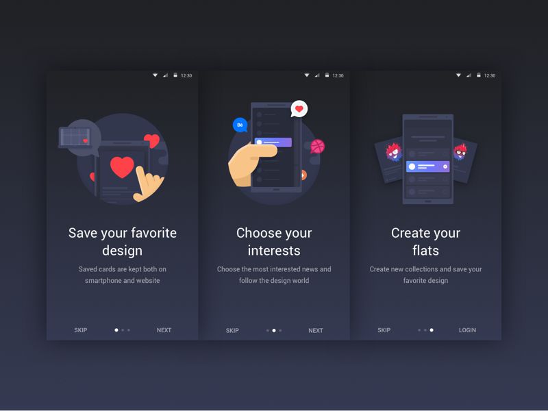
This is a beautiful example of a dark onboarding design. The icons fit perfectly with the dark theme and are complimented with bright outbursts of color and gradients. The text is large with excellent contrast, and the user is easily able to skip each step.
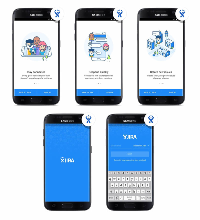
The Jira onboarding for Android uses incredibly detailed icons which are both descriptive and visually appealing. The inclusion of characters in each of these icons adds to the personable feel of the onboarding and makes it very fun to use. The buttons and actions are clear and contrasting, and the descriptions and text content is kept to an absolute minimum as not to overwhelm the user.
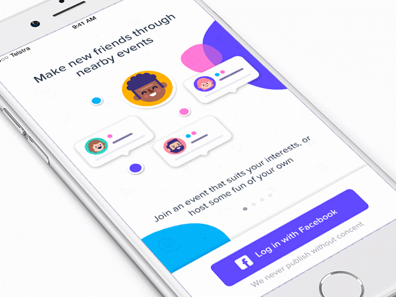
My personal favorite onboarding example. It has a delightful UX whereby the onboarding slides are both optional and unobtrusive. Users can decide whether they want to learn more about the app, or they can jump right in at any point and login with their Facebook account.
The colors, icons, background design, and animation is considered and well thought out, resulting in an onboarding which is fun and easy to use.
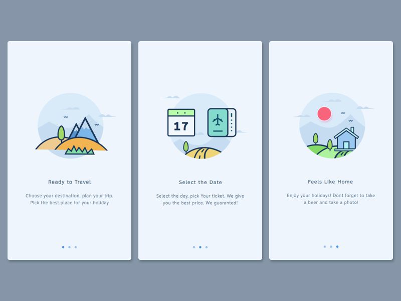
In one of the simplest examples of onboarding, this app strips everything back to present a very minimalist experience. The icons are descriptive, atmospheric, and overflow their container with satisfying results. The text is concise and well-spaced, and the progress feedback is minimal but more than adequate.
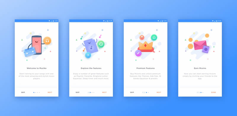
Again, this example shows just how important the iconography aspect is when it comes to user onboarding design. Taking the icons away would leave a very empty and uninspired example. However, the inclusion of such icons transforms onboarding into something so delightful you are tempted to complete the onboarding just to view the other icons. The colors are vibrant and happy, and the peripheral elements give a sense of joy and activity to the icons.
Which is your favorite onboarding example? Share it below in the comments!
This post may contain affiliate links. See our disclosure about affiliate links here.