Every day thousands of people browse the App Store and Play Store in search of utilities and entertainment. Behind every search and download is desire – a desire to solve a problem.
Products icons play a critical role in the process of search&download – in a world of short attention spans and many, many options, designers need to capture a users attention with just a few pixels on a tiny square canvas.
Every product needs a beautiful and memorable sign that attracts attention in the market and stands out on the home screen. Below you can see a few examples created by Fireart Studio.
![]()
But what exactly do you do if you need to design an icon for a mobile app that your users will notice and remember? Let’s take a look at some of the best principles of mobile app icon design.
Clarity
Clarity is an essential characteristic of a great interface. A pictogram is the first opportunity to communicate, at a glance, a product’s purpose. When they are unclear, there’s a high risk of confusion – when people are unable to correctly identify what a pictogram is supposed to represent, it just won’t work for them.
Tips:
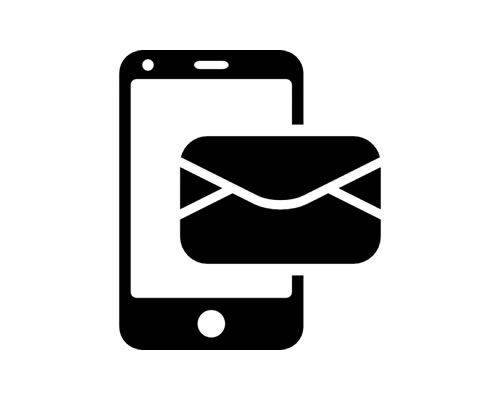
- Symbolism is key. People often associate pictograms with specific objects or actions based on previous experience. For example, in the Western world, the symbol of an envelope is commonly used to represent mail – both in digital and in physical spaces. It’s possible to use such associations to create potent visual signifiers for users.
- Check competitors. If you have a hard time finding ideas on how to design a mobile application icon, take inspiration from products in your niche. Your competitors have probably already found the most obvious way to represent the primary function of a product.
- Deconstruct user’s preferences. When designing any visual element, it’s important to consider what your target audience like or don’t like it. If you can conduct user testing, you can ask users directly by showing them different options. Try out several variations of your design to find the one users like the most.
Scalability
We should design a mobile app icon to make it crystal clear on every screen resolution.
Tips:
- Avoid fancy graphics effects. Don’t include photographic details, 3D perspectives and drop shadows because they are hard to discern at a small screen.
- Don’t use a lot of details. While on larger displays you have enough real estate to show large graphics and impressive visual effects, on a small screen such elements can become blurry.
- Avoid using words. There’s no need to include promo words like “Free” or a product’s name. Use words only when they’re essential or part of a logo.
This icon isn’t legible – how it looks on home screen and Notification Center.
- Check against a variety of backgrounds. While you can’t predict what wallpaper users will choose for their home screen, you still should check that your design works for edge cases – check your icon against a pure black, utterly white and colored backgrounds.
- Test on real devices. What looks good on a desktop screen might not be so good on mobile, so testing on a real device is essential.
Memorability
Memorability is about making something that stands out. If it stands out, it has a better chance of being noticed by users.
Tips:
- Complexity is the enemy of memorability. The more details you add, the less recognizable the object you design will be. Try removing elements until the concept starts to deteriorate.
- Test your icon on the screen. Do a quick test to figure out if the image stands out on the screen – just place it on a grid of pictograms, and you’ll see whether or not it stands out.
The 1Password icon has great recognizability.
Consistency
Think of your pictogram design as an extension of what your product is all about. It’s possible to create a connection between this small graphics object and entire experience – both logical connection (convey the meaning) and visual relationship (colors, textures, idea).
Tip: One way to ensure consistency is to use a styleguide (for example, to keep the color palette of your interface and icon in line).
Clear has a similar color scheme for both icon and interface.
Platform Recommendations
Just like any other GUI part, pictograms require following platform conventions. Consider iOS Human Interface Guidelines if you want to create a graphical symbol for iOS and Material Design guidelines for Android products.
Conclusion
Without any doubt, it’s possible to tell a great story in a wonderfully restricted canvas. Take the time to design beautiful and engaging graphics that perfectly represents your product’s purpose.
This post may contain affiliate links. See our disclosure about affiliate links here.