jQuery is the most popular JavaScript framework used for sliders. A lot of jQuery sliders can be categorized based on the techniques used for sliding. The following are some common and trending techniques used by developers.
- Layered Sliders – This is the latest addition to sliders with parallax effect.
- Fade In/Out Sliders – These types of sliders do not have controls. Content just fades away one by one.
- Banner Rotators – These sliders rotate in a circular path.
There are many other types of techniques as well. Each type of slider is suited for a different purpose and location on your website. Hence the designer has to carefully choose sliders for different locations.
Your Web Designer Toolbox
Unlimited Downloads: 500,000+ Web Templates, Icon Sets, Themes & Design Assets
Starting at only $16.50/month!
Even on our personal sites we create sliders with large dimensions to show products, sliders for displaying our project portfolio and small sliders to display featured or popular posts on a blog. So there is every chance that we might include more than one slider in a website. In the next section I’ll explain why multiple sliders can be a real pain for a designer or developer.
Source Files Download
Disadvantages of Using Multiple jQuery Sliders
As I mentioned earlier, different sliders provides different effects and different layouts. Web designers will be prompted to include the slider with best effects for different locations. There are many drawbacks to using multiple different sliders on a single web page.
- Each slider will have a set of script and CSS files. Increasing the number of scripts and CSS files will slow your site loading time, which will affect SEO.
- Different sliders may require different versions of jQuery. Hence jQuery files will be duplicated.
- It’s possible to have conflicts in codes with other sliders.
Considering the above points, it’s better to use one slider throughout your website. It’s possible to create different designs and features using the same slider. All you have to do is pick a flexible slider and have some knowledge of jQuery and CSS to customize it. I’ll be using Rhino Slider throughout this tutorial since it is one of the most flexible sliders available.
Introduction to Rhino Slider
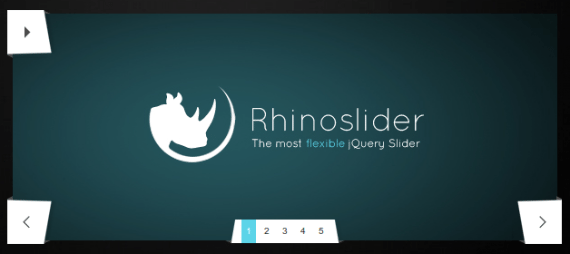
Rhino Slider is a jQuery Slider dual licensed under the MIT or GPL Version 2 licenses. You can download and get more information here. Following image shows the default view of Rhino Slider.
I have explained the Rhino Slider components and how it can be used in my tutorial How to Create a Multi-Step Form Using RhinoSlider. You can use it to get a better understanding about how it works. In this tutorial I’ll be explaining how to create different layouts and different functionality with a single slider.
Designing Custom Navigation for the Slider
Navigation is one important part of a slider. Even though sliders can be created to slide automatically in specified intervals, its preferable to provide controls for the user to go through them at their own speed. Generally Next and Previous buttons are provided in most sliders. Rhino Slider, which I am using for this tutorial, contains a numbered navigation similar to pagination.
We can create different designs for navigation pretty quickly and make the slider look completely different. I’ll show you how to change the basic styles of navigation. So lets get started.
Identifying Control Buttons
There are 3 navigation buttons in Rhino Slider for Previous Slide, Next Slide and Pagination. These components are provided with specific CSS classes so that we can identify them easily.
- Previous Slide – rhino-prev
- Next Slide – rhino-next
- Pagination – rhino-bullets
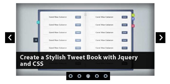
Now, have a quick look at the image below to get an idea about how we are going to change the design.
Step 1 – Designing Prev/Next Controls
As you can see, prev and next buttons are given different images to the original one with black background. Also, positioning of the controls has been changed to show them in the middle instead of bottom. So let’s discuss the necessary changes to main CSS file.
.rhino-btn {
	background:url(../img/rhinoslider-sprite.png) 0 0 no-repeat;
	z-index:10;
	display:block;
	text-indent:-999%;
	-webkit-user-select:none;
	-moz-user-select:none;
	user-select:none;

        /* Modified Styles */
	width:30px;
	height:25px;
}

.rhino-prev, .rhino-next {/* Modified Styles */ bottom:150px; }

.rhino-prev {
         /* Modified Styles */
	 background: url("../img/prev-arrow.png") no-repeat scroll 13px 10px #000000;
         padding: 10px 5px;
         left : -45px;
}

.rhino-next {
        /* Modified Styles */
	background: url("../img/next-arrow.png") no-repeat scroll 15px 10px #000000;
        padding: 10px 5px;
        right:-45px;
}

.rhino-prev:hover { /* Modified Styles */}

.rhino-next:hover { /* Modified Styles */}
.rhino-bullets:before, .rhino-bullets:after {
	position:absolute;
	display:block;
	left:-16px;
	content:' ';
	width:16px;
	height:26px;
	/* Removed Style */
        /* background:url(../img/rhinoslider-sprite.png) -224px 0 no-repeat; */
}
.rhino-bullets {
	position: absolute;
	bottom: -3px;
	margin:0 0 0 -50px;
	z-index: 10;
	background: #fff;
	padding:0;
        /* Modified Styles */
        left: 45%;
}
.rhino-bullets li {
	float:left;
	display:inline;
	/* Modified Styles */
	padding:10px;
	background :#000;
	/*margin:0 2px;*/
}
.rhino-bullets li a.rhino-bullet {
	display: block;
	width: 16px;
	cursor: pointer;
	background: white;
	font-size: 10px;
	text-align: center;
	padding: 6px 0 5px 0;
	color: #333;
	text-decoration:none;
	-webkit-user-select:none;
	-moz-user-select:none;
	user-select:none;
        /* Modified Styles */
	background:url("../img/pagination.png") repeat scroll 0 0 #0C1C28;
        height: 3px;
}

.rhino-bullets li a.rhino-bullet:hover, .rhino-bullets li a.rhino-bullet:focus {
	color:#999;
	/* Removed Style */
        /* background:#eee; */
}

.rhino-bullets li a.rhino-bullet.rhino-active-bullet {
	color:#fff;
	/* Removed Style */
        /* background:#5cd4e8;  */
        /* Modified Style */
	background-position:0px -14px;
}
Once you apply these styles, the slider will change its look to the design provided in the image. I have mentioned the styles which have been changed to achieve the new design. Now you can see how easy it is to create new designs.
Designing Preview Images for Slider
In the previous section, I explained how to use navigation controls and customize the layout. In this section we’ll try a bit of more advanced code to show preview images of the slider in place of navigation numbers. We will be using a combination of CSS and jQuery for this section.
So we have to remove the circular image used for pagination and increase the dimensions of navigation bullets to show the preview image. Let’s take a look at the CSS code first. All the changes from the original CSS file can be found in code comments.
.rhino-bullets {
	position: absolute;
	bottom: -3px;
	z-index: 10;
	background: #fff;
	padding:0;
        /* Modified Styles */
        bottom: -70px;

        /* Removed Styles
           left: 45%;
	   margin: 0 0 0 -50px;
        */

}

.rhino-bullets li {
	float:left;
	display:inline;
	/* Modified Styles */
	padding:1px;
	background :#000;
	/*margin:0 2px;*/
}
.rhino-bullets li a.rhino-bullet {
	display: block;
	cursor: pointer;
	background: white;
	font-size: 10px;
	text-align: center;
	padding: 6px 0 5px 0;
	color: #333;
	text-decoration:none;
	-webkit-user-select:none;
	-moz-user-select:none;
	user-select:none;

        /* Modified Styles 	*/
        height: 55px;
        width: 102px;
        padding: 0;
        border:5px solid #eee;

        /*  Removed Styles
		background:url("../img/pagination.png") repeat scroll 0 0 #0C1C28;
         */

}
img{
max-width:100%;
}
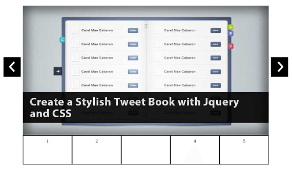
Once you apply the above CSS code the preview will look like the following.
Let’s play with some jQuery code to generate the preview images in place of numbers in bullets.
$('#slider li').each(function(){
	var image_src = $(this).find("img").attr("src");
	var panel_id = $(this).attr("id");

	$('.rhino-bullets li').find("#"+panel_id+"-bullet").html("<img src='"+image_src+"' />");
});
- First we traverse through all the li elements inside slider using jQuery each function.
- You may have noted that li elements for slider images have the ID as rhino-item0,rhino-item1 etc., and the respective pagination bullet as rhino-item0-bullet, rhino-item1-bullet.
- So we get the image src using the src attribute and get the ID of li elements above the image.
- Then we find the respective bullet not using the ID and assign the image to the preview section.
Now you will be able to see the preview images as shown in the screen below.

You can see how easy it is to change the designs and functions. Previewing images like this is not the most optimized way since it scales images. But its very useful in certain situations.
Slider with Vertical Tabs
Lets see how we can convert the default slider into a slider with tabbed navigation on the left side. You can take a look at the final output of this section using the following screen.
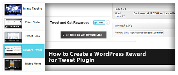
The following is the necessary changes you need to make to the default CSS file in order to customize the design.
.rhino-bullets {
    background: none repeat scroll 0 0 #FFFFFF;
    left: -136px;
    margin: 0 0 0 -50px;
    padding: 0;
    position: absolute;
    z-index: 10;

    /* Removed Styles
    bottom: -3px; */

    /* Added Styles */
    top: -3px;
    border:1px solid #A7A5A5;

}

.rhino-bullets:before, .rhino-bullets:after {
    position:absolute;
    display:block;
    left:-16px;
    content:' ';
    width:16px;
    height:26px;

    /* Removed Styles
    background:url(../img/rhinoslider-sprite.png) -224px 0 no-repeat;
    */
}
.rhino-bullets li {
    margin: 0 2px;

    /* Modified Styles */
    display: block;
    border-bottom: 1px solid #eee;

    /* Removed Styles
    float: left;*/
}

.rhino-bullets li a.rhino-bullet {
    -moz-user-select: none;
    background: none repeat scroll 0 0 white;
    color: #333333;
    cursor: pointer;
    display: block;
    font-size: 10px;

    text-align: center;
    text-decoration: none;

    /* Modified Styles */
    height: 50px;
    padding: 5px;
    width: 170px;

}
.rhino-bullets li img{
    width:75px;
    height: 50px;
    float: left;
}

.rhino-bullets li p{
    font-family: helvetica;
    font-size: 12px;
    font-weight: bold;
}
Apart from the thumbnail images we can also add a short title or caption in front of the header. You have to define the captions in a JavaScript array as shown in the code below.
var info = ["Image Tagging","Rhino Slider","Tweet Book","Reward Tweet","Sliding Menu"];

                $('#slider li').each(function(index){
                    var image_src = $(this).find("img").attr("src");
                    var panel_id = $(this).attr("id");

                $('.rhino-bullets li').find("#"+panel_id+"-bullet").html("<img src='"+image_src+"' /><p>"+info[index]+"</p>");
});
I have added the caption using the JavaScript array while traversing through pagination bullets.
How to Use the Designs in Single Page
In the previous 3 sections I showed you how to create different designs and functionality using the same slider. We changed the main CSS file of the Rhino Slider, but when we use more than one slider inside a single page we cannot change style the way we just did. So we have to find alternative methods to specify different styles for same classes and elements.
First we have to provide different IDs for slider containers as shown below and initialize the Rhino Slider separately.
<ul id="slider1" class="slider">
                <li><img src="img/slider/1.jpg" /></li>
                <li><img src="img/slider/2.jpg" /></li>
                <li><img src="img/slider/3.jpg" /></li>
                <li><img src="img/slider/4.jpg" /></li>
                <li><img src="img/slider/5.jpg" /></li>
            </ul>

            <ul id="slider2" class="slider">

                <li><img src="img/slider/4.jpg" /></li>
                <li><img src="img/slider/5.jpg" /></li>
                <li><img src="img/slider/1.jpg" /></li>
                <li><img src="img/slider/2.jpg" /></li>
                <li><img src="img/slider/3.jpg" /></li>
            </ul>
Then we have to assign a unique class to the bullet navigation list of each slider container. The following jQuery code will add the class to the navigation bullets.
$('#slider1').parent().addClass("slider1");
$('#slider2').parent().addClass("slider2");
Each design will have its own styles for each class. So prefix all the modified styles with the class relative to the slider. Consider the following example.
.slider1 .rhino-bullets {
	position: absolute;
	bottom: -3px;
	z-index: 10;
	background: #fff;
	padding:0;
        /* Modified Styles */
        bottom: -70px;

        /* Removed Styles
           left: 45%;
	   margin: 0 0 0 -50px;
        */
}
.slider2 .rhino-bullets {
	position: absolute;
	bottom: -3px;
	margin:0 0 0 -50px;
	z-index: 10;
	background: #fff;
	padding:0;
        /* Modified Styles */
        left: 45%;
}
In the above example 2 sliders have different styles for the rhino-bullets class. So prefix it with your slider class. Follow the same process for every other styles which is not common to all sliders.
So we have created a few slider designs and learned how to customize a slider. It’s time for you to create your own customized design for the slider. All are welcome to share links or images to your customized version of Rhino Slider.
This post may contain affiliate links. See our disclosure about affiliate links here.


