Today, we’re exploring a simple yet effective technique for toggling CSS classes on an HTML element using JavaScript. We’ll demonstrate this on a button element, and highlight the control of the visual appearance and state with just a few lines of code.
Your Web Designer Toolbox
Unlimited Downloads: 500,000+ Web Templates, Icon Sets, Themes & Design Assets

Creating the HTML Button
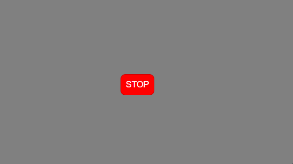
<button id="button" class="red">STOP</button>
We initiate our demo with a button element identified by the id “button” and carrying an initial class of red.
Styling the Button with CSS
body {
height: 100vh;
display: flex;
align-items: center;
justify-content: center;
background-color: grey;
}

button {
padding: 10px;
font-size: 1.1em;
border: none;
border-radius: 10px;
border: 1px solid rgba(0, 0, 0, 0.2);
cursor: pointer;
}

.green {
background: green;
color: white;
}

.red {
background: red;
color: white;
}
The CSS above does two things: it improves the button’s appearance and it defines two state classes – .green and .red. These classes will be alternated in JavaScript, affecting the button’s color and the associated user message.
Toggling with JavaScript
const button = document.getElementById("button");
const buttonPressed = (e) => {
e.target.classList.toggle("green");
e.target.classList.toggle("red");
e.target.innerText = e.target.innerText.trim() === "STOP" ? "GO" : "STOP";
};
button.addEventListener("click", buttonPressed);
In the JavaScript snippet, we first access the button element using its id, "button". The buttonPressed function is then defined to react to a click event on this button. With each click, the .green and .red classes are toggled on our button element using classList.toggle(). This gives us the visual interplay between the red and green states.
Moreover, the button’s text also toggles between “STOP” and “GO” thanks to a ternary operator. This operator checks if the current button’s text is “STOP”, changing it to “GO” if true, and if not, it reverts back to “STOP”. This creates a clear visual correlation between the button’s appearance and its stated status.
The Final Result
💡 Pro Tip: The power of class toggling extends beyond our demonstration. You can create rich, interactive experiences across your designs by applying this technique. Consider a photo gallery where toggling a class alters the layout view, or a “Read More” feature on blog excerpts that expands the content view. The concept could also be applied to toggle dark and light modes on a website, offering a customizable user experience.
This post may contain affiliate links. See our disclosure about affiliate links here.