The hero is the section of a landing page which has the utmost importance.
It is contained within the fold of a website and therefore is the first area that communicates with the visitor. This means the message needs to be put across simply and concisely to convey the product or service effectively. It is also the area where the company can create high visual impact and interest, and lead the visitor on into the key content sections.
In this article we are going to look at some excellent hero design examples in landing pages to discover what makes them so efficient.
All the Landing Page Templates You Could Ask For
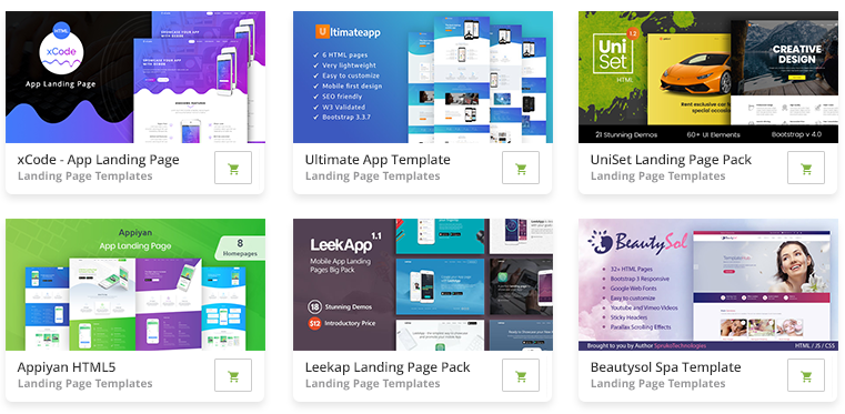
2M+ items from the worlds largest marketplace for Landing Page Templates, Themes & Design Assets. All of it can be found at Envato Market.
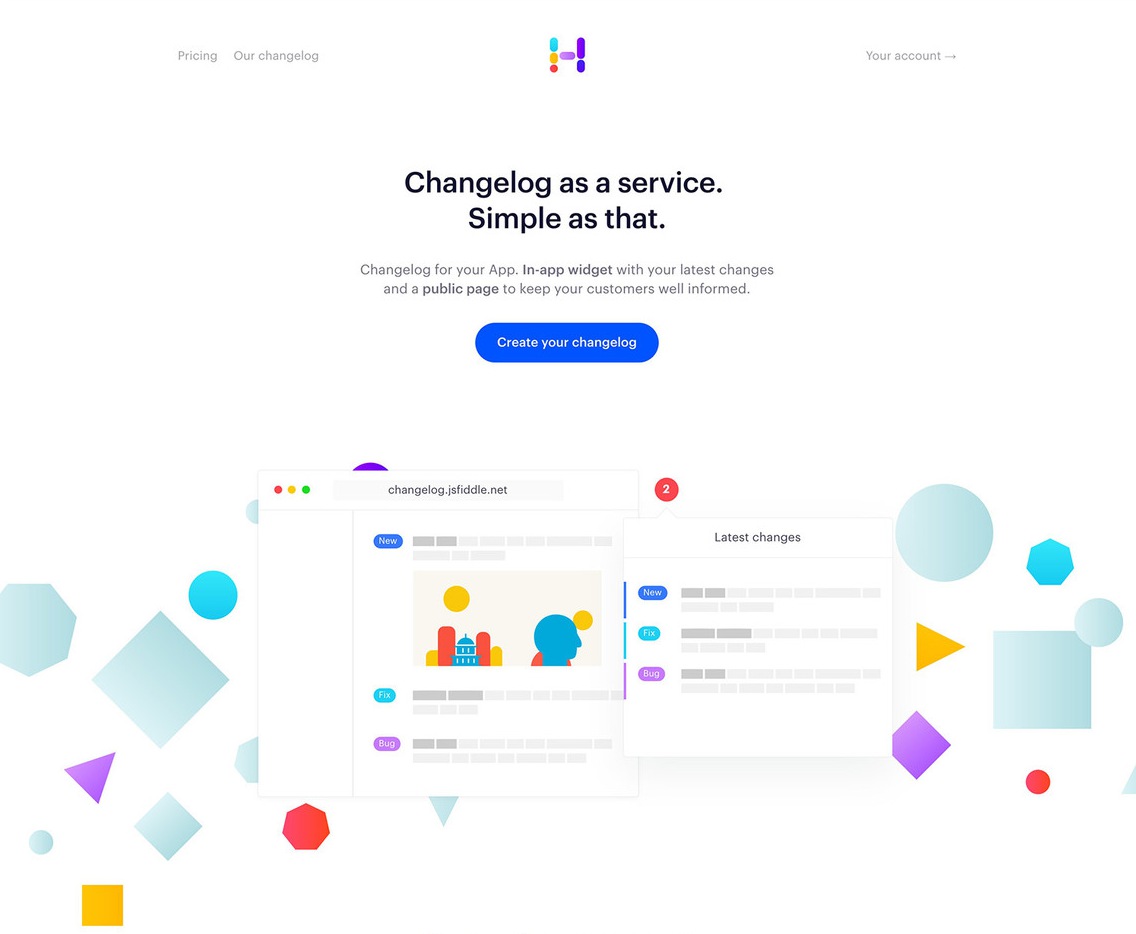
Headway
Headway maintains a beautifully clean hero section, while delivering a concise product description and clear call to action. The navigation options are simple and easy to understand and cast the primary focus on the hero message.
The colorful illustrations serve as a content break, and carry the brand through the design, while visually representing the product at the same time.
Rezi
Rezi’s hero section sparks a tangible sense of emotion. It tempts the visitor with the emotion attached to receiving the property keys and moving home.
The message is short, large, and quickly gets across the use of the site as a tool to rent or let property. The imagery has a subtle purple hue to continuate the branding through the design. A clear call to action accompanies the hero section, allowing the site to capture the user’s initial interest and learn more about the service – in this case, getting an instant property offer.

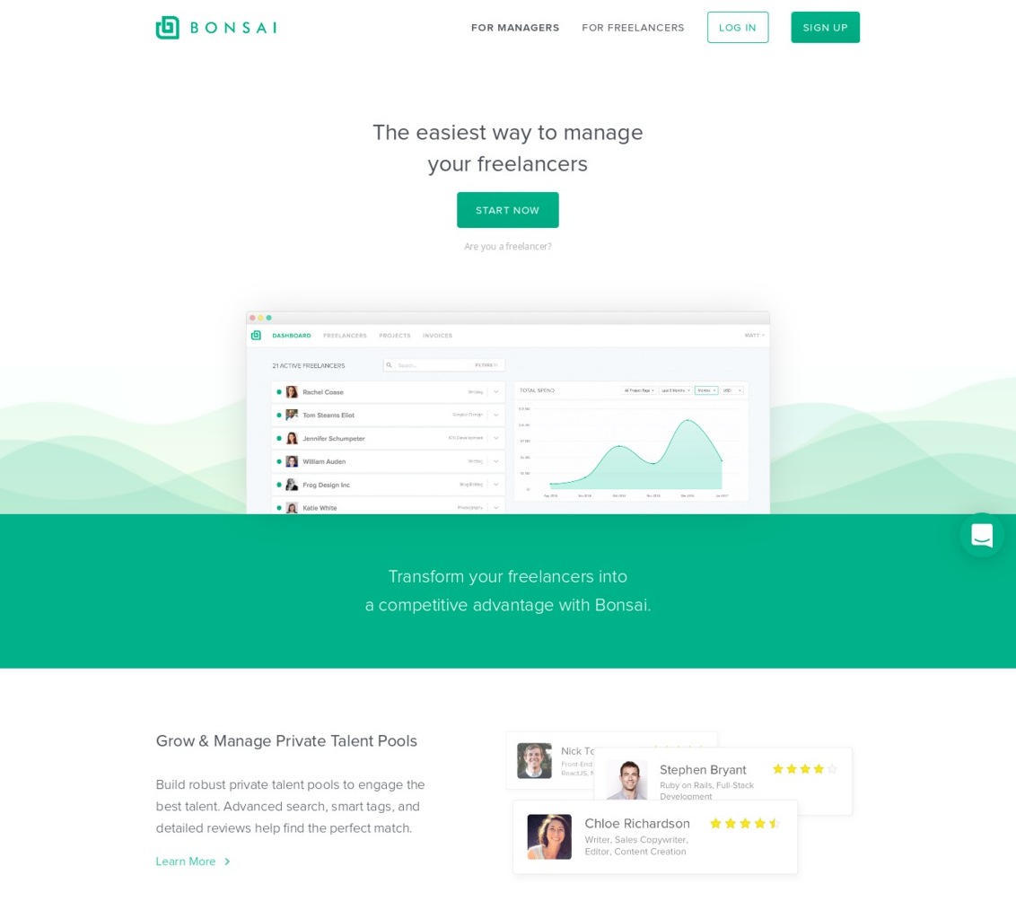
Bonsai
Bonsai has executed their hero section with precision and simplicity. They have not even opted to include a description, going simply with a large title which quickly explains the product at hand.
The title is accompanied by a clear call to action and a product screenshot which reinforces the concept of the product further.
This user interface also allows them to sell their product through its clean and simple design. The waves behind serve to create visual interest, carrying through both the brand as well as the graphs which are so integral to the product and its underlying concept.
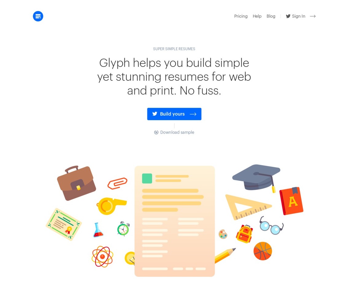
Glyph
Glyph is one of the more simple approaches to hero design in landing pages. There is very little noise, distraction, or hard-selling. It’s as simple as a description of what Glyph does, and an accompanying call to action which stands out clearly against the minimal design.
The illustrative section is situated below the main hero section to keep the important information and call to action as high into the fold as possible. The section also serves as a break between written content, as not to overload the user with information.
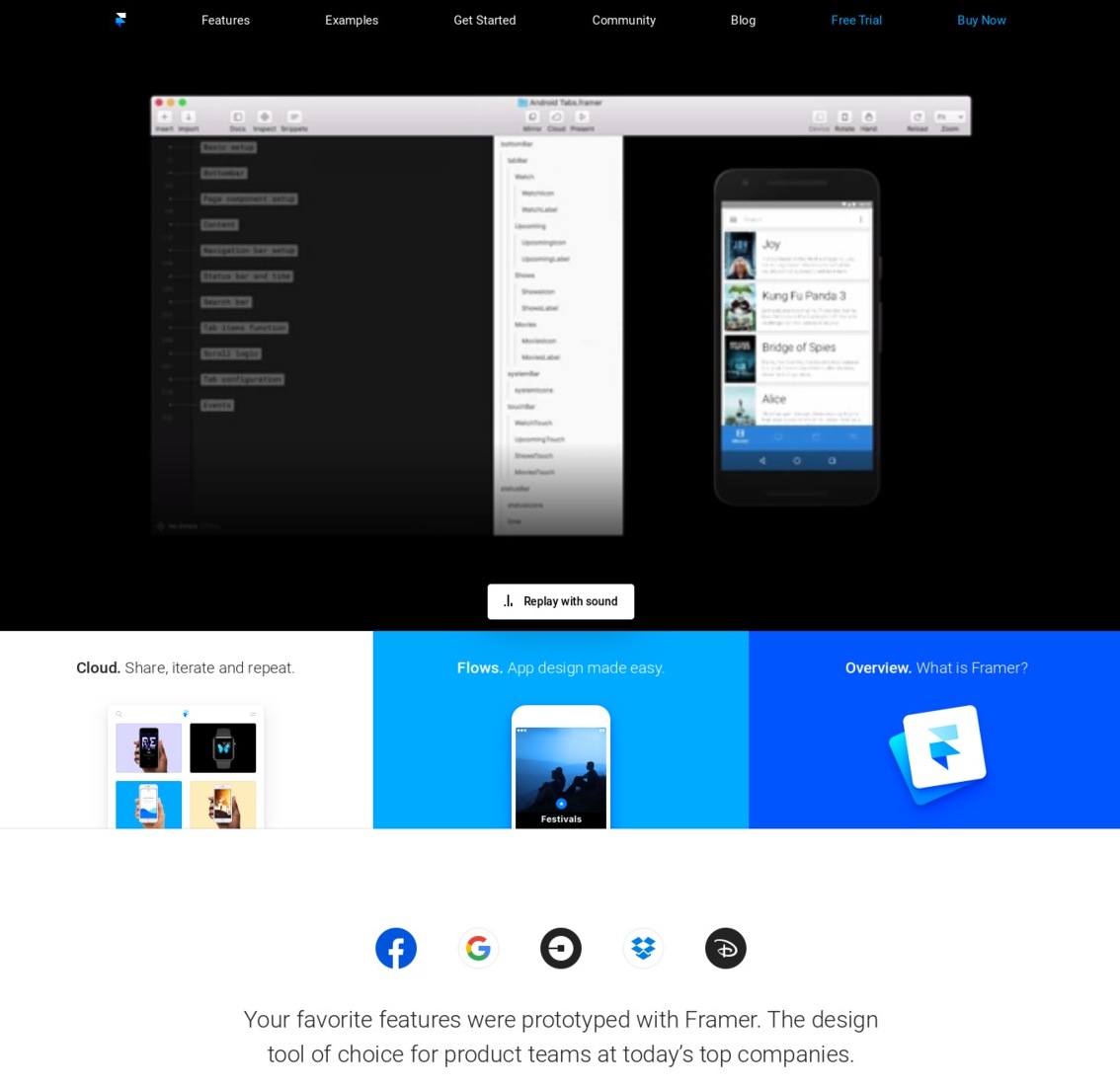
Framer
Framer is probably the most polished and structured of all the examples. It uses a clear grid system with plenty of differentiation through color and spacing. The main hero area uses an effective video to quickly convey what would otherwise be a difficult product to describe to the everyday visitor.
The design is focused less on producing a hard-sell, and more on educating the user about the product, hence the positioning of the primary call to actions in the top right of the navigation. The use of color is clear, sharp and effective, cleverly using the brand colors throughout. The three cards provide a useful visual separator from the main written content.
Which are your favorite hero design examples in landing pages? Share them below in the comments section!
This post may contain affiliate links. See our disclosure about affiliate links here.