There is a seemingly endless supply of crazy fonts to choose from. But few of those fonts are actually good for a blog or website. Minimal and simple fonts make great headers and body text for a website that wants to be clean and readable. With 58% of people visiting webpages on mobile devices, it’s important that web fonts be very legible even at small sizes. These fonts are all geometrically sound, have well-thought-out spacing and kerning, and were often specifically designed for screens.
What fonts look good where is often fairly subjective, but most people can appreciate a good minimal font. We live in a cluttered world with a lot of distractions, so simple fonts are seeing a revival in web design.
Here are 12 of the best free fonts for minimal blogs and websites!

Montserrat
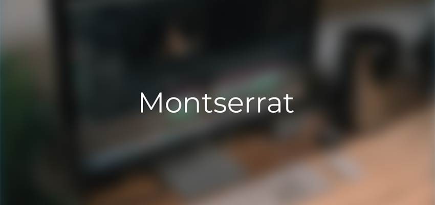
Montserrat is a sans serif font that tends to be on the thinner side. It has a bit of personality, with the inspiration coming from signage in the Montserrat neighborhood of Buenos Aires. Certain characters such as the capital ‘J’, and the capital ‘R’ have special aspects that make this font really stand out, despite being minimalist. You’ll always recognize the use of Montserrat in a webpage, with iconic curves and lines.
Source Sans Pro

Source Sans Pro is another sans serif mainstay that was specifically designed to work well in user interfaces. This makes it the perfect font for blogs and websites. Most of the characters are very simple, straightforward, and balanced. It was inspired by gothic fonts, but spread out the character’s elements vertically and horizontally, to increase readability.
Simplifica
The Simplifica typeface is a somewhat condensed sans serif font. It has very consistent character heights, to increase readability. This font flows easily and legibly across any webpage. It really shows off why the word “simple” is in the name. The tall character heights make for a smashed-together look, but the wide variety of ascenders and descenders provide enough interest to prevent Simplifica from being hard to read.
Blogger Sans
Blogger Sans was designed for website headers, and focuses on legibility. Some characters are shorter or more compact, which means this font is great for headings with small line spacings. While many minimalist fonts involve just straight lines, Blogger Sans employs more rounded corners. It’s a slippery slope to Comic Sans from here, so use something like this only when very appropriate.
Caviar Dreams
Caviar dreams is a thinner sans serif font that features a lot of straight lines and a few surprises. The lowercase ‘e’ in particular has a 45-degree angle line that adds a lot of personality to any header text you use this on. The “caviar” in the name makes this font seem ideal for elegant looks, and its clean lines would certainly imply that as well.
Quicksand
Quicksand is designed for display purposes but is still legible at small sizes. It has rounded terminals, which makes it easy to read whether using light or bold styles. Overall, it is based on geometric shapes, so all of the characters just make sense when seen together. It is clear that the entire font is based around a few curves, and lines jutting out of those curves in a deliberate fashion.
Roboto
The Roboto font has a geometric core that also features a lot of open spaces to increase readability. This typeface lets characters take up their natural amount of space, rather than forcing a grid. That makes Roboto easy to read on a webpage, and look pleasing to the eyes at the same time.
Lato

Lato was originally conceived for corporate logos, which is probably why it works so well as a professional-looking blog or website font. It is a sans serif font that has a fairly timeless, simple design. Its simplicity makes it great for body text, but stands out enough with some unique characters and rounded elements, to be a great header font as well.
Oswald
Oswald is a play on Alternate Gothic sans serif fonts, and was optimized for digital displays. All of the characters are well-balanced with a combination of straight lines and rounded details. The letters have a very tight spacing between them, but everything is still legible at a small size. The entire font has an “upwards” feeling to it, making it seem tall and strong.
Raleway
Raleway was designed for headings and other large usages. It is a sans serif font that comes with a unique look – some of the numbers have additional ascenders and descenders that can give some special character to a heading, although that doesn’t work for every situation.
Merriweather
Merriweather is a serif font, but one that works nicely for web display. It was specifically created for being easily read on screens. The serifs make the font appear sturdy and strong, while a taller overall design gives plenty of room to legibly read this typeface. This makes a great, subtle replacement for a classic font like Times New Roman, which is similar in many ways.
Playfair Display
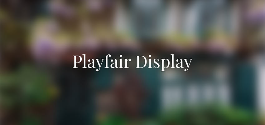
Playfair is a stylistic serif font that works great on any website trying to convey a sense of elegance. This font is elegant while not sacrificing simplicity. There are just enough details and unique serifs to make it exciting. It feels like an old, classical font, while still maintaining modern sensibilities. Most sans serif fonts will pair nicely as body text, with Playfair used for headings.
Fonts That Add Simple Personality
Quite often, simple, no-frills fonts are more effective than their over-the-top counterparts. The selections above enable you to make a statement in a clean, simplistic manner. That, in turn, will allow your content to speak for itself.
This post may contain affiliate links. See our disclosure about affiliate links here.