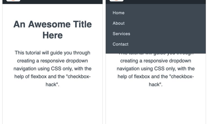
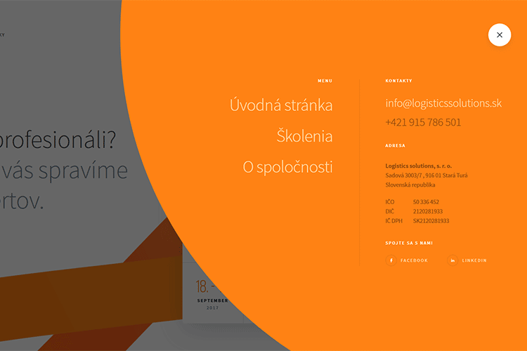
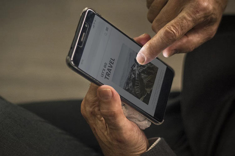
Navigation is the key to a good user experience (UX). Users rely on intuitive digital navigation to locate helpful information, explore a brand’s story, and make purchasing decisions.
Confusing navigation can be enough to make a user bounce or exit. As UX experts learn more about how consumers engage with digital content, the number of ways designers mix and match navigation elements has grown. Choosing the right navigation setup for your mobile and desktop sites can transform your UX and boost business.
Your Web Designer Toolbox
Unlimited Downloads: 500,000+ Web Templates, Icon Sets, Themes & Design Assets
Consistency is King
If there is one thing that all navigation experts agree on, it’s the importance of consistency. Navigation needs to be consistent across the site and available on every page.
An inconsistent navigation menu leads to confusion. Users should not have to search for hidden navigation menus or try too hard to find a desired page. No matter what type of navigation setup you choose, you must prioritize consistency. Do this by focusing on a few main aspects:
- The menu should be present on every page. Don’t leave users stranded on a page with no way out. The menu should be available on every single page within your website. If menu options have multiple levels, leave breadcrumbs so visitors can see the hierarchy of where they are on the site. Breadcrumbs are particularly important when users find the page through an external source.
- Make each menu item react the same way. If the About tab drops down into a list of different choices, so should the other tabs. If one is a link to a landing page, make the others links as well. Each item in the navigation menu should react the same way to a user’s touch (or click).
- Elements should be intuitive. There are certain website design elements that users have come to connect with a meaning. Placing an arrow by a menu item, for example, typically means there is a drop-down list that goes with the item. Create elements that help users know what to expect from navigation, and keep them the same throughout your site.
The Nielsen Norman Group states that recognition is easier than recall when it comes to memory. The brain relies on cues to activate the memory and retrieve information.
Make navigation easy for site visitors by allowing them to depend on recognition rather than recall to get around. The more consistent you are, the better visitors will recognize the meaning behind each element on your site. This will lead to faster all-around website browsing – and happier users.
Clear, Concise Labels
The navigation menu is not the place to get clever with your content. Users rely on the menu to make their way around your website. The purpose of the menu is to provide direction. It does not need to entertain or shock site visitors.
Keep menu labels simple, clear, and concise. Most websites use the same one-word labels for a reason. Users are familiar with options like Home, Products, About, Blog, and Contact. They know what the labels mean and what to expect when they choose an option.
Alternatives to the Hamburger Menu
Remember the great hamburger menu debate of 2014 for mobile site design? It’s ongoing, with modern website designers coming down on either side of the issue.
Many mobile websites still use the trusty hamburger, because this is what most mobile users look for. The “hamburger” is the menu icon that consists of three stacked horizontal lines. Designers initially used it because it conserves space on smaller mobile screens. Many designers today are trying alternatives to the hamburger, such as:
- Tabs
- Scrollable navigation
- Bottom navigation
- “Show More” options
- Inline list with headers
- Segmented control
Alternatives to the hamburger menu have had great success on many sites, especially those with a small number of options. The consensus among many designers is that if you can show navigation, show it.
Scrollable Navigation Menu Example
Sometimes this isn’t possible due to smaller mobile screens or several menu options. In these cases, progressive disclosure is acceptable. Your menu choice will depend on the amount of content you need to squeeze in and the goals for the site. An older audience, for example, may appreciate a permanently visible menu rather than the hamburger. Try different styles to see if one increases revenue.
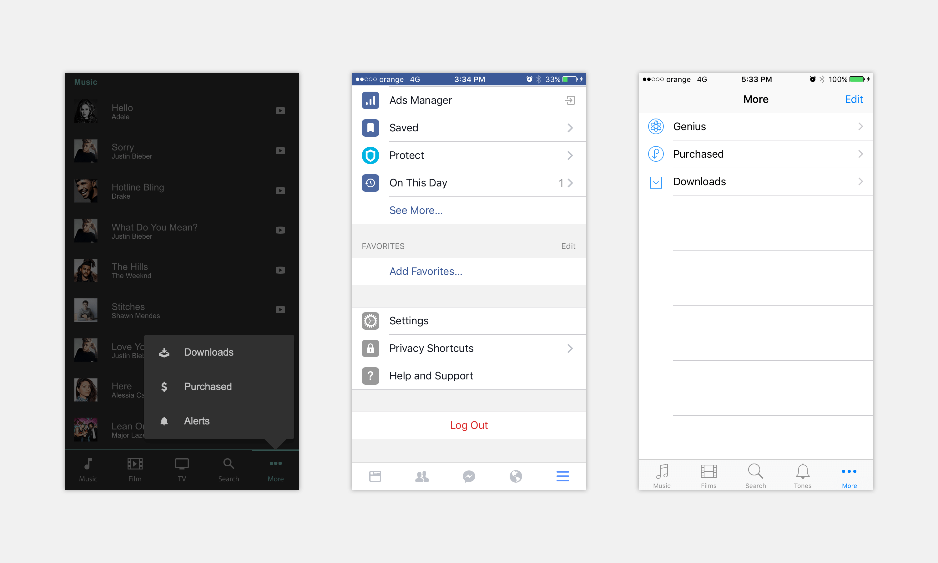
Show More Options Example
Easy-to-Find Search Bars
Designing a functional menu involves more than just clarity and consistency – it’s about maximizing the usability of your site.

The YouTube Search Bar
One feature that can improve usability is the search icon (typically a magnifying glass). If users look for the search bar, they are already lost enough to need a direct search feature. Don’t make matters worse by hiding the search option – or leaving it out altogether.

The New York Times Search Bar
The search bar gives users a way out when they’re lost, or a more direct route to information for users with specific tasks in mind. Taking away the search bar can result in frustrated visitors who decide to look elsewhere instead of scouring your site for what they want.
Put the search bar somewhere clearly visible from every page. Most users look to the top right-hand corner for the search option, or at least somewhere close to the menu.
The Carousel Menu
Carousel menus are becoming more popular on blog-type sites and those that publish regular updates and news stories.
The “carousel” refers to a menu at the top of the page that shows the most recent articles the site has published. Many news sites and blogs use thumbnail images in the carousel to draw the eye and make it easier to select an article.
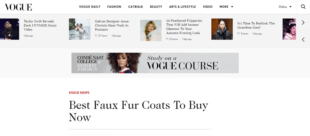
The Vogue Carousel Menu
The carousel tab also has the title of the article, and/or a brief description of what’s inside. It basically serves as a slideshow with clickable links for users to browse through easily. Carousel menus are great for showing off the latest content, and for keeping users on your site with a range of other interesting articles they may want to read in plain site.
Mega Menus
Another trend sweeping navigation design is the mega menu. As the name implies, this menu is plus-sized, taking up the page vertically and horizontally. These menus became popular among magazine-style blogs, but more brands are using them to make a statement with their menus.
The mega menu is ideal for a site with multiple levels of navigation. Instead of confusing users with a dozen drop-downs, expand the menu across half the page and layout the options clearly, using images and thumbnails if desired.
The mega menu is also great for sites that frequently post articles because the designer can use different columns for recent stories and related links.
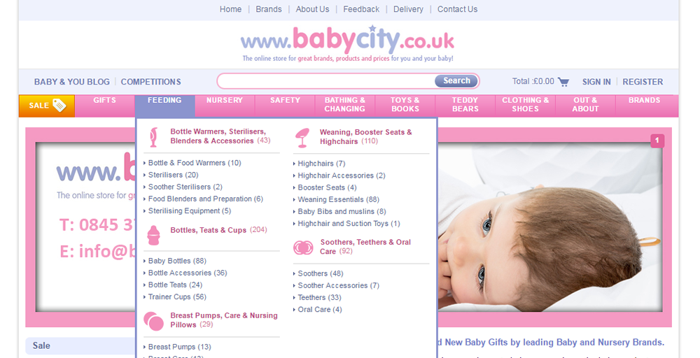
Mega Menu Example
Fixed Navigation Bars
The infinite scroll style website became popular thanks to social media and mobile sites. Pioneers like Facebook use the format to allow readers to scroll infinitely, constantly uploading new information every time the user reaches the bottom of the page.
Scrolling is also easy to do with your thumbs, making it ideal for mobile users. With this website style came an issue with navigation – should it stay at the top of the page or somehow remain visible? The answer came with a fixed navigation menu.
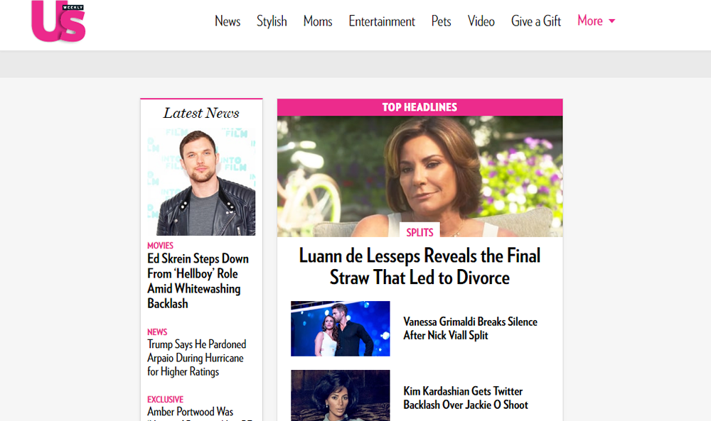
Fixed Navigation Example
Fixed navigation menus remain in place when a user scrolls down the page. This type of menu is also called sticky navigation, and appears most common as a top navigation bar.
The menu is always present for the user to change pages. Facebook uses this format to allow users to view their profiles or check notifications in the midst of scrolling through their newsfeeds. The infinite scroll with a fixed navigation bar may be appropriate if your website has a social feel, or if the site deals with a lot of data.
There is no question that a site’s navigation affects the user experience. Will users have a positive experience, or a negative one? Optimizing your navigation setup using the latest trends for mobile and desktop design can lead to a better all-around UX – and better business success. Consider updating your website to include some of the newest site navigation best practices.
This post may contain affiliate links. See our disclosure about affiliate links here.


