There is always vast room for improvement with any website, and small business websites are no exception. With the phone book a communication tool of the past, establishing a solid online presence is at the forefront of a lot of small businesses.
If you’re a small business owner, your website is a pivotal part of your marketing and branding, and shouldn’t be taken lightly. It’s integral to not just focus on appearance – but usability – as this will play a major role in how long your customers stay around.
Articulate Your Mission

In today’s society buzz words are a thing of the past. Freely express your vision for your business with the world on your website. You can start by asking yourself (or your client) these three questions:
- Who are you?
- Who are your potential customers?
- How can you tell your potential customers who you are?
After answering these three questions your can begin to develop a creative strategy for your website that will ultimately make it more effective. These questions hold the key to making marketing decisions, branding your business, building fierce loyalty within your customer base, and a lot more.
You’ll find mission statements for some well-known companies here.
Keep these tips in mind when creating copy for your site:#
- Employing overly sophisticated language or industry-specific jargon could confuse, isolate, and frustrate clients. Use words you would use when speaking to someone in person.
- Read your marketing material to a child in late elementary or middle school. Do they understand your product? If not, what did you need to tell them before they did?

A Call to Action
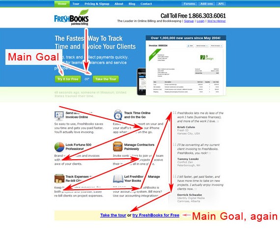
You’ve spent hours upon hours designing a beautiful website for your clients, complete with custom illustrations and a flashy new slideshow, but your client isn’t getting any new business. A fundamental error of many small business websites is they fail to include a clear Call to Action. If you aren’t leading users to commit to an action (buy a product, contact you or subscribe, for example), then you are losing them.
You may have spent a lot of time driving traffic to your client’s website, ultimately to only have these customers not convert into new business. If a call to action is a small link buried in a sea of text, it’s easy to see how these customers got away. To achieve a business’ goals, creating a successful call to action to guide users where they need to be should be at the forefront of your web design check list.

The call to action button above is placed in a prominent location; it’s large and has a distinctive color with respect to surrounding elements. To provide additional context on what it means to “Purchase the book”, the call to action button is followed by text explaining cost and available format (traditional book or PDF).
Keep the following in mind when creating the right call to action:
- The design of a call to action can be broken down into 4 simple elements —size, shape, color, and position. Each plays a vital part in determining how effective the call to action is in directing the user.
- Don’t overdo it with multiple call to actions on each page.
- Provide access to the call to action quickly. Your visitor is most interested in accessing this information as quickly as possible so don’t create any unnecessary hurdles!
Content
We all love a beautiful website, but when that website loads slowly or gets in the way of accessing pertinent information, it’s time for some restructuring. It’s important to address what is the ultimate goal you wish your visitor to achieve in visiting your site. Your site should ultimately draw focus to the content, and all those bells and whistles are just icing on the cake.
Most people won’t read everything on your page, so it’s critical to decide the most important content that needs to be there. This can be achieved through a visual hierarchy that guides the user through the page and creates a more enjoyable user experience.
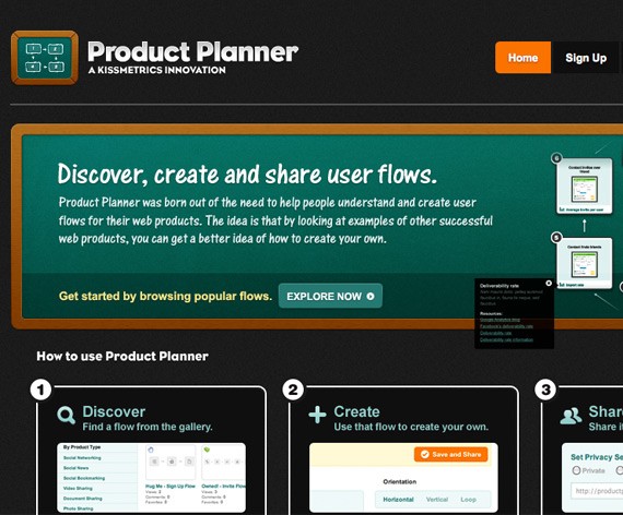
Here’s an article on Eye Tracking to give you a better idea of how to structure content.
Here are some tips to keep in mind when structuring your content:
- White space is necessary. Giving your content room to breathe allows the user to focus on the most important aspects on any given page.
- Break up lengthy blocks of text into digestible blocks. Heading, sub-headings, bullets, blockquotes, and paragraphs are all necessary components of a well-structured website.
- For every flash animation or widget on your web site, your site’s loading time will increase while your screen real estate decreases.
- Challenge every item on each page and ask, “Does it really need to be there? Does it serve a specific purpose? Can I live without it?”
- Crisp layouts, cohesive colors, and well thought-out design elements give off a sense of know-how and experience.

SEO
Search Engine Optimization (SEO) should also be addressed in your overall website strategy. Quality content with legitimate mentions of key words and topics related to your business will help to bring more business your way. What’s best is results are now consisted of all kinds of content, including videos, images, maps, business listings, tweets and even Facebook Page posts.
- Add a Blog. Search engines love fresh content and if your client updates it regularly, they will experience a distinct SEO advantage. The interactivity also increases the likelihood that potential customers will social bookmark it and share it with their network.
- Consider creating a YouTube channel. Every video you post to your channel can be tagged and indexed, increasing the odds your brand name will appear in natural searches for keywords associated with your business.
- Remember to add footer links to every page, use meta description tags, and make each page unique.
This post may contain affiliate links. See our disclosure about affiliate links here.
