Whether you prefer serif or sans serif, new fonts are coming out all the time. And they’re going in and out of style all the time, as well. 2019 is a year of bold designs that make a statement, so each of our featured fonts in this post will focus on the emotional response they can create, as well their artistic statement.

Helios
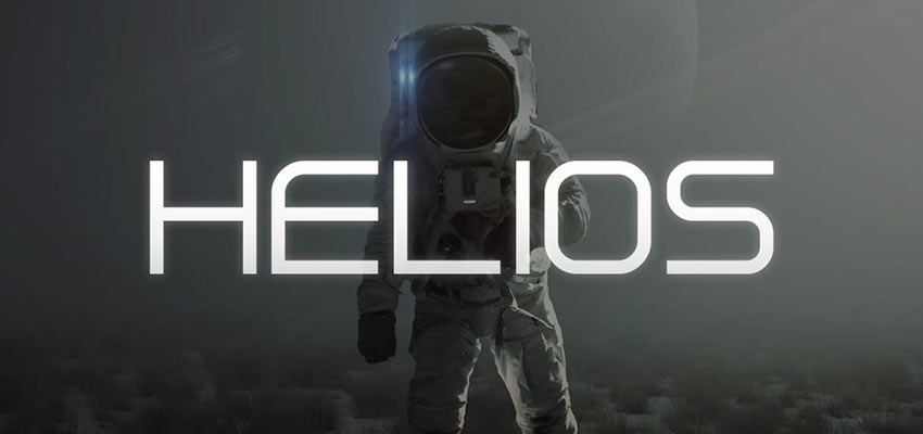
Helios is a sans-serif font with a futuristic touch. On first glance (and thanks to the accompanying sample image) it makes one think of space. Really, this font could find a home on a video game cover, a tech company’s homepage, or as a trendy sticker. Helios feels simultaneously as clean and sterile as a spaceship’s airlock and as packed with personality as any other decorative font.
Summer Loving
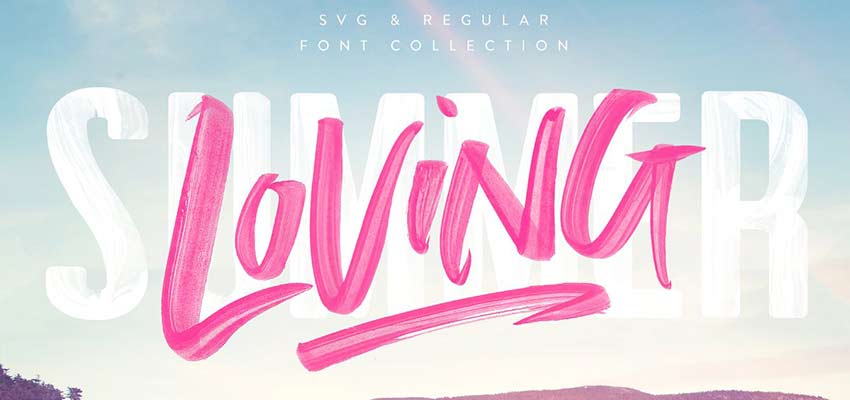
Handwritten fonts have been popular for a long time. There are a lot of situations that call for this style. But in 2019, authenticity is valued higher than ever, and nothing looks more authentic in design that a handwritten typeface. The Summer Loving font looks painted – some variants are hastily scribbled, and others look stenciled. Either way, it is full of bubbly personality.
While the name would suggest using this for summer designs, it could work during any season. It does lend itself to bright color palettes, but can definitely be used as a legible graffiti.
Bobby Jones
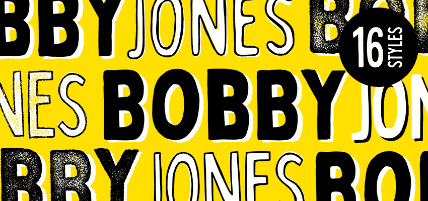
The Bobby Jones font checks a couple of the boxes for font trends in 2019. Namely, it has a certain sense of nostalgia and whimsy, which is in style. It can also easily be used in a brutalist-style piece, given the somewhat gritty styles available. It’s a little bit quirky, a little bit bold, and definitely versatile. If 2019 is about standing out and being different, then this is a great font to try out.
Quinta
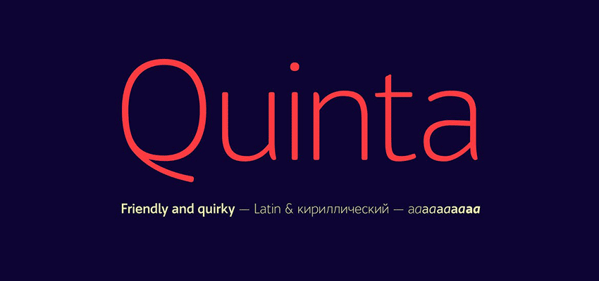
Another trend in 2019 is a smaller font size within hero images. With this decrease in font size, it’s important to find an easy-to-read type. A sans serif font is a great place to start, because they tend to look great on various backgrounds.
Self-described as “friendly and quirky”, Quinta is very readable. It has subtle rounded corners, which does make it inviting and lighthearted. A perfect choice for a corporate website header that wants to be a little more friendly and less cold.
Object Sans
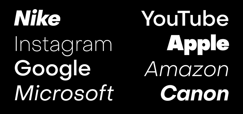
Looking for something even more simple and clean? Whether you’re looking for a font to read on screen or in print, this easy-to-read font is great for any need. Its versatility and ubiquity will make it perfect for any modern design or logo. In fact, the designer shows off various corporate logos using the font and they all look great. They’re easily recognizable and of course very legible!
Tiempos
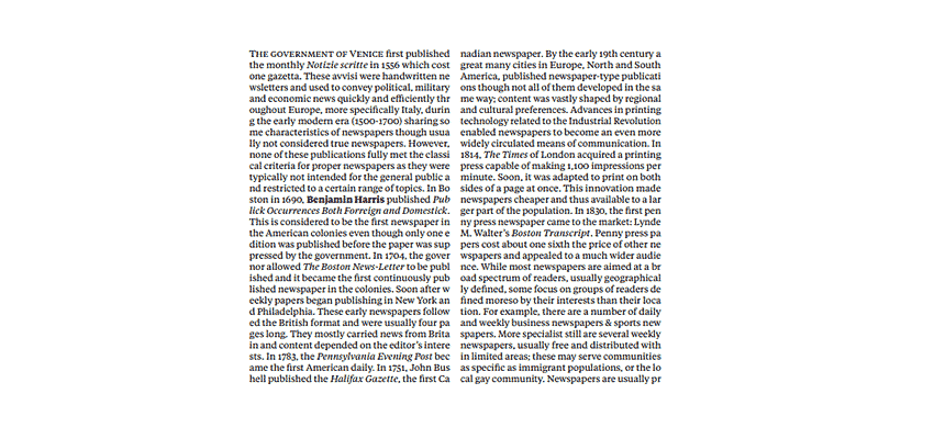
Tiempos is a serif font that looks great as a headline or as body text. The fine version was actually designed for National Geographic! The upper-case characters are the same height as the tallest lower-case characters, and it’s compact without losing any legibility.
Morganite
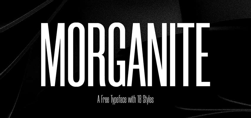
Morganite is a tall and thin font that is great for titles and headlines. It feels like something right out of a magazine cover or movie poster. It’s bold and big, which is just what some designs need in 2019.
Coves
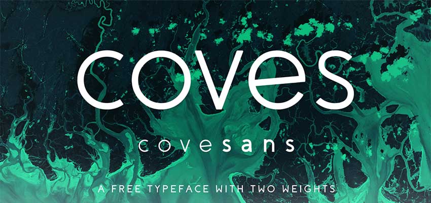
Coves is a sans serif font with a unique twist. For the most part, it is a pretty standard looking sans serif font, but it has some nice surprises, like the slight angle of the lower case ‘e’. It’s a little quirky, but also clean, simple, and great for businesses. It’s legible with plenty of space between elements, whether you go with the light or bold version.
Fixer
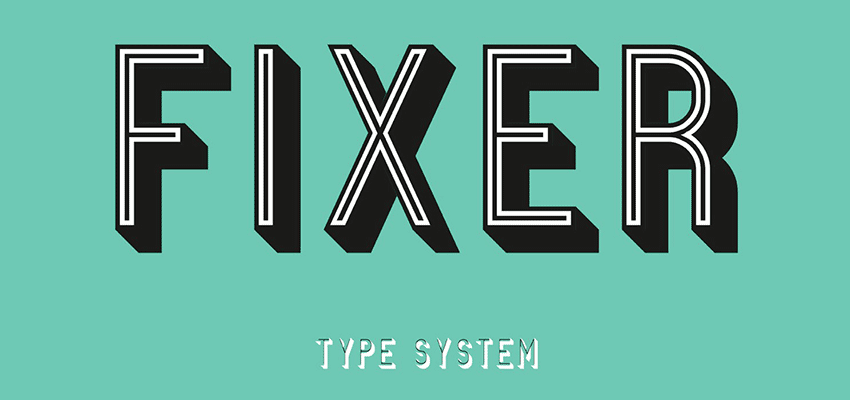
Fixer features a lot of variations, including regular, inline, and 3D. This can be a bold font for a large sign, a clean and modern font for a web graphic, or a vintage font to bring out some nostalgia. The versatility means this font can be utilized for so many different projects. The options are limitless!
Julietta Messie
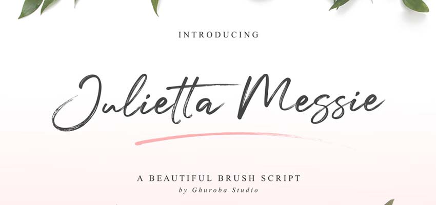
On to something more script-based. The Julietta Messie brush script looks like a handwritten cursive font, which would look great in a light floral setting like the example above. Whether it’s a wedding invitation, an Instagram photo, or a signature. Fonts like this are always necessary, and timeless in a way. 2019 is no different.
Wanderlust
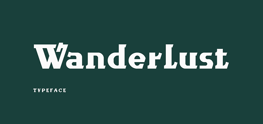
This unique font gives off some serious outdoor feelings, and would look great on things like maps, nature photos, or pamphlets. It has some heavy serifs, but a good designer can make the most of this.
While in some cases it could be hard to read, it has its place. Its particular look makes it a great font for 2019. Expect to see fonts like this used in unexpected ways this year.
Machineat
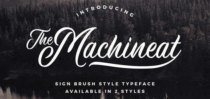
This clean script font looks like it belongs on a vintage sign, or burned into a piece of wood. It is in fact inspired by traditional signs, and mimics the natural flow of letters that handwritten signage often has. Machineat is a great traditional font, but feels simultaneously modern and relevant for this year.
Nature Spirit

As humans get more and more technological, the more we want to get back to nature in any way possible. That is exactly the reason why fonts like Nature Spirit are going to be big in 2019. We’re still stuck on the internet, but we can at least see a more natural-looking font when we visit websites.
This font offers a rough and a smooth version, as well as plenty of alternative characters that can give your design a customized look. Customized fonts are going to be big this year, and this looks the part pretty well.
Thunderstorm
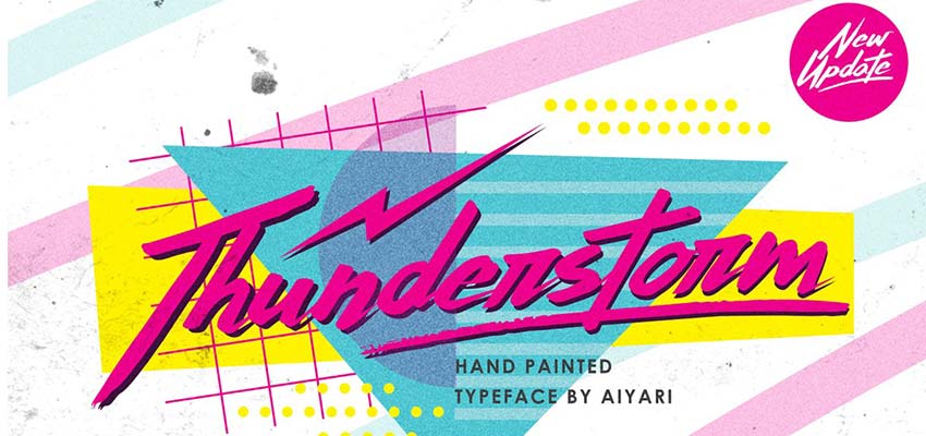
Thunderstorm harkens back to a retro 80’s or 90’s style. Nostalgia is cool (did you hear about the vaporwave trend?) and that is also reflected in the fonts we use. Expect a lot of brands to leverage “rad” fonts like Thunderstorm in order to connect with the 90’s kids of the internet (or perhaps because they are the 90’s kids).
Quantum

Moving on to something a little different, let’s take a look at the Quantum font. Despite the need for retro fonts in 2019, there is also a need to look toward the future. Futuristic fonts aren’t quite as popular as they used to be, but there are still some very appropriate places for them.
Quantum would be fantastic on a futuristic video game logo, a sci-fi movie poster, or a technology company. This font is full of angular lines with bold accents.
Playfair
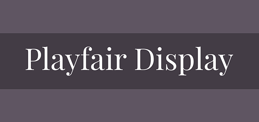
Playfair is a serif font with some classic details. This is an elegant choice that would be perfect for a website or graphic that calls for a bit of sophistication. That still certainly exists in 2019, so you will be seeing Playfair and typefaces like it pretty frequently, where they are appropriate.
Source Sans Pro
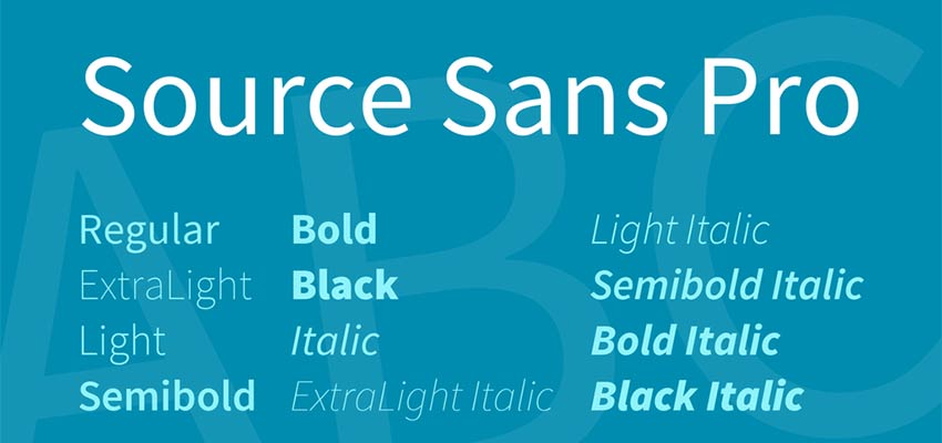
Let’s end this one with another basic sans serif font. When it comes to web design, a classic sans serif font is something that every designer should have in their back pocket. Source Sans Pro is a fantastic, simple font. There’s nothing showy here, which makes it the best font for clean webpage headings or body text.
Top Fonts for the Modern Web
Fonts are often subjective. Some people like it clean and simple, some people like it gaudy. But 2019 will have some defining font trends. Having these fonts at your disposal will enable you to be versatile and creative this year!
This post may contain affiliate links. See our disclosure about affiliate links here.