When you’re setting up your own online shop, in all your worrying over the site itself, you may forget one very crucial step: marketing. You don’t need a team for DIY marketing; get on social media, start blogging, and snatch up those free ad credits from hosting providers.
But even more important than advertising is its appearance. A distinguishable logo, visually appealing marketing content, and beautiful website will set you apart in the eCommerce world. Luckily, you don’t have to be a seasoned artist to create decent designs. Get a grasp on the basics, and you’re already on your way.
The Importance of Graphic Design
Graphic design is easy to pick up though difficult to master. But when marketing an eCommerce site, or any sort of website, good composition is key. Your website, advertisements, and even the pictures you post on social media must have an appealing and original appearance, or viewers will quickly click away.
Theme
The first thing to consider is what theme you’re after. Minimalistic? Retro? Modern? Artistic? What you’re selling can play a big role here. A store that sells games or computer parts may want a futuristic, dark, or shiny theme to complement the products.
- If you already have a website with a solid theme, you can use the same or a similar design and color palette.
- Chose a theme that’s linked to your products, your company, or your website’s look.
Strive for originality above all else. What makes your website, ad, or email different from everyone else’s?
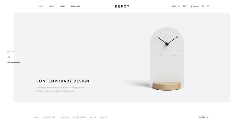
The minimally designed Depot WooCommerce Theme
Placement
Graphic design is not so much about art and imagery as the way the picture is put together. Placing pieces correctly and using proper spacing is essential.
- Sketch or use an image editing program to plot out each element’s placement. You don’t need to worry about alignment and symmetry yet. Just see how it looks on paper.
- Look at how the pieces make up the whole. Squint your eyes to see if its looks appealing without all the details.
- Use placeholder text and pictures until you have a good idea of what the final product will look like.
- If you’re uncomfortable starting from scratch, don’t be ashamed to use a template.
At the very least, you should study what others have done, whether you’re tweaking a website, creating an advertisement, or writing a blog post. The single rule of art: always use reference images!
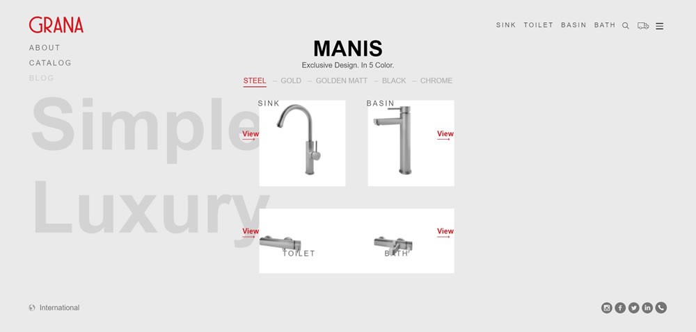
Perfectly positioned elements: Grana.cc
Lines and Shapes
Despite how simple they seem, basic lines and shapes can be put to great use in a picture. A straightforward design is often better than an overly complex one.
- Lines can separate or link content, or surround and highlight important parts of the image.
- Simple shapes draw the eye. Combining different types can make a dynamic and appealing picture.
- The strong imagery provided by bold and distinguishable shapes sticks in potential customers’ minds.
Color
Color is one of the most essential aspects of design. Your choice of hues can create a treat for the eyes or a lurid mess. What makes a “good” color palette is debatable, but there are a few rules to remember.
- Don’t use too many colors. 2-4 is ideal.
- Contrast is eye-grabbing and great for adverts, but can be garish and displeasing.
- Analogous colors are more harmonious, but can appear dull without contrast.
- Consider the mood of the image. Are you trying to rouse excitement? A flaming red will surely draw attention. Or are you more of a chill sort of business? Gentle blues, greens, and whites are perfect. If you sell cute products like toys, pastel may be proper.
- If you’re unsure, the safest bet is to borrow your website’s color scheme.

Typography
Arguably the most important in graphic design, typography is itself an art. Finding the right font, color, and placement is necessary if you want people to pay attention to what the words say.
- Use different font sizes for different types of text (header, body text, buttons), but stay consistent between them.
- Pick 1-3 fonts, and no more. Small images such as banners look best with one or two.
- Don’t overuse stylistic or cursive fonts.
- Make sure the text is legible. Use a contrasting color so that text pops and is easy to read.
Be mindful of the content as well. Get to the point quickly. Use short words and sentences. Include a call to action that encourages people to “click here” or “call now”.

Simplicity
In graphic design, it’s generally better to go for a more simple style. It’s easier and often looks better.
- Don’t cram all free space with giant text, random stock images, and other clutter.
- White space is a blessing; it draws attention towards the visual elements and causes less eyestrain.
- Make use of basic shapes before complex images.
In general: Use as little fonts, colors, and graphics as you can. Pick a few fonts, a small palette, and a handful of images. It’s better your creation be called “plain” than “ugly”.
How to Use Design In Marketing
Now that you know the basics, how and when to apply them? Marketing isn’t all ads and email campaigns — it begins with your site, and everything you post online.
Logo and Site Design
If you haven’t begun your eCommerce website yet, these basics of design will serve you well. Usability and simplicity should be your main goal. If no one can find your shop in the clutter, you’re losing money. Instead, go with something that’s easy to navigate and isn’t an eyesore.
Using an eCommerce platform like BigCommerce may be the solution. Your website is the most significant part of your marketing strategy — what’s the use of advertising if your website isn’t up to par?
An eCommerce package has vital features like a drag-and-drop builder, a CMS with analytics and inventory management, and upselling tools. Even if you’re proficient in web development, including these can be difficult. With an eCommerce program, it’s seamless.
As for your logo, bright colors and simple shapes will be the best way to something memorable. Three colors is perfect, and some of the most recognizable logos are one color and even one or two shapes.

Don’t forget about your company blog. Posts shouldn’t just be a block of text! Use images and clever typography to create a more beautiful blog.
Advertisements
When it comes to adverts, resist the urge to make something that’s overly bright or flashing. No one likes seeing one of those pop up, and you’ll only get blacklisted.
Instead, create something simple that stands out from a typical webpage but still draws the eye. Incorporate small animations to further pull attention, without disrupting or annoying viewers.
Email Marketing
Emails may be made primarily of words, but that’s no excuse to ignore how it looks. The layout of text and images is the difference between a successful email campaign and ending up in the trash folder. Always use pictures; plain-text emails are visually boring.
Consider using a service like MailChimp to create more pleasing layouts for your mail. Sites like this contain templates you can customize and drag images into easily.
Social Media
Even on Twitter, graphic design plays a part. An account filled with nothing but links and text posts is no fun! You’ll get more followers if your social media is interesting and full of variety.
While this falls more under image and video editing, similar principles with color palettes and typography still apply.
Create Something That Stands Out
With knowledge of design and how to apply it, you should be able to launch a successful and beautiful marketing campaign. Just remember: simplicity, strong colors and shapes, clear theme, and good typography. Eye-catching, but not distracting.
Keep these guidelines in mind, and you’ll be effortlessly creating beautiful websites, eye-catching ad banners, and wonderfully laid out blog posts and emails. And you didn’t even have to hire an artist!
This post may contain affiliate links. See our disclosure about affiliate links here.

