By combining some gray, black, and variations of different light colors, and a nice subtle texture, we will try to give the interface a grungy, minimal look.
Calendar Design – Final Result
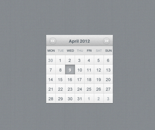
This is the final result of our calendar widget. Just in case you’re getting curious, use this link to download the .PSD
Your Designer Toolbox
Unlimited Downloads: 500,000+ Web Templates, Icon Sets, Themes & Design Assets
Unlimited Downloads: 500,000+ Fonts, Web Templates, Themes & Design Assets
Step 1
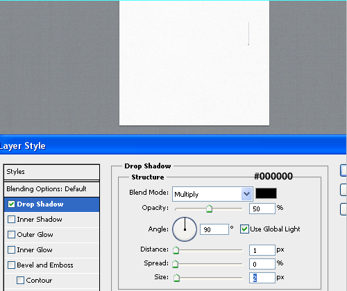
We’re starting our calendar by creating a simple shape. It doesn’t need to be big since it will be used somewhere in a sidebar. Choose a size between 200-300 pixels in height, as well as 200-300 pixels in width. For this project I’ll go with 235 pixels high and 230 pixels wide. Apply a really subtle shadow by adding a 1px shadow, with an opacity of 50% because we are working on a dark-grey background which doesn’t contrast with a really visible, black shadow.
Step 2
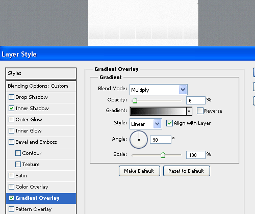
It is time to create the base for our date-boxes. This will be pretty simple even if it does look a bit strange. We must create a rectangular shape (somewhere around 35 pixels in height) and add a gradient overlay effect with an opacity of 6%.
That is really small, but we don’t want those boxes to stand out. They will simply hold the “numbers” which will show the dates. Because we are working on a white background, you’ll have to do 6 white lines (of 2 pixels in width) which will divide each box.
Step 3
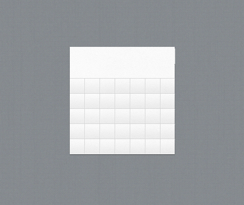
Repeat that action five times. We now have 35 boxes which will show our dates. Don’t worry that there aren’t 31 or less because we will also show a few dates from the previous and upcoming months.
Step 4
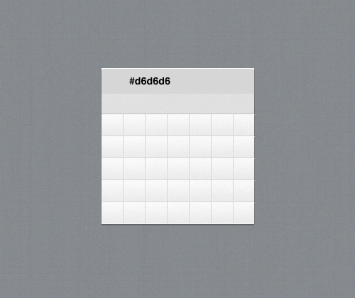
You’ll have to fill two rectangles of the same height with two different colors. We’ll give the upper one a darker color and the bottom one a lighter gray. The color of the upper rectangle doesn’t matter because we will apply a pattern effect to it later.
This is an optional step, but if you make the upper bar 1px smaller so we can achieve a nice drop shadow effect later.
Step 5
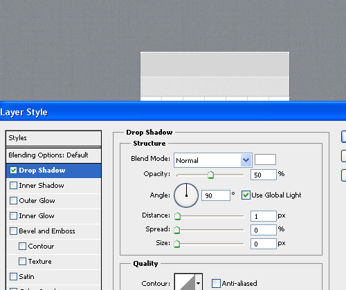
Now apply a real drop-shadow effect to the upper bar but be sure to set the size to zero, and give it an opacity of 50% so it is more gray than white.
Step 6
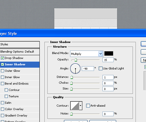
Now we would like to make a really visible separation between the bars by adding an inner shadow with an opacity of 15%. That is really an almost visible inner shadow, but it does make a difference if you take a look at overall details.
Step 7
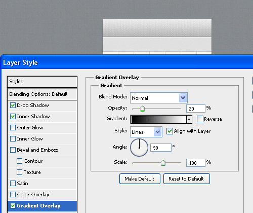
We will be adding a really nice and subtle pattern from SubtlePatterns which will add a grunge effect. You can choose any light texture from their collection as almost any will work. Also add a gradient overlay effect with an opacity of 20%.
Step 8
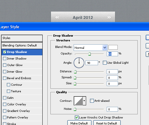
Input and center the current month in text along with the year in numbers, and give it a dark gray color . The font I used is Helvetica Neue Bold and14 pixels. Apply a drop shadow effect with an opacity of 50%.
By using the custom shape tool (U), create two shapes, merge them (CTRL+E) and then duplicate it and reverse it (CTRL+T). This will indicate the previous and next month.
Step 9
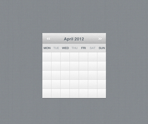
Moving on to our empty gray bar. By using the Regular Helvetica Neue font, at 12 pixels, input the abbreviated version of week days.
Step 10
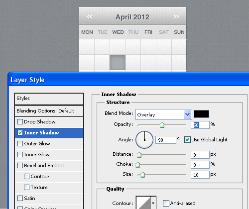
By using the Rectangle Tool (U), create a gray box over any “date-placeholder” and add an inner shadow effect, of about 50 percent opacity, overlay blend mode, size of 10, and distance of 3 pixels.
Step 11
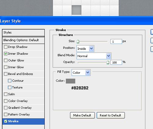
To the same gray box, apply a darker gray stroke of 1 pixel. It will make the inner shadow more visible and will create a small border between the highlighted box and the others.
Step 12
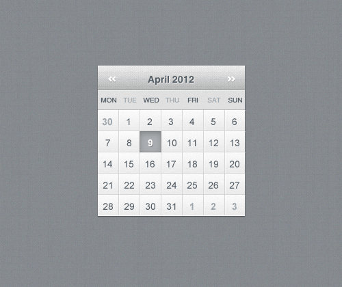
Input all the dates of the current month by using the Regular weight of Helvetica Neue (12px). By using the same font, we will input numbers for the upcoming dates, as well for the last day of the previous month. Set the color for the bold numbers a little bit darker than their background.
Final Result

Click here to download the PSD Source Files
You can finish it up by creating 2 round shapes (Use the Ellipse Tool (U) and keep holding SHIFT for a perfect circle).
Set the fill for the circles to zero and then apply a 1 pixel dark gray stroke.
Position them around the “previous-upcoming” shapes to enhance their look a little bit.
This post may contain affiliate links. See our disclosure about affiliate links here.


