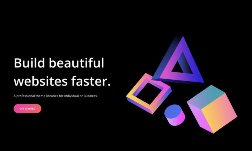
Web design can be a tough nut to crack. There are so many aspects which go into the making of a good website, that it can get difficult to put it all together.
However, having a well-designed, user-friendly website is crucial to your business. In this digital world, websites serve as the first point of contact for any customer. This means, your website has to present a persuasive case on your behalf. A good website can intrigue a user, make you look professional, and even help convert a random user into a customer.
Your Web Designer Toolbox
Unlimited Downloads: 500,000+ Web Templates, Icon Sets, Themes & Design Assets

According to a study done by Adobe in 2015, if people are given only 15 minutes to read a content, or engage with information on a website, two-thirds of them would engage with the website that is beautiful.
Similarly, 59% would opt to engage with a website that is aesthetically pleasing, instead of engaging with a website that is simple to look at. These and more stats point out the importance of giving time and attention to your website design. In this article, we are going to present 12 simple ways that can help you make your website more engaging.
Add a Coming Soon Page with a Countdown to Pique Curiosity
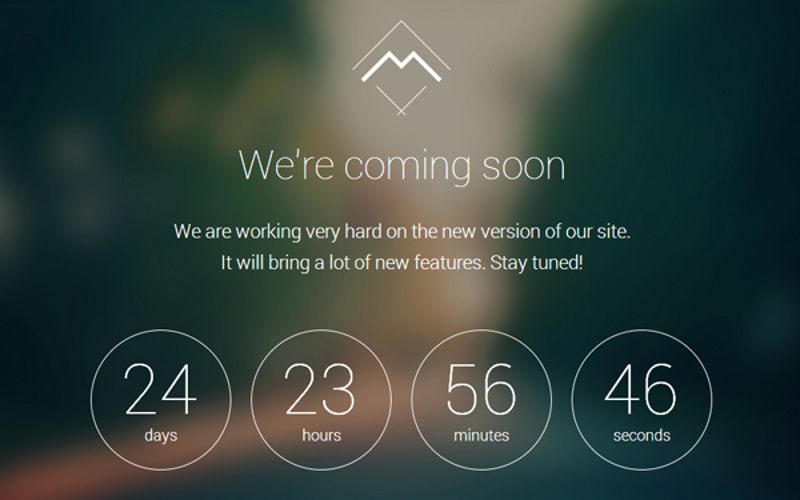
So you are a new business and you are working on your website? But that shouldn’t mean you web URL should not be live already!
Your business marketing should start way before your actual website and business is launched. And the best way to do this is through a coming soon page. A coming soon page with a countdown keeps people hooked, and it also directs your users to a specified date in the future when they can expect your website to be up and running.
You can also use such a page for introducing new sub-pages or product pages. Don’t wait till you’re ready to make it ready, just let your users know you’re working on it and something great is coming their way through a captivating countdown timer!
Add a Video Background

Do you know what is impossible to ignore in a website? A moving element. It is human nature to focus attention on anything that moves – it captures your attention right away. The best way to use this to your advantage is with the help of an eye-catchy video background. A video background can be a very subtle and elegant addition to your website that grabs attention right away.
Video backgrounds instantly make your website look very contemporary and modern, and they add an element of interest that is not possible with static images.
According to Food Blogger Pro, they managed to improve the conversion rates of their landing pages by 138% by adding a well-put together video background! Isn’t that amazing?! However, beware, a video background is a tricky thing and it must be done in the right way to come off as aesthetically harmonious.
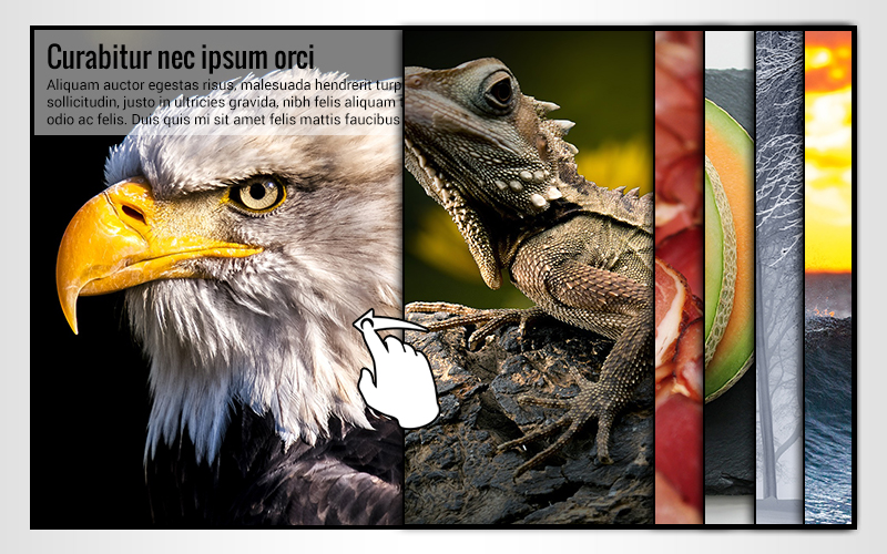
Add a Slider with Ken Burns Effect
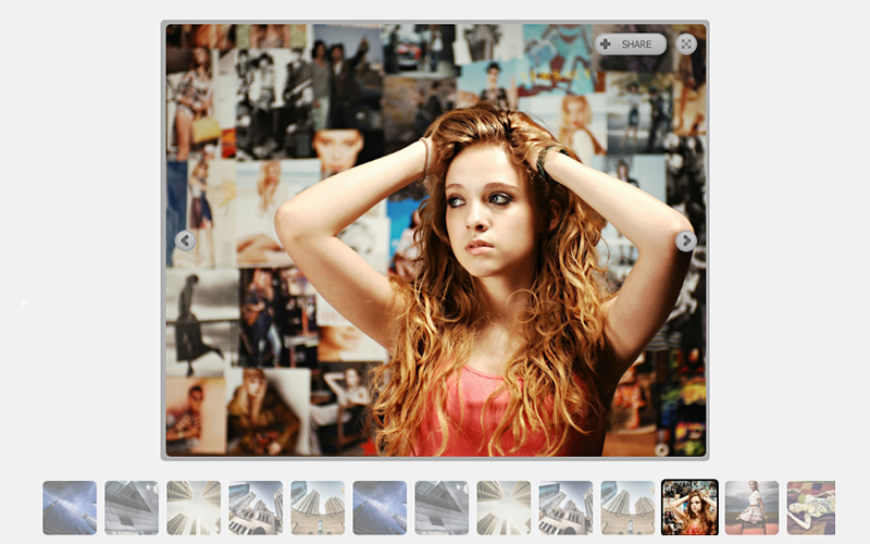
Ken Burns Effect is a videography technique where a static image is panned and zoomed at different intervals to make it look like its moving. It is a very clever technique that can convert your stash of digital photography into amazing animations.
Adding a photo slider with a Ken Burns Effect can give your homepage a great new look. It is especially mesmerizing to watch!
Add Buttons with Background Textures
Adding textures to your clickable buttons can greatly enhance the look and feel of your website. Buttons with textures stand out and direct the user towards important clickable actions.
This is especially helpful for websites that utilize flat design, where it is impossible to distinguish a clickable button from a non-clickable one. Using textures can give your button a different look which helps people orient better. This improves the overall performance and navigation of your website.
Customized Login Page
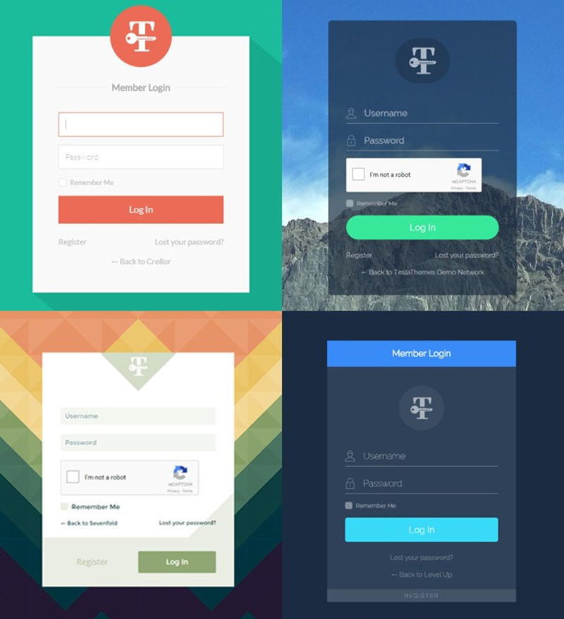
True, login pages are used by your team or staff, but is that a reason to compromise on quality and finesse? Making login pages fun for your team can give them the much-needed inspiration they need to meet your business goals, which will in turn feed into better results for your customers.
Personalize the login pages with your company’s logos, fun messages, backgrounds and more. Not only does this look professional, but it also feels great.
You can also customize the login pages of your customers. Many online businesses have accounts for customers to help them track orders and save information. Having a personalized look for customer login pages comes off as modern, professional and cool.
Try Out a Different Menu – Circular for Instance
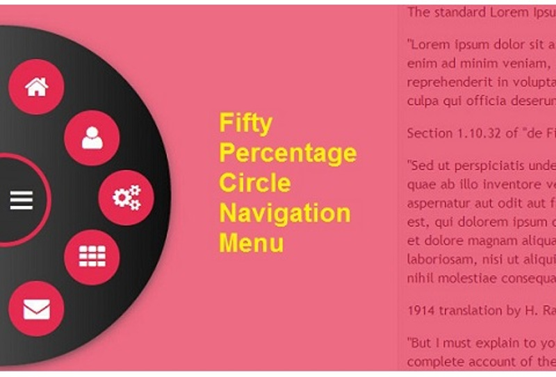
Want to add a special oomph factor to your homepage? Go for different menus. If you thought drop down was the only way, try out circular menu systems and see the appeal. Compared to the conventional drop down menu, the novelty of the circular menu is going to win over your users.
Give Special Effects to Stock Images or Product Images

According to Hubspot Stats, content with images is shared 40 times more than content without images. Similarly, content with images is more likely to be read and remembered compared to content without it.
When you understand the importance of images for your website, and the massive appeal they hold, it is also important to understand how to present them in the best possible way. There is nothing wrong with enhancing the appeal of your images in Photoshop. Add interesting filters, tweak the contrast and brightness and add any other special effects. These will help grab the attention.
Show Modern Hover Effects

Adding hover effects to websites is the latest and hottest trend. Hover effects look cool and delve out important and pertinent information in a very interesting way.
For instance, if your user is hovering over an image, your hover effect text can state the name of a product or some other relevant information.
You can also add interesting greetings or any other messages with hover effects. This will instantly make your website look trendy and professional.
Captivate Your Audience with Animation
Whether it is a GIF animation or any other kind of animation, there are a million ways to use these to grab the attention of your users.
You can use animations on homepage sliders, or use them to narrate important processes and procedures. For instance, if you run a test-prep business, use an animation to show how the test-prep procedure works!
Add Audio Effects
Add nice background music and recorded audio clips. You can also add soothing nature sounds or any other relevant audio effects that can grab the attention of the users. For instance, if you run a car showroom website, an audio effect or a car zooming by would look cool. Similarly, you can use many other relevant audio effects.
Remember, the purpose is to engage your clients at levels of their senses. So while you are engaging their eyes, also tap in and engage the ears. This will provide a more holistic sensory experience that is bound to tickle the emotions.
Add a Flip book Rather Than a Traditional Product Catalog
You must have already come across this wonderful feature. A flip book is a mock, animated version of a real book. It appears just like a real book. You can see images and text on the book pages, and when you click on the page, the page turns over with a very realistic swoosh, just as if it were real!
A flip book is a great way to showcase your products. Instead of having a boring, static catalog in the form of a pdf, go for an animated flipbook. A flipbook is not only more interactive as the user gets to click and roll the pages, but it is also better to look at. And the best part is you can also introduce appropriate audio clips at appropriate places in the Flipbook.
Add a Unique Pricing Table to Show Comparison
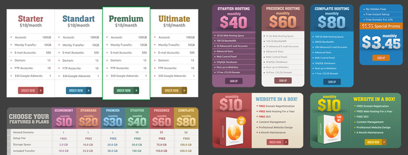
Want to convince your customers to prefer you over your competitors? There is nothing like giving them something to compare with. Often when people view your products and prices, they cannot place it in a framework and see where you stand.
However, if they are provided with something to compare with, they can better assess the value of the products and services that you offer. This is why it works when a brand, that has a promotional sale going on, writes the sale prices along with crossed off original prices. This gives people something to compare the sale price with, and thus something to assess value against, and help make the decision.
Give your users a chance by adding a unique and creative pricing table that shows off the difference in price along with the difference in features and services. You may even use the pricing table to point out the difference between the different packages you offer.
All of these ways will help improve the overall look and feel of your website, enhance its performance and help convert visitors into leads. So, what are you waiting for? Spruce up your website now and expect amazing results after that.
This post may contain affiliate links. See our disclosure about affiliate links here.