It’s easy to follow the trends, and many websites choose to go the safe route of a minimalistic, white appearance. There’s nothing wrong with this, as it’s reliable, tested and beautiful all the same. But many designers want to try something different, a style that will stand out from all others. We should look to other websites to find inspiration in their unique designs. Here are a few sites that broke the mold, creating something new and beautiful.
April Zero
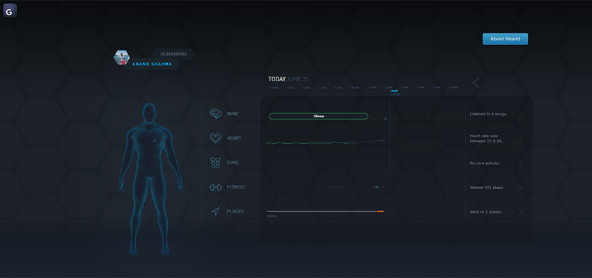
Gyroscope is an app that tracks your health and fitness, to put it simply. The creator decided to have this personal data uploaded live online, and April Zero was born. Besides the amazing concept, the website has a sleek, dark design.
Kultur Design
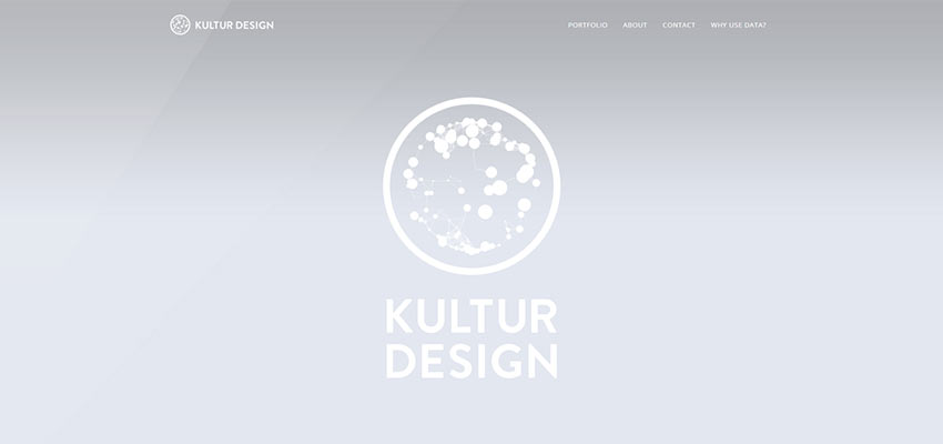
Kultur Design specializes in creating innovative graphics, and their impressive portfolio is dazzling to look through. There are lots of generative animations and more to play with, which fit beautifully into their design.
Daniel Spaztek
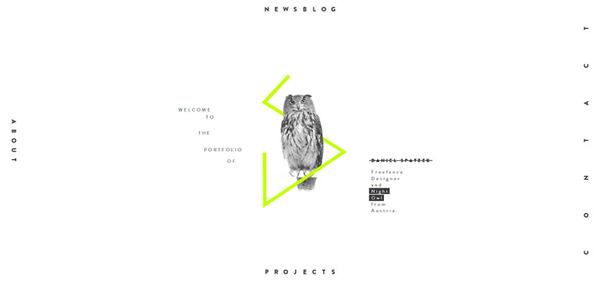
Besides its unique layout, Spaztek’s portfolio makes use of unique animations and videos. It all blends seamlessly together to create a unique and fun experience. His choices in web design are bold and unconventional – but satisfying.
Resn
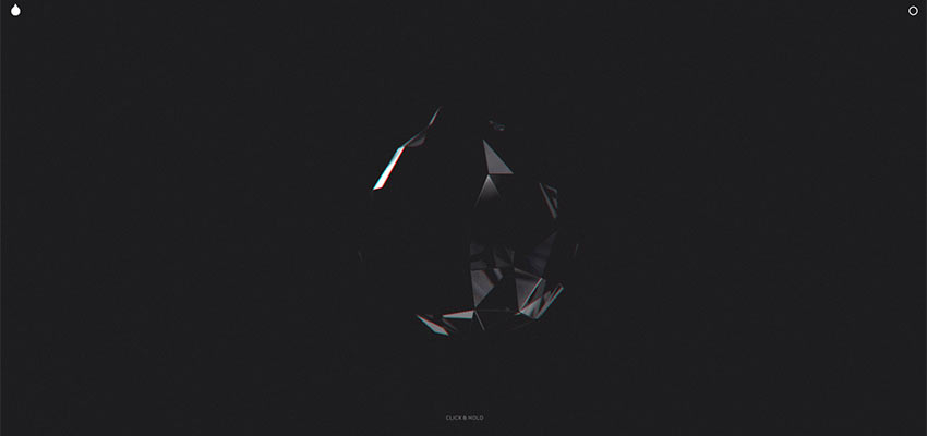
This interactive website is truly a trip. If you’re looking for a web animation that captures the eye and leaves you reeling, this is the place to go. A unique style and seamless animation creates a gripping experience you won’t soon forget. Just look out for loud noises and flashing colors.
Proofdrinks
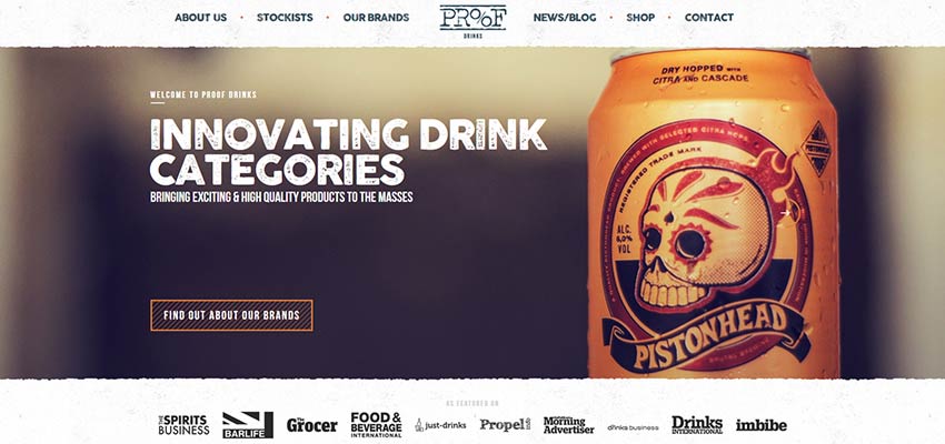
Proofdrinks’ rough, grungy design shakes up the typical minimalistic format. While the site makes use of white space, the smudged typography, scratchy image edges and imperfect lines create a completely new feel.
Vizua
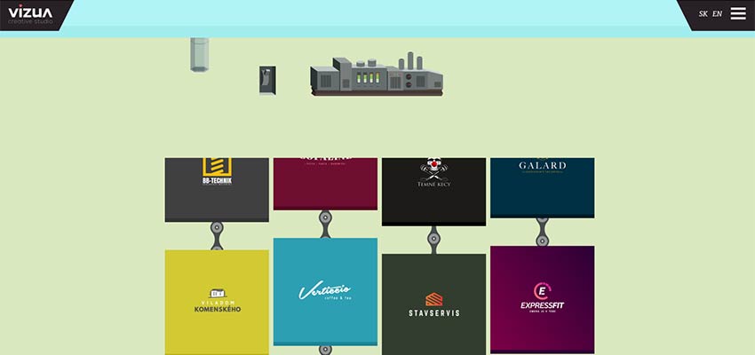
Vizua uses well-crafted animation and illustration to walk you through their design process. The website is fun to explore, and there are even small interactive elements on some of the pages.
Molecular Products

The segmented full-screen banner looks great on its own, but what makes it even better is the animation. Hovering a segment causes it to pop out and play a video. This interactive design is interesting and immediately captures the eye.
The Drawing Room
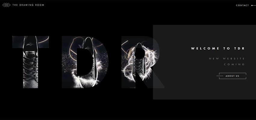
It may only be a placeholder, but the video masked by an overlay of bold typography creates a simplistic but truly stunning visual. Take notes!
Pin-Up Magazine
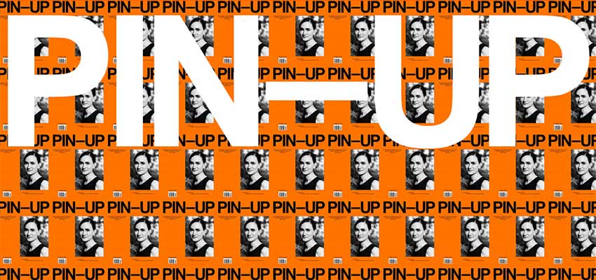
Minimalism has come to be expected. So, when you design a website where every inch of the screen is filled, it can be surprising. Maximalism is difficult to pull off. But, when done correctly, it can make for a great modern webpage.
#direnduvar
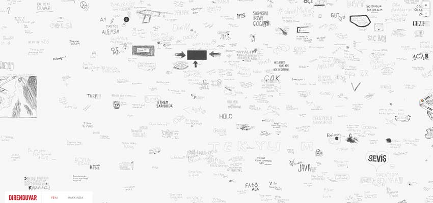
Direnduvar is the “Wall of Resistance”, a Turkish website that allows visitors to draw on the wall. Each node is re-playable, allowing you to see the user redraw their entry. Besides the unique concept, the sketch-like one-page design is very appealing.
Nordic.design
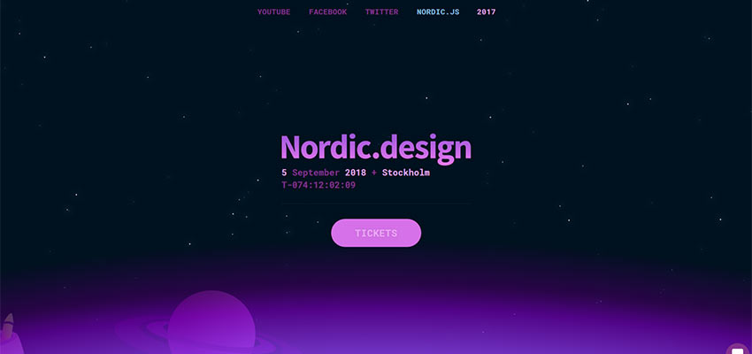
With its dark palette, cute and engaging animations and beautiful full-screen look, this one-page website is a joy to look at and navigate.
blk.
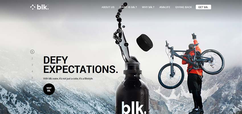
Dark themes are rare, but blk. pulls it off well. Bold typography, subtle animations and unique navigation make this site worth checking out. The dynamic scrolling grabs your attention by snapping you to the next image in the set.
Gorgeous and Unique Design
Hopefully you found some inspiration from these examples! If you’re a web designer looking to try something new and different, go ahead and break the mold. An eye-catching website can hook visitors on appearance alone, and you may just find yourself at the head of a new web design movement.
This post may contain affiliate links. See our disclosure about affiliate links here.