For every trend, I will provide you some data and research that supports the fact followed with examples of real websites utilizing it. I will also recommend some tools, resources, and services for implementing the trend into your project.
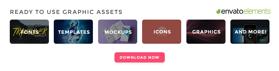
24,500+ Fonts, Website Templates, CMS Templates, and Landing page Templates are now available for just $29 per month with Envato Elements
By joining Envato Elements you gain access to plenty of useful design elements for your all your design needs. All of this is available for a single monthly subscription to Envato Elements. Join today, and gain access to a massive and growing library of 24,500+ creative assets with unlimited downloads.
1. Imagery Web Design Trend: Large Background Images
Stock photos still play a major role in digital communication, whether it’s an eCommerce store, portfolio or blog. People use images to engage more with users and illustrate the message they are trying to send.
For a long time, the web has been suffering from cheesy and fake looking stock photography with super happy people wearing perfect smiles and suits.
Brave People uses a slideshow of full-width genuine photo backgrounds that create an impression of a humanistic brand.
Thanks to communities, like Unsplash, Picjumbo, Death to the Stock Photo, because designers can now utilize beautiful and, most importantly, natural looking photos for their web designs or blog posts. We’ve seen many websites using photos from Unsplash and it simply looks amazing.
“Users pay close attention to photos and other images that contain relevant information but ignore fluffy pictures used to “jazz up” Web pages.” – Nielsen Norman Group
The Nielsen Norman Group eyetracking studies have shown that people generally ignore cheesy and artificial looking photos. However, 2016 is the year of genuine imagery and you should take advantage of using real photos to connect with your audience in a genuine way.
Examples of Large Background Images in Web Design
Grain & Mortar
Natural and real photography resonates with people, instead of using cheesy stock photos. Grain & Mortar used an informal shot of their team that connects with the visitors very well.

Grain & Mortar is another great example of beautiful imagery in web design.
Grovemade
People make purchases based on their emotions. Grovemade utilizes high-quality photos of their products that definitely add a feeling of trustworthy organization and awakens a desire to buy the product.
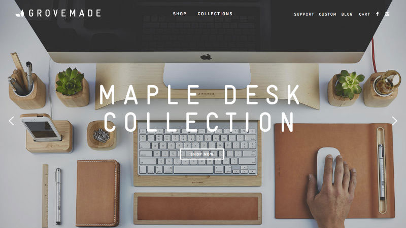
Grovemade has a beautiful, product-focused approach when it comes to their website.
2. Video Background Web Design Trend
Websites generally are storytelling tools and storytelling can be more effective when visuals and motion are involved so the ideas and emotions can be transferred to the visitor easier.
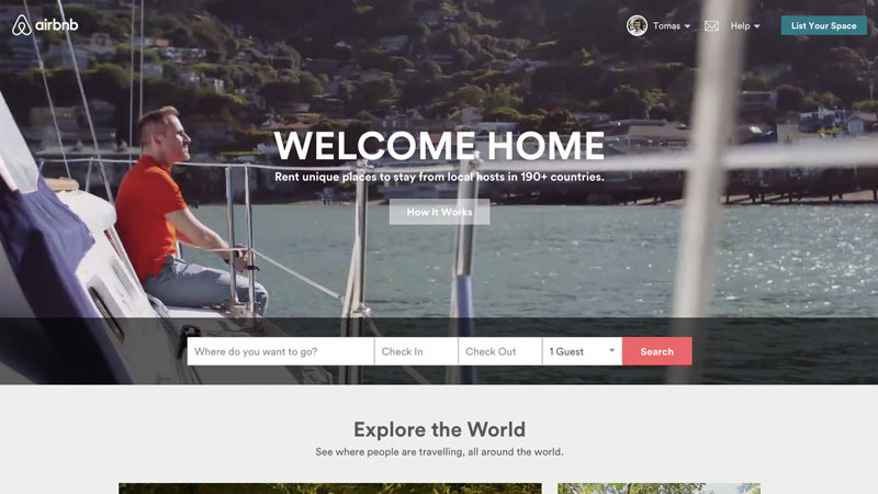
Airbnb takes advantage of beautiful videos in order to complement their ‘Belong Anywhere’ campaign.
We’ve seen businesses implementing video in their websites. In 2016, this trend will grow even more with the endless possibilities of 3D graphics and HD quality videos to build that impression of real life experience. According to ClickZ people love video as statistics show mind blowing numbers of video consumption online.
Users prefer content in a visual format, which explains why online content video views have finally topped 50 billion views each month.
> The exponential growth of YouTube proves the fact that old school TV is dying and people prefer to choose what they want to see. This SocialTimes infographic reveals surprising numbers of how US millennials are abandoning TV.
YouTube reaches more US adults aged 18–34 than any cable network. Users upload 100 hours of video to YouTube every minute.
> The downside of this trend, however, is extended load time. Many websites solve this problem by beautifully designed loading screens but it doesn’t change the fact that people still have to wait for the full experience to load.
Examples of Video Backgrounds in Websites
A Bloom of Ruins
A Bloom of Ruins creates a memorable experience by utilizing mysterious light and blurred imagery in the video background and loads super fast making a magical overall look and feel.
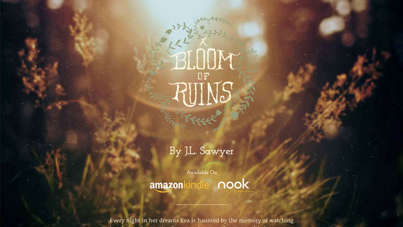
A Bloom of Ruins is a great example of subtle video being used as a full website background.
Bloomberg Media
Bloomberg Media is a media company whose focus is large amounts of information and breaking news. Utilizing video that is activated by hovering your mouse over add this feeling of being a trustworthy and technology savvy company.
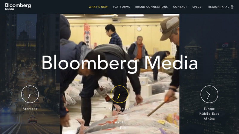
Bloomberg Media uses video to demonstrate the diversity and capabilities of their work.
3. Personal Branding Trend in Web Design
Personal branding exists whether you focus on it or not. Your identity and your image (how you are perceived by other people) are very different. The main focus of personal branding is to align vision and mission so you are perceived as you’d like to be instead of people speculating and having different opinions about you.
“Your brand is what people say about you when you’re not in the room” – Jeff Bezos, Founder of Amazon
> I highly recommend you check Neil Patel’s “The Complete Guide to Building Your Personal Brand” to better understand the importance of personal branding and actionable steps to get where you want to be.
Examples of Personal Branding in Websites
An1ken Group
Founder of An1ken, Jacques van Heerden makes sure people get to know him, his company values and what his company is all about. No hiding online – visit the website now and tell me does this company look and sound trustworthy to you? It totally does for me.
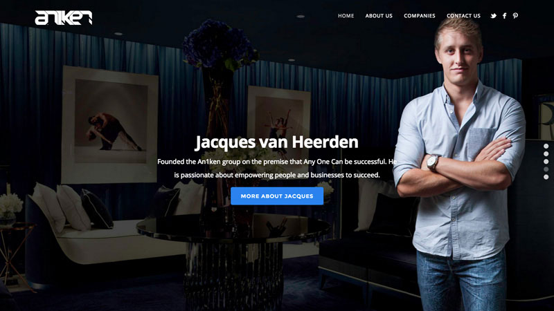
An1ken Group website isn’t yet another faceless organization. Nicely used profile photo and a simple description says it all.
The Daily Positive
Having a human behind the brand or organization makes people trust it and help them make a decisions easier. Personal photo along with a combination of high number of followers as a social proof ensures people that it is worth following.
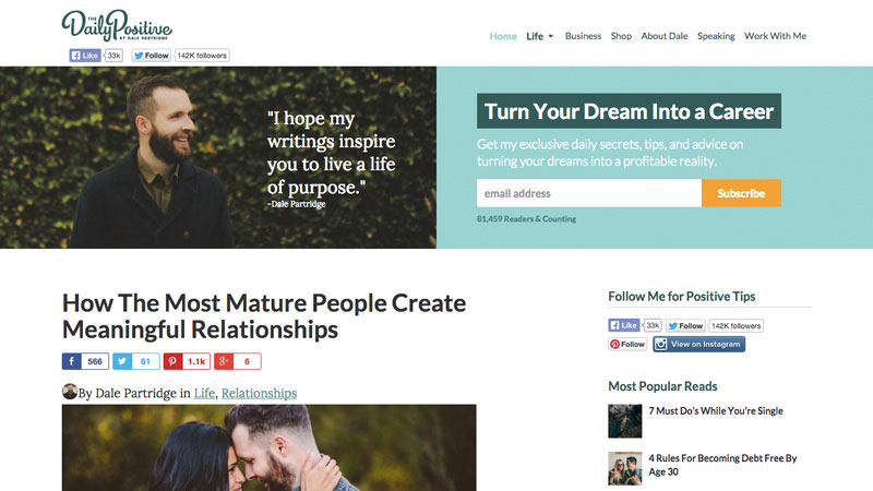
The Daily Positive is highly associated with Dale Partridge personality.
Tobias van Schneider
Bold, straightforward and effective. Tobias uses lots of negative space to draw attention to his personal brand and make communication clear with concise facts.
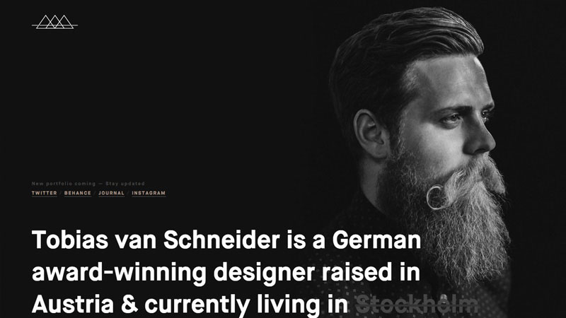
Tobias van Schneider has a very memorable portrait photo accompanied with bold typography and straightforward facts.
4. Web Design Trend – Mobile First Websites
Web usage patterns are changing and statistics cannot be ignored if you want to succeed in today’s market. Every third website visitor now uses a mobile device and websites that do not offer mobile optimised versions are causing an unpleasant experience and eventually losses money as users tend to abandon the website if it doesn’t render well on mobile device.
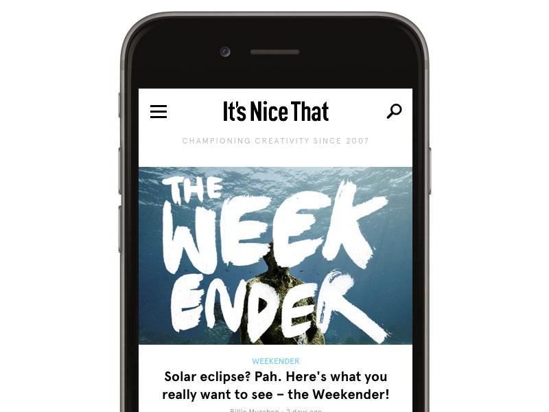
It’s Nice That combines beautiful visuals and elegant typography to build a pleasant mobile reading experience.
“The number of people using mobile devices outstripped people on desktop computers in 2014.” – Jim Edwards
Adopt a mobile first approach when designing or redesigning your website to ensure that you maximize your potential and reach more of your target audience. This means you have to be brief, focused on the content and performance which takes advantage of advanced features, like mobility, GPS, touch screen and more, that desktops aren’t able to offer.
In 2017, we’ll be seeing the continuous growth of mobile web design development and spectacular innovations based on the ever changing market behavior. Read more about Mobile First, an adaptive, future-friendly solution for website design.
Examples of Websites Built Mobile First
The Verge
The Verge is a super visually heavy news website with lots of colors and imagery. However, they have done a great job on optimizing it for mobile devices with a clean layout and close relation to the desktop version.
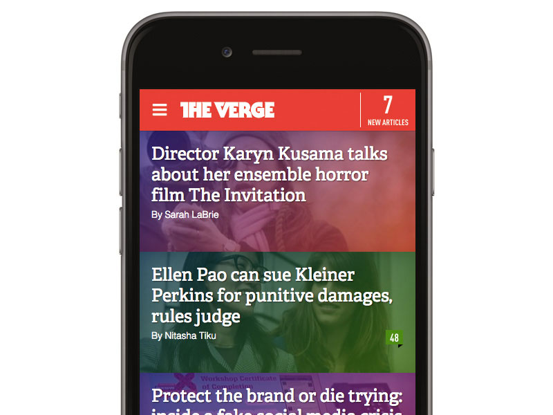
The Verge is a perfect example of tapable space and finger friendly buttons, (read post titles with illustrations).
Newsweek
Keep it simple is the design approach the Newsweek design team has taken to form their mobile version with loads of white space and clean typography and accompanied by relevant imagery.
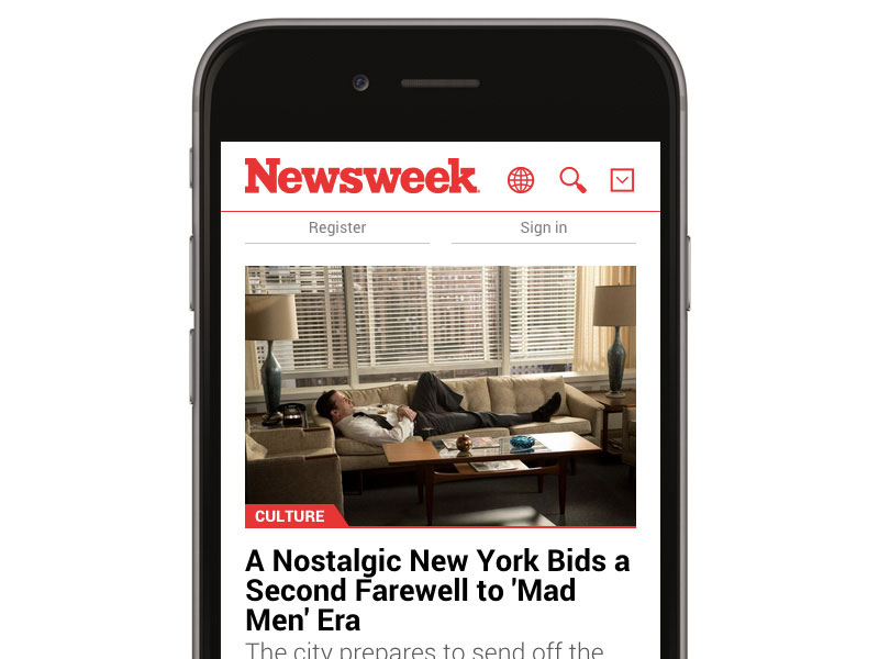
Newsweek is a great example of heavy content website that looks organised and lightweight on mobile device.
5. Modular Design (Grid Based) Web Design Trend
Modular or grid based design, also known as cards/tiles design approach, is not new in the web design scene, but it started to get more traction as it is reusable and very responsive-friendly with the tiles stack nicely on different screens and form a flexible layout that looks nice and clean on any screen size.
A lot of white space combined with strict grid and rectangle shaped content blocks look very balanced and trustworthy.
Modular design, or “modularity in design”, is a design approach that subdivides a system into smaller parts called modules or skids, that can be independently created and then used in different systems.
A modular system can be characterized by functional partitioning into discrete scalable, reusable modules, rigorous use of well-defined modular interfaces, and making use of industry standards for interfaces. – Wikipedia
One of the best known examples of modular design is the Microsoft Metro style which doesn’t seem to be very successful, though. However, many web apps like Pinterest, Instagram, Designspiration are utilizing the grid based design very successfully.
Website Examples of Modular Design
Anthony John Group
Anthony John Group has a clean, image based grid with just enough of white space to make things look balanced and trustworthy.
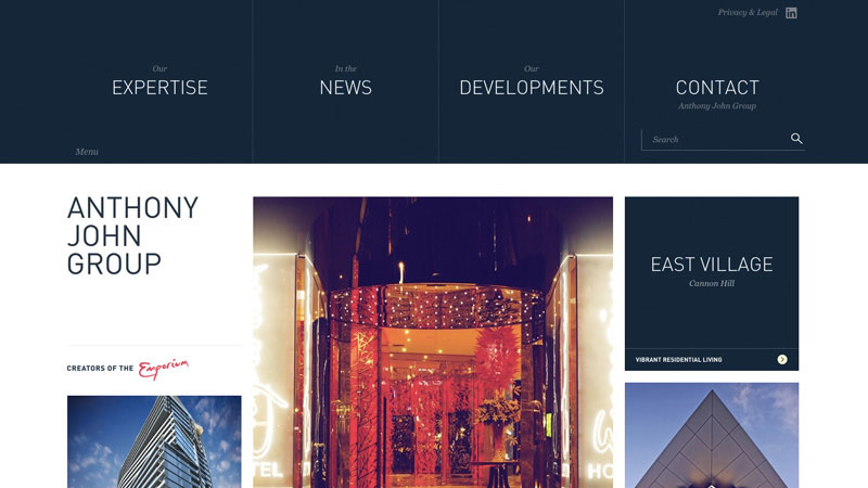
A nice and clean example of how tiles are used to lay down the content of the website.
Well Made Studio
Well Made Studio has a harmonious combination of pastel color palette with authentic typeface and balanced spacing.
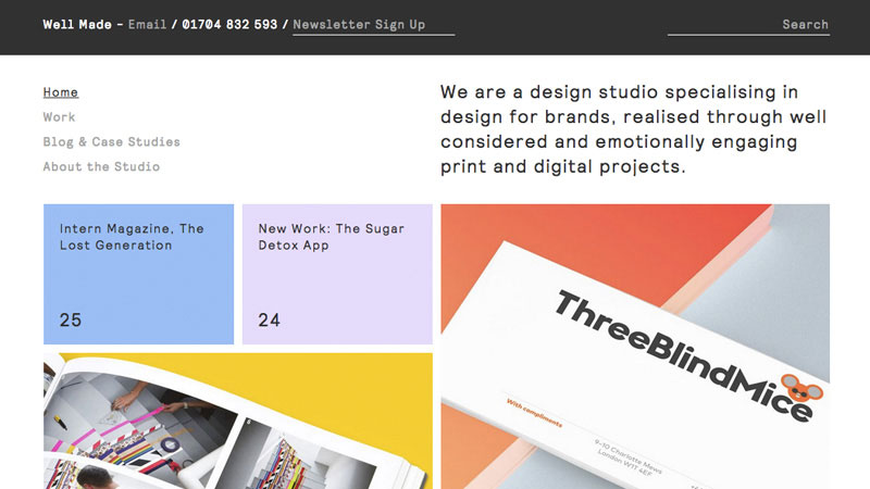
Well Made Studio combines pastel color palette with clearly defined cards for content pieces laid out in an organized grid.
6. One Page (Single Page) Web Design Trend
It simply makes more sense from the UX perspective – Rebecca Gordon’s research “Everybody Scrolls” shows that users love scrolling.
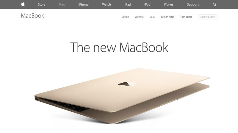
Apple MacBook has designed a super long single page to represent its new product.
Scrolling is winning over clicking due to the changing web browsing patterns. As mentioned earlier, mobile device usage growth has influenced the way websites are designed nowadays. With smaller screens and super natural touch scrolling movement, people prefer to scroll around instead of clicking on the links and waiting for the content to appear.
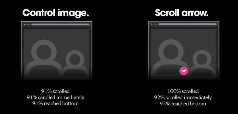
Research conducted by Huge shows that despite the layout structure nearly 90% of visitors will scroll until the bottom.
One pagers gained momentum a couple of years ago but now it has started to make even more sense and people seem to enjoy it as it presents huge chunks of information at once in a nicely designed step by step flow.
Examples of Single Page Websites
Spotify’s Year in Music 2014
One page layouts are popular among yearly reviews like Spotify’s Year in Music. Large amounts of data and statistics digested for mass consumption with a visual and interactive approach.
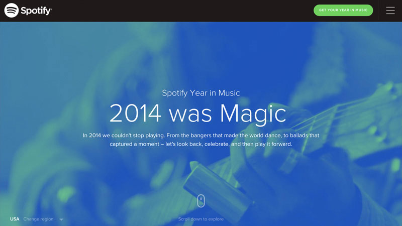
Spotify’s Year in Music allows a natural timeline of the year in an easy to browse manner.
Brandon Gore
One page design philosophy starts to get traction among individuals building personal portfolios, Brandon Gore being one of them. He includes a personal portrait photo to better connect with the visitor and provides some essential information about himself, his work, and his contact numbers.
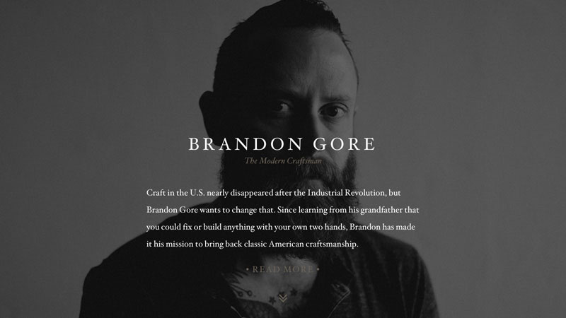
Great example of the previously discussed Personal Branding trend combined with One Page design philosophy.
7. Material/Flat design Web Design Trend
Flat design was quickly adopted by designers and big tech companies like Apple that basically killed skeumorphism very quickly. Some of the advantages of using the new paradigm are that flat design forces designers to focus more on content, pick the right colors to help users navigate through designs, and use white space with care.
Strong focus on key brand color and loads of negative space with an emphasis on the product.
68% [of web designers] think that flat web design will still be around five years from now.
The popularity of Google Material Design philosophy is being embraced by many designers and developers that lead to cleaner and more organized digital products which can be used without the users having to learn the complex curve. Research conducted by Usabilla shows that web designers are in favor of the flat design movement.
Examples of Flat Web Design Trend Websites
Format
The main function of the flat design is to put emphasis on content while design has to serve as a communication tool. Format has mastered flat design by combining clean type with flat color scheme and stunning imagery.
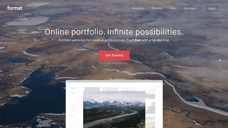
Format has a lovely combination of stunning image combined with sleek flat graphics in a balanced composition.
Neo
Neo has a balanced website design with dozens of negative space that makes reading very pleasurable. Also thanks to perfectly chosen typefaces. Flat design also works very well with minimal approach. for example, Neo delivers essential information with nothing to add or remove.

Flat design in action – clean layout with unusual color palette and loads of white space.
Summary and Conclusion About Trends in 2017
If you’ve been following the web design scene for some time you may have felt what is coming next. There are no significant changes in 2017 but some trends that started getting traction in 2014 will continue growing and affecting more people while others will slowly fade away.
However, web design is evolving very quickly and, most importantly, it adapts to people’s behavior and technology advancements. In this article I’ve touched some trends that will be on the spotlight for the rest of the year and the resources I’ve provided will help you to quickly get into the game.
This post may contain affiliate links. See our disclosure about affiliate links here.