While it is true that Material Design is a reference for a design language initiated by Google, it is more than just an idea.
Without question, it has caused designers to overhaul their concepts for web and app design procedures. In fact, many websites have already applied Material Design documentation scheme by Google.
Your Web Designer Toolbox
Unlimited Downloads: 500,000+ Web Templates, Icon Sets, Themes & Design Assets

Material design is a living document that is available to the public is what inspired this idea. The documentation is regularly updated so that the changes in its scope and technology can be reflected.
What Material Design is supposed to achieve?
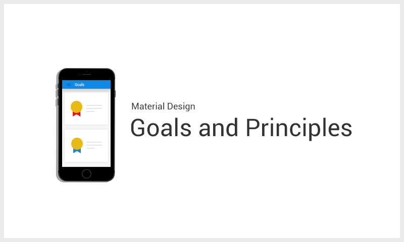
Material Design Goals and Principles
Truth be told, Material Design revolves around a set of goals and principles that are easier to formulate than to implement. However, this should not be a problem because the essence is more on thinking the design and improving it.
Material Design Goals:
- Come up with a visual language that blends classic principles of an impressive design with the improvement and chance of technology and science.
- Create one underlying system that enables a unified experience on different platforms and sizes, regardless of the device. Mobile guidelines are basic, but touch, voice, mouse, and keyboard are all first-class involvement procedures.
Material Design Principles:
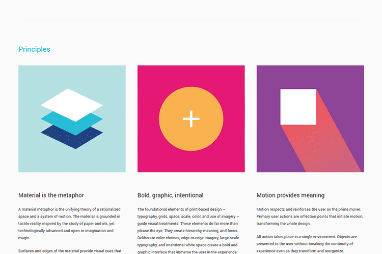
1. Material is the metaphor
It is important for the visual cues to be anchored on reality. A material metaphor is the coalescing theory of a rationalized space and a system of motion. The material is anchored on tactile reality and influenced by the study of paper and ink.
Despite this, it is technologically advanced and entertains magic or imagination.
The use of common tactile features helps users to fathom affordances fast. Nonetheless, the suppleness of the material gives rise to new affordances that displace those in the physical world, without defying the rules of physics.
The essentials of light, surface and movement are vital to the transmission on how objects move, interact, and exist in space and in relation to one another. Truthful lighting shows layers, splits space, and suggests moving parts.
2. Bold, graphic, intentional
Visuals should be guided by the basic design theory, such as the use of color, images, scale, type, grids, and space. They give rise to hierarchy, meaning, and focus.
Measured color choices, edge-to-edge imagery, large-scale typography, and intentional white space make a bold and graphic interface that submerge the user in the experience. A highlight on user actions enables core functionality immediately clears and gives way-points for the user.
3. Motion gives meaning
While there is no denying that moving objects or actions are great, it has to be ensured that they don’t interrupt the user experience in any way. Additionally, there has to be coherence between these animations or moving images and the very essence of the website.
Motion respects and strengthens the user as the major mover. Prime user actions are modulation points that start motion, which results to the overall transformation of the overall design. All actions happen in a single setting.
Objects are offered to the user without destroying the continuity of experience despite the transformation and the reorganization. Motion is evocative and fitting, functioning to focus attention and ensure continuity. Feedback is restrained but distinct. Despite being efficient, its transitions are coherent.
Material Design vs Flat Design
There are a lot of guiding factors for Material Design. However, they can be simplified into a wide array of specific ideas and approach. Google has formulated a set of rules on how to make animations, patterns, styles, layouts, usability, and components.
You have to take note, though, that the material should be connected with reality, meaning that the objects can be found in a 3D space…well, almost!
As far as the aesthetics are concerned, it borders between the skeuomorphism and the scale of flat design. In contrast to flat design, though, Material Design widely makes use of the so-called paper shadow. This shadow is meant to act like a sheet of paper lying on a bright surface.
It imitates a 3-D presence for a digital object. Perhaps, the most well-known example is the Gmail icon that makes use of lighting effects to make you think of a tangible envelope.
Material Design Color and Typography
The color concepts of Material Design are pretty much inspired by the flat design trend, which means its color palettes are not only bold but bright, too.
Color is inspired by bold color statements contrasted with muffled backgrounds, taking hints from modern architecture, pavement marking tape, road signs, and sports courts.
It emphasizes bold shadows and highlights as it merges vibrant and unusual colors. What makes the color concepts of Material Design interesting is the use of sharp contrast.
The guidelines for typography are just as basic as well since it takes on the same flat theme and simple sans serif. It has a default font for all sorts of applications, Roboto, which comes with a download link and a ladder for the usage of fonts.
Material Design Layout and Design
The basic layout and design structure of Material Design projects are inspired by print design concepts. Creating and using a baseline grid and mathematical structures for the appropriate placement of elements are strongly encouraged. The layout further simplifies into areas that recommend how and where to put elements for the ultimate user interaction.
Additionally, every idea has a downloadable template for the creation of Android. However, there is a risk for a designer to end up with a design that might be too cookie-cutter, or worse, an app that is undeniably Android. Without question, this can be in the bad graces of people who adore iOS.
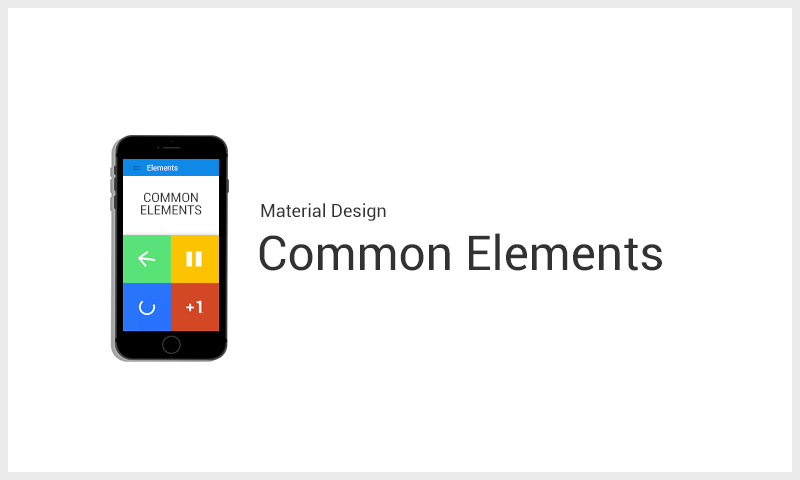
Let’s take a look of what design elements best describe Material Design.
Material Design Common Elements
All the elements in Material Design are detailed definition. Definitely, it is hard to imagine something that is not there.
Here are some of the most common components of Material Design:
- Bottom sheets – are sheets of material that slide from bottom up to reveal additional content.
- Buttons – either contain an image or text or both in accordance with the color of your app.
- Cards – serve as an introduction to more information
- Chips – contain complex entities, such as a short title string or photo
- Dialogs – its content ranges from text or UI control
- Dividers – this component separates content within page layouts and lists
- Grids – separate similar data, such as images and optimize it for visual comprehension
- Lists – present similar data, like texts and images, and optimize them for reading comprehension
- List controls – these are icons found to the left or right side of the list
- Menus – emerge from buttons and used to choose a discrete action or option
- Pickers – work well for display in a confirmation dialog
- Progress and activity -represent each action with a single activity indicator
- Sliders – let you choose a value from a series of values
- Snack bars and toasts – these are primarily used for system messaging.
- Subheaders – special tiles that describe distinct sections or indicate seams in the material
- Switches – are also called selection buttons and divided into three kinds – checkboxes, radio buttons, etc.
- Tabs – helps you explore between apps and sites much easier
- Text fields – determine the type of character that will be included in the field
- Tooltips – are the labels that appear on hover
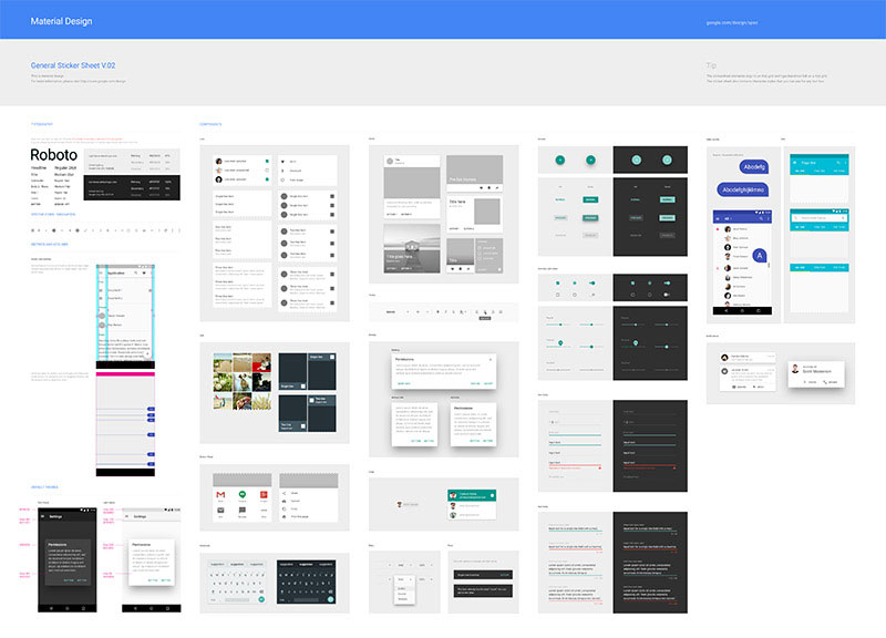
This is how downloadable components look like.
If the look of the featured components falls in your good graces, you can even download an Adobe Photoshop, Illustrator or Sketch file that offers all of the elements and Android system icons. The sticker sheets come complete and include styles that conform to the recommended grid.
Material Design Usability, Interaction, and Accessibility
There is no denying that the most successful products are readily available to a wide array of consumers. This can only be possible is a product becomes accessible to all people, regardless of their ability, for as long they can understand it and help them accomplish their goals.
In the case of Material Design documentation, it opens the eyes of the web designers to patterns that can improve interaction, usability, and accessibility.
While it is true that several of the aesthetic properties of Material Design appear very basic and make the experienced designers raise their eyebrows, it can’t be denied that many of its interaction and usability ideas are never to be ignored.
Beyond the shadow of a doubt, the section of its interaction patterns is of great help to designers. It specifies a set of concepts in order to make some elements universal from one design to another. These are some of the simple tools that web users don’t only presume to work but work specifically, too. This is a clear advantage, without question.
One Material Design documentation that has been outlined and provided with helpful options is accessibility. It provides a great deal of consideration to users that might interact with the design in a way that does not affect the color or sound, among some other things, can appeal to many web users.
Usage of Cards
With Material Design, content is always offered in cards that use hierarchy, background images and content to offer context and an entry point to a stronger information and outlooks.
Without question, cards work well as they are meant to put just the enough amount of information in a compressed overview, which are improved and supported by visual elements. There are many variations of cards, and they depend on the content you want to fill in.
However, more often than not, you will need to display an action or give an information in a content block.
There are plenty of Material Design resources across the Web
10 Material Design Resources
The idea of Material Design is great, and its guidelines are neat and new. Even if the guidelines seem to be of no use to most experienced designers, as it is most likely that they don’t need this level of guidance, it can’t be denied that it is still awesome.
Having said this, it is not really surprising why Material Design is making its presence felt more and more. You can download several things from Google, but there are many resources that can help you discover more ideas for Material Design:
Below is the list of some useful Material Design concept resources:
- Material design for Bootstrap
- Google layout templates for mobile, tablet and desktop frameworks
- Angular.js Material Project
- Polymer Designer
- Material Design Gallery
- Material Interaction
- Materialize Front-End Framework
- Material color palette
- Material design Sketch template
- Material design on Android checklist
Examples of Websites and Mobile Apps that Have Applied Material Design
The concepts outlined in Material Design have already been embraced by many websites and mobile apps.
Here are five examples that display the principles of Material Design, demonstrating how designers can employ and tinker with the idea:
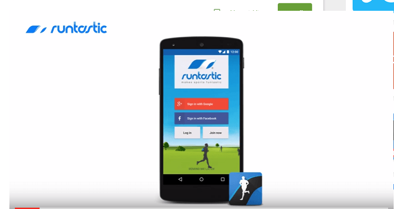
Runtastic is a fitness app that uses Material Design
Runtastic Running and Fitness
Runtastic Running and Fitness. With Runstastic, you can elevate your fitness to a higher level. There is no denying that it is the best free fitness and running app tracker that you can have in your Android device. This app boasts of its GPS to map and take track of your fitness and sports activities. It can, likewise, monitor the duration, elevation change, distance, amount of calories burned, and many more.
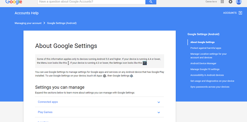
Google loves Material Design
Google Settings
What else embodies Material Design but Google itself. Google settings shows the simplicity, neatness, and user-friendliness of the design as well as how to utilize it effectively.
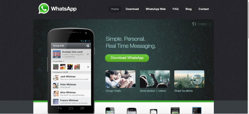
WhatsApp is an example of a mobile app which adheres to Material Design
WhatsApp. This messaging app allows you to exchange messages without paying a single centavo for SMS. It is available for Blackberry, Android, iPhone, and Windows phones.
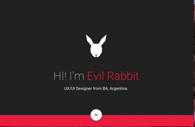
This designer utilizes Material Design
Evil Rabbit
Evil Rabbit is the brand of an Argentinian designer whose work has been featured in Behance and other design websites. One of the things that makes him stand out is how he uses Material Design effectively.
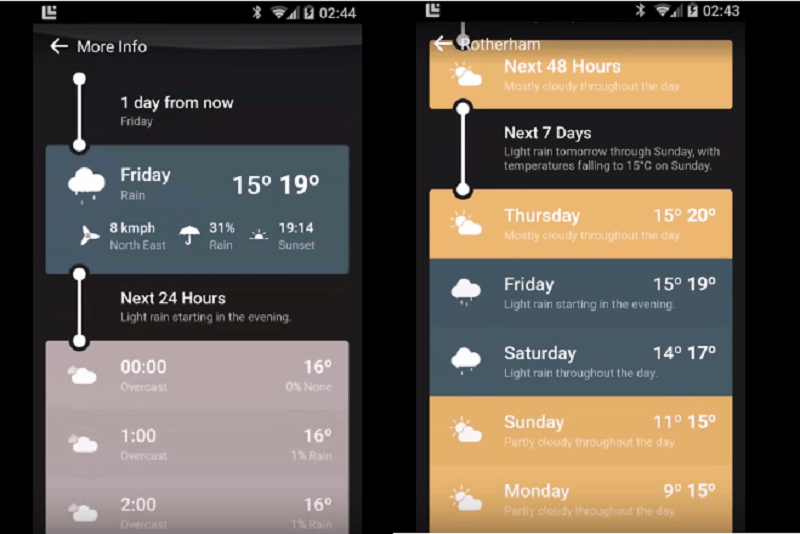
A beautiful weather app using Material Design
Weather Timeline
Despite the simplicity of this weather app, it can’t be discounted that it is a great help to its users. It shows the weather forecast in a timeline that helps you glance and understand the information.
Third Party Apps for Material Design
There is no arguing that Material Design makes Android further elegant as it makes use of flat and consistent shapes that give a sense of depth with shadows, larger white space that improves readability and touch targets, and create transition animations. These are the principles that Google has provided to Android designs, and there are third-party apps that are in congruence with these:
One of the most successful website using Material Design
Feedly
Feedly is one of the most interesting RSS readers. Without question, it is the best successor to the Google Reader, eventually earning the right to be the default for various reading services.
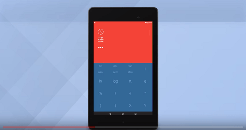
Numix: A very cool calculator app
Numix Calculator Pro
While it is true that Google has its own calculator, Numix can take pride in the fact that it has more powerful capacities. Additionally, it can be customized in more ways than one. It allows you to slide down the screen and see previous tabulations.
If you swipe the keys, you can have more advanced functions. Numix also comes with a well-designed widget that you can use on the home screen. This means that you can start your computation right away.
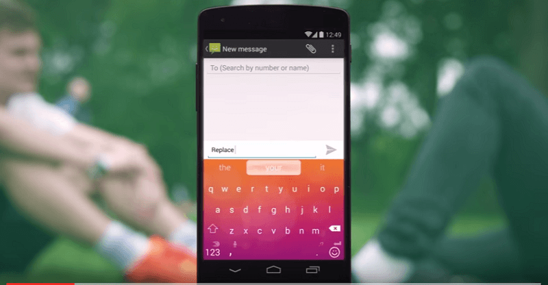
SwiftKey is one of the best Android keyboards and it uses Material Design
SwiftKey
There is no denying that SwiftKey is one of the best Android keyboards. With its recent switch to a freemium model, it now offers a theme store that boasts a ton of keyboard choices. Furthermore, Swiftkey now offers two Material Design keyboards that look similar to the new choices that Google keyboard offers.
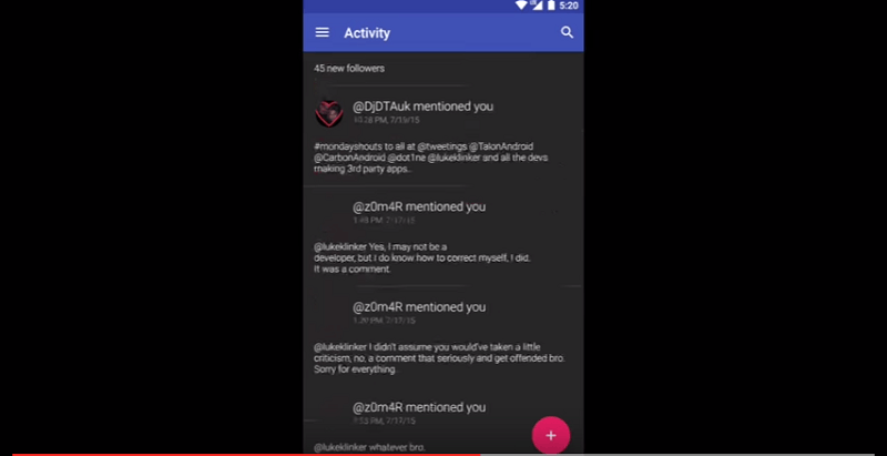
Talon uses shadows, layers, and floating buttons
Talon for Twitter
While waiting for Twitter to update its app with Material Design, Talon for Twitter has already applied the principles of Material Design, using layers, shadows, and the floating button. Its slide-out menu is of great help for you to get to know your “@ mentions” and lists. Without question, it’s far more sophisticated than what Twitter is on an Android device at the moment.
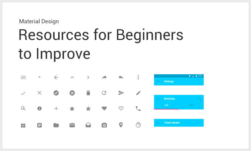
Resources for Beginners to Improve their Material Design Skills
The following are some of the important resources that you can check out and help you develop or brush up on your Material Design skills.
1. Material Design Specification and Tutorial from Google
While learning the basics of Material Design is the most logical move that you need to do, sad to say, it is not the easiest. The Material Design specification from Google is a helpful introduction to the primary goals and principles of Material Design itself.
It details the simple ideas, such as material, material properties, animation, layout, components, elevation, patterns, style, and many more.
2. Android Getting Started with Material Design
Sure, specifications are helpful. Nonetheless, nothing can be more helpful than learning from an extensive tutorial that teaches how to implement specifications. And, speaking of tutorials, it can’t be denied that the Android Getting Started with Material Design tutorial is one resource that you need to check out for in-depth yet comprehensible tutorial.
In fact, even web designers who think that they already know Material Design too well will be surprised that there are still things that they can learn from this tutorial.
3. Android Development Tutorial: Lollipop Material Design
This is another highly recommended in-depth tutorial. This focuses on the many aspects of Material Design, like animations, elevations and shadows, SGV drawables, palette and color extraction, and many more.
This tutorial focuses more on the clarification of the specification rather than a tutorial that produces a deliverable and does not contain a code.
4. Material Design Video Tutorials
This is definitely a must-see for designers who are fond of video tutorials. There are more than 58 video tutorials that you can choose from.
Since these video tutorials are in HD, your eyes won’t really be blurred with hazy images. Furthermore, they only last for an average of 10 minutes.
Conclusion
Designs, especially those related to technology and trends, are rapidly changing as you can just imagine. Toy with different ideas, but don’t be attached to them. Just like every single design trend, framework or idea, you need to assess if the concept you are entertaining is applicable to the project that you are working on.
Hence, if you think that Material Design is good for your project, go for it and explore the possibilities.
This post may contain affiliate links. See our disclosure about affiliate links here.