There is one thing web designers have in common with designers in other disciplines. It is that they look for simple solutions to specific problems. This is the case with improving website navigation.
Web designers strive to create simple, logical structures to build website navigation characteristics. This has resulted in the establishment of best practices. These best practices are not complex. They are quite straightforward and easy to implement.
Taking these top 5 navigation best practices to heart will save you time and energy. Plus, both you and your users will benefit. You won’t face the stress associated with using a poorly-designed navigation system.
The Top 5 Website Navigation Best Practices
Best Practice #1: Make it as easy as possible for the visitor to reach her main goal
When a brick and mortar store has a special something, it doesn’t hide it in the basement. As this would require shoppers to search the store for it.
A visitor to your online store is attracted to a special or new and exciting product line. It can be seasonal sales, or the latest news or updates. Your visitor will be best served by placing an eye-catching image on the front page. A CTA to point her in the right direction will also work perfectly.
A search bar or a set of crystal-clear CTAs is what you need. These are two straightforward methods to keep a visitor from getting lost.
Best Practice #2: Always let a visitor know where in the website she is
A Current Locator has, for a good reason, been a website navigation gold standard for years.
It does not matter how carefully you design a megamenu. It can be easy for a user to get lost when confronted with one that features dozens of different products. That problem can easily be avoided by tracking:
- The present location of the user
- Where he came from, and
- Where he could be expected to go next
A helpful navigation feature is using a contrasting color. This is done to indicate the user’s present location on the website.
Incorporate a mini-map of the user’s journey on the page. It is another way to give him or her a helping hand.
Make it a point to keep a fixed menu on top of the page. This will help the user decide where to go next to further explore the site.
Best Practice #3: Use standard icons and lingo – always
Website navigation is one area in which you need to keep creativity on a short leash.
Users want to be helped along the way. Preferably, without having to figure out how best to proceed every step of the way. Don’t make your users have to think, and don’t feel you have to entertain them either. Save your creativity for other areas, where it will be appreciated.
How about hamburger menu? Much of the time it will be an excellent choice.
A menu shaped like a penguin with random clickable areas would be appropriate? Definitely a no-no.
How about a bold logo that returns the user to the Homepage when he or she clicks on it? YES.
An animated logo that warps the user into another dimension? NO! The other dimension would likely turn out to be another website – of the user’s own choosing.
Best Practice #4: 7 menu items – max
Most users can remember 7 things fairly easily, but they begin to struggle when the number is higher. Keep your menus clean and simple.
It’s the same with links, especially on the homepage. Hundreds or even a dozen links can be overwhelming. Multiple links can be appropriate for academic papers. But for a website, you need to keep everything as simple as possible.
Only list what’s important for the user; and place the two major areas of interest at the top and bottom.
Best Practice #5: Base the menu type in accordance with the amount of content
What works for one website won’t necessarily work for the next, no matter how good the idea may seem. This applies to menu types and designs as well. This is an area in which you don’t want to mindlessly follow what seems to have worked for others.
That’s mostly because different websites can feature different amounts of content. The amount of content a website has plays an important role in determining the menu type.
For a small store with a limited inventory? A single navigation bar is usually best.
For a large eCommerce shop selling 150 brands of clothing for men, women, and children? You’ll want either a vertical collapsible menu or a carefully-structured megamenu.
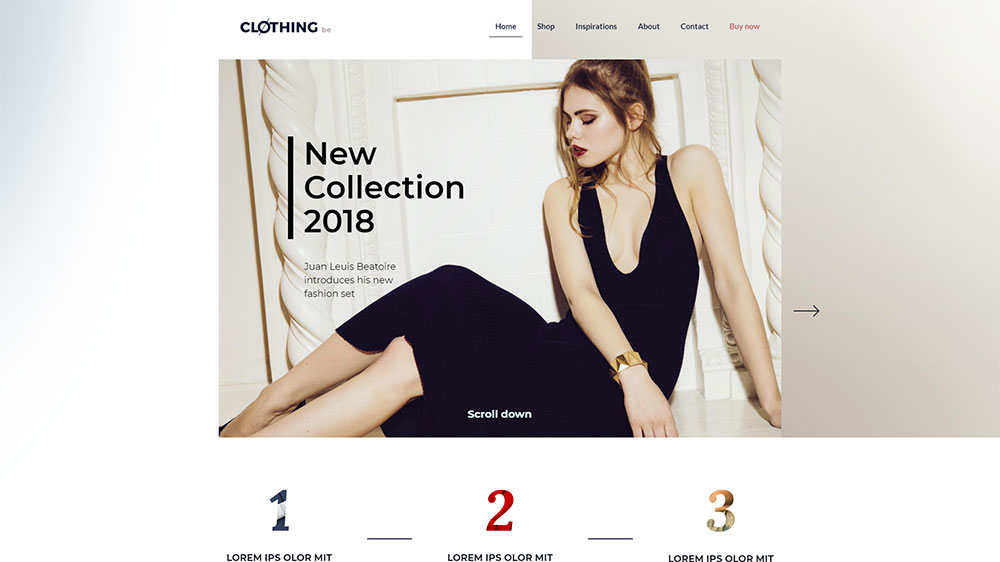
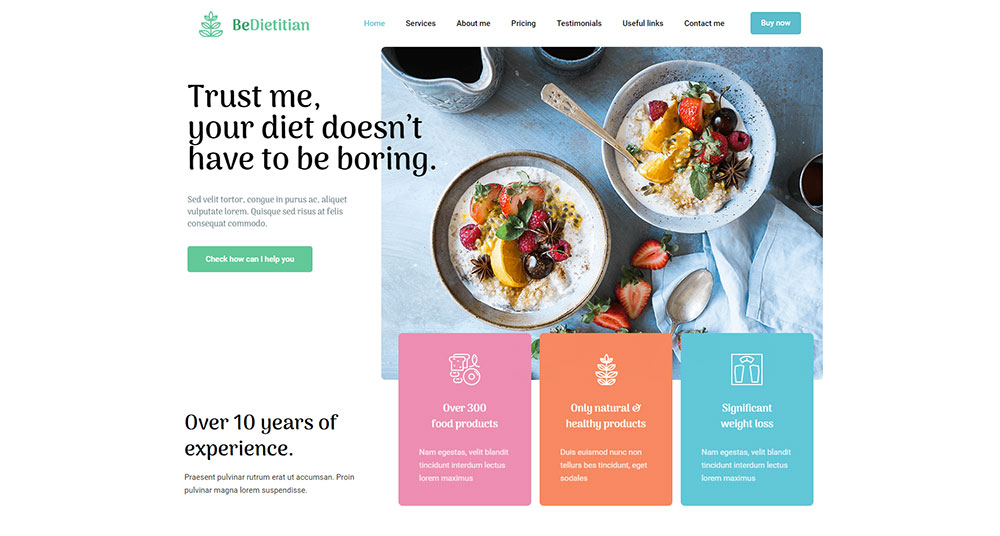
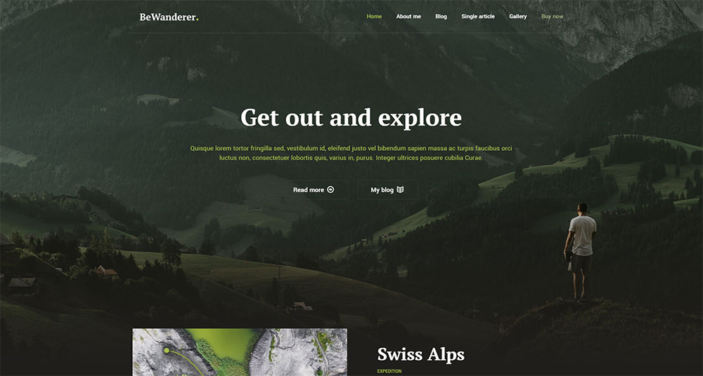
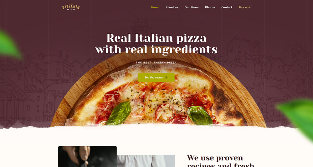
A Simple Solution Incorporating All 5 Best Practices – BeTheme
Keep it simple, keep it evergreen; and you’ll easily keep up with the top best practices, which tend to change slowly. An even easier approach that will also save you time and energy? It is to take advantage of what pre-built websites offer.
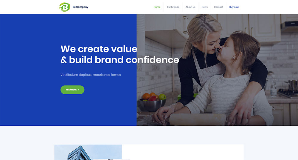
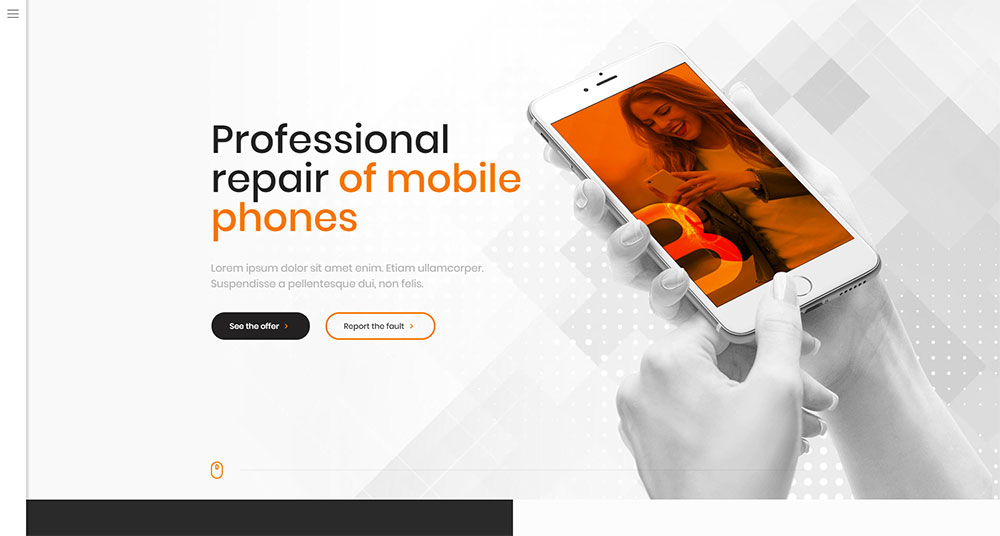
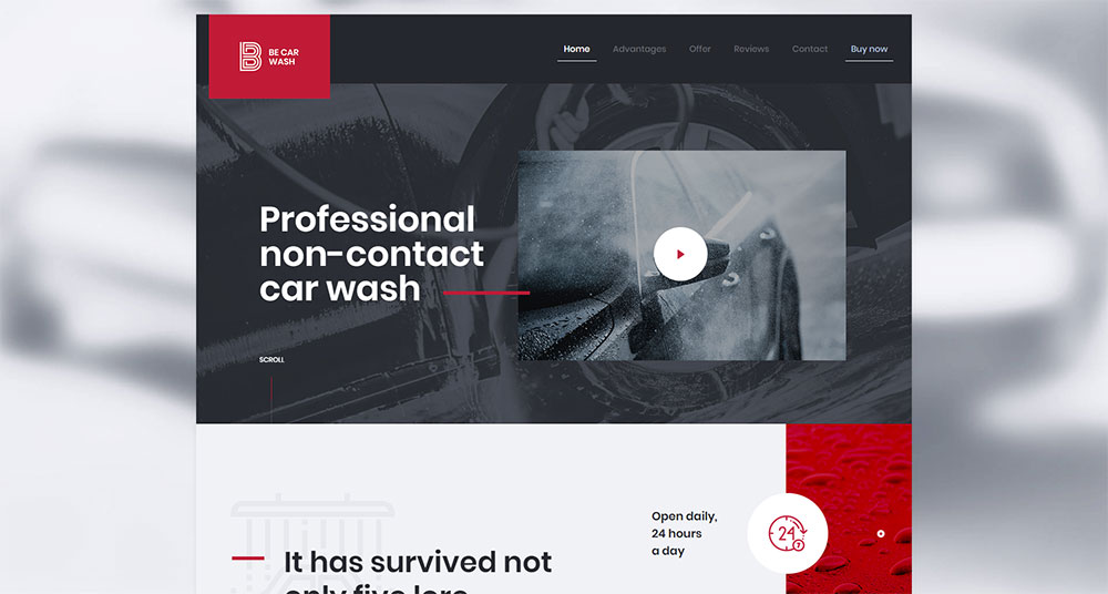
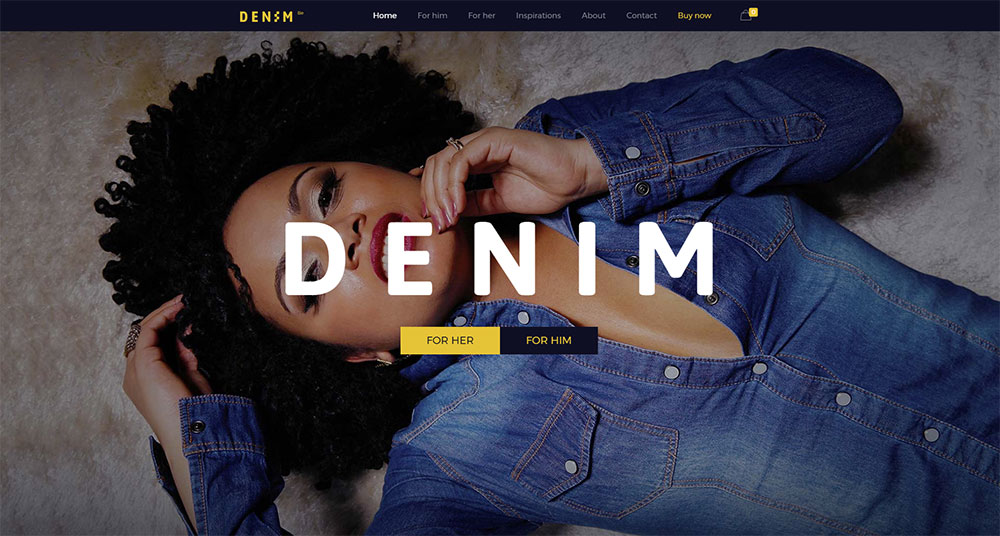
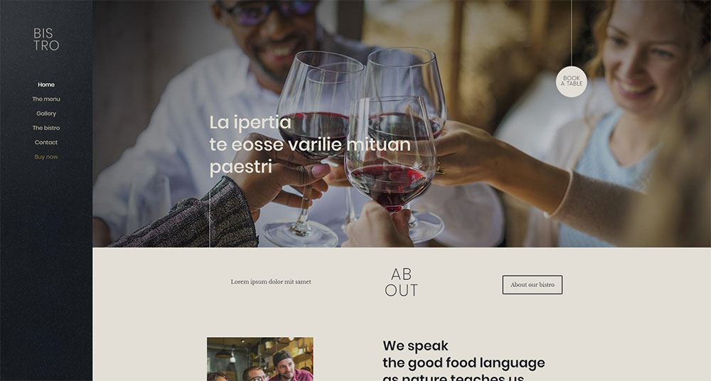
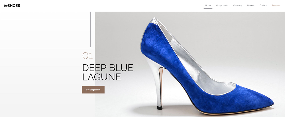
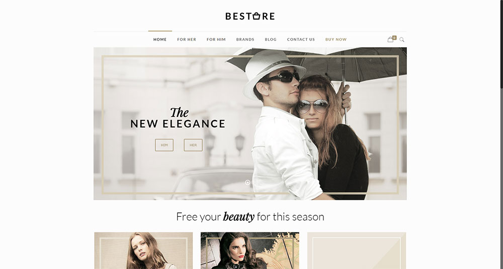
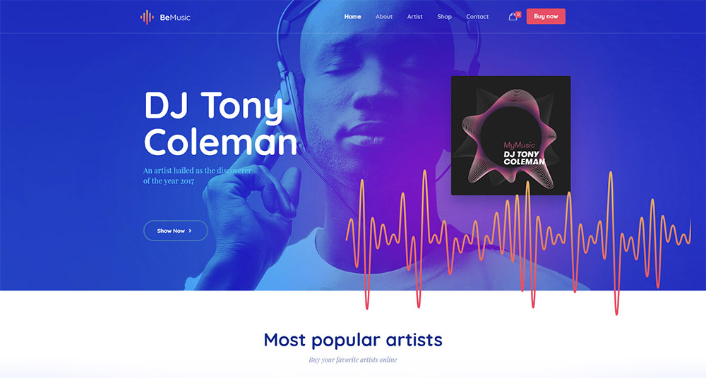
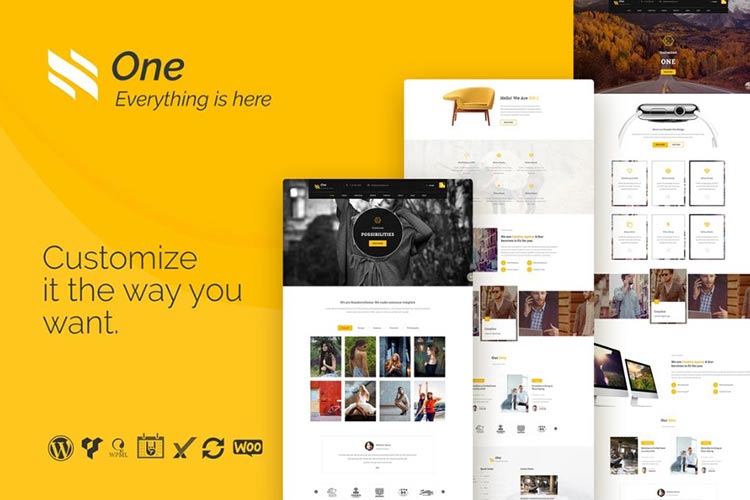
BeTheme has more than 320 pre-built websites. They have been carefully categorized by type and industry. The design of each is aligned with specific user navigation needs and expectations.
Summarizing:
A summary of what we’ve covered:
- Never fail to direct the visitor toward her main goal – on every page
- Make it a point to let the visitor know where she is, has been, and could go
- Use standard icons and lingo so the user knows precisely what to do
- Limit menu items to seven
- Base your menu type on the amount of your website’s content
- Use pre-built websites to ensure easy website navigation
This post may contain affiliate links. See our disclosure about affiliate links here.
