Today, we’ll delve into a creating tooltip with a retro gaming-inspired design that could add an interactive, fun touch to your interface. This guide will walk you through the setup needed to craft this unique tooltip and explain each step in detail. As a result, we’ll have a tooltip with a gaming-style font, harmonious colors, and smooth animations. Let’s dive in.

The HTML Structure
Let’s start with the structure. Our journey begins with HTML. This is where we craft the skeleton of our tooltip, using a simple button with an embedded span tag. The button triggers the tooltip, and the span tag houses the tooltip text:
<button>Hover Over Me
    <span>Hey! A retro gaming-style tooltip.</span>
</button>
CSS Styling
Next, we move on to the CSS styling, the core of our tooltip’s appearance and animation. Our CSS styling is broken down into four stages: General Setup, Button Styling, Tooltip Styling, and Tooltip Animation.
General Setup
/* Importing custom font for retro gaming feel */
@import url("https://fonts.googleapis.com/css2?family=Press+Start+2P&display=swap");

body {
  /* Centring the button */
  display: flex;
  align-items: center;
  justify-content: center;
  height: 100vh;
}
We import a custom gaming-style font Press Start 2P from Google Fonts for a retro gaming look. Then we style the body to center our button.
Button Styling
button {
  /* Making the button interactive and center aligned */
  display: flex;
  align-items: center;
  justify-content: center;
  position: relative;

  /* Styling the button */
  width: 16em;
  height: 3.2em;
  padding: 0 1em;
  border: none;
  border-radius: 3px;
  background-color: #f04e23;
  color: #fff;

  /* Applying custom font */
  font-family: "Press Start 2P", cursive;
  font-size: 1.8vw;

  cursor: pointer;
  outline: none;
  appearance: none;
}
We start by setting the button to flex and aligning the items to the center. The button is given a width and height, padding, and styled with a rounded border. We set the background color to red-orange (#f04e23), the text color to white, and apply the custom font. The cursor is set to pointer to indicate the button is interactive.
Tooltip Styling
span {
  /* Positioning tooltip relative to the button */
  position: absolute;
  left: 50%;
  bottom: 100%;
  opacity: 0; /* Initially hiding the tooltip */
  margin-bottom: 1em;
  padding: 1em;

  /* Styling tooltip */
  background-color: #303030;
  font-size: 0.6em;
  line-height: 1.6;
  text-align: left;
  white-space: nowrap;

  /* Setting initial state for animation */
  transform: translate(-50%, 1em);

  /* Making the changes smooth for animation */
  transition: all 0.15s ease-in-out;
}

span::before {
  /* Creating a triangle at the top of tooltip */
  content: "";
  position: absolute;
  top: 100%;
  left: 50%;
  width: 0;
  height: 0;
  border: 0.5em solid transparent;
  border-top-color: #303030;
  transform: translate(-50%, 0);
}
The span, which contains the tooltip text, is given an absolute position to enable it to be positioned relative to the button. The tooltip is hidden initially with opacity: 0;. The tooltip color is set to dark gray (#303030) to contrast with the button. The span::before selector is used to create a triangle at the top of the tooltip.
Tooltip Animation
button:hover span {
  /* Making tooltip visible and moving it upwards */
  opacity: 1;
  transform: translate(-50%, 0);
}
When the button is hovered over, the tooltip’s opacity changes to 1, making it visible. The transform property also changes; it shifts the position of the tooltip from its initial state (1em below the button, out of sight) to a new state (aligned with the bottom of the button, but appearing above it because of the absolute positioning). The transition property that we defined in the Tooltip Styling section ensures these changes occur smoothly over time, creating an engaging animation effect.
And that’s it! This should give you a button with a cool retro gaming-themed tooltip.
You can play around with the text, colors, font sizes, and other parameters to customize the look and feel of your tooltips to match your taste and preference.
The Final Result
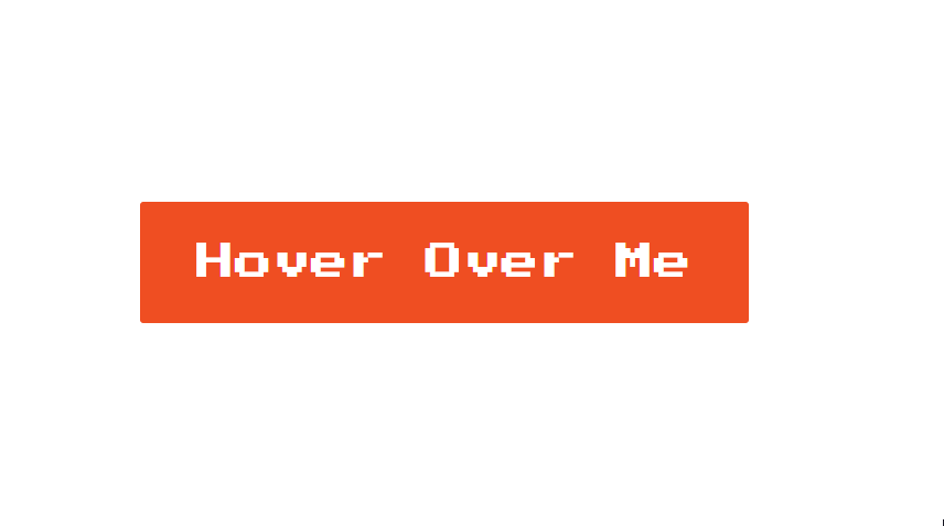
While this retro gaming-style tooltip is a fun addition, remember that it’s not an industry standard. However, it could prove great for personal websites or projects that allow for a more creative and playful interface. You should also consider the color contrast for visually impaired users and the tooltip’s mobile compatibility.
This post may contain affiliate links. See our disclosure about affiliate links here.