Most of us didn’t understand the real use of iPad but still we bought it. The touch keyboard wasn’t as quick as our laptops, still we used it.
A market came into existence and everyone was looking for “iPad compatible” design. Guess what, the keyword iPad compatible is already being searched over 50,000 times on Google every month if Google’s Keyword Tool is to be believed. And then there are multiple related keywords. It simply shows how important the iPad market has become for app designers.
(The usual) NOTE – This discussion will not teach you how to create a riveting iPad app. And, trust me when I say that “I am NOT covering the usual tips that have been covered a zillion times already on other blogs!”
All the Mobile UI Kits You Could Ask For
How Many Instructions are Too Many?
Personally, I hate apps that have a lot of instructions. What is the use of designing an app when you cannot keep it simple? If your app requires the end-user to read a thick user manual over and over then, my friends, you have just designed a flop app.
Remember that you give out instructions for your app users so that they get the feel and move on to the real app. Your list of instructions should never be a turn-off for app users.
So, avoid the usage of a “question mark” icon on every possible screen of your iPad app. Let the app be the instruction booklet in itself. Seriously, I hate apps with too many instructions!
Now, Don’t Confuse “Hints” with “Instructions”
You know what? Sometimes I feel bad when I get the feeling that my reader may have misunderstood me. Above, I asked you to avoid using too many instructions for people to be able to use your app. “Hints” are a different ball game altogether. Hints are a form of “positive poking” that helps the users move on when they are struggling. So, its good to give away hints to keep the app users interested.
WARNING – Never overdo your take-my-hint-and-move-on style in your app. The end-user might just lose interest.
Layout Must Change Comfortably With Orientation
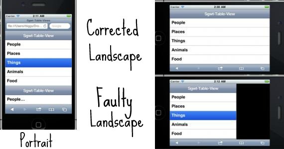
The image above says it all. In the case of orientation sensitive devices like iPad the layout of an app must not be broken with the change of orientation of the device. Though the broken layout might not hamper the productivity of the app, it is surely a turn-off for the end-user.
Who would want to use an app that does not understand the orientation of their iPad? It is like using an app which was never designed for iPad (or any other orientation sensitive gadget for that matter) in the first place. Consider checking out the Holy Grail of Mobile Layout.
Always Display the Username On Screen
This might sound weird, but with devices like iPad this is a must. iPad is the sort of gadget which will be used by multiple members of a family. I am not saying that iPad is always a family gadget, but in many cases it is. One family member uses the iPad and then another picks it up.
Who would want to use an app or an interface while someone else is logged into it? Worst case would be that you would never know if someone else is logged in until you figure out the data is not yours. Like the eBay app for iPad which won’t display the logged in user’s ID:
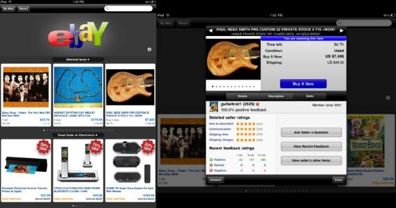
So, it is suggested that you clearly show the logged in user’s ID on every page of your app. It will help clear any sort of confusion and unwanted situations.
Never Overdo the Gestures
Users of iPad know that the device understands tapping and sliding. You don’t have to write it in bold and make it overly obvious. A slight mention of “Tap me for more” is all that is needed to keep the users looking for more.
You don’t have to explain to the end user what tapping means, how it can be done and what its advantages are. Don’t make it look silly.
The White Space..Pleeeease!
Don’t tell me that this is one of the obvious tips that has been discussed already. I have to discuss this over and over til you guys understand the importance of it especially in the context of iPad like devices. See, devices like iPad can stretch your design or make it look cluttered.
If you are creating an app especially for iPad then you can minimize the clutter, but what about the times when the app has to be updated every now and then?
Dynamically updated apps can sometimes break because of the different sizes of images that are pushed on a daily basis. So, design your app in a fashion that there is lot of free space available. It helps the user’s mind relax. Also, it automatically de-clutters the result.
iPad Hails Minimalism. So Should Your App!
Steve Job’s speech below has nothing much to do with the minimalist looks of iPad (and all other Apple devices) but somehow or other they all connect. I’ll be shocked if you tell me that you haven’t seen this video before. Which bunker do you live in?
One quick glance to your iPad and you will know how simple it is. The device is packed with extremely amazing technology but it doesn’t show off. Now, will you consider designing an iPad app that pops out of your gadget especially when the gadget itself is placed comfortablly in your hands? Follow minimalism and see how your app merges itself with the amazing iPad interface.
Touch is Good but Don’t Over-Use it
Quickly, check the image below before I start explaining what I want:

The CNN app for iPad features a sleek-looking navigation bar at the very bottom. This bar makes it easy for readers to quickly go through various stories and read whichever stories interest them. See how CNN minimized the usage of browser buttons by pushing the important content on one screen itself. It is good that iPad features a feather touch experience but sometimes too much slide and touch kills the experience too.
Make it comfortable for the end-user and see how they fall in love with your app!
This post may contain affiliate links. See our disclosure about affiliate links here.
