In web development, it’s often the small touches that enhance the user experience and make your website stand out. The :placeholder-shown pseudo-class in CSS selects input elements when their placeholder text is visible, offering a convenient way to distinguish between empty fields and those that contain user input. This allows you to create dynamic styling and improve the user experience by providing visual feedback.
Consider this concise example, where we apply a subtle effect to empty input fields.
Your Designer Toolbox Unlimited Downloads: 500,000+ Web Templates, Icon Sets, Themes & Design Assets

Constructing the Form
We’ll start by setting up the HTML structure for our form. Each input field includes a placeholder text and is assigned a class called .highlight-empty.
<form>
  <input type="text" placeholder="Enter your name" class="highlight-empty">
  <input type="email" placeholder="Enter your email" class="highlight-empty">
</form>
Applying Styles with CSS
Once we’ve established our form structure, we can move on to styling our input fields where the use of the :placeholder-shown pseudo-class is critical.
input {
  font-size: 0.9rem;
  margin: 10px;
  padding: 5px;
  width: 20%
}

.highlight-empty:placeholder-shown {
  border: 2px solid lightcoral;
  box-shadow: 0 0 5px lightcoral;
}

html, body {
  background: #333;
}

body {
  padding-top: 4em;
}

form {
  display: flex;
  justify-content: center;
  align-items: center;
  flex-direction: column;
}
Understanding the CSS Code
In the CSS code above, we’ve used the :placeholder-shown pseudo-class to apply a light coral border and a subtle glow to the input fields when they are empty and show the placeholder text. As soon as the user starts typing, the effect disappears, indicating that the input has been provided.
.highlight-empty:placeholder-shown {
  border: 2px solid lightcoral; /* Adds a light coral border to empty fields */
  box-shadow: 0 0 5px lightcoral; /* Adds a subtle glow to empty fields */
}
Other CSS properties applied include the styling of input fields (input), the styling of the body (body), and the arrangement of form elements (form). However, you’ll likely work within more complex structures. For instance, you might apply the input styles within specific form components instead of universally. Similarly, the form styles here are rudimentary. They’d usually be adjusted to match your website’s layout and design requirements.
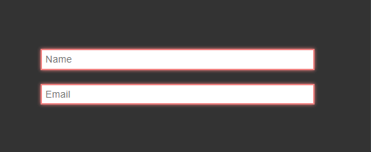
Exploring the Final Result
Check out the GIF below to see the result of this code in action.
To customize further, you can experiment with different border styles, colors, and box-shadow properties. In addition, you can combine :placeholder-shown with other CSS selectors, such as :not, to create effects for different input states.
💡Pro Tip: Note that :placeholder-shown selects the input itself, while ::placeholder styles the text. As a result, the styling of the placeholder text might be affected due to its parent-element relationship.
This post may contain affiliate links. See our disclosure about affiliate links here.