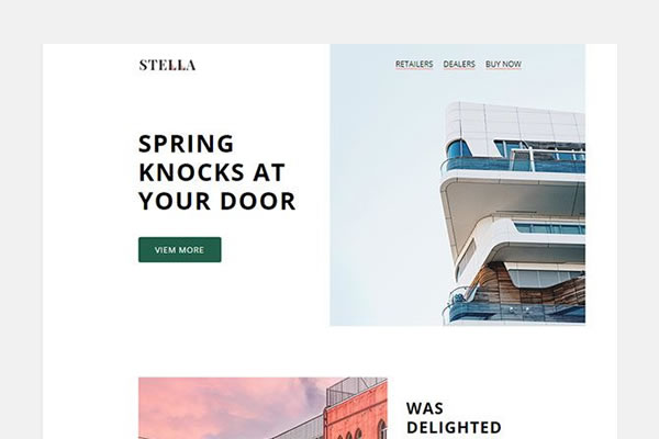
According to Campaign Monitor, mobile surpassed web and desktop client usage July 2012. As mobile email usage grows, web developers and designers must consider optimizing the look of their email newsletters on phones and tablets.
Email clients such as Outlook (Windows), Mail (OSX), etc. use different HTML engines. Many have different rules. That being said, some CSS might work while some might not.
Your Designer Toolbox
Unlimited Downloads: 500,000+ Web Templates, Icon Sets, Themes & Design Assets
So, in making an email template, it is highly recommended to use a different approach. Many email clients completely remove the head and strip out styles while some support a limited set of inline and internal styles for formatting. To many, an old-school table layout is the best way to go.
For your reference, read Campaign Monitor and Emailology.
Resources You Will Need to Complete This Responsive Web Tutorial:
- Pacifico Font (Google Fonts)
- Dummy Images Created in Photoshop
- Social Media Icons
- Time and Patience
If you’re looking for pre-coded responsive newsletter templates, take a look at this collection.
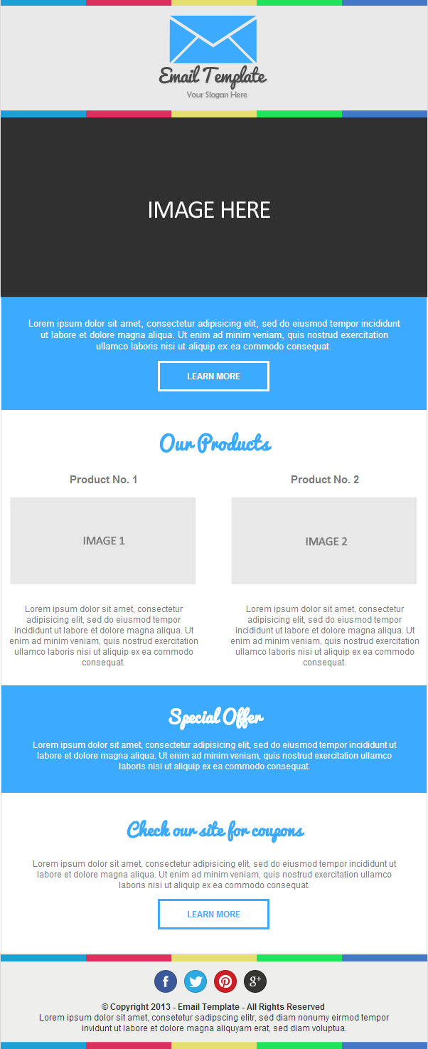
Our Final Product
File Structure.
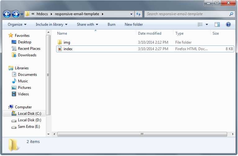
Our file structure will consist of an img folder and an HTML file since we will do internal CSS this time:
- index.html – this will serve as our main file
- img folder – for our image
The Markup: Building Design in HTML
Our HTML document starts with a DOCTYPE and then followed by HEAD, TITLE and BODY sections. Then, we’ll add the link to our Google fonts – “Pacifico.” We will also add the CSS later on in our HEAD section. So let’s go ahead and add this to our index.html file.
<!doctype html>
<html xmlns="http://www.w3.org/1999/xhtml">
<head>
<meta http-equiv="Content-Type" content="text/html; charset=UTF-8" />
<title>Email Newsletter Template</title>
<link href='http://fonts.googleapis.com/css?family=Pacifico' rel='stylesheet' type='text/css'>
</head>
For our body tag, we will set margins off and then we’ll put the attribute selector yahoo=”fix”.
To explain this attribute, let me give you quick information about Yahoo. According to Campaign Monitor, Yahoo! Mail ignores media queries. To solve this, we need to use a tricky solution by using attribute selectors.
By adding a value of “fix” to the Yahoo attribute, it can give me access to the general selectors of media queries. To learn more about this, you can check this article.
<body leftmargin="0" topmargin="0" marginwidth="0" marginheight="0" yahoo="fix>
For the layout structure, we will wrap the whole thing with a wrapper table and set the width to 100%.
<table width="100%" border="0" cellpadding="0" cellspacing="0" align="center">
Next, the header and the following table elements will be wrapped by a container with a 600px table layout. We’ll put a class of border-complete and put styles on the header on our CSS code later. The basic structures of the columns and inline CSS of elements such as the background color and width will also be added.
For our table and image elements, we will also add class device Width for the responsive look. Inside our header section, we will include two divider images and a logo.
<table width="600" border="0" cellpadding="0" cellspacing="0" align="center" class="border-complete deviceWidth" bgcolor="#e9e9e9">
Now that we have our header set let’s go ahead and add the banner image and the text markup.
For this part, we will be using the file img-banner.jpg on the resource that we provided above. The markup is just the same as the structure of the head except for the border. Instead of adding border-complete class, we will add border-lr class (this will add a border on the left and right only) along with the deviceWidth class.
<table width="600" class="border-lr deviceWidth" border="0" cellpadding="0" cellspacing="0" align="center" bgcolor="#eeeeed" >
<tr>
<td>
<a href="#"><img class="deviceWidth" src="img/img-banner.png" border="0" /></a>
</td>
</tr>
</table>
For the banner text, we will give it a height of 108px and align all texts to the center. The text will have a class of banner-txt.
<table width="600" height="108" border="0" cellpadding="0" cellspacing="0" align="center" class="border-lr deviceWidth" bgcolor="#3baaff" >
 <tr>
 <td align="center">
 <p id="banner-txt">Lorem ipsum dolor sit amet, consectetur adipisicing elit, sed do eiusmod tempor incididunt ut labore et dolore magna aliqua. Ut enim ad minim veniam, quis nostrud exercitation ullamco laboris nisi ut aliquip ex ea commodo consequat.</p>
 <a href="#" class="white-btn" align="center"> LEARN MORE</a>
 </td>
 </tr>
 </table>
For the products section, we need to align two columns. Go ahead and create two tables next to each other and give each column a 48% width. We will also add H2 and h2 tags along with their respective classes and then will, later on, add the styling on our CSS codes.
<table width="600" border="0" cellpadding="0" cellspacing="0" align="center" class="border-lr deviceWidth" bgcolor="#fff">
 <tr> <td align="center"><h2 id="our-products">Our Products </h2> </td> </tr>
 <tr>
 <td class="center">
 <table width="48%" border="0" cellpadding="0" cellspacing="0" align="left" class="deviceWidth" >
 <tr>
 <td align="center">
 <h2 class="our-products">Product No. 1 </h2>
 <a href="#"><img width="262" src="img/image1.jpg" border="0" class="deviceWidth" /></a></p>
 <p class="our-products"> Lorem ipsum dolor sit amet, consectetur adipisicing elit, sed do eiusmod tempor incididunt ut labore et dolore magna aliqua. Ut enim ad minim veniam, quis nostrud exercitation ullamco laboris nisi ut aliquip ex ea commodo consequat.</p>
 </td>
 </tr>
</table>
<table width="48%" border="0" cellpadding="0" cellspacing="0" align="right" class="deviceWidth" >
 <tr>
 <td align="center">
 <h2 class="our-products">Product No. 2 </h2>
 <a href="#"><img width="262" src="img/image2.jpg" border="0" class="deviceWidth" /></a></p>
 <p class="our-products"> Lorem ipsum dolor sit amet, consectetur adipisicing elit, sed do eiusmod tempor incididunt ut labore et dolore magna aliqua. Ut enim ad minim veniam, quis nostrud exercitation ullamco laboris nisi ut aliquip ex ea commodo consequat.</p>
 </td>
 </tr>
</table>
</td>
 </tr>
 </table>
The coupons section will just have the same layout structure like the special offer section but will have its own styling classes.
<table width="600" border="0" cellpadding="0" cellspacing="0" align="center" class="border-lr deviceWidth" bgcolor="#fff" ><tr>
 <td style="text-align: center;">
 <h2 id="coupons"> Check our site for coupons </h2>
 <p id="coupons">Lorem ipsum dolor sit amet, consectetur adipisicing elit, sed do eiusmod tempor incididunt ut labore et dolore magna aliqua. Ut enim ad minim veniam, quis nostrud exercitation ullamco laboris nisi ut aliquip ex ea commodo consequat. </p>
 <a href="#" class="blue-btn" align="center"> LEARN MORE</a>
 </td>
 </tr>
 </table>
The Footer will also have the same styling like the header part so go ahead and copy the styling of the header. Inside our footer, we will create another table for our social icons and give it an id of social-icons followed by another row for our copyright text. At the end of our footer, we will put a closing tag to our wrapper table.
<table width="600" border="0" cellpadding="0" cellspacing="0" align="center" class="border-complete deviceWidth" bgcolor="#eeeeed" >
 <tr><td width="100%" ><img src="img/divider.png" class="deviceWidth"/> </td> </tr>
<tr>
 <td align="center" valign="top" id="socials">
 <table id="social-icons" border="0" cellspacing="0" cellpadding="0" >
 <tr>
 <td><a href="#"><img src="img/fb.png" width="32" height="32" style="display:block;"/></a></td>
 <td><a href="#"><img src="img/twitter.png" width="32" height="32" style="display:block;"/></a></td>
 <td><a href="#"><img src="img/pinterest.png" width="32" height="32" style="display:block;"/></a></td>
 <td><a href="#"><img src="img/google.png" width="32" height="32" style="display:block;"/></a></td>
</tr>
 </table></td>
 </tr>
<tr>
 <td style="text-align: center;">
 <p id="footer-txt"> <b>© Copyright 2013 - Email Template - All Rights Reserved</b> <br/>
 Lorem ipsum dolor sit amet, consetetur sadipscing elitr, sed diam nonumy eirmod tempor invidunt ut labore et dolore magna aliquyam erat, sed diam voluptua.
 </p>
 </td>
 </tr>
<tr><td width="100%" ><img src="img/divider.png" class="deviceWidth"/> </td> </tr>
 </table>
</table>
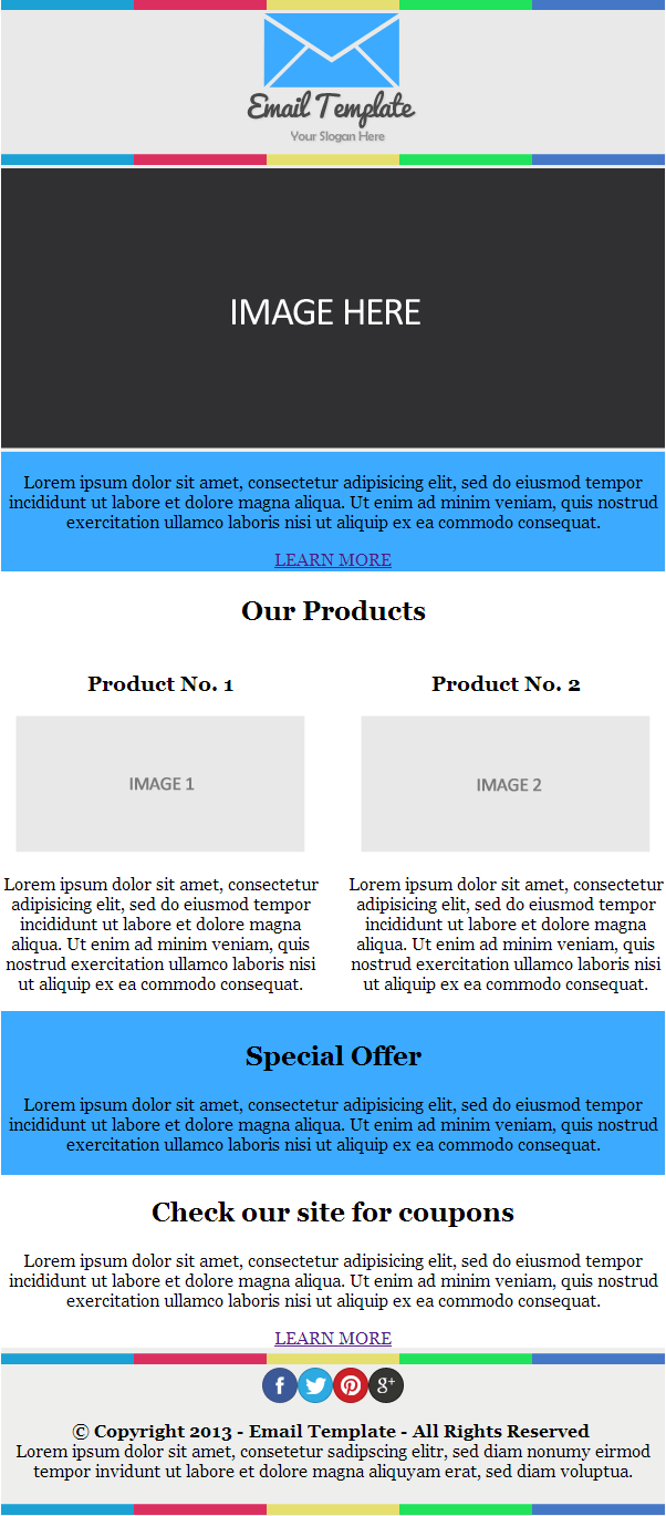
By this time, you must have something like this.
The CSS Tutorial Part
Now that we have our markup structured, we can now start adding different styles to the HEAD section to make it look good and responsive for desktop and mobile views.
Let’s first add stylings for our general elements, such as the body, image, buttons and tables. For our body elements, we will set this to 100% width for the responsive look.
For our table, we will set it to border collapse to set the tables whether the table borders are collapsed into a single border or detached as in standard HTML. This will be followed by the logo and buttons, which are fairly self-explanatory.
body {
 width: 100%;
 background-color: #fff;
 margin: 0;
 padding: 0;
 -webkit-font-smoothing: antialiased;
 font-family: Georgia, Times, serif;
 }
table {
 border-collapse: collapse;
 }
td#logo {
 margin: 0 auto;
 padding: 14px 0;
 }
img {
 border: none;
 display: block;
 }
a.blue-btn {
 display: inline-block;
 margin-bottom: 34px;
 border: 3px solid #3baaff;
 padding: 11px 38px;
 font-size: 12px;
 font-family: arial;
 font-weight: 700;

 color: #3baaff;
 text-decoration: none;
 text-align: center;
 }
a.blue-btn:hover {
 background-color: #3baaff;
 color: #fff;
 }
a.white-btn {
 display: inline-block;
 margin-bottom: 30px;
 border: 3px solid #fff;
 background: transparent;
 padding: 11px 38px;
 font-size: 12px;
 font-family: arial;
 font-weight: 700;
 color: #fff;
 text-decoration: none;
 text-align: center;
 }
a.white-btn:hover {
 background-color: #fff;
 color: #3baaff;
 }
For our border, we have two classes. The first one is the border-complete class that will set all the borders (top, bottom, left, right) while the second class border-lr will only set the border for left and right.
.border-complete {
 border-top: 1px solid #dadada;
 border-left: 1px solid #dadada;
 border-right: 1px solid #dadada;
 }
.border-lr {
 border-left: 1px solid #dadada;
 border-right: 1px solid #dadada;
 }
For our elements for H2, h2, and paragraph tags, we’ll just add styling for colors, text-align, and a series of padding to make them look good on the screen.
#banner-txt {
 color: #fff;
 padding: 15px 32px 0;
 font-family: arial;
 font-size: 13px;
 text-align: center;
 }
h2#our-products {
 font-family: Pacifico;
 margin: 23px auto 5px;
 font-size: 27px;
 color: #3baaff;
 }
h2.our-products {
 font-family: arial;
 font-size: 15px;
 color: #7c7b7b;
 }
p.our-products {
 text-align: center;
 font-family: arial;
 color: #7c7b7b;
 font-size: 12px;
 padding: 10px 10px 24px;
 }
h2.special {
 margin: 0;
 color: #fff;
 color: #fff;
 font-family: Pacifico;
 padding: 15px 32px 0;
 }
p.special {
 color: #fff;
 font-size: 12px;
 color: #fff;
 text-align: center;
 font-family: arial;
 padding: 0 32px 10px;
 }
h2#coupons {
 color: #3baaff;
 text-align: center;
 font-family: Pacifico;
 margin-top: 30px;
 }
p#coupons {
 color: #7c7b7b;
 text-align: center;
 font-size: 12px;
 text-align: center;
 font-family: arial;
 padding: 0 32px;
 }
For our footer, we will style our social icons and give it a width of 28%. The text will have a padding and an Arial font face.
#socials {
padding-top: 12px;
 }
p#footer-txt {
 text-align: center;
 color: #303032;
 font-family: arial;
 font-size: 12px;
 padding: 0 32px;
 }
#social-icons {
 width: 28%;
 }
By this time, you already have the same perfect look just like the PSD design.
Using Media Queries for a Responsive Look
To make our email template responsive, we will start adding some media queries for smaller devices. This is a technique to make HTML and CSS respond to the device width of the browser. So to do this, add the following code.
@media only screen and max-width 640px {
 body[yahoo] .deviceWidth {
 width: 440px !important;
 padding: 0;
 }
body[yahoo] .center {
 text-align: center !important;
 }
#social-icons {
 width: 40%;
 }
}
@media only screen and max-width 479px {
 body[yahoo] .deviceWidth {
 width: 280px !important;
 padding: 0;
 }
body[yahoo] .center {
 text-align: center !important;
 }
#social-icons {
 width: 60%;
 }
}
In this code, we use the Yahoo attribute that we put in the BODY tag to let us use media queries in Yahoo! Mail. On a 640px viewport, we will set the class deviceWidth to 440px and set the social media icons width to 40%. While on the 479px viewport, we’ll set the class deviceWidth to 479px and set the social icons to 60% width.
Final Thoughts
Congratulations! You now know how to optimize emails for mobile devices!.
This post may contain affiliate links. See our disclosure about affiliate links here.

