Over time, responsive design has matured quite nicely. In the beginning, it was just about providing something to accommodate different screens – even if it wasn’t all that great. But modern responsive design has unleashed a lot of creativity. Instead of thinking of small screens as a burden, many designers are finding new ways to embrace the challenge of creating something with both beauty and function.
With that established history, we thought it would be interesting to take a look at a few sites that are really at the forefront of great responsive design.
Here they are, complete with responsive views and some thoughts on what they bring to the table (or should I say, tablet?):
Your Web Designer Toolbox
Unlimited Downloads: 500,000+ Web Templates, Icon Sets, Themes & Design Assets

The Washington Post
One of the great challenges of responsive design is taking a content-heavy website and making it work on smaller screens. The Washington Post does a fantastic job of making the most out of whatever screen real estate is available.
While the desktop version takes advantage of a multi-column grid, the tablet (portrait) and phone versions handle the challenge of compressing content quite well. The dead-simple slide-out header navigation on small screens is to be commended for its ease of use. The experience is optimized for mobile while still feeling familiar.

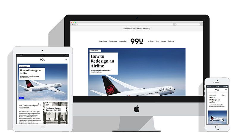
99U
99U is Adobe’s online magazine for creative professionals. One of the aspects to love about this site is the utter simplicity of its layout on any screen size.
The use of a light background and large black typography make everything easy to read from desktop to mobile. A unique feature to look for is that, on a mobile device, the site’s footer is actually hidden in the hamburger menu. This little trick saves some space and reserves it to maintain focus on the content.
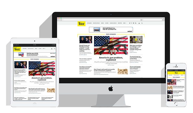
Vox
Vox is a news site that takes a bit of a different route with mobile navigation.
Instead of the ubiquitous hamburger menu, the standard text navigation bar shrinks down as the screen gets smaller. But instead of trying to squeeze several items in a small space, categories are gradually removed from the menu and hidden under a drop down menu called “More”.
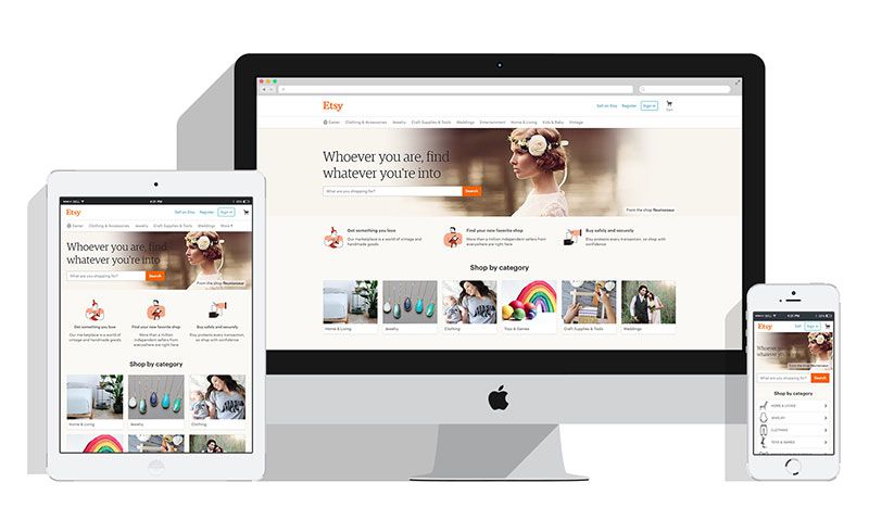
Etsy
Perhaps no one designs to their audience better than Etsy. The crafty marketplace does responsive right, as well. Among the mobile highlights is a header that gives you all the basics (a logo, links to Sell, Sign In and a Shopping Cart icon) in an incredibly clear and concise manner.
Their shop by category section transforms from multi-column photo cards to a clean, vertical icon menu. This is a great example of progressive enhancement at work.
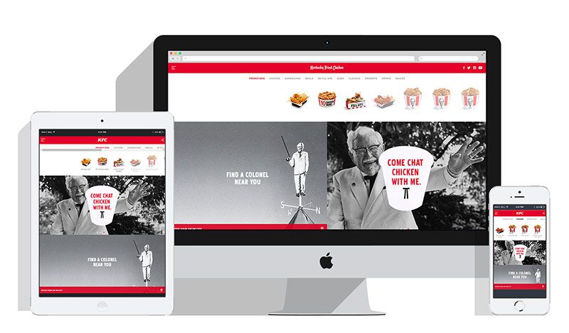
KFC
KFC, the finger-lickin’ good purveyor of chicken, has really done some outstanding work on their website.
The UX is incredibly consistent between different devices and screen sizes. The use of both a hamburger menu and horizontal scrolling on all viewports means that users will know exactly what to do – regardless of what they’re using to browse the site.
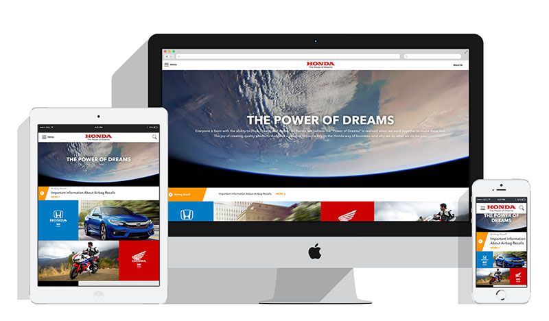
Honda
The maker of many things, Honda has several product lines and brands users may be interested in. Their use of color in each alternating banner makes it quite simple to find what you’re looking for (which looks particularly cool on tablets and phones).
Again, this is a site that brings a very similar experience on different viewports.
The National
Indie rockers The National make great use of screen real estate. In fact, their grid-style layout for news and information stretches across the entire width of an HD screen.
This type of layout lends itself well to going all-out on page width. Smaller screens get treated to a similar vibe, with the news items being listed side-by-side and still easy enough to read. This site is a reminder that responsive design also includes taking advantage of higher screen resolutions, not just making sure everything fits on smaller ones.

The Responsive Revolution
Looking at the sites we mentioned above, none of them are particularly revolutionary on their own. But each has their own interesting technique and philosophy for how responsive design should work (not to mention lots of challenges to overcome in getting there). They may not be revolutionary, but they are certainly part of the revolution.
This post may contain affiliate links. See our disclosure about affiliate links here.