Navigation forms a crucial aspect of any mobile application, and as such, it is vital that it’s implemented effectively in order to form an effective user experience.
Even apps such as YouTube have shown just how hard it can be to execute navigation perfectly, as they have continuously attempted different approaches with their Android app.
With that being said, below we are going to look at some examples of highly effective navigation in mobile app design.
All the Mobile UI Kits You Could Ask For

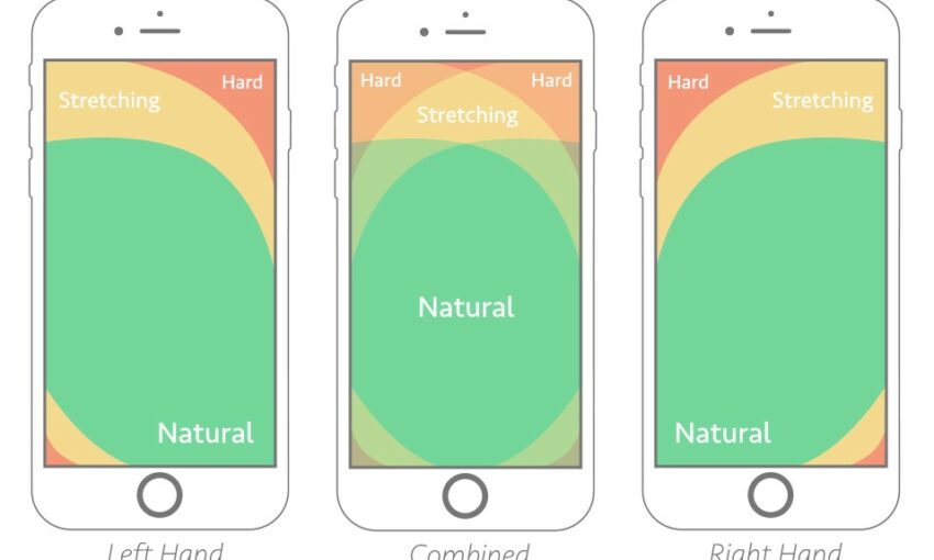
While not typically seen on Android apps, Instagram implements a tab bar at the bottom of the screen as opposed to the top, providing a cohesive cross-platform user experience with its iOS app. This also makes the key actions all within better reach of the user’s hand and allows them to access them without covering up any content.
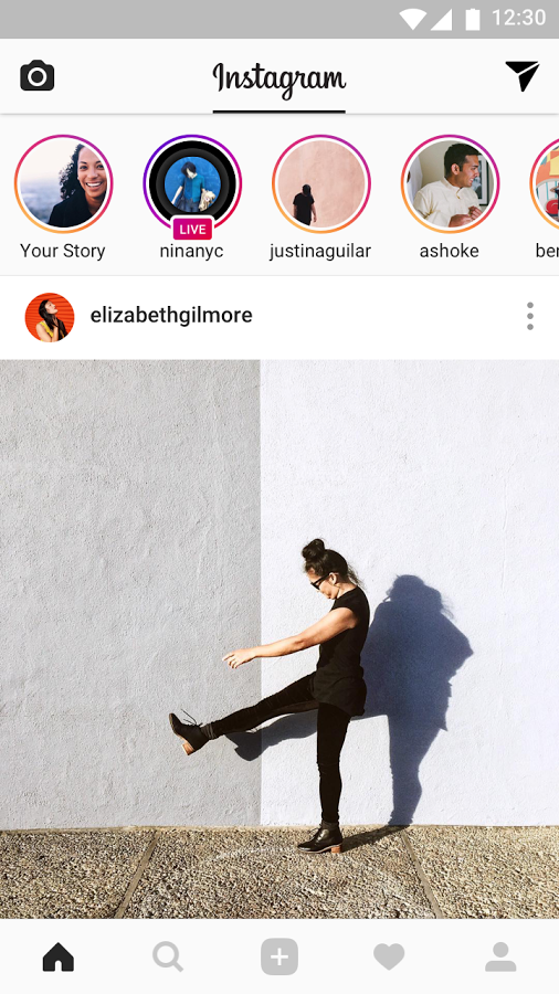
Where Instagram comes into its own is with its tab header. This ingenious solution allows for a swipe right or left to navigate the camera and send screens without compromising on spacing or the visual design language.
All screens are readily available and can be accessed in a single tap, unlike with hamburger implementations. The clear iconography allows for the removal of any tab labels, and the number of navigation icons is kept down to a minimum to avoid overwhelming the user.
Messenger
Messenger is another app which implements the tab navigation approach. This time the positioning is constrained to the header – a more typical Android implementation – and allows the bottom section to be kept clear for primary actions which in this case is the plus icon. The icons are clear, easy-to-understand, and again allow for the removal of labels resulting in a more refined and uncluttered visual experience.
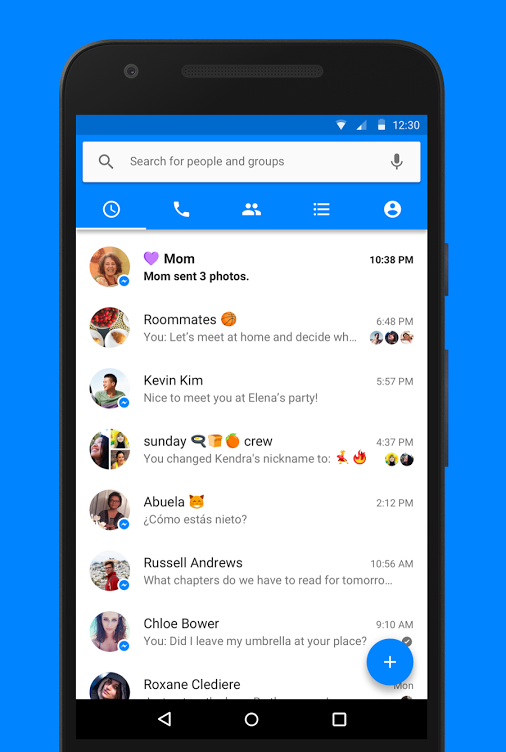
Messenger uses bottom borders to provide visual feedback for active tabs. While this is more typically associated with Android, iOS tends to use color and/or icon fills to feedback on these states.
Many apps which contain tab bars will often also include a hamburger icon on Android in order to access less often used items. The iOS equivalent is to add a ‘More’ tab. Facebook has managed to avoid this with Messenger and has refined the user experience and ease of navigation in the process.
From a visual standpoint, Messenger’s navigation is also very attractive, making use of brand colors, depth elements, and avoiding the display of titles throughout.
SoundCloud
SoundCloud is one of the finest examples of a simple navigation system. It has succeeded in reducing the number of tabs down to just three: Home, Search/Discover, and User. As such, the result is an app which is incredibly easy to understand and navigate. Where it could potentially have had up to five or more tabs, it has managed to merge a number of these.
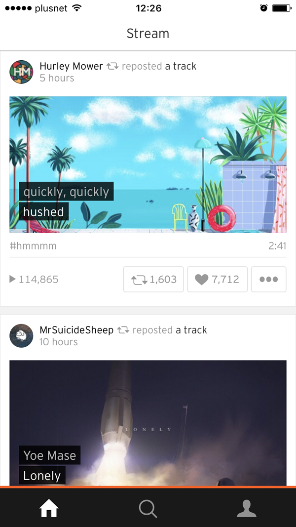
Another neat feature is how the play tab is hidden until you begin to play music. At this point, it subtlely appears to the right of the user icon and uses delightful animation to both alert the user it has been added, as well as to give feedback on whether music is currently playing or paused.
The navigation uses opacity to highlight active and inactive states and applies an orange top border to carry through aspects of the SoundCloud branding to the app. The icons are large, clear, and well spaced, resulting in a finely executed example of mobile navigation.
Finished
More and more apps realize the importance of navigation and the positive impact it can have on user experience. In Android, we see a shift away from the hamburger navigation to a sole tab bar. On iOS, more and more apps are removing tiny tab bar labels in place of large and clear iconography.
Through 2017, this looks set to continue and develop as designers seek to simplify app designs and improve user experience.
This post may contain affiliate links. See our disclosure about affiliate links here.