I recently had a request from a WordPress client for a star rating widget of sorts, so I thought I would share the solution I came up with using Advanced Custom Fields (ACF) and CSS. There are no images involved – just pure CSS plus Unicode stars and a handy range slider on the back end so the client can easily enter a rating anywhere from 0 to 5 in steps of 0.1. Thanks to a nice example I found on CodePen (seen below), the front end elements were easy and simple, utilizing CSS custom properties and variables in a compact code. Connecting this to ACF so the client could easily edit their ratings brought it all together in a quick solution that I have not seen elsewhere, thus the idea to make it available here in case anyone else is looking for something similar. Ready to dig in?
UNLIMITED DOWNLOADS: 500,000+ WordPress & Design Assets
Sign up for Envato Elements and get unlimited downloads starting at only $16.50 per month!

Coding The Stars
See the Pen
Tiny but accessible 5 star rating by Fred Genkin (@FredGenkin)
on CodePen.0
As you can see from the above CodePen, there is not much involved, yet it is a cleverly coded idea. This is taken from a great tutorial over on CSS Tricks, called “Five Methods for Five-Star Ratings”. The HTML below utilizes a custom CSS property (--rating) and makes no calls to the server while maintaining accessibility.
<div class="stars" style="--rating: 2.3;" aria-label="Rating of this product is 2.3 out of 5."></div>
The property is actually a conversion from a value to a percentage that’s handled in CSS using the calc() function:
--percent: calc(var(--rating) / 5 * 100%);
Then the filling of the stars based on the rating/percentage is done using a linear-gradient background that creates hard color stops at the percentage points that are designated.
background: linear-gradient(90deg,
  var(--star-background) var(--percent),
  var(--star-color) var(--percent)
);
In the CodePen example, the author uses CSS variables for the star size, color, and background. You can go this route if you want to be able to change those elements easily, or you can just code them in yourself if you have no plans to change them down the road.
background: linear-gradient(90deg,
  #fc0 var(--percent),
  #fff var(--percent)
);
Once the stars code is done, we can now make it work with the ACF range slider.
ACF Range Field
I’m assuming you are already familiar with Advanced Custom Fields, since you arrived at this article with it in the title. If not, you can learn more about the plugin here.
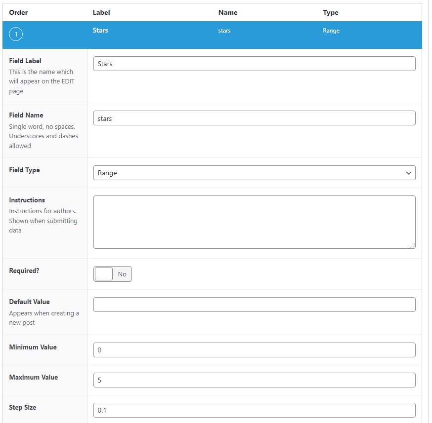
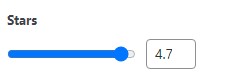
For our use case, we want to create a Range field so the client can select a range from 0 to 5 in steps of 0.1, enabling them to set the star rating at 4.7, for example.
In the WordPress backend, navigate to Custom Fields > Add New to create a new field group, then give it a title and click the button labeled Add Field to create the new field. Add the Field Label (we’re using “Stars” in our example), select the Range field type, set the Maximum Value to 5, and the Step Size to 0.1. You can make any other edits you see fit, but these are the minimum to get this working the way we want it to work.
After saving your changes, you can now edit whatever page, post, or template PHP file in which you want to show the star rating by entering the following code:
<?php
$stars = get_field('stars');
if($stars) echo '<div class="stars" style="--rating: '. $stars .'" aria-label="Rating of this product is '. $stars .' out of 5."></div>';
?>
This code replaces the HTML we were originally using, and now it will show the rating that is set on the backend when the Range field is updated. Pretty simple, right?
For reference, here’s the complete CSS that will make the magic happen (derived from the SCSS in the CodePen).
.stars {
    --percent: calc(var(--rating) / 5 * 100%);
    display: inline-block;
    font-size: 60px;
    font-family: Times;
    line-height: 1;
}
.stars::before {
    content: '★★★★★';
    letter-spacing: 2px;
    background: -webkit-gradient(linear, left top, right top, from(#fc0), to(#fff));
    background: linear-gradient(90deg, #fc0 var(--percent), #fff var(--percent));
    -webkit-background-clip: text;
    -webkit-text-fill-color: transparent;
}
This post may contain affiliate links. See our disclosure about affiliate links here.