SCSS is a powerful syntax of Sass that extends the capabilities of CSS, making it easier to create dynamic and customizable styles. To see this in action, we’ll demonstrate how to create a neat hover effect, which gives an appearance of being filled when hovered over. We’ll explain the implementation process, and customization options while providing context for the SCSS code.
Your Web Designer Toolbox
Unlimited Downloads: 500,000+ Web Templates, Icon Sets, Themes & Design Assets

The HTML Structure
Before diving into the SCSS magic, let’s start by defining a simple HTML structure for our button.
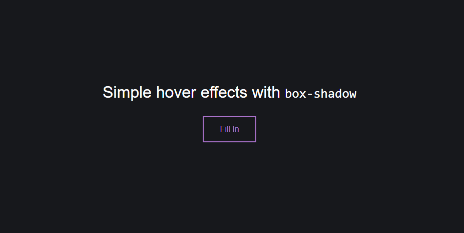
<div class="buttons">
  <h1>
    Simple hover effects with <code>box-shadow</code>
  </h1>
  <button class="fill"> Fill In</button>
</div>
In this snippet, we have a button element with a class of fill. This class will be used in our SCSS to define the hover effect.
Crafting the Hover Effect with SCSS
Now, let’s delve into the SCSS code and shed light on the key parts of our hover effect. Here, we apply various SCSS rules and CSS custom properties to create an engaging visual effect.
/* Base styling for the button */
button {
  --color: #a972cb; /* Button color */
  --hover: #ef6eae; /* Hover color */
  color: var(--color); /* Applying the color */
  background: none;
  border: 2px solid var(--color); /* Border with the color of the button */
  font: inherit;
  line-height: 1;
  margin: 0.5em;
  padding: 1em 2em;
  transition: 0.25s; /* Transition time */
}

/* Styling for button hover/focus state */
button:hover,
button:focus {
  color: #fff; /* White text on hover */
  border-color: var(--hover); /* Border color change on hover */
  box-shadow: inset 0 0 0 2em var(--hover); /* Inset box-shadow to create a fill effect */
}
The button selector defines the default styles for our button. We use CSS custom properties (--color and --hover) to set the color scheme for our button and its hover state. The transition property allows us to animate changes to these properties, creating a smooth fill effect on hover.
On hover or focus, we update the button’s text color, border-color, and apply an inset box-shadow to mimic the fill effect. This change is animated over 0.25 seconds as specified by the transition property in the button selector.
Rounding Up with Page Styling
For a better visual demonstration, we add some page styling. However, remember that these styles are tailored to this specific example, and in a real-world scenario, they should be adjusted according to suit your needs.
/* Page styling */
body {
  color: #fff;
  background: hsl(227, 10%, 10%);
  font: 300 1em 'Fira Sans', sans-serif;
  justify-content: center;
  align-content: center;
  align-items: center;
  text-align: center;
  min-height: 100vh;
  display: flex;
}

/* Heading styling */
h1 {
  font-weight: 400;
}
The body selector styles include the webpage’s font, text alignment, and color scheme. The h1 selector sets the font weight for the title.
Now, when the “Fill in” button is hovered over, we’ll see the effect in action.
Adapting this hover effect to suit your site’s aesthetic is as straightforward as modifying the --color and --hover CSS variables. Don’t forget to consider accessibility principles when choosing your color scheme, as the contrast between the button color and background color is important for readability. Rounded corners, set by the border-radius property, have been increasingly trendy and also contribute to better user experience due to their softer visual impact.
This post may contain affiliate links. See our disclosure about affiliate links here.