Most applications, either for mobile and tablet or beyond, rely on input from the user at least once. Actually, most of them rely on input from the user most of the time.
These users can only give us input via forms, and although they have been around for some time now, the majority of designers are still not able to design them properly.
The UX Designer Toolbox
Unlimited Downloads: 500,000+ Wireframe & UX Templates, UI Kits & Design Assets
Starting at only $16.50 per month!
Ask Only For What You Need
If there’s a thing you can do right away that is more important than anything else, this is it. I rarely fill in a form and think “this is spot on”; too rarely for a world in which UX designers pretend to be on top of their shit.
The shorter your forms are, the lower the drop-off rate. I know we’re not here to discuss conversion rates and how to improve them, but put your expectations aside for a while. This is important to know.
Endless studies show that the more information you ask from your users, the less likely they are to give it to you. This is why Facebook, Twitter and G+ created APIs that allow people to log in on different websites through their service.
It is called a social login. I’m sure you’ve seen the “Log in with Facebook” button more than once. Different sources mention that conversion rates improve with between 20 to 60 percent when signing up can be done a single click.
Don’t get me wrong. I am not implying this is what you should do. Actually, MailChimp advises against it, but the point is still the same: a single click on the sign-up button can be up to 60% more effective than filling in lots of details about yourself. It is similar to the 1-Click purchase on Amazon, which is clearly worth billions.
Back to the point. The less information you ask for, the higher your chances will be that users will sign up. What’s the most frustrating is that most of the time you don’t even need that much information. Are you selling a digital product? Don’t ask for my physical address; you don’t need it. Are you selling a pair of shoes? E-mail for order confirmation, address for shipping, and credit card information for payment – that’s it. You don’t need anything else.
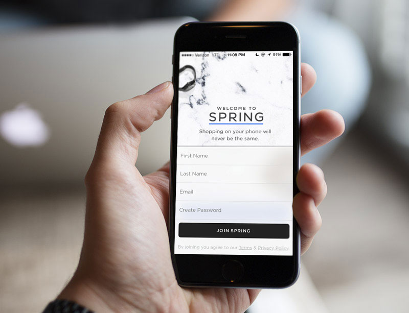
If you want to join Spring on the iPhone, they only ask you to fill in four fields. Quick and easy.
It’s frustrating to see how many e-commerce experts just don’t get it. If you rather risk losing me for some extra piece of information (which you might use later to upsell me), you should drop off this design career of yours. Once you lost me as a potential client, not only am I not coming back, but I will buy from your competition, which in the end will harm you. Don’t drive me away by asking for more information than you need.
In case you would like to have more information about me, but you don’t really need it to sell me something, ask for it after I’ve signed up or ordered a product. When you already have my money in the bank, you can ask me for whatever you want. I may not want to give you any further information (some will, though), but at least you didn’t lose a sale.
This is a step that you can go and do right away. This should be the starting point for improving your forms: ask only for what you need.
Stick to a Single-Column Layout
If you want to keep your customers off confusion, make sure you stick to a single-column, vertically aligned input fields. This way the users will not be confused about which field is to be completed next. If you have a two-column form, they could either complete it by column or by row. Which is the right way? Nobody knows.
If you only have an input field per row, there is no confusion. The speed of the process will be higher and the confusion, hence the frustration of the user, will be lower. This also reduces eye movement because users don’t need to do any jumping and only need to look one way: down.
Fine-tune Your Labels in Contact Forms
Labels are also a crucial factor. Without them we would not be able to understand what needs to be filled in and this would clearly render our forms useless. There are several ways of showing the labels, but there are also some guidelines you need to stick to.
First, always keep your labels outside of the input fields. This is an issue when labels are inside the user fields and disappear whenever the user clicks on a field. Users should always be able to see what needs to be filled in. The fact that the label disappears whenever the field is active does not make it easy for users.
If you don’t have a lot of vertical space, keep the labels to the left of the input fields. Otherwise, you can always have them on top of each field. When you have the labels on the left, always align them to the left. This makes it easier for the human eye to quickly scan the form. If you are designing for the Western world, keep this in mind. We read from left to right, so it is clear that we prefer hard edges along the left.
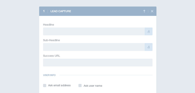
In this case, the designer chose to keep the labels on top of the field.
Separate related content
Although your form is long, you can make it look better by using colors and other visual elements. This is what the principle of proximity refers to. Several elements that are placed close to each other indicate to the human eye that those elements are somewhat related. This makes sense for forms that are longer than your usual 3-fields sign-up process.
If you structure your forms in this way, it will make them look organized and clean. Whenever you have a group of input fields that can be grouped together, make use of a thin horizontal line to unite related data. You can also use a light background color to create the same effect.
Indicate primary & secondary actions
In forms you always have a primary action, the one you want the user to take, and a secondary one, which can be a “cancel” or a “back” button. That’s the one you don’t want your users to click on unless they really have to, but it still needs to be there. You can’t give both buttons the same weight and importance.
The solution is to design the two buttons in a different way so that the visual impact of the secondary action is minimized. The “Cancel” button should not be given equal status to the primary action because it is not as important. This also guides the user towards what you consider the successful action.
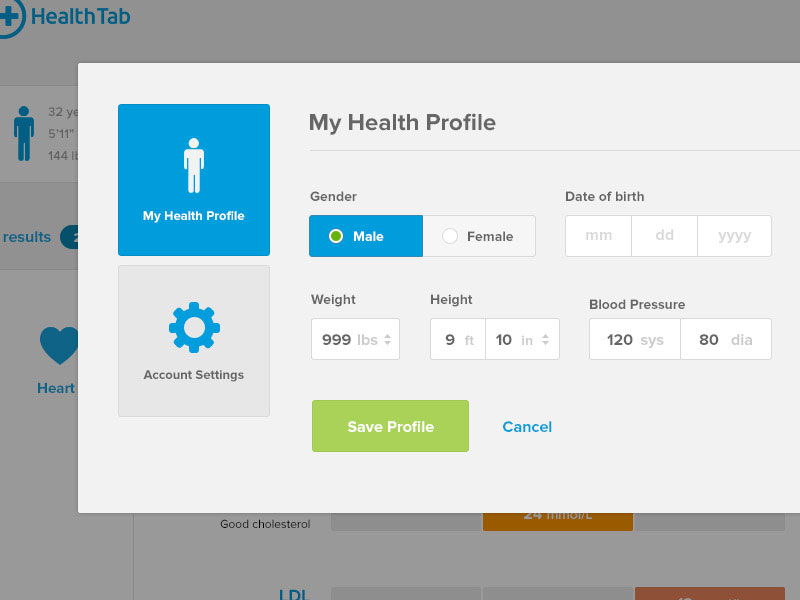
The primary action is in focus here. The human eye is drawn by it and not by the “Cancel” button.
Optimize Your Contact Forms For Mobile
Although there are countless web forms on the web and lots of UX designers out there, there is a frighteningly high amount of forms that are not optimized for mobile.
This is a biggie in a world where mobile takes over.
Optimizing forms for mobile means reducing the effort the user has to put in. Even a change as small as indicating the type of keyboard you want to pop up for each field can make a huge difference. What’s frustrating about this is that optimizing for mobile only takes a few lines of code in some cases, but developers don’t always do it.
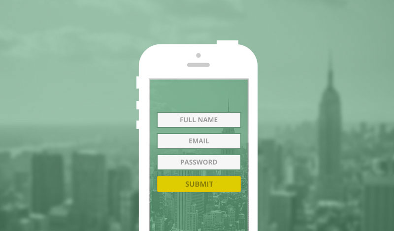
Indicating the type of keyboard that matches each field is a good starting point. If you have to fill in credit card digits, don’t make the standard keyboard appear, but the digital touchpad. You might think “Yes, this is common sense, why do it differently?”, but most designers tend to ignore this detail for whatever reason.
During check-out processes, it’s important to note that I, as a user, have the credit card in my hand. I am on the brink of handing you my details and giving you access to my money. This is a place where your system can’t give me the slightest sign of weakness because the probability of me dropping off is huge. When the user has a credit card in his hand and is willing to pay, the experience has to be flawless.
This is what differentiates the big fishes from the small ones.
Many times, system automation is the solution to user frustration. You can quickly develop some “hacks” that will make my experience ten times easier. Luke Wroblewski from Google explains in the video below how easy it is to reduce my effort as a user. Take a look.
#
Reduce Errors In Your Contact Forms
There is a lot you as a designer can do not only to reduce errors, but also to handle them and guide the user through when they happen. There is a number of interaction design patterns that can be taken advantage of for better error handling.
Validation is a key word for reducing errors. If you validate inline, you don’t give users many chances of being wrong. A good validation will automatically indicate to the user that he only wrote 15 digits instead of the 16 a credit card has, that the email address ends in “.xom” instead of “.com” and that not all the required fields have been completed.
The system will therefore not allow the user to click on “next” or “submit” unless he rights the errors. The advantage of using inline validation is that feedback is instant. The user will immediately know something is not right and will fix it. If you first return the form with errors after it is submitted, you risk frustrating the users.
Inline Contact Form Validation – How?
Inline validation has its own guidelines. You always need to be good at handling errors and giving users spot on feedback, but it is even more crucial when you validate forms instantly.
Letting the user know something is wrong can be a tricky one, but nothing good code can’t solve. Showing “error” as a message and highlighting the field with red is not enough anymore. Error can mean anything nowadays. Is the formatting wrong? The email? The length of the password? Did I forget to fill in a required field? Let me know what the error is if you want to reduce my effort. As Steve Krug said in his book, don’t make me think
Let me know what the specific error is and I will be able to fix it without any effort. If you make it easy for the user, the user will be more willing to go past the mistake and still give you his information, whatever information that is.
Forms with real time feedback score better at completion rates and customer satisfaction and decrease errors with up to 22% – Luke Wroblewski
Input masks are also something that you might want to make use of. They are most of the time used successfully on portable devices, but this is not an excuse for not taking the same approach to desktop forms too. Input masks don’t only prevent errors, but indicate what the correct format for an answer looks like.
You can quickly indicate what the valid formatting looks like via input mask and you can keep the formatting consistent by letting users know they are formatting the input right.
Input masks also help to collect only the information needed. If an input mask is correctly added on a field where the user has to type his credit card information, the mask will force the system not to collect any other input than digits. This means that if you, by mistake, tap on “space” or “slash”, the field will simply ignore it.
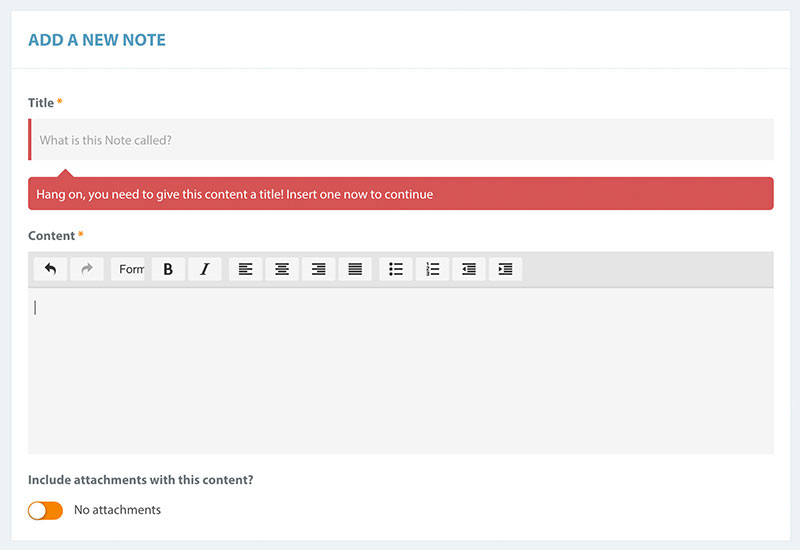
This is how an error should look like. Moreover, it also has a bit of a personal touch to it.
Reformatting the input from the user is also something you could do with a few lines of code. This means that regardless of how the user fills in his credit card information (with spaces or not), the system will (re)format it the right way.
This is the right way to implement inline validation and, trust me, sticking with it will only improve the experience you offer via your mobile website or apps. As mentioned earlier however, don’t only do this on mobile. Inline validation is something you can make use of on all devices regardless of their screen size.
If you choose not to validate inline, that’s fair enough. Keep one thing in mind, though: when on the error page, always prefill the fields that I’ve filled in correctly. Just because the email address was wrong you can’t make me write everything all over again. That’s just laziness on your side.
Helping Hints
If you want to further ensure that users have minimal chance for mistakes, use helping hints either to the right of the field as a secondary label or in the field as a placeholder. This is okay to use as a placeholder because it is not critical (as the label is), so it can disappear when the field is active without it feeling uncomfortable. This way you can guide the users to filling in the correct information. This will not only decrease the number of errors, but will also increase the completion speed by a reasonable margin.
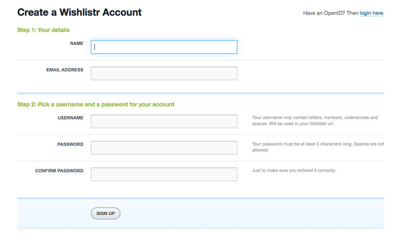
Wishlistr shows labels to the left and helping hints to the right of the field.
These helping hints can be shown in different ways, including as tooltips. This is also a good way of doing it, especially if you have limited horizontal space at your disposal.
Drop CAPTCHA
I know this might sound weird. Why would you drop a feature that should decrease spam? Because it’s annoying. I will not delve too much into it, but there are few things on the web I hate more than captchas.
There are forms in which it makes sense, but not all the time. As long as users have to fill in credit card information, you don’t need captcha. If there’s a credit card involved, it’s not likely that robots are involved.
Wrap Up
Contact forms are one of the web elements that can constantly be improved. When discussing contact forms, all bets are off. It depends so much on the audience and every set of forms you design has to match your audience and their needs.
But in every single case there are a few tips and tricks you can implement in order to offer a better experience. As a starting point, you should always optimize according to these tips.
This post may contain affiliate links. See our disclosure about affiliate links here.


