For most of us, the checkout process of a website means nothing more than just something we need to go through in order to buy something online. For eCommerce experts, however, the checkout process (and more importantly, the conversion rate drops) are nightmares that keep them up at night.
Improving the conversion rate with a minimal 1% can actually turn out to be a huge increase in income at the end of the month.
Optimizing conversion rates is a job of its own. It is very unlikely for a web designer to be an expert at it, considering marketing professionals spend years learning to improve them and many of them still don’t get there in time before the web trends change.
I will be honest with you right from the start: there is a lot of hard work behind learning how to work in this area and getting good at it. The good part is that there are not many web designers out there who are. If you get good at it, you will have a huge advantage over your competition.
Limit the Clicks
Cutting the checkout process to a limited amount of clicks can’t do anything else than increase the conversion rate. It is common sense that users, whenever they hold their credit card in their hands, are very sensible. The smallest detail can make them put the card back in their wallet and leave. If there is something you take from today’s article, it’s this:
If you want users to buy, you have to make it easy.
Now repeat this in your head a couple of times – if you want your users to buy, you have to make it easy.
There have been multiple studies (like this one or this one) showing that single page checkouts have higher conversion rates. You might argue that the “single vs. multiple-page” debate is counterproductive unless you know your audience.
I would disagree. Regardless of who your audience is, no one would rather have to go through a more complicated checkout process. No one. If you limit the amount of clicks and make it easy, you are better than many of the competitors out there.
Choosing a single-page funnel is without any doubt best and there is no better way to prove this than looking at the A/B tests that were done previously.
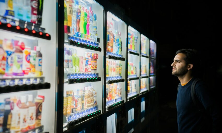
Simple check-out process on Dribbble
Don’t Ask Me to Sign Up
You found a nice product within a decent price range. You research it online and get ready to buy it. You go to their website and add it to cart. You click on “buy”. And then they ask you to create an account if you want to buy the product.
But I don’t want to create an account only for the sake of being in your database and you having access to my mail. I just want the product. No upsale, no newsletters, no marketing targeting me. Just give me the damn product.
If you don’t want my money, there is no easier way to let me know than asking me to sign up in order to buy. This is one of the things that makes me cringe. Many years ago I was looking for a fitness tracker. There were not so many of them on the market as there are today.
When I finally found the right one (which was also one of the few and the only decent choice), I headed to their website to buy it. They asked me to sign up. I didn’t. Today, I’m using a product from their competitor.
You should always allow users to buy without signing up. If you really want them in your database for whatever reason, there are two options of doing it. The more aggressive is creating an account at every purchase with the email and a random password. When you send the order receipt per mail, send the account information as well. If the user opts in, that is his choice! You don’t force him to do anything he doesn’t want to.
The second way of approaching it is asking users to create an account on the “thank you” page, after they purchase. Most of them won’t, but if you show them what the benefits are, some might. Tell them, for instance, that they can track their order if they create an account. That’s an added benefit. I would sign up (albeit with my “spam mail”) just to be able to track the package.
Another good reason for doing it after the purchase is that at that point in time you only need limited input from the user: the password. You already have everything else. If you ask them to sign up at the beginning, they will feel they have to give you a lot of information. But if you delay the signing up, it won’t feel the same, because users only need to type in a new password.
Regardless of how you do it, always give the user a choice. Don’t put him in the corner and ask him to create an account if he wants your product. You should be thankful he is willing to buy it in the first place. Don’t try to stop him. In the end, you might miss on a lot of money.
Free Shipping?
If your web shop offers free shipping, this is a biggie. “Free shipping” are probably the two words that brought most revenue to online sellers in the past decade.
For whatever reason, a free shipping offer that saves a customer $6.99 is more appealing to many than a discount that cuts the purchase price by $10 – David Bell
Statistics show most people leave products in a cart without buying them because shipping and handling costs are too high. A well-known study from UPS shows that a whopping 44% of the users who didn’t finish a purchase chose not to do it because of these costs. Just imagine being able to sell to so many more people, your income would go through the roof.
If you offer free shipping, make sure to highlight it during the checkout process and during the final confirmation (if you choose to have one). If you don’t offer free shipping, you might want to A/B test it for a couple of weeks to see how much your income grows.
Free returns and secure payments are also two elements you could emphasize during the checkout process. While many people already know how to look for a secure connection, some still don’t. They will always be afraid that someone will steal their precious credit card details, so making it obvious to them that this is not likely to happen can only help you and your conversion rate.
Nail the Forms
As I recently wrote in my latest article, unless you create amazing forms that improve the experience of the users, you won’t have much success with checkout processes.
Conversion funnels rely heavily on input from the users. Frustration, which is a thing I often find myself feeling when having to fill in a form, is not something you want your users to feel when they sit with their credit card and are ready to purchase.
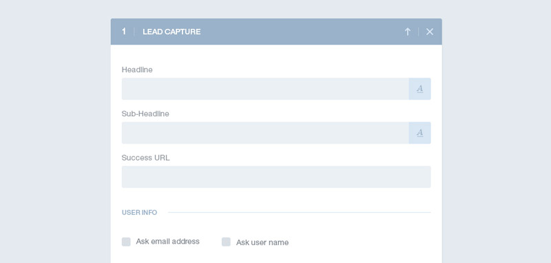
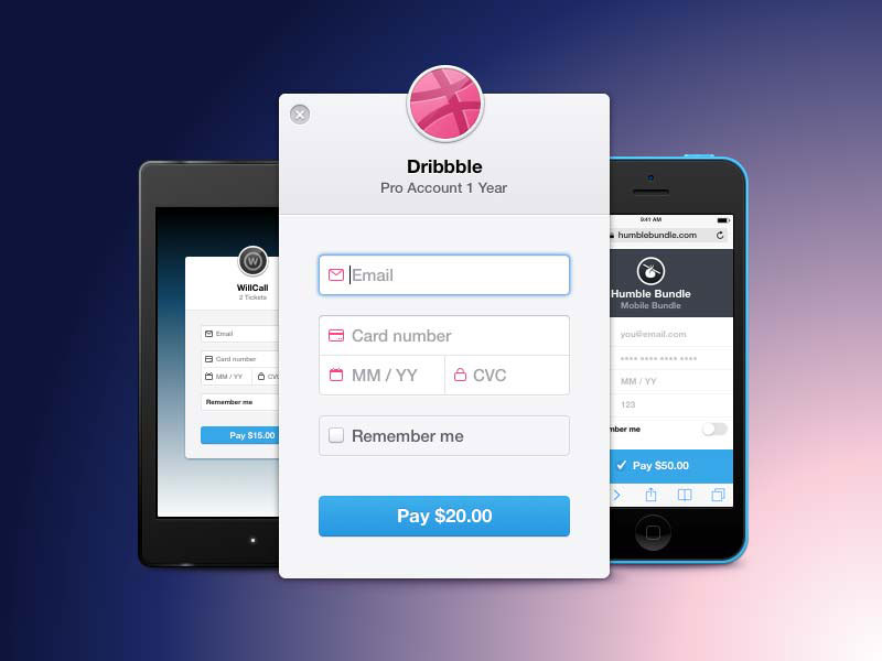
Forms are an important part of the check-out process
You should take a look at the whole article, but for the sake of making it easier for you, I will summarize here what is important when you try to improve your forms.
Ask only for the information you need. In Europe it is actually illegal to ask for more information from the users just for the sake of having it. If you don’t use this information for purchase-related operations, not only it might bring you legal issues, but it will also annoy your users.
Fine-tuning your labels and sticking to a single-column layout are two other tips that I speak about in the article. They are also really important for increasing the speed of completion.
You need to optimize your forms for mobile, no doubt about it. Keep in mind that a lot of purchases are made from portable devices and unless you create responsive forms, you will not be able to sell to as many mobile users as you could.
Have I added the product to the cart?
Noticeable microinteractions can make or break your eCommerce website. For instance, always let a user know he added a product to the cart. You would be surprised to learn how few websites are good at this.
Don’t get me wrong, most of them try to let the user know, but it doesn’t always work as well as it should. It should be as obvious as it can get that they’ve added something to the cart.
When a user adds a product to the cart, she should be able to quickly move on to the checkout page, but you shouldn’t force her to. If she wants to continue shopping, let her do it. This should be the default setting, but always keep the “checkout” page at a click’s distance.
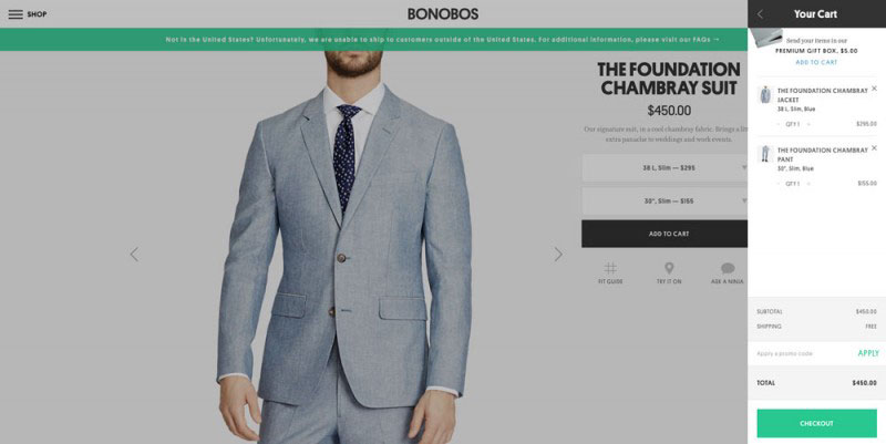
On this webshop you are not in doubt about what you’ve added to your cart or about how to purchase.
Persistent cart
If a user added something to the cart but never got herself to buy it, you would really be stupid if you let the cart expire or clear itself on refresh. Studies show that if you persist and retarget them with ads, users will come back and pick up where they left off. Moreover, they might even be happy that you remembered their cart. The reasons behind them leaving can be different.
Some might not be sure about the price, while others might have been caught in the middle of a busy day and simply forgot to checkout. You can never know. Trying to persuade the user to finish the payment process can’t do much damage, but it can increase your conversion rates a lot.
Ask for Credit Card Information Last
Another small trick you can use during the checkout process is asking for the credit card information last – after the name and the address. This might not make too much sense, but Cialdini’s principles of persuasion show that users feel they need to finish something they started. Some users might be reluctant to put their credit card information first, but if you ask for their name and address and they give them to you, you might get closer to a sell.
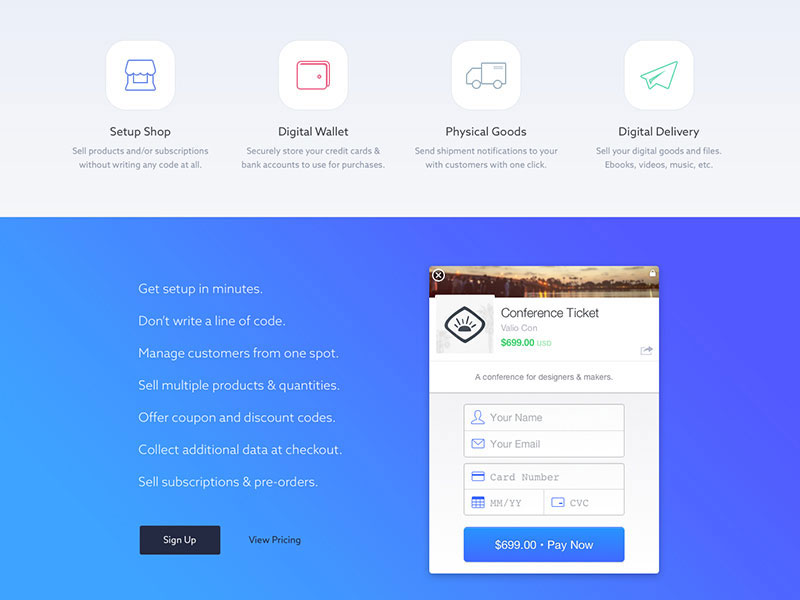
Plasso asks for the name and e-mail first and only afterwards for the credit card info.
Testimonials
Conversion rates are not only about design though. Sometimes other small details can increase them by a large margin. One of these details are the testimonials, which are very useful and powerful for when users are not sure if they want to buy a specific product.
Testimonials always have the power of convincing a user that a product is worth paying for. You need to employ this carefully, though. Just as positive testimonials can increase the conversion rates, negative testimonials can also decrease them.
Great Search Functionality
If you want to make it easy for your users, as I mentioned before, you can at least implement a decent search function. This is often a pain point for users. They often search for products and are not able to find what they are looking for because the search function is poorly implemented.
A good idea for the ones who still don’t get it is to show users what they search for. Many search engines show related products instead of the ones that users search for and this is annoying and a waste of time.
Windup
eCommerce is about much more than having a good set of products to sell. Users are so complex that it is impossible to sell to all of them, but there are a few tips and tricks you can follow to improve your conversion rate – sometimes by a lot. Today we took a look at the most valuable tips and tricks for eCommerce checkout processes.
If you follow these best practices you should be on your way to improving your conversion rates by some percents. It might not sound a lot in the beginning, but remember that even a single percent can mean a lot in income if you have a large webshop.
This post may contain affiliate links. See our disclosure about affiliate links here.