Calendar apps are synonymous with mobile devices; their importance is hard to measure given how integral they have become since the introduction of the Android and iOS ecosystems over a decade ago.
Since then, the calendar and planning category of mobile apps has attracted large numbers of users and considerable investment by startup companies. In turn, calendar apps have been subject to some of the very best creative and UI/UX input from some of the world’s top designers.
In this article we are going to look at some of the most impressive and stunning examples of calendar app designs across both the Android and iOS ecosystems.
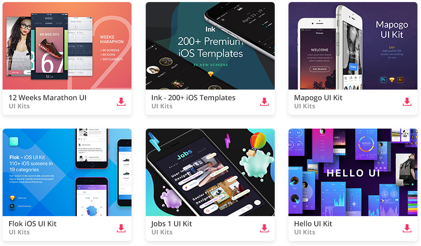
All the Mobile UI Kits You Could Ask For
N-calendar
N-calendar incorporates beautiful visual design with gradients and excellent contrast to produce a calendar app which is highly unique yet intuitive and exciting to use.
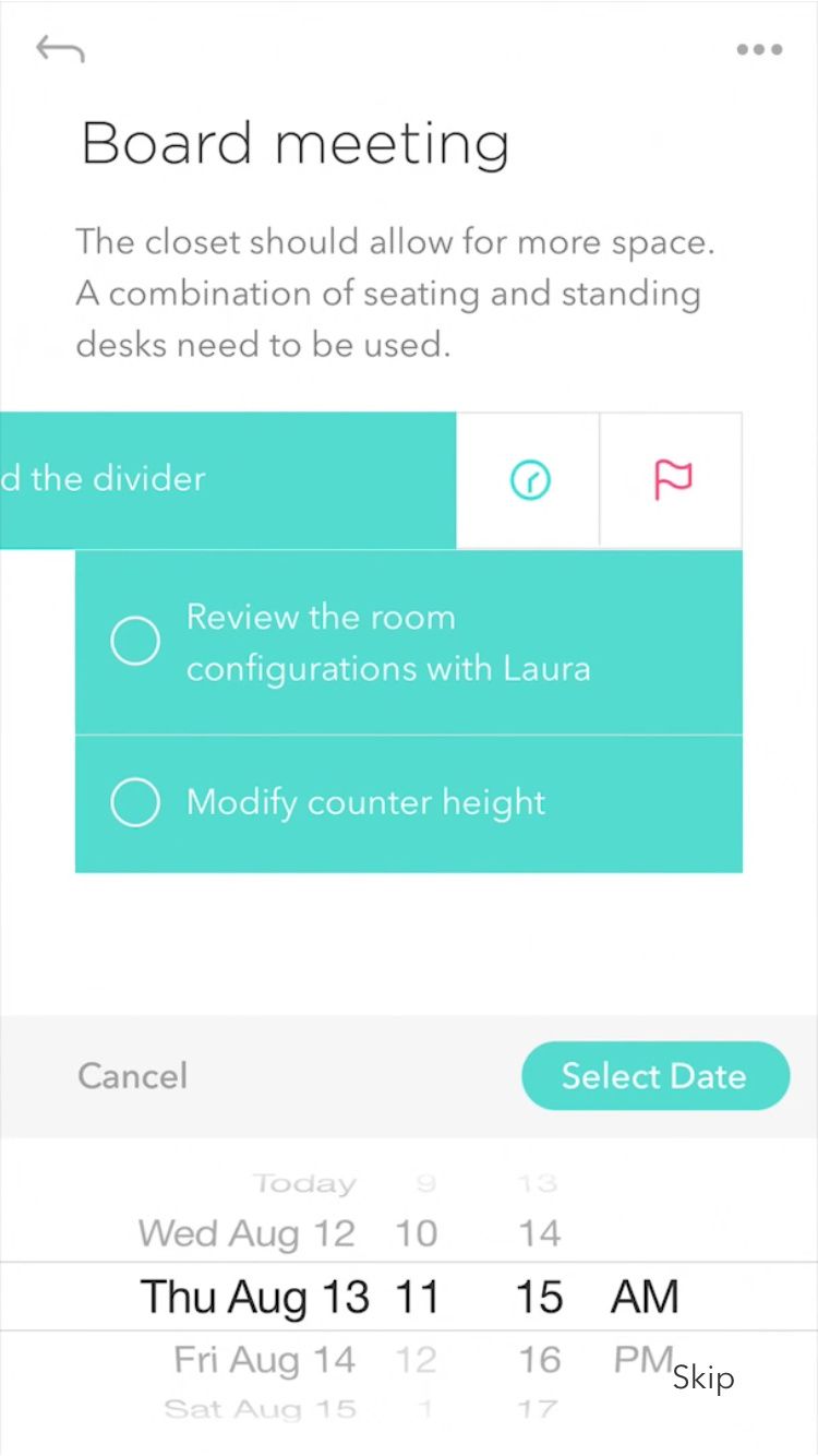
Event Calendar
A more traditional design, Event Calendar implements a standard month view as well as a weekly timeline. The design is minimal and clean, incorporating aspects of both iOS and Material design.
Neat Notes
Neat Notes uses a beautifully simple and refined design direction to produce a scheduling interface which is an absolute delight to both use and view.
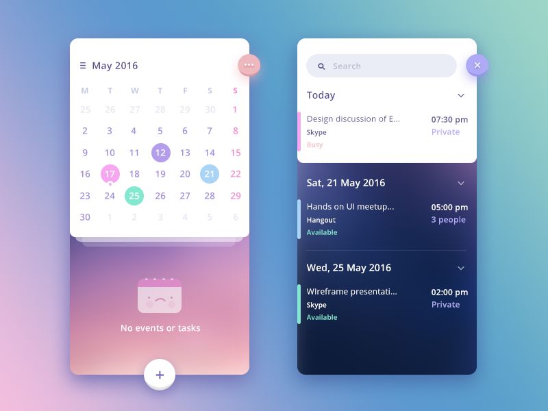
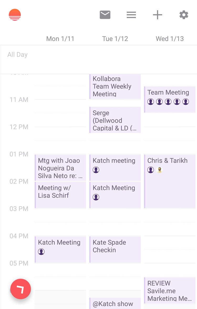
Sunrise
While now defunct, Sunrise’s app designs remain current and show some of the best design work to have ever been applied to a calendar app on both Android and iOS. The interface is clean with beautiful pastel colors and a simple and refined user experience.
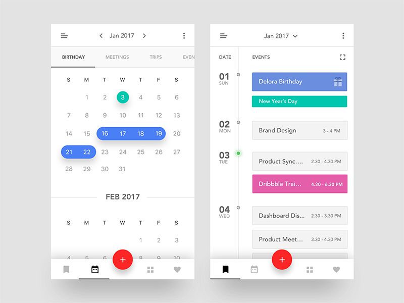
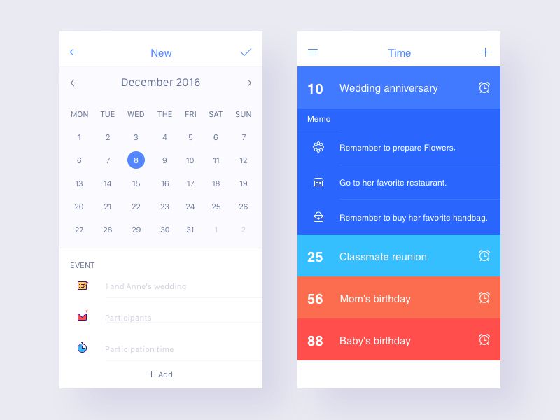
New Time
Similar in direction to Sunrise, New Time uses a very flat design language with bursts of color and a traditional grid calendar view for each month. The iconography adds unique personality to the design while remaining clear and easy to understand.
Recipe Schedule
Recipe Schedule incorporates elements and design direction from Material guidelines and applies it to iOS. The colors provide excellent contrast and the shadows produce the depth which is so often associated with Material design.
Facebook Events
Facebook events is similar in design to the default iOS calendar app, refining the features and design even further. It’s beautifully simple and intuitive, implementing little color but to great effect where applied.
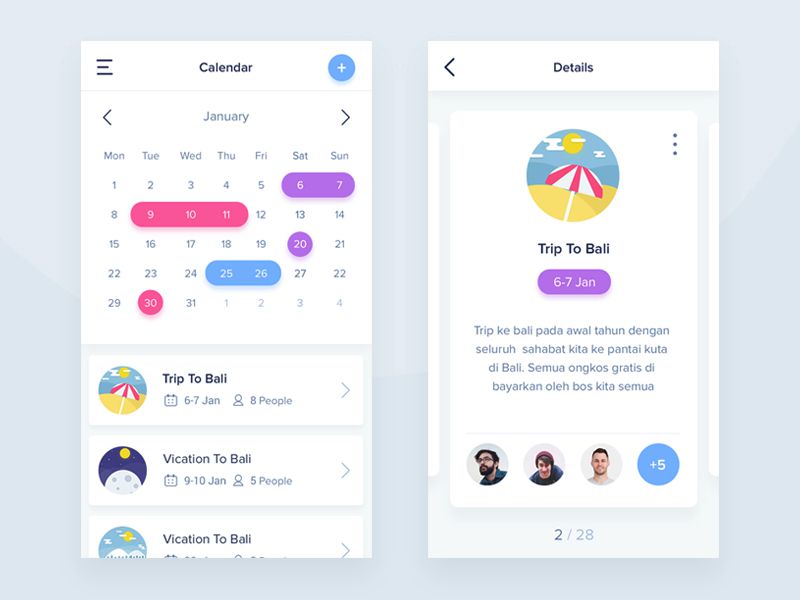
Travel Calendar
The Travel Calendar app incorporates great style through bold colors and drop shadow effects, giving the app a real sense of depth and playfulness. The design is well-space and utilizes the illustrative icons to improve the visual impact and user experience of the app.
Which is your favorite calendar app design? Which calendar app do you use on a daily basis? Share your thoughts in the comments below!
This post may contain affiliate links. See our disclosure about affiliate links here.