Today, we’re going to take a look at how we can apply cool animations using this Animate.css tutorial. Let’s get started!
Resources you need to complete this tutorial:
- Reset.css
- Animate.css
- Raleway (Google Font)
- Open Sans (Google Font)
- Flat Icons (You can choose any icon)
- Background Images (You can use any)
- Basic Knowledge of CSS animations
- Time and Patience
Your Designer Toolbox
Unlimited Downloads: 500,000+ Web Templates, Icon Sets, Themes & Design Assets

Folder Structure
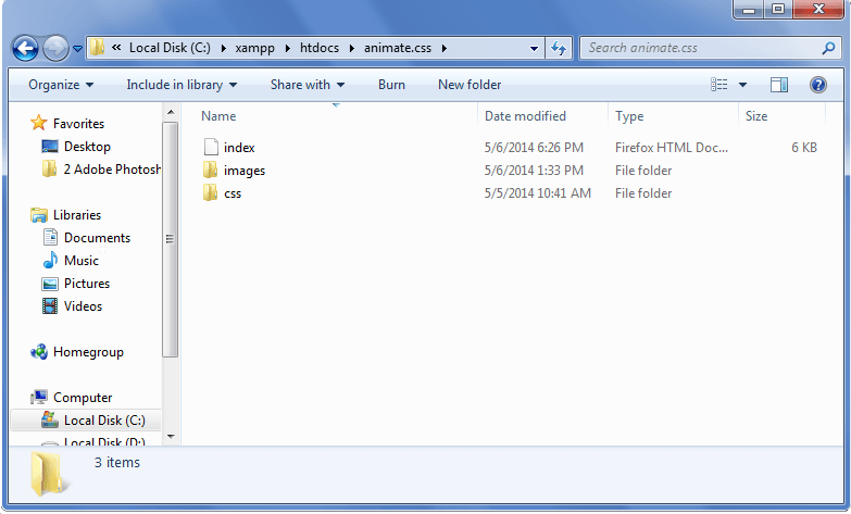
Our file structure will consist of an HTML file, images folder and a css folder:
- index.html – this will serve as our main file
- images folder – for our images
- css – for our styles
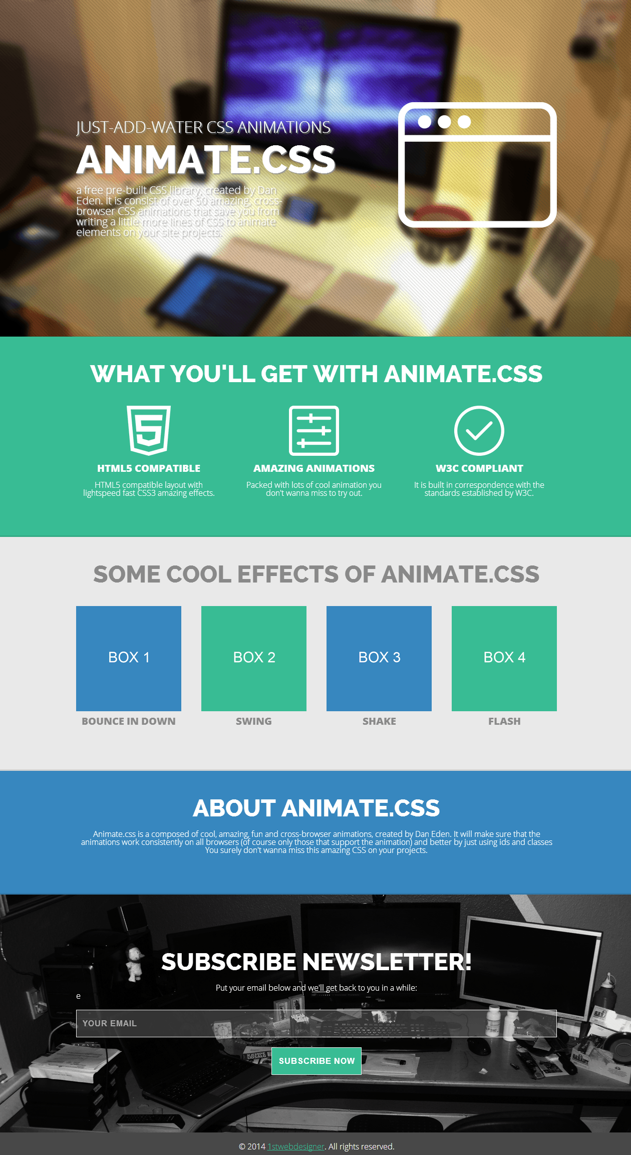
What We Are Going to Build
Getting Started
Before we begin with our markup, we will add first the HTML5 doctype and series of links on our Head section. This will include our links to our CSS and Google font libraries.
<html>
<head>
    <meta charset="utf-8">
    <title>Bring Your Website to Life Using Animate.css</title>
    <meta content="width=device-width,initial-scale=1" name="viewport">
    <!-- stylesheet -->
    <link href="css/reset.css" rel="stylesheet">
    <link href="css/style.css" rel="stylesheet">
    <link href="css/animate.css" rel="stylesheet"><!-- font faces -->
    <link href='http://fonts.googleapis.com/css?family=Raleway:800,300' rel= 'stylesheet' type='text/css'>
    <link href= 'http://fonts.googleapis.com/css?family=Open+Sans:400italic,600italic,700italic,800italic,400,600,300,700,800' rel='stylesheet' type='text/css'>
</head>
The HTML
For our HTML, we will wrap everything with our ID wrapper.
<body>
<div id="wrapper">
</div>
Cover Section
For our Cover section, we will wrap everything within an ID of cover followed by our class container to center all elements on the screen. Next, we will create two columns and float them left and right.
<section id="cover">
<div class="container">
<div class="fleft">
<h3>Just-add-water CSS animations</h3>
<h2>Animate.CSS</h2>
a free pre-built CSS library, created by Dan Eden. It
                consists of over 50 amazing, cross-browser CSS animations that
                save you from writing a little more lines of CSS to animate
                elements on your site projects.
            </div>
<div class="fright"><img align="right" id="browser" src= "images/browser.png"></div>
<br class="clear">
        </div>
    </section>
Features Section
For our Feature section, we will do the same thing we did in the Cover section; however, this time, we will be dividing each column using class column and one-third.
<section id="features">
<div class="container">
<h2>What You'll Get With Animate.CSS</h2>
<div class="column-container">
<div class="column one-third">
                    <img alt="" src="images/icon_html5.png">
<h4>HTML5 Compatible</h4>
HTML5 compatible layout with lightspeed fast CSS3
                    amazing effects.
                </div>
<div class="column one-third">
                    <img alt="" src="images/icon_animation.png">
<h4>Amazing Animations</h4>
Packed with lots of cool animation you don't wanna miss
                    to try out.
                </div>

<div class="column one-third last">
                    <img alt="" src="images/icon_w3c.png">
<h4>W3C Compliant</h4>
It is built in correspondence with the standards
                    established by W3C.
                </div>
            </div>
        </div>
    </section>
Effects Section
For our Feature section, we will redo what we did in the Effect section. But this time we will be dividing each column using class column and one-fourth since we have four columns.
<section id="effects">
<div class="container">
<h2>SOME COOL EFFECTS OF Animate.CSS</h2>

<div class="column-container">
<div class="column one-fourth">
                    <img alt="" src="images/box1.png">
<h4>BOUNCE IN DOWN</h4>
                </div>

<div class="column one-fourth">
                    <img alt="" src="images/box2.png">
<h4>SWING</h4>
                </div>

<div class="column one-fourth">
                    <img alt="" src="images/box3.png">
<h4>SHAKE</h4>
                </div>

<div class="column one-fourth last">
                    <img alt="" src="images/box4.png">
<h4>FLASH</h4>
                </div>
            </div>
        </div>
    </section>
About Section
For this section, we’re going to wrap everything in class container.
<section id="about">
<div class="container">
<h2>ABOUT ANIMATE.CSS</h2>

Animate.css is a composed of cool, amazing, fun and
            cross-browser animations, created by Dan Eden. It will make sure
            that the animations work consistently on all browsers (of course
            only those that support the animation) and better by just using ids
            and classes You surely don't wanna miss this amazing CSS on your
            projects.
        </div>
    </section>
Subscribe Section
For our Subscribe section, we’re going to do the same thing as in the About section. But this time, we’re going to insert a form for our text box and button.
<section id="subscribe">
<div class="container">
<h2>Subscribe Newsletter!</h2>

Put your email below and we'll get back to you in a while:

<form action="" id="subscribe-form" method="post" name= "newsletter-form">
<input id="subcribe_email" name= "subscribe_email" placeholder="Your email" type="email" value= "">

<input id="subscribe_submit" name= "subscribe_submit" type="submit" value="Notify Me">
            </form>
        </div>
    </section>
Footer
Finally, let’s add our markup for footer. We will still wrap everything in a container class and center this on the screen later on using our style.css file.
<footer id="main-footer">
<div class="container">
© 2014 <a href= "https://1stwebdesigner.com/" target= "_blank">1stwebdesigner</a>. All rights reserved.
        </div>
    </footer>
</body>
</html>
So with this markup, it is expected you’ll have the same output like the image you see below.
The CSS
For our CSS code, let’s first add the general style for our basic elements such as the body, H2 and H3 tags.
body {
    font-family: 'Open Sans', sans-serif;
    font-weight: 300;
}
h2 {
    font-size: 48px;
    font-family: Raleway, sans-serif;
    font-weight: 800;
    margin-bottom: 20px;
    text-align: center;
    text-transform: uppercase;
}
h3 {
    font-family: 'Open Sans', sans-serif;
    text-transform: uppercase;
    font-size: 32px;
    font-weight: 300;
    margin-bottom: 30px;
}
h4 {
    font-family: 'Open Sans', sans-serif;
    font-size: 20px;
    font-weight: 800;
    text-transform: uppercase;
    margin-bottom: 10px;
    margin-top: 10px;
}
.fleft {
    float: left;
}
.fright {
    float: right;
}
.clear {
    clear: both;
}
.center {
    text-align: center;
}
#wrapper {
    width: 100%;
    overflow: hidden;
}
section {
    box-shadow: 0 -3px 0 rgba(0,0,0,0.1);
    position: relative;
}
Next, let’s add the styles for the containers and columns.
.container {
    margin: 0 auto;
    width: 960px;
    padding: 50px 0 80px;
}
.column-container {
    margin: 40px 0 -40px;
    overflow: hidden;
}
.column {
    float: left;
    padding: 0 40px 40px 0;
}
.column-container.last {
    margin-bottom: 0;
}
.column.last {
    padding-right: 0;
}
.column.one-half {
    width: 460px;
}
.column.one-third {
    width: 290px;
}
.column.two-thirds {
    width: 630px;
}
.column.one-fourth {
    width: 210px;
}
.column.three-fourths {
    width: 710px;
}
.column img {
    margin: 0 auto;
    display: block;
}
For the Cover section, give it a background image. Then, style each specific element inside our cover section.
#cover {
    background: url(../images/background.png) center top no-repeat;
    font-size: 1.3em;
}
#cover .container {
    padding: 240px 0 200px;
    color: #fff;
}
#cover p {
    padding-right: 508px;
    text-shadow: 2px 2px 2px rgba(150,150,150,1);
    font-family: 'Open Sans';
    text-align: left;
}
#cover h2 {
    font-size: 78px;
    line-height: 60px;
    margin: 20px 0;
    text-shadow: 2px 2px 2px rgba(150,150,150,1);
    text-align: left;
}
#cover h3 {
    margin: 0;
    text-shadow: 2px 2px 2px rgba(150,150,150,1);
}
#browser {
    margin-top: -270px;
}
Next, add style to the Features section. We will give it a background color of #38bc94 and color of white. We will also center all of the text on each column.
#features {
    background: #38bc94;
    color: #fff;
}
#features h4,#features p {
    text-align: center;
    margin-top: 15px;
}
For our Effects section, let’s add a background color of #e9e9e9 and center all of the text.
#effects {
	background: #e9e9e9;
	text-align: center;
	color: #898989;
}
#effects img {
	width: 100%;
}
Next, let’s style our About section.
#about {
    background: #3787bf;
	color: #fff;
    overflow: hidden;
}
#about h2,p {
    text-align: center;
}
Before we proceed on our Subscribe section, let’s first add styles to our forms. This will have a style for our text box and button.
button,input,textarea {
    font-size: 16px;
    max-width: 100%;
    margin: 0;
    border-radius: 0;
    vertical-align: baseline;
    -webkit-box-sizing: border-box;
    -moz-box-sizing: border-box;
    box-sizing: border-box;
}
textarea {
    overflow: auto;
    vertical-align: top;
}
input,textarea {
    background: #6e6e6e;
    background: rgba(169,169,169,0.3);
    border: 1px solid #f4f4f4;
	color: #fff;
    font-weight: 700;
    letter-spacing: 1px;
    padding: 12px;
    text-transform: uppercase;
}
input:focus,textarea:focus {
    outline: 0;
}
button:hover,button:focus,input[type=submit]:focus,input[type=submit]:hover {
    background: #419d81;
	color: #fff;
    outline: 0;
}
button,input[type=submit] {
    -webkit-appearance: button;
    cursor: pointer;
}
button,input[type=submit] {
    background: #38bc94;
    -webkit-transition: all .5s;
    -moz-transition: all .5s;
    transition: all .5s;
}
.form-field {
    position: relative;
}
Now, let’s add the styles for our Subscribe section. We will add a background image and give each form element width and height.
#subscribe {
    background: url(../images/newsletter.png) no-repeat center center;
    -webkit-background-size: cover;
    -moz-background-size: cover;
    -o-background-size: cover;
    background-size: cover;
	color: #fff;
    padding: 40px 0;
}
#subscribe h2 {
    text-align: center;
	margin-top: 20px;
}
#subscribe-form .form-field {
    margin: 0 auto;
}
#subcribe_email {
    margin-top: 20px;
}
#subscribe-form .form-submit {
    height: 50px;
	width: 180px;
    display: block;
    margin: 20px auto 0;
}
#subcribe_email,#subscribe_submit {
	width: 100%;
    display: block;
    height: 55px;
}
Finally, let’s add some styles to our footer.
footer {
    background: #484848;
	color: #fff;
}
footer .container {
    padding: 20px 0 10px;
    overflow: hidden;
}
p#footer-copyright {
    text-align: center;
}
footer a {
	color: #38bc94;
}
Media Queries for Responsive Design
In order for our landing page work on different viewports, we need to customize some element style for a specific viewports using media queries. If you don’t know how media queries works, I suggest reading this article first. You can copy the code below and paste it in your CSS file.
@media all and (max-height: 1024px) and (max-width: 1024px) {
            	section .container,
            	footer .container {
                            	width: 900px;
            	}
            	#cover p {
                            	padding-right: 480px;
            	}
            	.column.one-third {
                            	width: 273px
            	}
            	.column.two-thirds {
                            	width: 587px
            	}
            	.column.one-half {
                            	width: 430px
            	}
            	.column.one-fourth {
                            	width: 195px
            	}
            	.column.three-fourths {
                            	width: 665px
            	}
}
@media all and (max-width: 1023px) {
            	section .container,
            	footer .container {
                            	width: 640px;
            	}
            	.column.one-third,
            	.column.two-thirds,
            	.column.one-half,
            	.column.one-fourth,
            	.column.three-fourths {
                            	width: 100%;
                            	padding-right: 0;
            	}
            	#cover p {
                            	padding-right: 220px;
            	}
            	#features .column.one-third {
                            	width: 300px;
            	}
            	#features .column.one-third:nth-child(odd) {
                            	padding-right: 40px;
            	}
            	#effects .column.one-fourth {
                            	width: 130px;
                            	padding-right: 40px;
            	}
            	#effects .column.one-fourth.last {
                            	padding-right: 0;
            	}
}
@media all and (max-width: 980px) {
.fleft{ float: none; }
.fright{ float; none; }
#browser{ display: none; }
#cover h3, #cover h2, #cover p{ text-align: center;
padding: 0;
margin: 20px auto;
}
}
@media all and (max-width: 640px) {
            	h2 {
                            	font-size: 2.8em
            	}
            	h3 {
                            	margin-bottom: 15px;
            	}
            	.column {
                            	padding-bottom: 20px;
            	}
            	.column-container {
                            	margin-bottom: 0;
            	}
            	.column-container {
                            	margin-top: 0;
            	}
            	section .container {
                            	width: 400px;
                            	padding: 50px 0;
                            	margin: 0 auto;
            	}
            	#wrapper {
                            	position: relative;
            	}
            	#wrapper.hidden {
                            	left: -240px;
            	}
            	footer .container {
                            	width: 400px;
                            	margin: 0 auto;
            	}
            	#cover {
                            	background-position: left bottom;
            	}
            	#cover .container {
                            	width: 400px;
                            	padding: 80px 0 40px;
                            	text-align: left;
            	}
            	#cover h2,
            	#cover h3,
            	#cover p {
                            	text-align: center;
                            	padding-right: 0;
            	}
            	#cover h2 {
                            	font-size: 54px;
                            	line-height: 44px;
            	}
            	#cover h3 {
                            	font-size: 23px;
            	}
            	#cover p {
                            	font-size: 16px;
            	}
            	.column.one-third,
            	.column.two-thirds,
            	.column.one-half,
            	.column.one-fourth,
            	.column.three-fourths {
                            	width: 100%;
                            	padding-right: 0;
            	}
            	#features .column.one-third {
                            	width: 100%;
            	}
            	#effects .column.one-fourth {
                            	width: 180px;
                            	padding-right: 40px;
            	}
            	#effects .column.one-fourth:nth-child(even){
                            	padding-right: 0;
            	}
            	#about-container {
                            	margin: 30px 0 20px;
            	}
}
@media all and (max-width: 480px) {
            	section .container,
            	footer .container,
            	#cover .container {
                            	width: 260px;
            	}
            	h2 {
                            	text-align: center;
            	}
            	#cover .container {
                            	padding: 150px 0 100px;
            	}
            	#effects .column.one-fourth {
                            	width: 125px;
                            	padding-right: 10px;
            	}
            	#about-container {
                            	text-align: center;
            	}
            	footer .container {
                            	text-align: center;
            	}
            	p#footer-copyright {
                            	float: none;
                            	margin: 0;
            	}
}
@media all and (max-width: 480px) {
   #cover h2 {
        font-size: 39px;
	}
    #browser {
        margin: 0 auto;
	}
}
@media all and (max-width: 320px) {
h2 {
    font-size: 20px;
}
#about h2 {
    font-size: 20px;
}
#subscribe h2 {
    font-size: 20px;
}
}
Animating Elements with Animate.CSS
Now that we have our landing page is ready, let’s animate our elements. There is an “animated” class in the Animate.css file that will make the effects work. This means you will need to declare the animated class first along with the animation class. See sample code below.
<h1 class="animated bounceInRight"> </h1>
For this tutorial, I’ve selected the following animation classes that I want to use all throughout the landing page; however, you can freely choose the animation classes you want to try out on the Animate.css demo site:
- bounceInLeft
- rotateIn
- bounceInRight
- lightSpeedIn
- flipInY
- bounceInDown
- swing
- shake
- flash
- bounce
- tada
- wobble
Animation Delay
For this part, we’re going to look how we can add cool animation with delay on our cover section.
First, on the H3 tag under the div with a class of fleft, I’ll add the animation class bounceInLeft. See code below.
<h3 class="animated bounceInLeft">Just-add-water CSS animations</h3>
Next, I’ll add the animation class rotateIn on our H2 class and the animation class bounceInRight on our paragraph tag. Check out the code below.
<h2 class="animated rotateIn">Animate.CSS</h2>

a free pre-built CSS library, created by Dan Eden. It is consist of over 50 amazing, cross-browser CSS animations that save you from writing a little more lines of CSS to animate elements on your site projects.
Finally, let’s put the animation class lightSpeedIn on our browser image under the div with a class fright.
<img align="right" class="animated lightSpeedIn" id="browser" src="images/browser.png"></div>
Now to add animation delay on each element, you need to open Animate.css and put a one-second delay for each animation class placed on the elements above using the following code:
    -webkit-animation-delay: 1s;
    -moz-animation-delay: 1s;
    -ms-animation-delay: 1s;
    -o-animation-delay: 1s;
    animation-delay: 1s;
As an example for our bounceInLeft animation class, you’ll have the code below:
.bounceInLeft {
    -webkit-animation-name: bounceInLeft;
    animation-name: bounceInLeft;
    -webkit-animation-delay: 1s;
    -moz-animation-delay: 1s;
    -ms-animation-delay: 1s;
    -o-animation-delay: 1s;
    animation-delay: 1s;
}
In the demo I created, you’ll notice that each element are not displaying at the same time. Put different time delays for each element since I added additional one second per element according to the order I prefer. See my code below:
.bounceInLeft {
    -webkit-animation-name: bounceInLeft;
    animation-name: bounceInLeft;
    -webkit-animation-delay: 1s;
    -moz-animation-delay: 1s;
    -ms-animation-delay: 1s;
    -o-animation-delay: 1s;
    animation-delay: 1s;
}
.bounceInRight {
    -webkit-animation-name: bounceInRight;
    animation-name: bounceInRight;
    -webkit-animation-delay: 3s;
    -moz-animation-delay: 3s;
    -ms-animation-delay: 3s;
    -o-animation-delay: 3s;
    animation-delay: 3s;
}
.lightSpeedIn {
    -webkit-animation-name: lightSpeedIn;
    animation-name: lightSpeedIn;
    -webkit-animation-timing-function: ease-out;
    animation-timing-function: ease-out;
    -webkit-animation-delay: 4s;
    -moz-animation-delay: 4s;
    -ms-animation-delay: 4s;
    -o-animation-delay: 4s;
    animation-delay: 4s;
}
Animation Hover
For this part, we’re going to look how we can add cool hover animation on our features. First thing we need to do is to add our animation classes on the elements we want to animate. See the code below.
<div class="column one-third animated flipInY">
        <img alt="" src="images/icon_html5.png">
<h4>HTML5 Compatible</h4>

HTML5 compatible layout with lightspeed fast CSS3 amazing
        effects.
    </div>
Notice that I added the animation class flipInY on the one-third div. You can apply this on the other one-third div for a similar animation.
Now to make our hover state animation effect, we need to add the hover pseudo class to the animation class we want this to take effect with. For this example, let’s apply it on class FlipInY.
.flipInY:hover {
    -webkit-backface-visibility: visible !important;
    -ms-backface-visibility: visible !important;
    backface-visibility: visible !important;
    -webkit-animation-name: flipInY;
    animation-name: flipInY;
    -webkit-animation-duration: 2s;
    -moz-animation-duration: 2s;
    -ms-animation-duration: 2s;
    -o-animation-duration: 2s;
    animation-duration: 2s;
    -moz-animation-fill-mode: both;
    -ms-animation-fill-mode: both;
    -o-animation-fill-mode: both;
    animation-fill-mode: both;
    cursor: pointer;
    cursor: pointer;
}
.flipInY:hover {
  -webkit-backface-visibility: visible !important;
  -ms-backface-visibility: visible !important;
  backface-visibility: visible !important;
  -webkit-animation-name: flipInY;
  animation-name: flipInY;
  -webkit-animation-duration: 2s;
   	-moz-animation-duration: 2s;
    	-ms-animation-duration: 2s;
     	-o-animation-duration: 2s;
        animation-duration: 2s;
         -moz-animation-fill-mode: both;
        -ms-animation-fill-mode: both;
         -o-animation-fill-mode: both;
            animation-fill-mode: both;
           cursor: pointer;
}
In my example above, I also added animation-duration to control the time I want the animation to roll. Notice that I also used animation-fill-mode. This property specifies what styles will apply for the element when the animation is not playing.
By default, CSS animations will not affect the element you are animating until the first keyframe is “played”, and then stops affecting it once the last keyframe has been completed.
Now that you learn how to apply animation on hover state, you can add similar hover state animation with the other section on our landing page using the same process. You can play around with it and customize it.
Conclusion
There you have it! You can continue putting animation classes on different elements you want to animate. Check out and download the demo to see it in action.
Did you have a lot of fun playing around with this great CSS library? Do you think this will be a great tool? Leave a comment below and let us know what you think.
This post may contain affiliate links. See our disclosure about affiliate links here.


