When building a new website, it’s always a good idea to sit down and think about all the content you truly want to feature. If you find that you have a lot to say, grid layouts are always a solid choice. For starters, most are responsive and will automatically adjust orientation based on the screen size each visitor is viewing it on.
But they’re also a good choice because they offer a convenient way to display a lot of information in a condensed space without being overwhelming. What follows is a list of free and premium grid layouts sourced from a variety of places including ThemeForest and CodePen, that offer flexibility and function for your website’s design.
Your Web Designer Toolbox
Unlimited Downloads: 500,000+ Web Templates, Icon Sets, Themes & Design Assets
Starting at only $16.50/month!

12 Column Grid
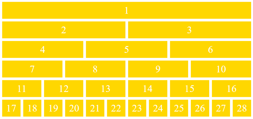
Create up to a twelve-column grid with this grid layout template. It’s simple, straightforward but definitely gets the job done.
CSS Grid Layout – Template Areas
See the Pen
CSS Grid Layout – Template Areas by Mozilla Developers (@mozilladevelopers)
on CodePen.
Another option is this CSS Grid layout. It offers templated areas into which you can add custom content. It also offers multiple fill options.
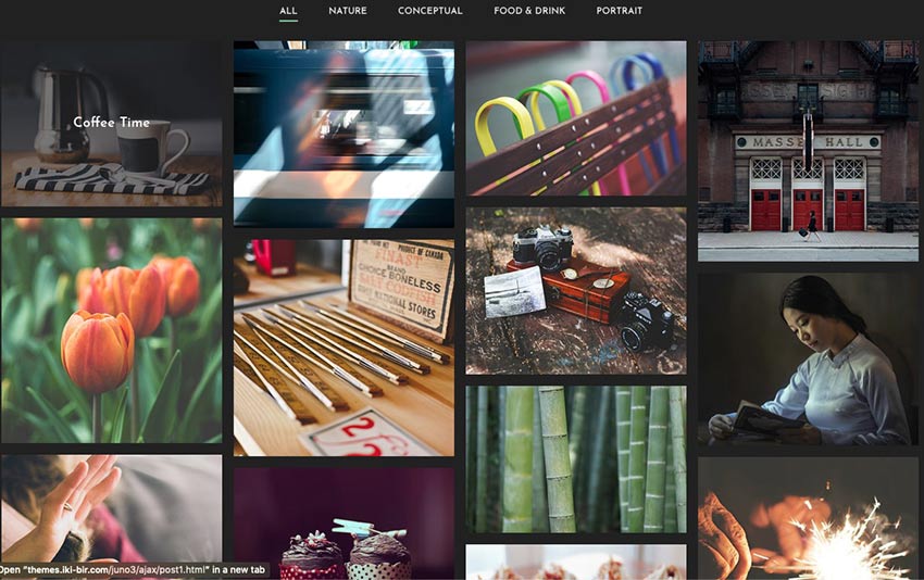
Roph
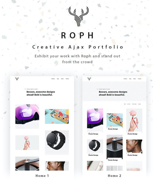
Now here’s a WordPress theme that provides a grid layout you can use in a multitude of ways. It’s designed for portfolio websites and the sky’s the limit for how you can envision using it.
CSS Grid Layout
See the Pen
CSS Grid Layout – New Terminology by Stacy (@stacy)
on CodePen.
This CSS Grid layout is super simple, but would definitely make it a lot easier to create a custom website capable of conveying a lot of information at once. It also supports lovely hover effects.
Mono
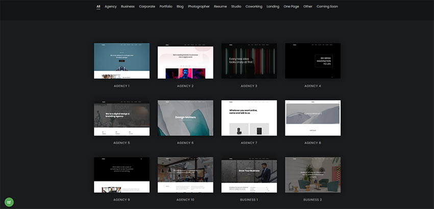
This is an HTML5 template that offers a stylish grid layout you can use in a variety of ways. With multiple templates, color schemes, and settings to select from, you’re sure to find something that suits your needs here.
CSS Grid Layout with @support Flexbox Fallback
See the Pen
CSS Grid Layout with @support flexbox fallback by Gustaf Holm (@primalivet)
on CodePen.
Or you could use this CSS Grid layout with a Flexbox fallback that offers interesting effects and an engaging look.
Stash
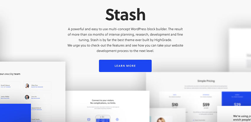
Stash is a WordPress block builder theme that you can use to create a high-quality website for businesses, corporate sites, and e-commerce sites.
Juno
This is such a lovely layout! Juno is an ideal WordPress theme for portfolios and photography websites.
True Masonry with Grid Layout
See the Pen
True Masonry with Grid Layout by Balázs Sziklai (@balazs_sziklai)
on CodePen.
This is another super simple option that offers a masonry grid layout that you can customize in a variety of configurations.
CSS Grid Layout Demo
See the Pen
CSS Grid Layout Demo 5 – Grid Gap by Stacy (@stacy)
on CodePen.
Another great option is this CSS Grid layout. Change the width of each column, adjust the number of rows, and change their configuration.
CSS Grid Layout – Blog Post Template
See the Pen
CSS Grid Layout – Blog Post Template by Stacy (@stacy)
on CodePen.
This is another grid layout template that offers a blog post layout you can use for your HTML-based blog.
Flexbox Grid Layout w/Mobile Menu
See the Pen
Flexbox grid layout w/ Mobile Menu by Lindsey (@cssgirl)
on CodePen.
Or you can use this Flexbox grid layout for a blog post template. It includes a mobile menu, too.
Magazine Grid Layout Vol. II
See the Pen
Magazine Grid Layout Vol. II by ilithya (@ilithya)
on CodePen.
If you’re looking to create a publication, this magazine grid layout ought to do the trick.
Content Grid System
See the Pen
Content Grid System (CSS Grid Layout) by Tobias Gerlach (@Gerlach360)
on CodePen.
Here’s another great option. It’s a content grid system that you can use to display a lot of information at once.
Flex and Grid Demo
See the Pen
Flex and Grid demo by rachelandrew (@rachelandrew)
on CodePen.
The Flexbox and CSS Grid demo layout is ideal for showcasing info on cards across a portion of your website. Think descriptions of your services or pricing tables.
CSS Grid Layout + Mondrian
See the Pen
CSS Grid Layout + Mondrian = <3 by Toaster (@ToasterCo)
on CodePen.
This grid layout can be used for highlighting content or creating your own work of art. It’s up to you.
Masonry Grid Layout
See the Pen
Masonry Grid Layout by Marco Biedermann (@marcobiedermann)
on CodePen.
Create something monochromatic and impactful with this masonry grid layout. Use it for a portfolio, to display photography, or to create an experience.
Flex 12 Column Grid
See the Pen
Flex 12 Column Grid by Nick Else (@nickelse)
on CodePen.
The Flex 12 Column Grid layout is the last one on our list and another solid option. Display as much information as you need in an organized and eye-catching way, easily.
Build Your Best Website Yet with Grid Layouts
And there you have it! Another list completed. We hope it will serve you well. This collection of grid layouts feature selections that are all easy-to-use and nice to look at. Enjoy selecting one that will serve your content well.
Good luck!
This post may contain affiliate links. See our disclosure about affiliate links here.