CSS is a powerful coding language that can give style and personality to HTML. CSS animations, in particular, are created by transitioning between various CSS configurations over a period of time.
There are a lot of extremely practical cases for CSS animation, such as the ability to animate HTML elements without the use of JavaScript or Flash (although some do utilize JavaScript).
In this article, we’ll be taking a look at 15 lighthearted CSS animation projects to give you inspiration for your next endeavor. These are going to be practical applications that have a certain level of whimsy and fun to them. Hopefully, they’re just as fun to work on!
Google’s Game of the Year
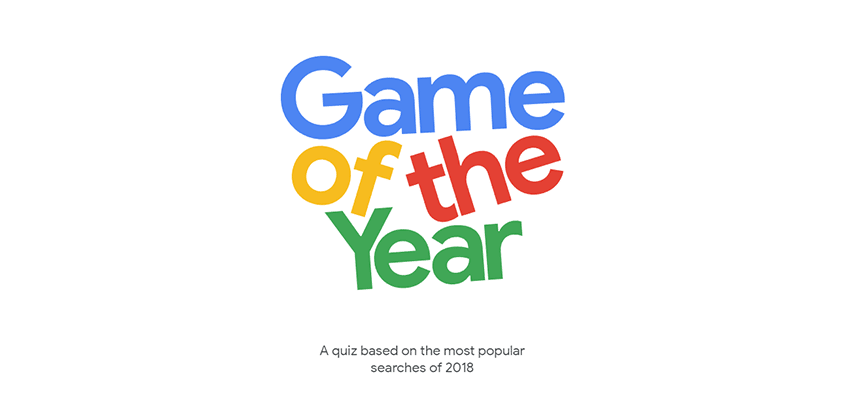
The Game of the Year animation for Google looks like a fairly simple CSS animation. It features the title text falling slightly, and the elements bumping into each other. While there is plenty of code that went into this, the core is animating the rotation of the elements after a delay.
Cascading Solar System
See the Pen
Cascading Solar System! by Tady Walsh (@tadywankenobi)
on CodePen.
The author of cascading solar system obviously has an eye for humor, naming his project so that it also can be abbreviated as CSS. This is an impressive but unassuming animation that models the solar system in 2D. The orbits use a scaled rotation speed so that they’re all accurate to their real-world counterparts.
Gooey Menu
See the Pen
Gooey Menu by Lucas Bebber (@lbebber)
on CodePen.
Menu animations are a pretty common use of CSS, and this gooey menu is no exception. This has plenty of small details, including a slight increase in size when hovering over the button, and then the bouncy, gelatinous animation when the menu expands.
Each individual button then highlights when hovered over. It is also a special treat to notice the subtle details. Take note of how the hamburger menu symbol collapses into an X and transforms back when you close the menu again.
Flying Birds at Fournier Père et Fils
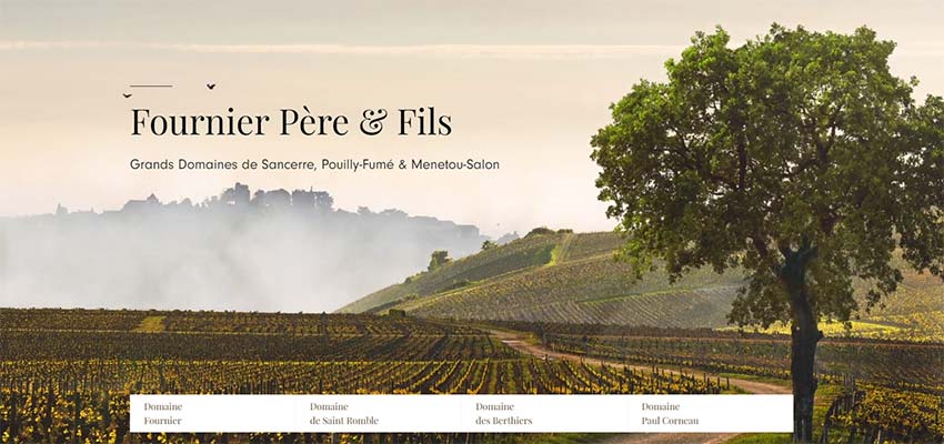
This winery’s homepage features an animation that involves two birds flying across the screen. The process of applying this animation is actually fairly straightforward.
The first layer of animation is to animate the birds flapping their wings, which works much like a flipbook. The second step is the animated vertical and horizontal path that the bird follows, in order to make the speed and flight path look natural. This is done through keyframe animation. The best part is, this can be replicated across any number of birds, you will just need to vary the timing a little bit.
Ball Loading Animation
See the Pen
CSS loading animation by Patrik Hjelm (@patrikhjelm)
on CodePen.
This loading animation is another simple one. It is a vertical line of seven circles that swing back and forth horizontally in a seemingly random pattern.
In terms of CSS code, each ball has its own short few lines of animation. Each ball has the same code except for the length of time that it takes to move side-to-side. This creates a variation between each element.
The rest of the code defines the keyframe points, so really it’s just selecting two keyframe points and varying the amount of time it takes for the circles to travel between them. While straightforward, this is often all you need for a loading screen!
Submarine
See the Pen
Submarine with CSS by Alberto Jerez (@ajerez)
on CodePen.
This CSS exercise features a little red submarine roving the ocean. It has several simple animated elements that come together to make a very pleasing looking loop. This is a lot of keyframing and elements linked to each other, but it’s a fun inspiration for your own CSS projects!
Circles Loading Animation
See the Pen
Animated – SVG Loader by Steven Roberts (@matchboxhero)
on CodePen.
Simple loading screens are one of the best ways to show off CSS, and these concentric circles are no different. The code is pretty quick and simple, essentially telling the circles to ease in and out of rotation at different intervals.
Since the shapes don’t actually change size, and just rotate around, it’s a pretty straightforward exercise in CSS! And it makes a great addition to any website.
Moving Background Mask
See the Pen
Animated – Background Mask by Steven Roberts (@matchboxhero)
on CodePen.
At first glance, you might not realize there is an animation going on here. But look closely, and you’ll see the colored background slowly gliding down. This is an extremely subtle effect, but sometimes that’s what CSS is all about!
At its core, this is using masking as you might see in a photo or video editing software. It only displays the image on the masked layer, and moves the image along a path.
Flat Design Camera
See the Pen
Flat design camera with CSS animation by Damien Pereira Morberto (@damienpm)
on CodePen.
This flat design camera image has a clever concept around it. Press the camera button, and it takes a picture! Well, sort of. The images are predetermined for this code, but the potential for more is there.
This CSS project has several small moving parts, such as the flashing red light on the left side, and the animation of the entire asset as the camera “prints” a photo. Overall, this definitely has some practical applications for any photo-related app that might access a user’s webcam.
Pulse Animation
See the Pen
Animated – SVG Pulse by Steven Roberts (@matchboxhero)
on CodePen.
This is another simple but effective CSS animation. And that’s a trend here! Some of the best uses of CSS are straightforward and simple. No need to get overcomplicated with it.
This one just sends out a few circles that fade out when they expand to their fullest. It’s pretty easy to come up with and to replicate. So, this is a great place to start for a simple CSS project if you’re looking for inspiration as a newcomer to the language.
Bubbling Up
See the Pen
Animated – SVG Bubbles by Steven Roberts (@matchboxhero)
on CodePen.
This bubble animation is made up of a few elements and animations. The first level of animation changes the bubble opacity and makes the image move vertically, so it looks like the bubbles rise up out of nothing.
The second level of animation creates a wobbling effect to make the bubbles look more alive and natural. This makes great use of keyframes, which really make CSS animations look smooth.
Google Now 3rd Party Apps
See the Pen
Google Now 3rd Party Apps by Paweł Kuna (@codecalm)
on CodePen.
This animation is inspired by another designer’s concept that was made in After Effects, but this one does it just with CSS! It’s a cute flat icon pack that pops into existence and slides out. This CSS code makes heavy use of keyframes and timing the different elements as they pop in.
It’s basically just the same code for each icon, but time-adjusted appropriately. This is great inspiration for making something that is simple overall, but is complex when you put all the pieces together.
Hamburger Menu
See the Pen
Hamburger Icon CSS3 ONLY Animation by Dawid Krajewski (@DawidKrajewski)
on CodePen.
Don’t let this simple hamburger menu fool you, it’s actually quite complicated. This doesn’t use any HTML or JavaScript and is entirely made in CSS.
What makes this complex is the fact that it doesn’t use HTML, so all of the shapes in this animation had to be created within CSS alone. From there, there is a lot of keyframe animation to construct the transformation between shapes. This should get you inspired to ditch the traditional HTML and try something different!
Perspective Split Text Animation
See the Pen
Perspective Split Text Menu Hover by James Bosworth (@bosworthco)
on CodePen.
This animated menu looks simple on the outside but can make a big impact on any website. When you hover over the area, the text changes perspective to follow your mouse. When you hover over a specific block of text, it gets split in half.
The animation uses some different techniques to achieve these goals, so it’s a great inspiration as an exercise for practicing some advanced CSS skills.
Floating Ghost
See the Pen
ghost by Beep (@scoooooooby)
on CodePen.
Let’s end with something fun! This adorable ghost just floats up and down, indefinitely. The image just eases in and out, up and down, and the shadow underneath expands and contracts. This simple animation is versatile and can be used as a loading screen or just about anything else!
A Moving Inspiration
CSS is a powerful tool in your web design pocket. Hopefully, these funny and lighthearted animations can inspire you to go out and create your own awesome concepts.
Always remember that you don’t have to make something just for productivity’s sake! You can create something just for fun – even if it serves no purpose. And who knows, maybe someone else will see it, and become inspired themselves.
This post may contain affiliate links. See our disclosure about affiliate links here.


