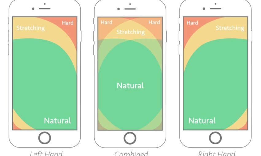
Compared to Google’s Material Design, iOS is considerably more lax in defining styles and design direction. This leaves it much more open in terms of interpretation.
In their Human Interface Guidelines, Apple do not go into the same level of detail as Material Design when outlining their design system. This has a negative impact on consistency, but does open the door for some interesting and creative applications of the guidelines.
In this gllery we are going to take a look at and analyse ten of the most creative interpretations of the iOS Human Interface Guidelines.
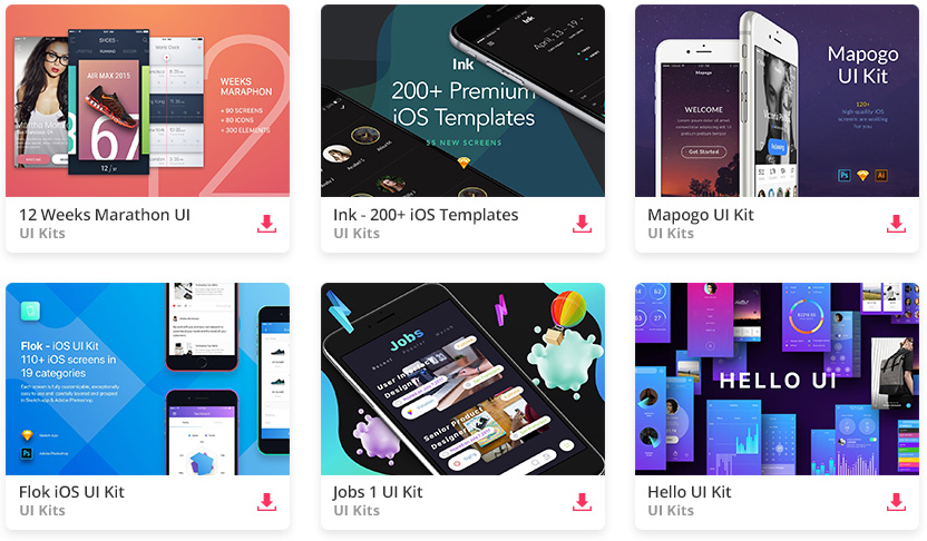
All the Mobile UI Kits You Could Ask For
Shop Exploration III
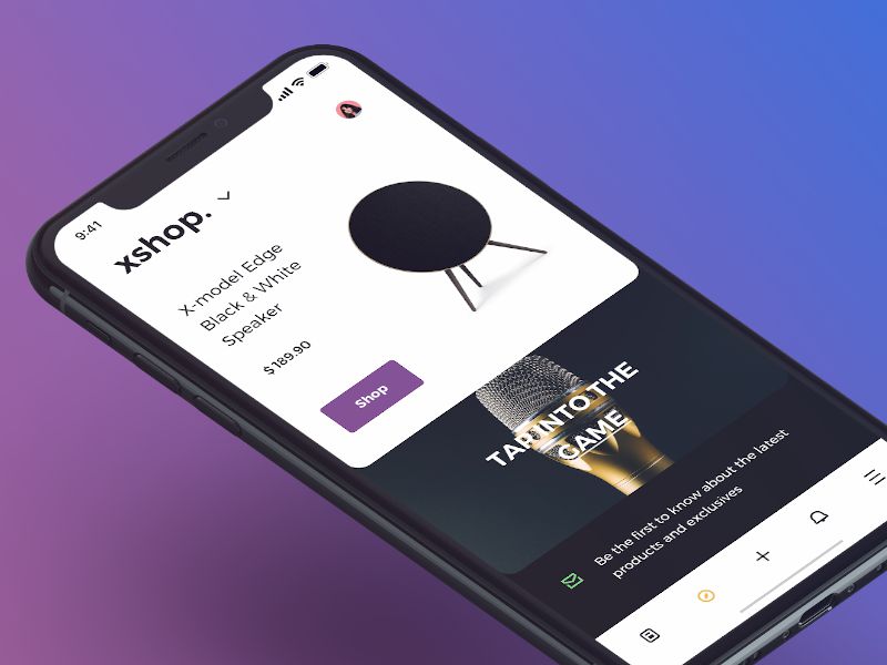
This first example implements a beautiful card-based user interface. The icons are minimal and the two-tone primary color scheme of black and white offers great contrast.
Checkout Flow
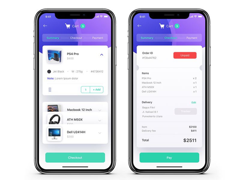
This card-based checkout flow is highly visual and incorporates a beautiful header section. It uses a well-selected color palette of purple and green, and the gradients combine perfectly with the patterned shapes.
Application for Riders
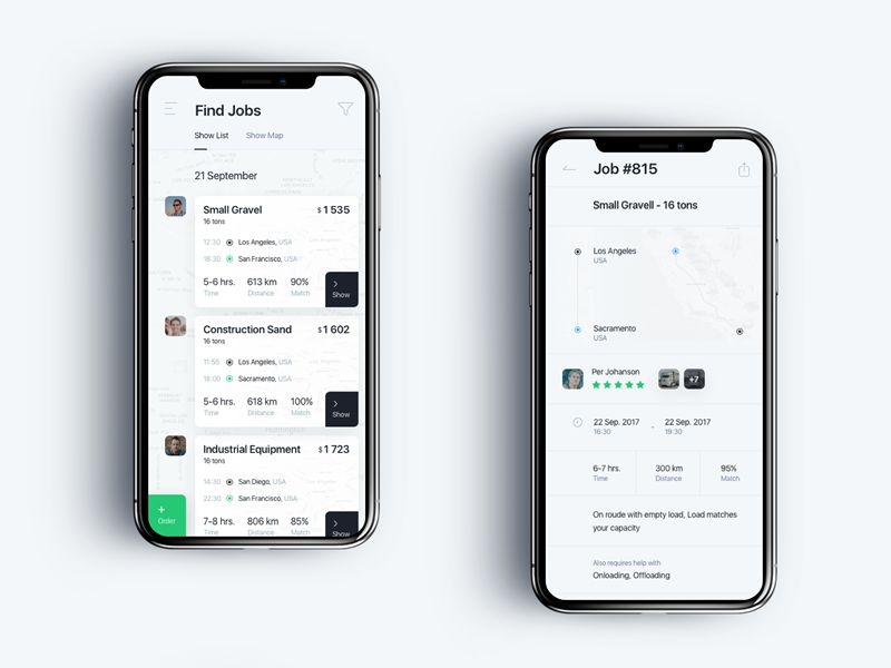
This app for jobs implements a unique approach to navigation and primary actions. The buttons are constrained to the corners, offering a potential iOS version of the floating action button.
Below App
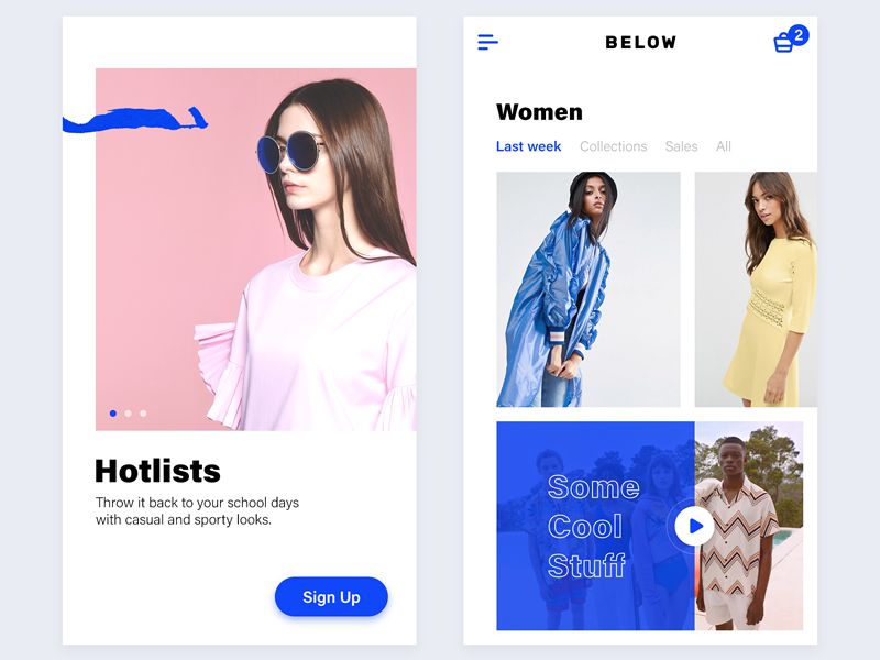
Using plenty of colorful and minimal imagery, Below App offers a take on iOS which incorporates elements of brutalism. The colors are stark and the typography is bold and impactful.
Business Calendar
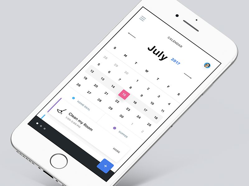
The business calendar is another app to offer its own take on Android’s floating action button. It uses a clean solution which is very much appropriate for iOS’s design language.
Aia
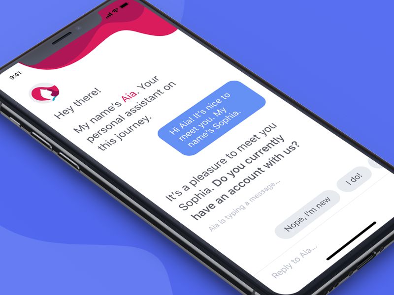
Aia’s chat bot user interface is exceptionally minimal. It displays beautiful crimson graphics underneath the status bar and uses large, clean typography throughout.
Crowdfunding Campaign
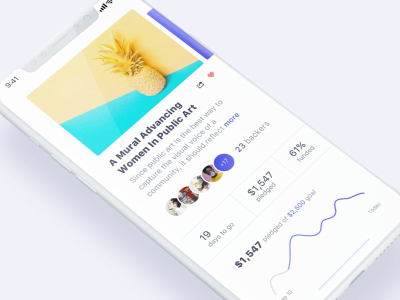
This crowdfunding campaign app uses an abundance of white. It’s contrasted with minimal imagery which appears to fall off the edge of the screen. It’s seemingly aiming for a similar effect to that achieved on Android devices like the Samsung Galaxy S8.
Music App
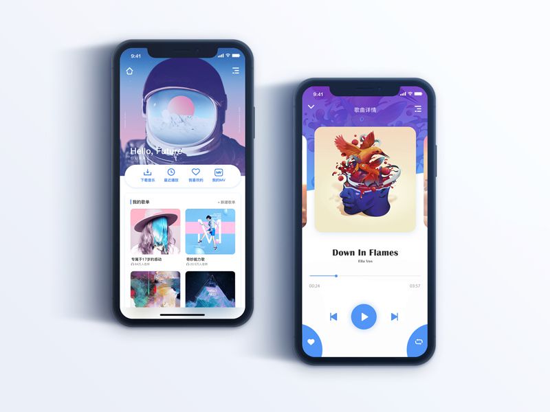
This visually impactful iOS design is incredibly creative in its use of color and imagery. The purple background spans almost half the screen and the primary actions use some rarely-seen button designs.
Map on iPhone X
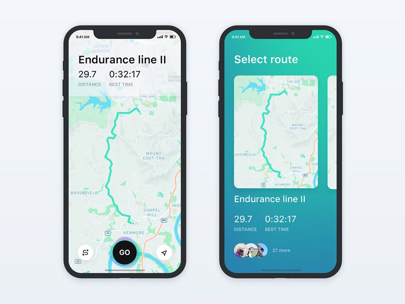
This map app uses all the real estate available on the iPhone X. The maps span edge to edge and the card-based navigation contrasts beautifully against the green/blue gradient background.
Who’s Hungry?
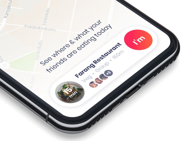
Though it’s missing the necessary bottom bar which replaces the home button, this design offers a beautiful take on card-based design elements. These elements are becoming more popular as they can be displayed over existing content with excellent contrast.
This post may contain affiliate links. See our disclosure about affiliate links here.