Login pages will always be an integral component of the modern web. The way we interact with them may well change in the future as new technologies like Touch ID or facial recognition make their way to the web. But for now, designers are tasked with making the process as simple as possible with input fields. They also have to ensure the design is in-keeping with the rest of the site design language, and incorporates key elements of the brand in order to reassure the user when inputting sensitive data.
In this article, we are going to select ten of the most beautiful and easy-to-use login pages on the web today.
Your Web Designer Toolbox
Unlimited Downloads: 500,000+ Web Templates, Icon Sets, Themes & Design Assets

Sweet
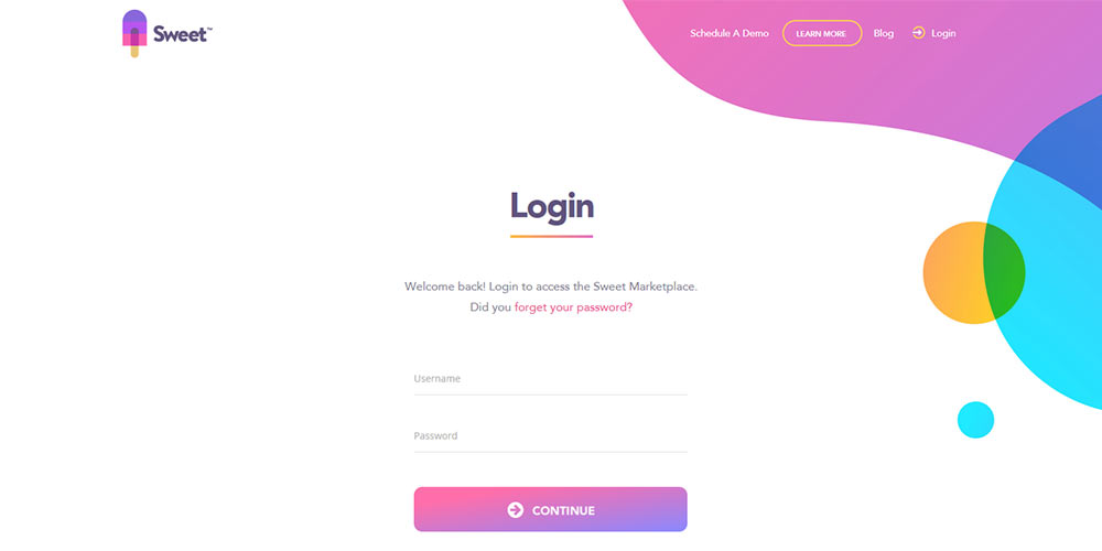
Sweet’s login page uses an abundance of bright, colorful gradients. It makes for a welcoming and attractive login screen with a hint of playfulness and perfect continuation of the company’s branding.
Zendesk
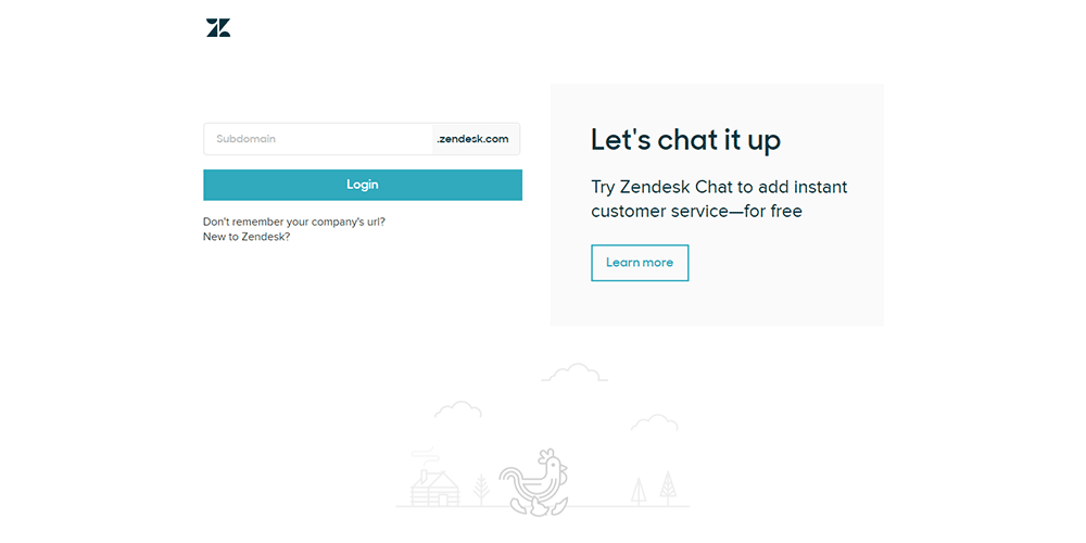
Zendesk’s login is simple but incredibly easy to use. The simplified logo and subtle footer illustration are beautiful additions without distracting from the important content area.
Squarespace
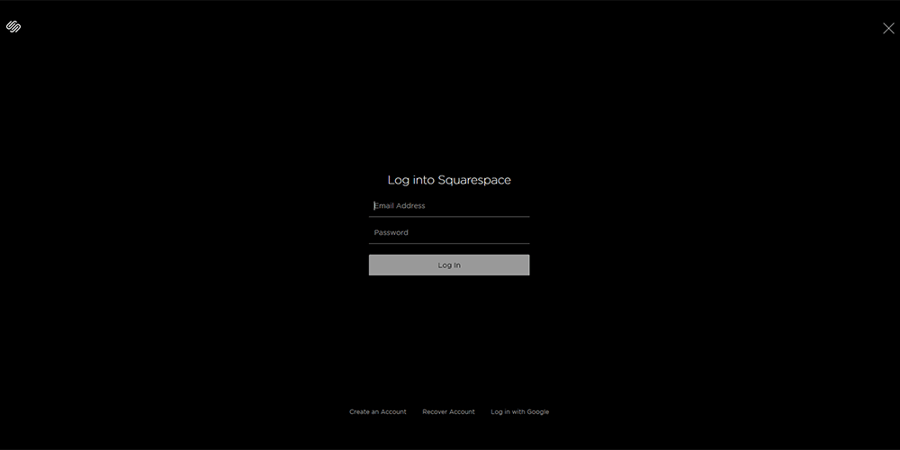
Squarespace’s login is dark, minimal, and on-brand. It has no visual distractions, just two simple inputs and a CTA. It’s a beautiful continuation of their design direction.
Headway
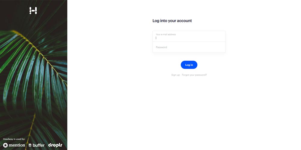
One of the more unique designs, Headway has split the login screen to include a beautiful image panel of the left. In this panel it also includes some client logos and their own logo. The blue CTA button is clear, attractive, and stands out perfectly.
VSCO
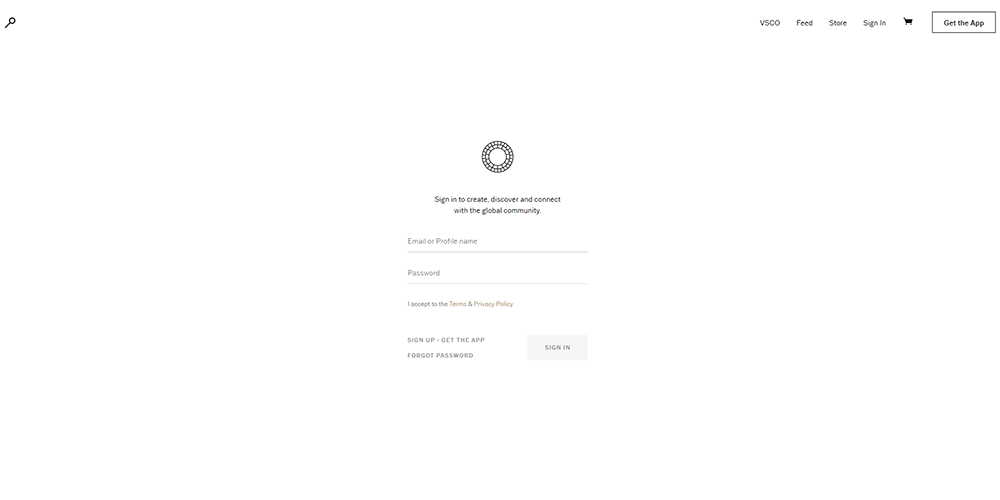
Similar to Squarespace, VSCO uses a minimal design direction for their login page. It includes the company logo, easily accessible links for important actions, and perfect contrast between descriptions, placeholder text, and the primary CTA.
Drip
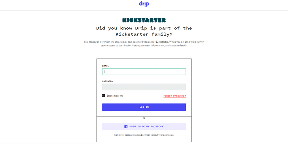
Drip’s login design is bold, using elements of both minimalism and brutalism. The colors are stark but cohesive and effective. The mono typography is a neat touch and makes this design stand out as one of the most unique and memorable.
Lookback
Lookback implements design language from Material Design for their login. It uses great color contrast and a card background with subtle depth effects.
Buffy
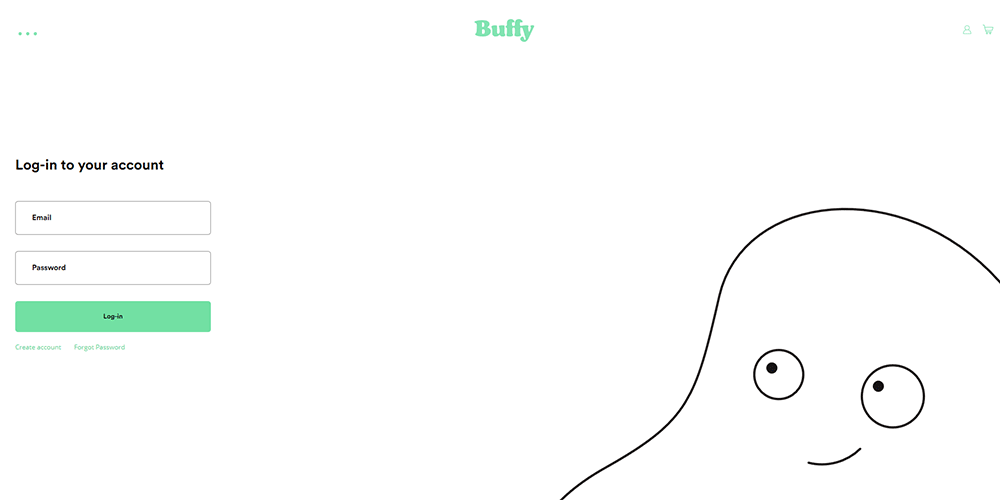
Buffy’s login design is so simple and easy to use. It’s unique in the way it’s positioned to the left, and includes a simple but fun illustration.
Paddle
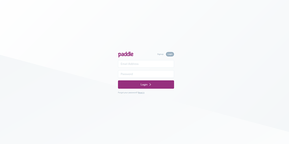
Paddle’s simple login form carries through the use of their brand colors, and combines with a highly visual but delightfully subtle background graphic.
Expo
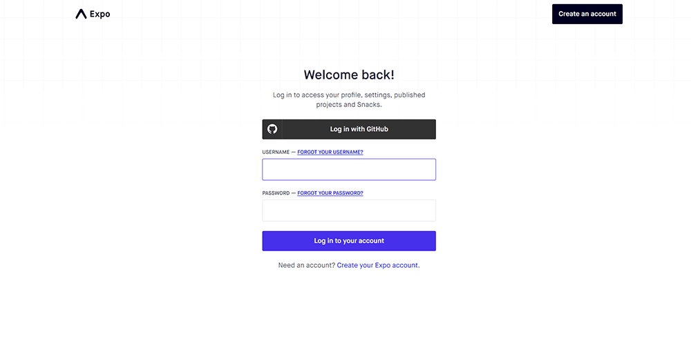
Expo also uses a subtle background graphic for their login page. The design offers excellent contrast with a clearly defined primary CTA.
This post may contain affiliate links. See our disclosure about affiliate links here.