Creating a well-managed set of CSS codes can be a challenge. As technology evolves, it’s not really easy to say if you’re doing the right CSS best practices or you’re just messing up the code and compromising the quality of your website on different browsers.
Your Designer Toolbox
Unlimited Downloads: 500,000+ Web Templates, Icon Sets, Themes & Design Assets

Table of Contents:
- CSS Best Practices
- Amazing CSS3 Techniques You Can’t live Without
- Web Service Review: CSS Lint – Helping You Code Better
- Do’s and Don’ts of Writing Better CSS and HTML
Unlimited Downloads: 500,000+ Fonts, Web Templates, Themes & Design Assets

CSS Best Practices
Through practice, you should be able to avoid CSS errors. So, to give you a guide on the dos and dont’s when writing CSS codes, we listed below the CSS practices to follow as well as the bad habits to avoid. So, get ready and let’s get started.
Use CSS Reset
Browser inconsistencies are one of the biggest problems of front-end development nowadays. Styles like margins, paddings, line heights, headings, font sizes and so on may look different on different browsers. The goal of a reset style sheet is to reduce browser inconsistencies by providing general styles that can be edited and extended.
One of the great examples for a reset CSS stylesheet is normalize.css, a modern HTML5 CSS reset. All you have to do is include it before your own style definitions in your HTML file under the Head section. Otherwise, these styles will override your own style definitions.
Provide Style Sheet Information
Put a Title, Author, Tags, Description, URL information and so on on your stylesheet. This will give the user/developer a reference person to contact whenever they need support regarding your creation.
/*
Theme Name: Simple Parallax Website
Description: Simple Parallax Scrolling Effect
Author: Samuel Norton
Author URI: https://1stwebdesigner.com/
Tags: Parallax, Website
*/
Organize Elements on the Stylesheet from Top to Bottom
Usually for beginners, they put the elements on the stylesheet according to what they want to put first. But this is not a good practice for CSS code structure as it will give you a hard time finding CSS code elements on the stylesheet. Ordering them from inclusive styles (such as body, H1, p, a and the likes) followed by a header to a footer will make a lot of sense.
As an example consider the code structure below.
/****** General Styles *********/

body {...}
h1, h2, h3 {..}
p {...}
a {...}

/****** Header Style *********/
#header {...}

/****** Navigation Style *********/
#nav {...}

/****** Footer Style *********/
#footer {...}
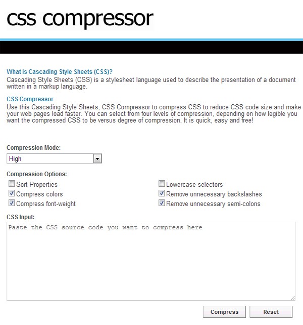
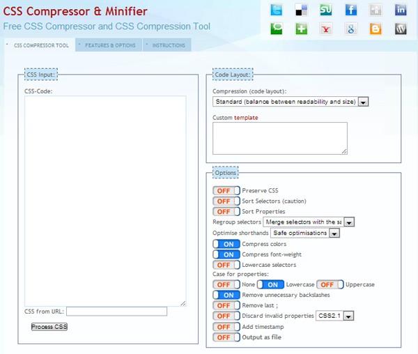
Shrink CSS file size with CSS Compressors
It’s really a great idea to shrink the CSS file size as it will remove white spaces, line breaks and remove redundant CSS styles. Through this, you can help browsers to speed up the loading of your CSS codes. Using tools like CSS Compressor and CSS Compressor & Minifier can make this happen.
Group IDs and Classes That Fall under the Same Element
If you have an element that contains different IDs and classes, you might want to group them to make them look organized and easy to find so looking for errors would not take time.
As an example, you have a class container that contains a div tag that has an ID of logo and another div tag that has an ID of icons.
</pre>
<div>
<div id="logo"></div>
<div id="tagline">< /div></div>
You can group them on your CSS code like this:
.
container {width: 960px; margin: 0;  padding: 0;}.
container #logo {font-family: Arial, sans-serif;  font-size: 30px;  color: red;}.
container #tagline {font-family: Verdana; font-size: 10px;}
Use Annotations/Comments to Identify a Set of CSS
Another best practice for CSS coding is putting a comment on each group of CSS. This will make it easy for you to look for specific groups of CSS once you got in to some CSS errors.
/****** General Styles *********/

body{
	margin: 0;
	padding: 0;
	width: 100%;
}

h1, h2, h3 {
    font-family: Arial, sans-serif;
	font-weight:normal;
	font-size: 55px;
	text-align: center;
	color: #fff;
	margin: 0;
	padding: 0;
}
Structure Naming Convention
Using proper naming conventions on IDs and classes will make a lot of sense to your work. This will help your work easier and faster in case you need to add elements or redesign a website.
For instance, putting a class of title-red will not make sense when you change the color of the title so why not just put title instead. Always name your elements properly based on their use not on their properties such as what color or font size the element have.
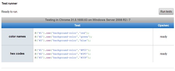
Use Hex Code instead of Name Color
According to a performance test run by Sean Connon, Senior Web Developer at Alien Creations, Inc, hex codes seems to be just barely faster on 4/5 runs. Check out the test performance here. Therefore, we recommend using hex codes rather than name colors.
Use CSS Vendor Prefixed
If you are aware of the new features of CSS3, you must also know that each browser has its own specification when it comes to a specific style. That’s why browser prefixes are being used to make sure that the browser supports the specific features/style you want to use.
Many designers and developers are having an error with this simple matter because they forgot to add vendor prefixes to target specific browsers.
The CSS browser prefixes are:
- Chrome: -webkit-
- Firefox: -moz-
- iOS: -webkit-
- Opera: -o-
- Safari: -webkit-
For instance, you want to add a CSS3 transition to your CSS code, you will just use transition property along with a vendor prefix. Check out the code below.
-webkit-transition: all 1s ease;
-moz-transition: all 1s ease;
-ms-transition: all 1s ease;
-o-transition: all 1s ease;
transition: all 1s ease;
Validate Your CSS
Using W3C free CSS Validator will let you know if your CSS code was properly structured. Another benefit of using it is it can point you the error on your stylesheet, thus, saving you more time on troubleshooting it manually.
Bad Habits to Avoid
Creating Redundant CSS
Using styles again and again for specific elements is not a good practice. It’s very important that you clean your code and remove redundant styles. For example, if you have a paragraph tag and span tag that has the same font size and color, you might just group them using a comma.
Take a look at the code below.
BAD PRACTICE
span {font-size: 12px; color: red;}
p {font-size: 12px; color: red;}
BEST PRACTICE
span, p {font-size: 12px; color: red;}
Mixing Tag Names with ID or Class Name
Adding tag name to an ID or Class Name is not a good practice since it would slow down the matching process unnecessarily.
Check out the code below.
BAD PRACTICE
p#container {color: red; font-size: 8px;}
BEST PRACTICE
#container {color: red; font-size: 8px;}
Targetting Margin and Padding Positions Separately
Using separate CSS codes to target margin or padding either on top, left, right or bottom is not a good idea. Shrinking your code and combining it in one line will make your code more readable and makes the loading of the browsers faster.
BAD PRACTICE
For example, you have a div id of container and you target all the positions’ margin separately. See the code below.
#container {
margin-top: 10px;
margin-right: 2px;
margin-left: 5px;
margin-bottom: 14px;
}
BEST PRACTICE
You can just combine all these styles in one line. Check out the code below.
#container {margin: 10px 2px 5px 14px;}
Using Underscores on ID or Class Name
Using underscores might give you unnecessary results on old browsers. It is highly recommended to use hyphens.
Take a look at the example below.
BAD PRACTICE
.
left_col {margin: 0; padding: 0;}
BEST PRACTICE
.
left-col {margin: 0; padding: 0;}
Final Words
Throughout this article, I provided you some tricks and guidelines on how to write a better CSS code and what mistakes to avoid. Keeping these rules while you’re coding will help you implement clean codes and prevent you from having errors in the future. Make sure you validate your CSS code using W3C CSS Validator for a quality and error-free CSS code.
Now let’s look at some great techniques that you wont be able to do without.
Amazing CSS3 Techniques You Can’t live Without
CSS3, along with HTML5, is quickly shaping up to be one of the most exciting and useful Web technologies in years. In this section, I will be explaining some of the new graphics-rich techniques and properties available with CSS3. You will learn what is likely to be approved as part of the final spec, what is still a work-in-progress, and how to deal with cross-browser incompatibilities and lack of support in older browsers.
Introduction to CSS3
CSS3 is a collection of modules that extend the previous CSS2 specification that we all know and love. Most of the graphics effects discussed in this article come from the Backgrounds & Borders module. There are a number of other additions in CSS3, some of which are more layout-focused, others enable ways of dealing with content styling that previously required server-side HTML generation or JavaScript.
The important thing to remember is that CSS3 is still a work-in-progress, so just because some of the latest browsers support these features doesn’t mean that (a) you should expect all browsers to support these features soon, and that (b) you won’t have to change how you do things later on once CSS3 becomes a full fledged standard.
What Used to Require Images No Longer Does
The annoying problem of having to save out dozens of special image slices just to create a nice button or box style is solved with CSS3. Using several new properties, many of the common graphical effects we designers like to employ on a regular basis are easy to create right in the code. These include (click each image for demo & source code):
Shadows
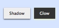
Recently, designers were just starting to get used to the fact that you can easily add shadows behind text. Internet Explorer doesn’t yet support the text-shadow property, but Safari and Firefox have for some time. But what’s really exciting is now you can add drop-shadows to boxes and controls using the box-shadow property. The syntax for box-shadow is much the same as text-shadow, which we describe below.
Gradients
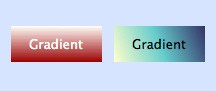
Wow! That is all done with CSS, no images required. Just so you realize how fast things are developing, CSS3 doesn’t actually specify a standard syntax for gradients yet, so currently there is one syntax used by WebKit (Safari, Chrome, etc.) and another used by Gecko (Firefox). We will explore both approaches in this article.
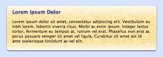
Borders with Rounded Corners
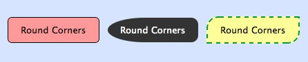
CSS has allowed several different border styles (double, inset, dotted, etc.) for some time, but now with CSS3 we have the ability to add a border radius to some or all corners. Yes, rounded corners are now possible without resorting to crazy JavaScript hacks or images! Another part of the CSS3 specification is border images, which is also interesting. It’s a rather complicated technique all by itself, so I will save that discussion for another time. You can read more about the spec at the W3C.
How to Style Boxes
A good mindset to employ when using the latest CSS3 techniques is first to find an acceptable baseline style that is supported by incompatible browsers. We’ll cover some thoughts about older browsers or IE support later in this article, but the idea here is to style a box or page element without using shadows, rounded corners, gradients, etc. and see if you are reasonably happy with the result. If it looks decent, then you can go ahead and add all the nice eye candy with the knowledge that if someone is using a browser without the necessary CSS3 support, they’ll still have a reasonable experience.
For today’s example, we’re going to through three stages to add in our special styles.
Start with the Baseline
.styledbox {
background-color: #fed;
border-top: solid 1px white;
border-bottom: solid 1px #669;
padding: 10px 18px 10px 18px;
color: black;
font-family: "Lucida Sans MS", "Lucida Grande", Helvetica, sans-serif;
font-size: 10pt;
margin-bottom: 10px;
}
This CSS code will get us started. Create a div and enter in some text, and you’ll see a basic box look.
Add Rounded Corners
As with most of these properties, we have to maintain more than one syntax to support multiple browsers (a real drawback currently). Since I develop first in Safari on the Mac, I’ll start with the WebKit version.
-webkit-border-radius: 8px
Aha! The corners are now rounded. Next, I’ll add the Gecko version:
-moz-border-radius: 8px
border-radius: 8px
When at all possible, always add the version without any prefix. That way you’re future proofing your style sheet in anticipation of the CSS3 final standard.
If you want to have additional control over the radius of each corner, use the border-[top-left|bottom-right|etc.]-radius syntax. Note that currently, the Gecko version is slightly different: -moz-border-radius-topleft, etc..
Add a Drop Shadow
Now, we’re going to add the drop shadow. If you’ve ever used the text-shadow property before, this syntax will look familiar.
-webkit-box-shadow: 0px 1px 3px rgba(0,0,0,0.7);
Now here you’ll notice I’m not using typical hex codes for the colors but am using the new rgba syntax. The first three integers are the expected 0-255 range of colors values, but the last one is a decimal number from 0.0 to 1.0 that represents the alpha value (literally the opacity of the color). The ability to specify semi-transparent colors is truly welcome and allows us to create shadows that work well on different backgrounds.
Again, don’t forget the alternative versions:
-moz-box-shadow: 0px 1px 3px rgba(0,0,0,0.7);
box-shadow: 0px 1px 3px rgba(0,0,0,0.7);
Adding a Gradient Fill
OK, this is where things are going to get tricky. The CSS3 spec for gradients is so new and undefined that there’s a completely different syntax whether you’re talking about WebKit or Gecko. I had to spend some time going back and forth between BBEdit and Safari to get it just right, and then when I switched over to Firefox, it took another while before I could figure out how to duplicate my results.
Gradients can be applied to a few common properties. Usually you’ll want to use background. Here’s the WebKit syntax:
background: -webkit-gradient(
            linear,
            center top, center bottom,
            color-stop(0%, #fffffa),
            color-stop(30%, #fed),
            color-stop(80%, #fed),
            color-stop(100%, #fffffa)
            );
For each color-stop, you can use a percentage or a position value (px, etc.). I think percentage is nice because it will scale with the box.
The Gecko syntax is different in rather confusing ways, but requires less typing:
background: -moz-linear-gradient(
            top, #eef, #cce 30%, #cce 80%, #eef 100%
            );
I recommend starting with the background selector for the solid color, then do the WebKit version, then do the Gecko version, for a total of three background selectors. Browsers will go down the list and use the one that they understand.
Final Result: (demo & source code here)
Bonus Feature: gradients on top of images!
As you can see, the final product looks really nice. You can even stack multiple boxes on each other and see how the shadow effects and corners are drawn. But then I had an idea. I’d heard that CSS3 supports multiple backgrounds, so could I actually create a gradient with alpha transparency on top of a background image? The answer is: yes.
background: -webkit-gradient(
            linear,
            center top, center bottom,
            color-stop(0%, rgba(255,255,255,0.8)),
            color-stop(30%, rgba(255,255,255,0))
            ), url(http://www.siteshine.com/images/tan_background.jpg);
background: -moz-linear-gradient(
            top, rgba(255,255,255,0.8), rgba(255,255,255,0) 30%
            ), url(http://www.siteshine.com/images/tan_background.jpg);
The key is to specify the WebKit version with the gradient, followed by a comma, followed by the url to the image. And then do that all over again with the Gecko version. That provides us with a beautiful “shine” effect at the top of the box rendered directly on the image. With CSS3, you won’t have to worry about height-related image tiling issues for glows or shadows again!
Styling Forms
Form styles can be tricky as browsers sometimes won’t render controls styled by CSS (they continue using the native OS’s UI elements). Or they use some of the selectors and ignore others. Generally, your best bet is to stick with text fields and buttons, and use Javascript-based custom controls for drop-downs, radio buttons, check boxes, etc.
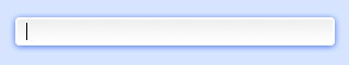
Here’s an example of a couple of form elements styled using CSS3:
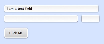
One cool thing I did was add extra styling for a “glow” ring when the form element has the focus using the :focus pseudo-class.
You can also create an awesome button using a single span tag. Check this out:
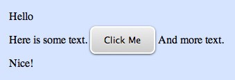
<p>Here is some text. <span class="roundbutton1">Click Me</span> And more text.</p>
What About Older Browsers?
The key with supporting older browsers or particularly Internet Explorer is to choose your battles carefully. Some designers will decide they need every user’s experience to be top-notch and so will eschew virtually all CSS3 effects in lieu of using images as before. Other designers may be so gung-ho about CSS3 that they forget that many users will not experience that great of a visual design.
What I recommend is to try as hard as you can to create elements using standard CSS2 syntax first. If you get to an acceptable place, then add the CSS3 effects you want. If you don’t find the baseline acceptable, then you’ll need to go the old-school way. If you go through this thought process with every element individually, then you’ll probably end up with a site design that has some elements done old-school for maximum compatibility, and other elements (perhaps less critical ones) spiffied up for the latest CSS3 browsers.
What doesn’t make sense is to spend time creating image-based versions, then creating alternative CSS3 versions. Yes, serving two different versions depending on the user’s browser could save a small amount of bandwidth, but I don’t see it as being worth the effort. Go with one version or the other and stick to that.
As we speak on how to write better code, we are introducing you with one great tool. Ready? Alright!
Web Service Review: CSS Lint – Helping You Code Better
Coding is something that takes time to learn and novice developers might not use the best practices when converting web interfaces from a Photoshop file into a fully functional web site. It would be really good to have access to an experience programmer, but not everybody can afford to hire one or knows someone that is with spare time.
So you might ask yourself what to do to improve the code before delivering a web page. Well, lucky you, there is a tool out there which I will review for you today. The tool is called CSS Lint, it is totally free and I definitely recommend trying it and see what you can get out of it. The difference between a good and a great programmer is all in the small details CSS Lint can fix for you – or, at least, can tell you to fix them and why.
CSS Lint is an open source application that checks your code syntax and, according to the latest web standards, gives you a list of mistakes it spotted in your CSS code. It is similar to the W3C Validator, only it gives you better descriptions of your issues and offers suggestions about how to solve them. The tool is very easy to use. The only thing you have to do is paste the source code and choose the rules you want to be enforced (and there are lots of them). CSS Lint will start analyzing your code immediately after you hit the lint button and it will not take too much time until you will see a full preview of how good your code is.
The rules
As said before, you can choose your code to be checked by certain rules and I will give you a list with all the rules you can choose from.
1. Errors
- Beware of broken box sizing.
- Require properties appropriate for display.
- Disallow duplicate properties.
- Disallow empty rules.
- Require use of known properties
2. Compatibility
- Disallow adjoining classes.
- Disallow box-sizing.
- Require compatible vendor prefixes.
- Require all gradient definitions.
- Disallow negative text-indent.
- Require standard property with vendor prefix.
- Require fallback colors.
3. Performance
- Don’t use too many web fonts.
- Disallow @import.
- Disallow duplicate background images (new feature)
- Disallow selectors that look like regexs.
- Disallow universal selector.
- Disallow units for 0 values.
- Disallow overqualified elements.
- Require shorthand properties.
4. Maintainability and duplication
- Disallow too many floats.
- Don’t use too many font sizes.
- Disallow IDs in selectors.
- Disallow !important.
5. Accessibility
- Disallow outline: none.
6. OOCSS
- Disallow qualified headings.
- Heading should only be defined once
The good part about any of these rules is that CSS Lint gives you a full explanation of each of them and, in most of the cases, recommendations on how to improve your code and keep the same functions, but avoid the specific mistake you made.
All these rules definitely make sense, but there is no time to take a look at all of them, so I will choose the most important and give you an explanation about why it’s a mistake to use them, and also some tips about how to replace them with valid code. This is only to give you a preview of the tool, you can obviously dig into it more later.
Disallow duplicate properties
A few years ago assigning the same property to a container was a mistake, although it is not considered one today. Today this is used as a way to deal with varying levels of browser support for CSS properties. There are browsers out there which support RGBA colors and there are some that do not, so a snippet like the following one would be accepted:
. container { background: #000; background: rgba (255, 255, 255, 0.5); }
Moreover, the following lines are also OK:
. container { border: 1px solid black; border: 1px solid red; }
However, this is not accepted and is puts up a warning when the two properties are separated by another different one or when the properties have the same value:
.container { border: 1px solid black; border: 1px solid black; }
or
.container { border: 1px solid black; color: red; border: 1px solid black; }
Require use of known properties
As more and more properties are accepted in a CSS file, this rule makes sure you don’t have any typos in your code. It is like spelling check in Microsoft Word. This rule checks each property name and makes sure it is a known CSS property. If there is a vendor-prefixed property (the ones beginning with a -), they are ignored by the tool, because they may add in their own properties. A normal CSS validator would warn when such a property is used (-moz-border-radius sound familiar?), because it doesn’t recognize the name, but CSS Lint doesn’t.
a { color: red; } would be accepted, but a { colr: red; } would be displayed as a warning, because the property colr does not exist. The following snippet: a { -moz-foo: bar; } would not be displayed as a warning.
Don’t use too many web fonts
Using too many web fonts is clearly bad technique, not only from a design perspective, but also from an accessibility and usability point of view. A web page that has to load more than one (maximum two) web fonts at every refresh is going to load very slowly and we know how this affects the user experience on a site.

Web fonts should not be overused.
The tool searches for the popular @font-face property and warns you when there are more than five of them. However, I personally don’t recommend you use more than one and, if you can, try to avoid using them at all.
Disallow too many floats
The float property is used to achieve a columnar layout in CSS. Some of us have been thought we have to use as many floats as possible to ensure everything stays in place, but this is not the case anymore. Today there are lots of grid systems out there which you can download and they do not have an excess of this property. They are also made by expert developers and do not have usability flaws. The 960 Grid System and The Grid System are two incredible grid generators and I recommend you check them if you haven’t already.
Moreover, using one of these grid systems will decrease the amount of code you have to write yourself, which will help you deliver the web site faster and make the final product better.
CSS Lint warns you when there are more than 10 floats used (which is something most of the designers already use when they create the basic layout). Analyzes have been made and it seems the grid systems improve web site performance (source), so why not take advantage of them?
Don’t use too many font-size declarations
If your website is well-organized, then it probably has a small set of font sizes. However, many designers prefer to use a clearly visible hierarchy and do this by playing with the font sizes. Well, this would not be a problem either if developers would code it properly. Instead of using font-size 15 times, define three classes and use each one of them five times. To better illustrate, take a look at the code below:
.small { font-size: 10px; }
.medium { font-size: 13px; }
.big { font-size: 16px; }

The font-size property should not be overused – try classes instead. Image from: www.dtelepathy.com
This way, instead of declaring the size of the font 15 times, just point the container to a class. This is known to be much faster and to improve the loading speed of your web page. If there are more than 10 font-size properties used in your CSS file, this tool will show you a warning and a description of the issue.
Disallow !important
The !important property is used to increase the specificity of a given property value. If a web page has many instances of this property, it is a clear sign that the developer uses it because he has problems styling the page effectively. Therefore, CSS Lint displays a warning when the !important property is used.
Heading should be defined only once
The heading is an Object-Oriented CSS (OOCSS) which works by defining certain objects that can be used to place a particular object anywhere on a web page and display the same. For example, the heading elements (h1 to h6) are built-in objects and should look the same wherever they appear. This means developers are not allowed to define the same element multiple times.
The following code displays as a warning:
h3 { font-weight: normal; }
.box h3 { font-weight: bold; }
As you can see, the h3 has been defined twice, once for general use and once when used together with the class called box. This is not allowed! However, headings can be defined more than once when the hover property is used:
h3 { font-weight: normal; }
h3:hover { font-weight: bold; }
CSS Lint is nothing more than a tool
The bottom line is that CSS Lint should be taken as what it is – a tool. This means that no developer should code like this tool wants only because it says so. There are some rules that developers might not agree with (like the controversial OOCSS rules) and nobody forces you to use this tool as a Bible. CSS Lint should only be a tool to help you if you want to know where you can improve. None of us like to find out that we have issues in the way we code – so some of us might reject it.
So, the conclusion?
Even though there are some issues with it, I think CSS Lint is a tool you should start using. None of the ways of coding is the best one, unless we think it is for the purpose of our project. If you think you’re doing everything right, then so be it. Otherwise just try to use CSS Lint a few times and see if it improves your results. If it does, it might be worth to stick with it.
CSS Lint is also a very good way for beginner developers to learn more about the way they code and the way they should do it. There is nothing wrong with that and it is never too late to learn something new.
Do you think CSS Lint is useful? Did you know about it or have you used it? Did it improve the way you code or the loading speed of your website? Or was it a waste of time?
Now we are going to look at some CSS and HTML combined, as the two are going hand in hand.
Do’s and Don’ts of Writing Better CSS and HTML
CSS and HTML are key languages to begin with, when you decide to invest your time in web design and development. They are powerful languages and most of the time may seem simple to work with. However, every single one of us, beginners, or advanced developers, have committed basic or major mistakes working with both these languages. With this in mind, I believe it is extremely important and always welcome to learn some good tips and practices which I hope will help you improve your skills and experience.
Some of you may be thinking that since you don’t see anything out of place when viewing your web page, you have your HTML and CSS documents built correctly, but you may be wrong. The truth is that you should not trust everything you code. Using the same ID more than once on the same page won’t result in wrong alignments or retrieve any error (unless you try to validate), but it is in fact bad markup and a major flaw in your code.
Doctype

Not so long ago, we had to use those really long Doctypes that were almost impossible to remember. Now, since you just need to use <!DOCTYPE html> on the top of your document, we have a much cleaner and better solution. Nevertheless, some people still forgets to specify it. This is mandatory for a validated and organized HTML document.
How you should do it
Never forget your DOCTYPE.
ID vs Classes

An ID is a unique identifier which allows us to target a specific element on the page and, since it is unique, it can only be used once in a page. On the other hand, we have classes which allow us to do exactly the opposite. Classes are used when you have the same element more than once on a page.
How not to do it:
<div id="block">
   <div id="btn"></div>
   <div id="btn"></div>
</div>
How you should do it:
<div id="block">
   <div class="btn"></div>
   <div class="btn"></div>
</div>
Say no to inline styling

Inline styling is unfortunately a pretty common practice and at the same time a bad one. It has nothing to do with invalid code or bad markup, but with organized code and structure. Imagine you have 30 pages and you need to remove an inline style you have applied to the same div on every single page, it would take you forever and steal precious time.
How not to do it:
<div style="width: 100%; background: #fff;"></div>
How you should do it:
<div id="wrap"></div>
Ove use of divs and CSS Classes

So you started your own project, you know how to use divs, ids, and classes. Inline styling is not your thing (fortunately), and you love to create styles and apply them everywhere. That’s great, but don’t write more than you have to. Having a div with an unordered list inside and a class applied to each li element is unnecessary.
How not to do it:
<div id="navigation">
   <ul>
      <li class="left"></li>
      <li class="left"></li>
      <li class="left"></li>
   </ul>
</div>
How you should do it
<ul id="navigation">
   <li></li>
   <li></li>
   <li></li>
</ul>
And in your stylesheet
#navigation li { float: left; }
Browser Resolution

According to the W3c’s latest statistics (January 2011), 13.8% of internet users have a 1024×768 screen resolution, and 85.1% use a bigger screen resolution. So the question is “What resolution I should design for?” I personally use a maximum width of 960 or 980 pixels for a vertical layout and between 550 and 640 pixels in case of a horizontal layout. Besides, though 13.8% seems to be a fairly low number, it still represents millions of internet users.
How you should do it
Consider everyone’s needs, and especially your target audience.
Block vs Inline elements

Differentiating block from inline elements can be a a delicate matter for beginners. A block element is displayed on a new line taking by default 100% width of the containing element, like divs (<div>) or paragraphs (<p>). An inline element is displayed with no line breaks meaning that it starts on the same line, taking only his own width, like span (<span>) or image (<img>). You can also change the way an element is displayed, this means that you can change an inline element to be display as a block and vice versa.
How you should do it
span { display: block; }
Use comments to organize your code

When I start a project, I try to organize it through commenting as much as possible and you should do the same. This is something purely optional but I highly recommend its use. It not only helps you find the section or element your are looking for, but also makes your life easier when you need to know which div your </div> is closing.
How you should do it
<!-- Begin #header -->
<div id="header">
<!-- End #header -->
</div>
Stylesheet:
/* --------------------------------------------------------------
Header
-------------------------------------------------------------- */
#header { background: #fff; }
Cross-Browser Compatibility

When you decide to make something, you should place yourself in the role of the end-user, and imagine that, even today, some of them still use browsers like IE6. A page in renders differently in Firefox than in Chrome or Internet Explorer. There are some useful tools you can use to check how your page renders in different browsers. Charina wrote a very complete article regarding this topic which I recommend reading – 10 Useful Tools For Cross-Browser Compatibility Check
How you should do it
Do not forget to pay attention to your layout in different browsers, systematically.
Keep it short – Generic classes, properties and CSS files

When you are coding you should always have one thing in mind, plan for the future. You are already using comments and keeping your code organized, so why stop here? The first thing I do when I’m coding CSS is to specify a section of generic classes, then on my HTML I simply use them alongside with other elements.
How not to do it:
Stylesheet
#firstblock { background: #000; float: left; }
.genblock { background: #006699; float: left; }
HTML
<div id="firstblock"</div>
<div class="genblock"></div>
How you should do it
Stylesheet
.left { float: left; }
#firstblock { background: #000; }
.genblock { background: #006699; }
HTML
<div id="firstblock" class="left"></div>

<div class="genblock  left"></div>
This is a simple way of declaring two classes. I like to find the most efficient way to do things, and as you can already guess, I really like keeping things organized, so when it comes down to properties, it’s the same thing. Why should we write the same property over and over again when we just need to write it once?
How not to do it:
#content { margin-top: 10px; margin-right: 12px; margin-bottom: 0; margin-left: 15px; background-color: #000; background-repeat: no-repeat; }
How you should do it:
#content { margin: 10px 12px 0 15px; background: #000 no-repeat; }
The ideal number of CSS files you should have in your project depends entirely on you and the way you work. I have been involved in projects where there was a “generic.css”, “main.css”, “global.css” among others, it took me forever to understand the purpose of each file. I usually have just two CSS files on my projects – style.css and reset.css.
How you should do it
You should make it simple and efficient to edit later on.
Don’t use heading tags randomly

Heading tags are not just there to make it pretty, they establish the importance of your content which makes them valuable for SEO. There are six Heading tags: h1, h2, h3, h4, h5, and h6. H1 is the most important, so you should use it for your web page or business name only. The rest of the tags should be used according to title or content importance. Also, you don’t need to have heading tags everywhere on your document.
How not to do it:
<h6>Post title</h6>

<h1>Text content</h1>
How you should do it:
<h2>Post title</h2>
<p>Text content</p>
Use absolute position only when you have to

When you’re starting out, you can easily become addicted to the use of absolute positioning. This is because it is an easy way of placing elements, however, this property should not be used excessively. Since elements with absolute position lose their normal flow, it is almost impossible to align them with other sections on the page. You simply can’t tell a normal element to be on the left side of an element with absolute position.
How you should do it:
Use absolute position only when you need to, and not because it is easier.
Type fonts

So is there a font you really like and you would love to use it on your page, is it a standard font? What if not? These are are questions you need to ask before you choose your typography. When you choose a font you must always have a backup plan, this means that in case the user does not have the chosen font, the second choice (or third, etc) will appear. Examples of standard fonts are Arial, Georgia, Lucida Sans Code, Times New Roman, Verdana, Tahoma, and some more. Now let’s say you would like to use a font that is non-standard, what would you do? The most obvious answer is @font-face.
How not to do it:
p { font-family: AurulentSansRegular, Arial, Helvetica, sans-serif; }
How you should do it:
@font-face {

font-family: 'AurulentSansRegular';

src: url('AurulentSans-Regular-webfont.ttf') format('truetype');

}

p { font-family: 'AurulentSansRegular', Arial, Helvetica, sans-serif; }
Always validate

The title is pretty self-explanatory, you should always validate your CSS and HTML documents. Why? The answer is why not? You have a way to know if your code has errors and it gives you solutions to fix them, so really, why not? Add CSS Validator and HTML Validator to your favourites.
How you should do it
Validate your CSS, and after that do the same for your HTML.
Conclusion
Some may consider these tips and techniques common sense and simple to understand, others not so much, but the important thing is that every coder make mistakes, and practice makes perfect.
Hope you enjoyed the article and have some fun experimenting, but keep it organized!
This post may contain affiliate links. See our disclosure about affiliate links here.


