Most Western packaging appeared limited, merely ‘contained’ on the canvas or package. Whereas Japanese design is more alive, spirited and energetic. Japanese packaging is created not to just contain the product, but has a unique soul of its own.
It’s easy to tell–most of the packaging and product designs are based on nature. In fact, they go to great lengths to add tiny details like faces, eyes and smiles to products to make it more ‘kawaii.’ Charming mascots, sweet characters and happy faces definitely sell in the company, and cute characters will definitely lure consumers into buying their products.
Kudamemo Fruit-Shaped Notepads
Japanese brought us so many ‘kawaii’ items, or objects that are so good and yummy enough to be eaten. The Japanese taught us to see life from a more humorous perspective, even during the most mundane times like working in the office. Some of the more interesting takes on mundane office items are things like what Japanese design studio D-Bros brought us. D-Bros created awesome sticky notes that looked like sliced fruit.
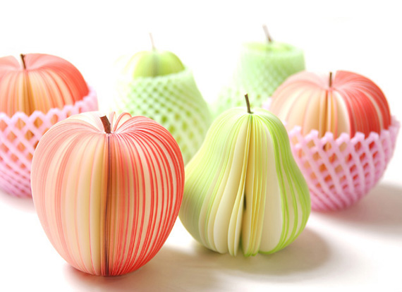
The notepad is designed by Masashi Tentaku. The stem is an actual tree twig. The notepad has 150 sheets of notepaper. It is sold individually or in a 6 pack. It looks so realistic–it even comes with the netting like the actual fruits!
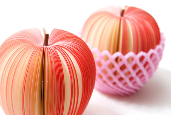
The Kudamemo sticky pads are available in apple and pear. The note pads look pretty on your desk, it makes a great decoration or gift.
Plastic Watering Cans
Could you imagine a watering can or a flower vase made out of a very thin plastic sheet? Sounds absurd, but it’s totally workable and practical.
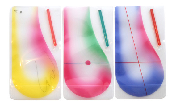
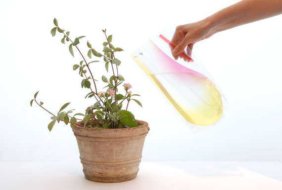
This quirky product design is again brought to you by the Japanese design company D-bros. It takes brilliant creativity to make a cheap material like plastic look beautiful, classy and elegant. D-bros has once again created an innovative design, using a flat plastic sheet as a watering can to water flowers and plants. In addition, you can also use them as a flower vase!
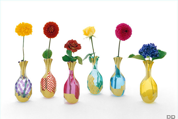
Did I mention that the company also made flower vases made of the same material?
Brilliant Package Design for Fruit Boxes
Japanese designer Naoto Fukasawa takes packaging design to a whole new level through literalist design. Most brands and packaging nowadays bombard users with texts, fonts, colors and elements to stand out from the supermarket shelf. Fukasawa takes the road less traveled and created these brilliant packaging designs.
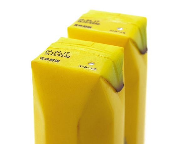
Above is the photo of Fukasawa’s brilliant design for a banana flavored juice box. He simulated the look, feel and texture of the fruit flavor contained inside. His design for a juice box is brilliant, vibrant and creative.
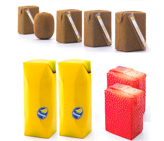
Naoto Fukasawa also designed fruit boxes for strawberry, kiwi and even tofu for a fruit box for soya milk.
Flower Packaging Design for Mizu-Yokan
You may have noticed by now that Japanese design tends to be inspired by nature–and the same is the case for the packaging design for a confectioner named Koujuken in Nara.
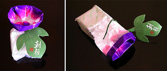
The flower packaging design is beautiful; giving careful attention to meticulous design and detail. It shows that the sweets are as natural and great tasting as the package implies. The packaging design celebrates the July flower Morning glory, with the foil printed with matte and gloss. It is sealed with a leaf fastener, looking like and pretty origami flower.
Lightbulb Lanterns by Kyouei
Japanese designer Kouichi Okamoto marries both traditional and modern design to come up with a contemporary, conceptual take on the Japanese lantern.
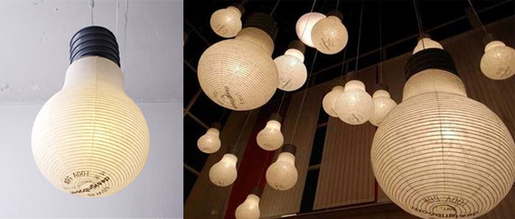
The lantern mimics that of an ordinary, modern lightbulb, but the materials used are that of the traditional paper lantern. It even comes with the text and elements to make it look like the real thing. The design first appeared during the 2008 Stockholm Furniture Fair, but is now available in for purchase.
Japanese Kawaii Matches
How can you make a cute design out of ordinary matches? Seem impossible? The Japanese apparently didn’t think so.
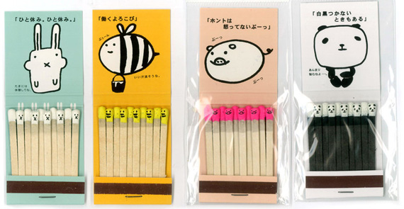
Looking at the kawaii designs with their cute tiny heads and grins, it seems like sparking a light with these matches is a crime.
Tohato Caramel Corn
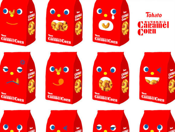
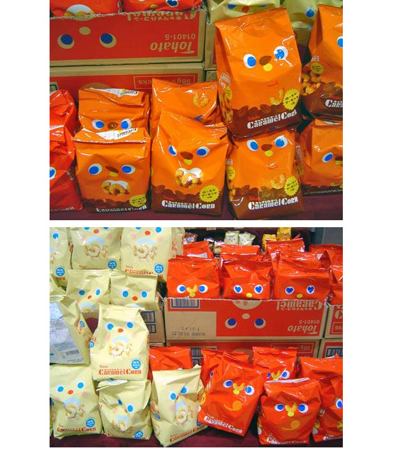
The packaging features cute characters with different expressions, along with the caramel corn inside the character’s mouth. It’s bright, colorful and eye-catching–certainly this will be the first snack in the grocery shelf that will catch your attention.
Nendo Chocolate Pencils
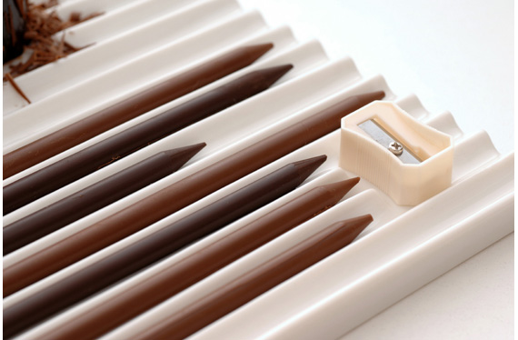
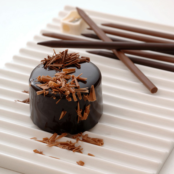
These chocolate pencils are practical and smart, great for garnishing chocolates and desserts. Chefs and chocolate lovers can use the special pencil sharpener that comes with it, in order to grate the chocolate on a dish.
The chocolate pencils are a collaboration with Nendo and patisserie Tsujiguchi Hironobu, the master behind dessert shops Mont St. Clair & Le Chocolat de H. Every meal and dessert plate is a masterpiece, just like a painting. And like a painting, it starts with a blank canvas and some art tools–thus the design of these chocolate pencils.
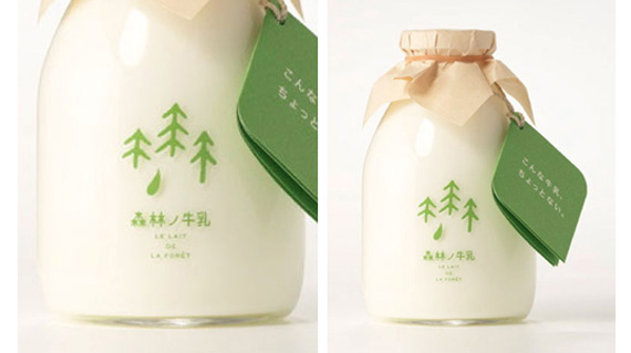
Minimalist Milk Packaging
A minimalist and fresh packaging for the Milk Forest brand that was created by Japanese design studio Rise Design Office. It looks fresh like the milk it contains, having been produced by cows that have been living in the forest freely throughout the year. You know what they say–the happier the cow, the better the milk!
Other Amazing Japanese Packaging Design
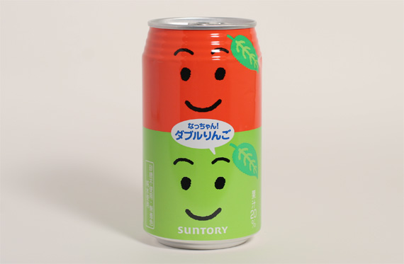
Nachan Drink
Akanbe Felt Bag
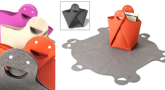
A multi-purpose bag that can also be spread out into a mat. And we can’t help but love the smiley bag handle.
Chichiyasu Yogurt
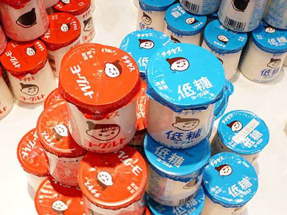
Charming, sweet characters definitely sell, especially with dairy products.
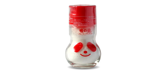
Ajinomoto
Ajinomoto Salt Packaging in Japan.
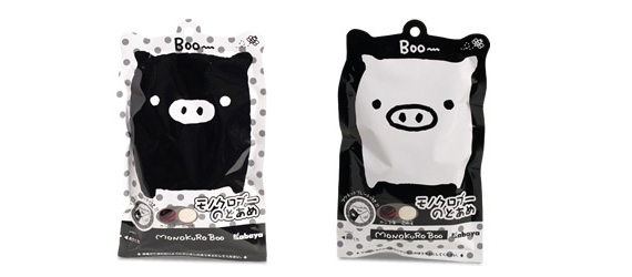
Monokuro Boo
Eye candy packaging
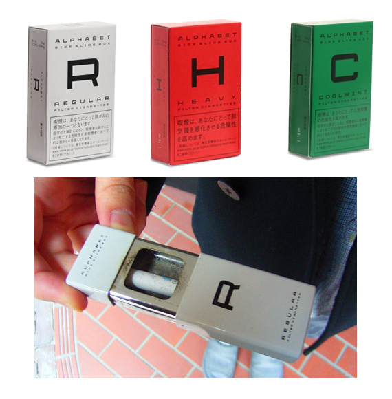
‘Alphabet’ Cigarettes
Regular, Heavy and Cool Mint cigarettes with minimalist packaging. The packaging is also a portable, mini-ashtray.
This post may contain affiliate links. See our disclosure about affiliate links here.

