Newsletters have long been a necessary aspect of marketing. While in the early years, designs were basic and uninspiring, we are now seeing some extraordinary examples of companies and individuals look to separate themselves from the competition and deliver something with high visual appeal to subscribers.
In this article, we are going to take a look at the latest newsletter design trends and showcase some of the most effective examples in circulation.
Your Web Designer Toolbox
Unlimited Downloads: 500,000+ Web Templates, Icon Sets, Themes & Design Assets
Attention-Grabbing Imagery
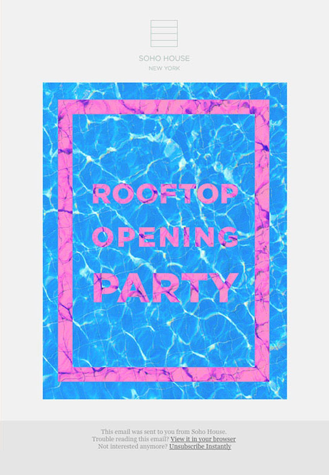
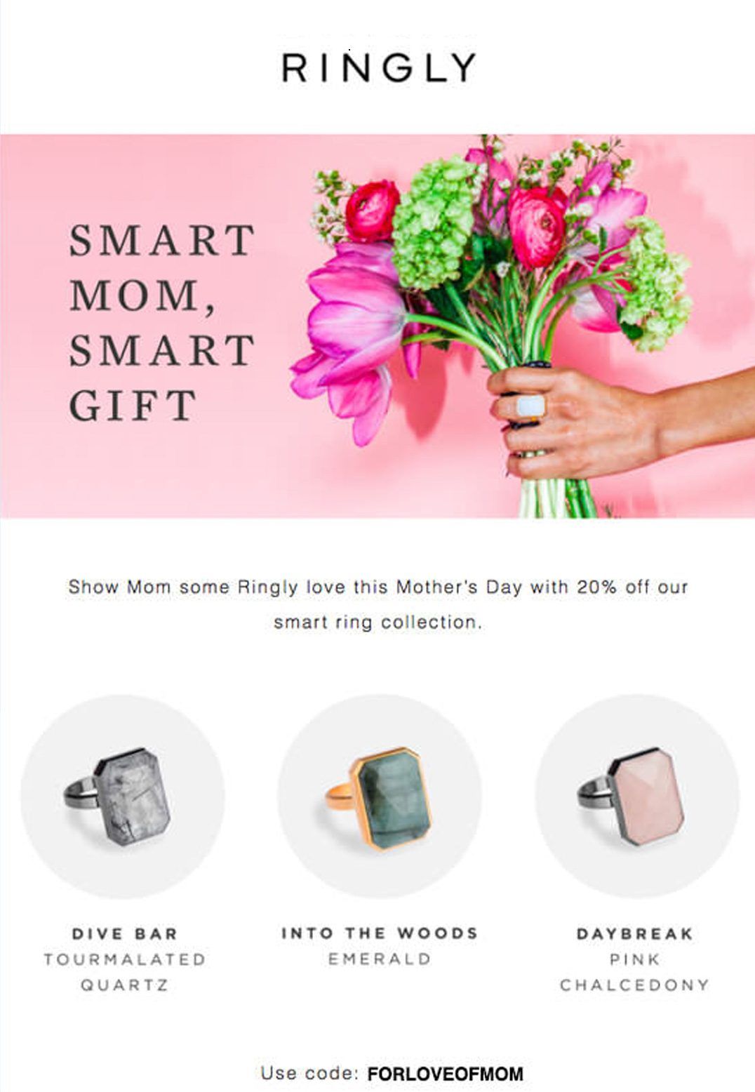
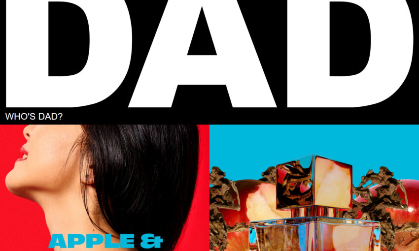
As users’ inboxes are busier than ever, companies only have a split second to grab attention as emails are flicked through and discarded at a mere glance. One way to do so is through bright and colorful imagery which stands out while also conveying a message and acting as a CTA area.
Minimal Content
Similarly, email content is down-sizing to ensure they don’t lose users’ attention with overly long content sections and text areas. The content is kept precise and to-the-point, allowing the user to gather necessary information in just a few of seconds.
Brutalism
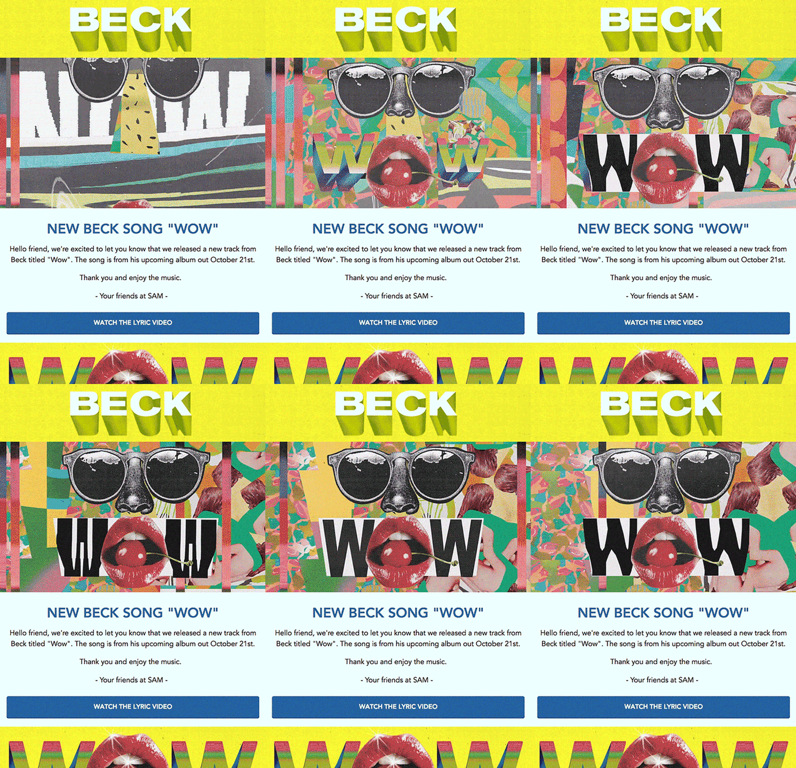
Brutalism has also found its way across to newsletter design. It is particularly effective in promoting artists’ music such as in Beck’s example below. It uses long, distorted drop shows, bright colors, collage imagery, and basic upper and title case typography.
Bright & Vibrant Colors
Bright color usage is especially effective in drawing a user’s attention and adds much visual interest to what would, as you will see from the below example, otherwise be a somewhat underwhelming newsletter that could easily be glanced over or missed while checking your inbox.
Focus on Typography
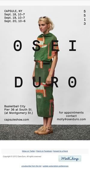
Typography is an excellent medium for carrying a brand in an email newsletter. So often, newsletters do not conform to the same standards as their counterpart website.
The below example uses typography elements sparsely but with purpose, including important information such as location and dates, and emphatic type for the company name. It results in a poster-like appearance – great for demanding attention and showing off a product or clothing line.
Have you received a remarkably designed newsletter recently? If you have, share it with us below!
This post may contain affiliate links. See our disclosure about affiliate links here.

