This article was originally posted at https://medium.com/@christinatruong/how-to-add-a-css-gradient-overlay-to-a-background-image-170216435f65 and was kindly shared by Christina Truong. Check out more of her work at https://christinatruong.com.
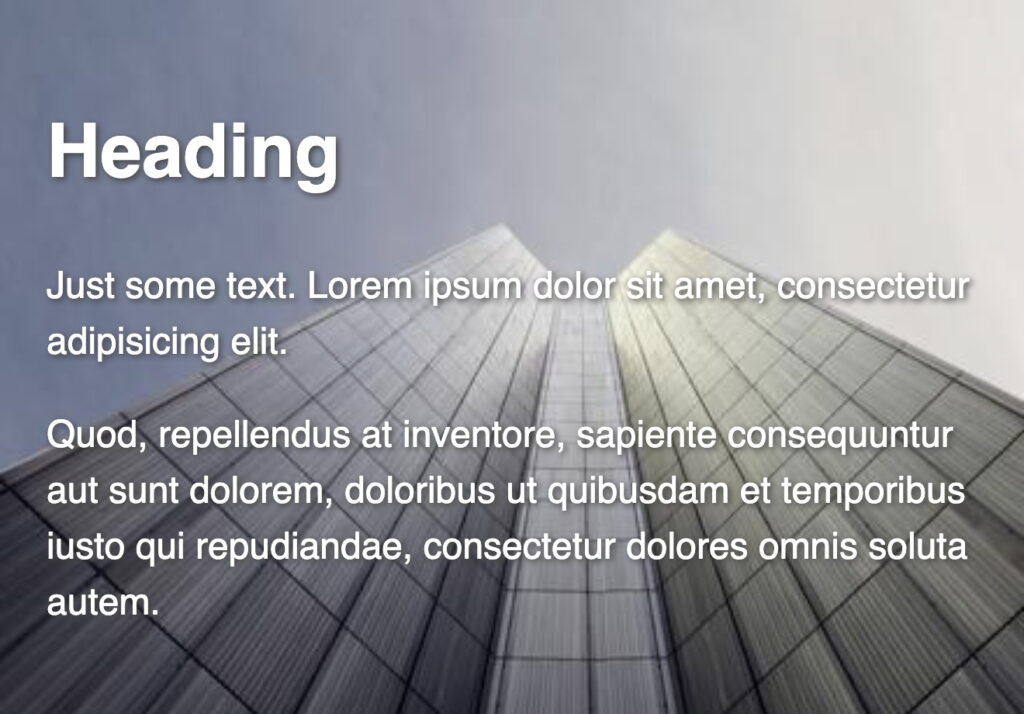
Using images on a web page helps to add visual interest. But figuring out how to place text on top of the image, while making sure you can still read it, can be challenging. There are a few different ways to get around this issue.

Prefer to watch a video? This article is a companion piece to my Decoded by Christina series on YouTube.
Option 1: Choose the right background image
The easiest option is to use images that have a big blank area for your text or doesn’t have a lot of detail.
If you don’t have your own photos, there are plenty of free and paid options for stock photography such as Adobe Stock or Unsplash.
Option 2: Edit the background image
Maybe there’s a specific photo that you want to use but it doesn’t have any blank areas for text or has a lot of detail. Another option is to use Photoshop or other image editing software to change the overall color profile of the image. This can help light colored text stand out by darkening the background image or vice versa.
To create this effect, add a black or white background color on a layer underneath the image, and then change the opacity of the image, to darken or lighten the photo.
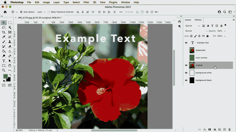
Example of editing images in Photoshop by changing the opacity and adding a background layer
You could also add a color overlay or de-saturate the photo to make it black and white. Depending on the image, these techniques can help to make the text stand out.
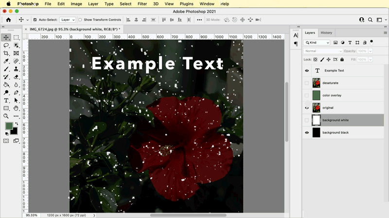
Example of editing images in Photoshop by adding a color overlay and de-saturating the image
This might be okay if you have a few images but if you’re using a lot of photos, it might get cumbersome to manually edit all the photos.
Accessibility
If you are making edits to images, it’s best to avoid adding text to the image itself. For the visually impaired, screen readers are used to read out the text in an HTML document. If the text is in the image, then it can’t be read aloud. And you want your web pages to be as accessible as possible.
While you can and should add an alt attribute to your images, this attribute is used for describing the image itself.
<img src="image.jpg" alt="description of image"/>
And most of the time, when working with text and images, the image file is added as a background image using the CSS background or background-image property, so you won’t even be able to add an alt attribute. So just avoid doing it altogether!
body {
  /* shorthand */
  background: url(image.jpg) no-repeat;
  /* longhand */
  background-image: url(image.jpg);
  background-repeat: no-repeat;
}
Option 3: Use CSS!
Luckily, there are ways to work with text and background images using different CSS properties and techniques.
The color and text-shadow property
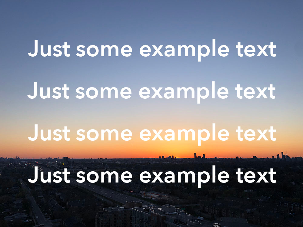
Sometimes just adjusting the text color, with the color property, will do the trick. If the image is mostly dark, use white or a light color to add contrast, or vice versa if the image is mostly lighter colors.
In the example below, the heading is in an area of the image that has less detail, so a color change kind of works. But the paragraph text is still hard to read since it’s in a more detailed area of the image.
Screenshot from the Codepen containing the full HTML and CSS example
Another option is to add a drop shadow, using the text-shadow property.
h1, p {
  color: white;
  text-shadow: 1px 1px 3px #444;
}
Screenshot from the Codepen containing the full HTML and CSS example
But I find this doesn’t always work well with more detailed images. Plus it can be tricky to add a drop shadow to longer blocks of text or smaller font sizes.
To learn more about how to add a drop shadow to text, check out my text-shadow post.
The background property
Another option is to use the background property, which allows for a couple different ways to add color to either the the text or the image. The background property is actually shorthand for many different properties but this post will focus on background-color and background-image.
background-color
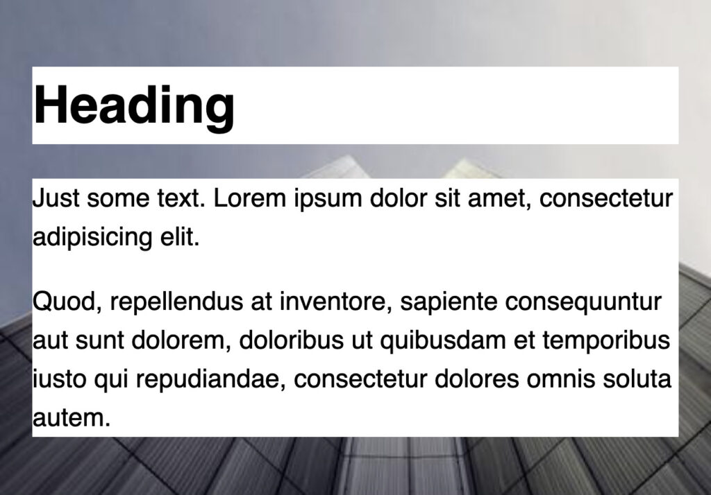
Let’s start with taking a look at how to use background-color to add a color to the element, which will display underneath the text. This property can be used with any type of <color> value.
A background-color can be added to a single element, such as the h1 tag, in the Codepen example. It can also be added to a group of elements by selecting the containing element, such as the text-container div, which will add a color to the container being used to group all the paragraphs.
h1 {
  background-color: white;
}
.text-container {
  background-color: white;
}
Screenshot from the Codepen containing the full HTML and CSS example
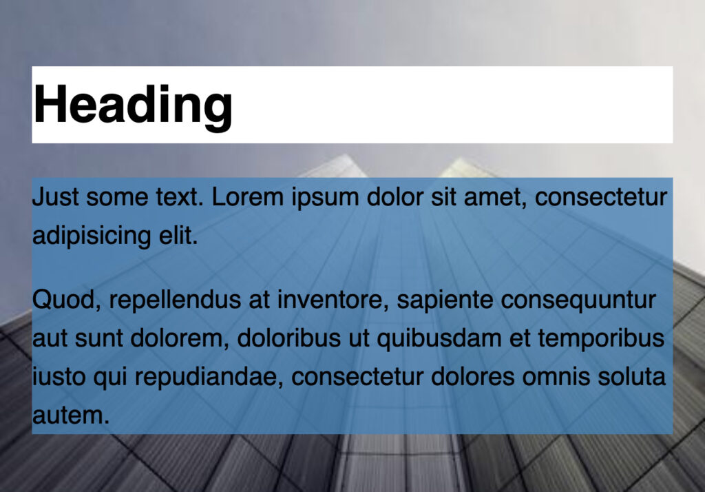
To have more of the background image showing through, add transparency by using an rgba() colour value instead of a keyword or hex code.
/* sets the color with alpha transparency */
background-color: rgba(70, 130, 180, 0.8);
The first three values specify the red, green and blue components, using numbers between 0 and 255, with each value separated by a comma. 0 represents black and 255 represents white. All other colors are a combination of the remaining numbers. The last value sets alpha channel, which is how the transparency is added. Any value between 0 and 1 can be used. 0 is fully transparent and 1 is solid. A percentage value can also be used. For example 0.8 is the same as 80%.
Screenshot from the Codepen containing the full HTML and CSS example
You can find RGB values using image editing software like Photoshop or other online resources. Here are a couple that I like to use:
- colours.neilorangepeel.com — browse through a bunch of different colors and find the RGB, keyword or hex values
- rgb.to — if you already have a color value and just need to convert it to RGB, this tool will do that
This technique will only add a background color to the elements, not the entire background image. Also, text-based elements are usually block-level elements, so they span the full width of their container. Adding a background-color to it will add the color all the way across the container, even if the text doesn’t span all the way across—as you can see with the “heading” in the above example.
If you don’t want that effect, there are some workarounds using the display value. View the video example for more details.
background-image to create a color overlay
To change the look of the entire background image itself, use the background-image property to add a color overlay to the whole image instead. Here’s how it works:
- Multiple images can be displayed using the
background-imageproperty - A gradient can also be displayed using the
background-imageproperty - Use a gradient and a background image to display a color overlay on top of the image
The Syntax
Multiple background images are separated with a comma. The images will be displayed stacked on top of each other. The first image listed will be on top of the following image.
background-image: url(image1.png); /* one image */
background-image: url(image1.png), url(image2.png); /* two images */
Gradient CSS data types are used to display a transition between two or more colors. Here’s the syntax using the linear-gradient function and an image. Make sure to define the gradient value first to create the color overlay effect, since the first value displays on top.
background-image: linear-gradient(color, color), url(image.png);
Here’s how this technique looks using a gradient on top of a background image:
background-image: linear-gradient(rgba(0,0,0 0.2),rgba(0,0,0,0.8)),
                  url(<https://picsum.photos/id/1031/500/400>);
I’ve added a black overlay, using the rgba() color value to add transparency, to be able to see the background image underneath. A gradient function also requires at least two color values: the first value is the top of the gradient, the second value is the bottom of the gradient. Also, because the values for this style can be kind of long, I like to put the two different values on its own line, just to make it easier to read. This is just my personal preference for formatting this type of declaration.
If you don’t want a gradient effect, then use the same values for both the top and bottom of the gradient. If you want to keep the gradient effect, just change the opacity levels or choose different colors.
Because the rgba() value requires parenthesis, which is contained within the linear-gradient() function which also uses parenthesis, it easy to accidentally to either be short a bracket or have too many. So just be sure to double check your syntax.
See the Pen
Working with text and background images by Christina Truong (@christinatruong)
on CodePen.light
Now you can tweak and edit as you please without the need to make any changes to the image file itself. To see a more detail breakdown of the techniques mentioned in the article, check out the corresponding video.
This post may contain affiliate links. See our disclosure about affiliate links here.


