It is undeniable that Apple is a great influence and mover in technological innovations.
People love the thought of a High Definition experience because of great quality images. They like to zoom in without having the photos or elements distorted into pixel bits and pieces. As a web designer, if you don’t mind using elements with massive pixels in your designs, then, you can say it’s just a walk in the park. To accomplish a great HD web design, it takes more work than the usual and it may also cost more than the usual.
Your Web Designer Toolbox
Unlimited Downloads: 500,000+ Web Templates, Icon Sets, Themes & Design Assets
Starting at only $16.50/month!
Is HD Web Design so bad?
The first issue that web designers would want to resolve is the design compatibility to all kinds of screens. Not everyone is a Mac user, nor does everyone have high resolution screens and an Internet connection strong enough to handle high definition displays. Web designers need a solution to these problems. But the first question is, can HD web designs possibly cater to everyone?

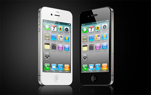
When Apple launched the iPhone 4 in mid 2010 it came with something totally new, the “Retina” screen. This new introduction took users by storm. They designed it to have the old resolution doubled, with an astounding 326 pixels per inch. And to think that a 27″ iMac had only 109 ppi.
For the users, it’s not bad at all. They will be able to view images in a very clear image, of course granting that they are looking at an HD proof design. But, for the Web Designers, it may push them a little further than the usual
It’s quite a list of disadvantages for High Definition Web Designs. But let me just break it down to some most common and very difficult to miss points on having an HD design.
First of all, high-res layered PSDs can make your computer load as if it’s going to take forever. Because of the heavy files, it will be as if your machine is crawling just to get it up. Then there are high-res stock photos. Those that may cost more damage to your budget.
More quality, more money. And of course, unless all of the people gets the fastest internet connection like that 75 year-old Swedish woman, high resolution images may just take so long to load up on the web.
What Can Web Designers Do?
There is quite a population of Mac users; however, it is also a fact that not every capable being in the world can use or afford to buy Apple’s somewhat overpriced products.

High resolution images and graphics would mean an attack to low resolution screens, phones and tablets. That would also mean that not everyone can visit your HD web page in such a breeze. If they don’t mind loading up images with doubled resolution, they might need to wait a while.
So, how can you make a good HD design that would not leave the other population out of your web page?
Use Scalable Vector Graphics (SVG)
 Always use vectors in your HD web designs. It is quick and easy to scale your artwork to different dimensions without losing the quality of your work. SVG files are always stored as XML, and not bitmap. For vector-based graphics, using Adobe Illustrator does the perfect job for great scalability.
Use CSS to Render Elements
Designers have predicted this movement towards HD. Using CSS3 to render user-interface elements is also very important when doing a high resolution design. CSS3 has box-shadow and border radius properties that work pretty much the same way as vector graphics.
Smooth Responsive Layouts
IPad and iPhones have the capacity to switch from portrait to a landscape view, depending on how the users are holding their gadgets. This would make your web page almost impossible to view when you have it on a fixed layout. Having a fluid and adaptive layout will allow the users to be able to see your web design even when they’re moving about.
High Resolution Images
Sad but true, there is no way around this one. Good quality images and photos are made to be dependent on resolution. To get your images HD-ready, you need to amp it up with the resolution, meaning you have to double the number of pixels per inch. High resolution images to an HD web design is a must, for now.
The best option is to use fewer images on your design as possible. Hopefully, in the nearest future there comes a solution to this dilemma.
Do People Notice or Care?
High resolution designs get the attention of most users when they realize that it isn’t compatible with their screens. Do people care about HD web designs as a whole? The answer is NO. Majority of the users wouldn’t even know the technicalities of a high resolution design. What they mostly care about is they are able to open the web pages smoothly.
Majority of web designers use the Mac in doing their jobs. However, you have to consider other designers that doesn’t use high-resolution screens or “Retina” display screens. According to about.com – web browser window size matters more than monitor resolutions.
For Mac users with handheld “Retina” screens like iPads and iPhones, another possible solution to the issue would be to make a separate or a different page for them if they need a high resolution display that they can zoom in and out of.
Ultimately…
There are ways to prepare your site for “Retina”.
Although we are being pushed into the future of high definition experience, not all of us are ready. When it comes to catering the needs of Mac users, as web designers, you need to step-up your game. Thanks to Apple, HD web designs are now in high demand.
At this point you may love or hate how they have affected the jobs of web designers, but it still won’t stop the demand for HD web designs. Apple maybe the first to come up with the “Retina” display, but, rest assured, the others will follow.
Let us just hope with this change, new kinds of software and apps will be available to cater to the need for producing great HD web designs.
This post may contain affiliate links. See our disclosure about affiliate links here.
