Presenting sumptuous and refreshing foods and beverages gives eCommerce owners much to work with when it comes to website design. Tantalizing images and a showcase of the associated benefits work well to draw customers into the purpose behind the website and lead their clicking fingers all the way to checkout.
As you will see from these examples, a great image can go a long way.
Warning: Some of these food images are so tantalizing you may find yourself reaching for a snack before the article is through.
Your Web Designer Toolbox
Unlimited Downloads: 500,000+ Web Templates, Icon Sets, Themes & Design Assets
1. 4th Street Cookie Company
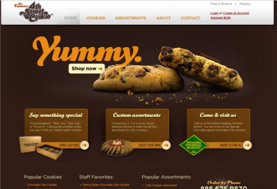
The 4th Street Cookie Company sells cookies as a supplementary income source to their physical store. The success of their web design is evident in the eye-catching images of their cookies (makes you want to reach right in to the screen and grab one!) and their easy navigation. Their clever call to action is strategically placed next to the cookie with an arrow. If you click to see the actual site, you will notice a slider that showcases five different varieties of cookies, all with images just as tantalizing as this one.
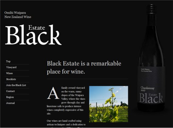
2. Black Estate Vineyard
Simplicity is the name of the game for this website and simplicity is often very effective if done right. This website nails it with its beautiful, elegant typography against the rich, black background. The design just beckons wine lovers to take a closer look.
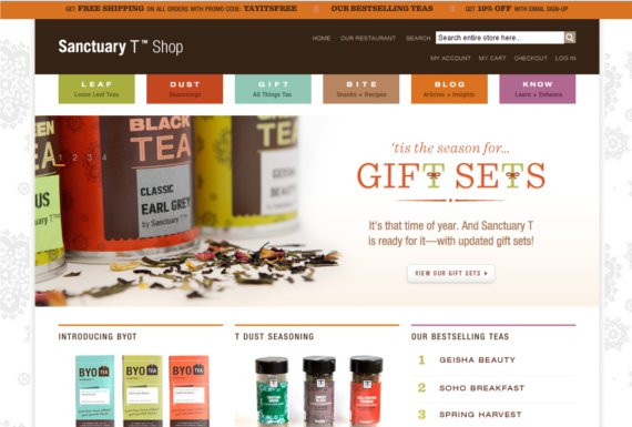
3. Sanctuary T Shop
Though this site has a few “faux pas”, overall it organizes information well and draws the visitor in. The color blocks on the navigation offer a creative style to what could be a boring menu. The navigation also shows that square-edge elements can be effective if done creatively. The products are showcased in the slider and right below the main graphic to grab visitors’ attention at every turn.
I also like the “Bestselling teas” which is a great way to keep potential customers on the website. People love to read reviews or look at highly-rated products.
Two things I would adjust in this website are the logo (it’s somewhat lacking) and the main graphic image that mentions the season “autumn”. Using the seasons is a great marketing ploy which I will show you in another example, but it ceases to work if you do not update the graphic. This can actually work against you.
Do you see any other possible improvements?
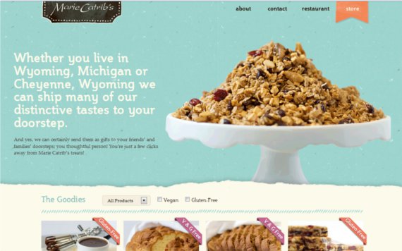
4. Marie Catrib’s
Again, I love the mouth-watering images that make you want to research the site more. Also, the typography is a nice addition to the overall light and fun attitude behind this website. It’s simple design is effective and the products are showcased well overall.
The product pages are also designed well with ingredients displayed prominently, an important addition for the healthy-conscious customer who visits this store. Also notice the context-sensitive navigation options “More info” and “+ Cart” that appear when users hover over an item on the home page.
The only element I would change is to make the image on the home page “clickable” to direct customers to the order page for that particular item
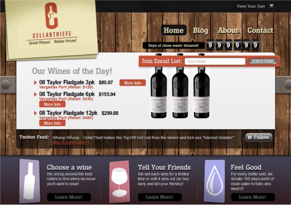
5. CellarThief
This website is very creative and for that reason it is often showcased on many blogs as an example of the best eCommerce website design. The designer’s use of textures and color is superb and the associated content (tell your friends, choose a wine, feel good) is displayed with right-aligned text to remain secondary but also pop on the page.
The creative background brings the brand to life and the “wine of the day” is an effective call to action expressing urgency for customers to take action before the day is over. If you click to the product pages you will see a well-organized layout that focuses a lot of copy in well-defined areas.
6. Gevalia Coffee
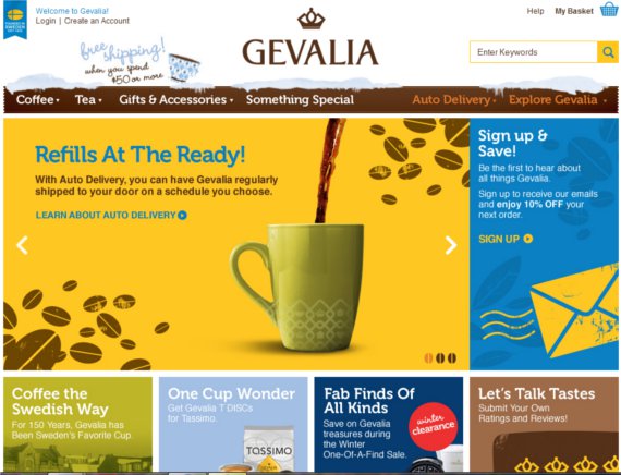
The font on this website may appear a little larger than most, but some newer sites are using these fonts along with grand logos and images to nail their message right from the start. The size of every element works well together. If the logo were smaller or the font any larger, it may have thrown off the whole appeal of the site.
7. Ghirardelli
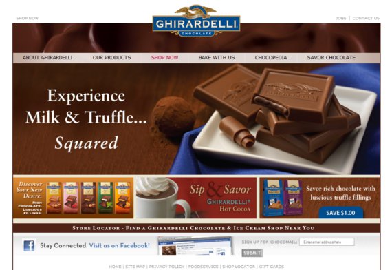
I am showing this website because I liked the images on the slider and the concepts behind them. They not only showcase Ghirardelli chocolates as ultimately decadent, but they also display images of the benefits of the product and how it can be used. The slider shows images of Valentine’s Day recipes and also urges the customer to buy the chocolate so the recipe turns out exactly as shown.
8. Teasta
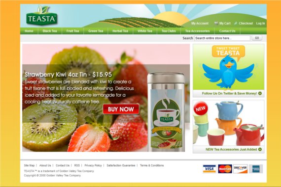
The choice of bright color works well for this brand and it captivates the customer. The “Buy Now” button is prominently displayed in the center graphic and the secondary content works well with this clean design.
Social interaction is also important for this brand and the use of the Twitter bird with clever content entices customers to follow the brand to land extra coupons and discounts.
The navigation is well thought out, although I would change it up a little so it stands out more.
9. Nuts in Bulk
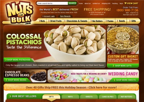
Apart from some extra clutter, I chose this site for many reasons:
- Creative, eye-catching logo
- Nice, easy to locate navigation menu
- Content segmented into separate blocks to streamline the design and make it appear clean.
- Green call to action buttons in each block which stand out from the page
- Slider showcasing products with enticing copy and images
- Phone number displayed in orange color to pop out from the background but not overtake the design.
10. Snapple
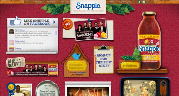
I am showing this website for creative inspiration. It is not a design I would recommend for all eCommerce stores but it works for the popular brand Snapple. Since Snapple is already a worldwide brand, it was a good idea to take the web design out of the box and create something unique.
The design offers visitors a chance to connect with Snapple on Facebook, Twitter, or via email. The website contains interesting, interactive elements that will keep visitors on the site. The site made me wonder around a little even though I don’t drink Snapple.
11. Purdy’s
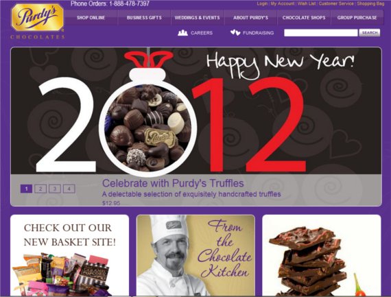
I like the simplicity of this site and how all the elements pop against the purple background. I am a strong believer of the “less is more” approach for eCommerce stores and I think this strategy is displayed here nicely. The subtle leaf design in the background is also a nice touch. Also, pay attention to how the website uses the season to stay relevant and interesting. The New Year is showcased to entice visitors to stay and shop.
12. Mom & Pop Corn
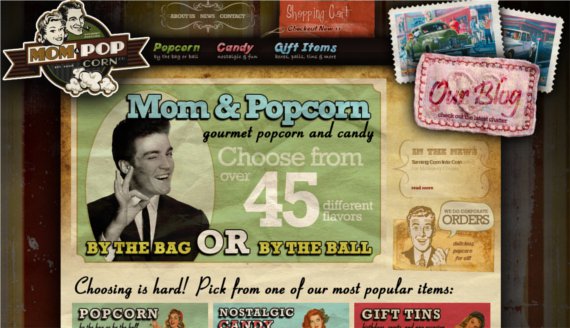
This site is a little grunge for eCommerce but I wanted to show off its creativity. This design style would most likely appeal to a younger population with an artistic bent.
I can appreciate the creative logo design and placement as well as the fun font and eye-catching navigation. If you look closely, the design still follows a typical layout with the main image followed by three sub-sections; however, it has been injected with a lot of personality that will appeal to a particular demographic.
13. Chocomize
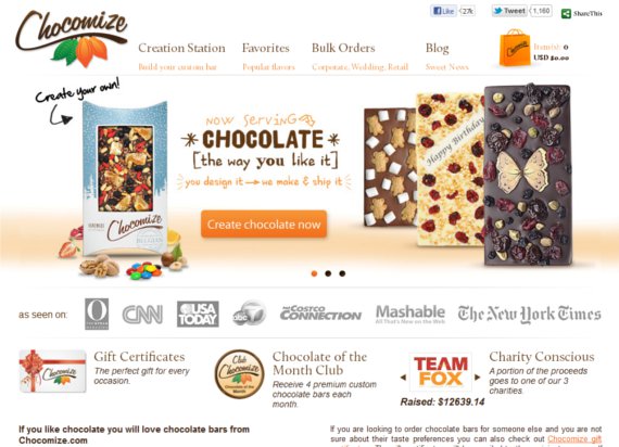
Though there are some design elements I would change, I liked the color scheme of this site. It is also great for conversions to display any noteworthy clients as this site did below the main slider. I would have showcased them a little differently, but the strategy is a good one nonetheless.
It should also be noted that this site does a good job at passing the 6-second test. Show your website to people for six seconds or less (anywhere from 4-6 is good) and then ask them if they know what the site is selling. This site was successful at making a complex and new concept like customized chocolate easy to understand and grasp within the first few seconds.
Now that you are probably running to the cupboards to fill your mouth with some chocolate, hold on for just a few more minutes…
I chose this website to show how you can change the area around the slider to showcase more products. The orange call to action buttons are also popping out from the design. Additionally, the BBB logo is displayed but not obstructive to the overall design.
15. Cheryl’s
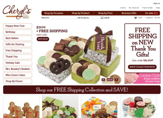
A few reasons why this website design is successful:
- Free shipping prominently displayed
- Side navigation well-defined and catches the eye
- Large banner displays advertising and draws the eye there while separating content nicely.
- Font is easy to read and scan and separated from design elements well
A few negatives:
- Cart symbol small and lost on background
- Contact information not visible
- Search bar is very small
When it comes to website design, sometimes two or three or even four eyes are better than one. Do you like these eCommerce website designs? What improvements or design changes would you make to these sites, if any? We would love to hear your opinions!
This post may contain affiliate links. See our disclosure about affiliate links here.

