This tutorial will help you create a responsive carousel using the CSS scroll-snap property and very little JavaScript for navigation. You can use it for products display, or as a gallery, or for your testimonials – like the example in this tutorial. So here is what we will be creating:

This is really just a horizontal scroll section but when you scroll, it “snaps” (auto-adjusts the position of the scroll container) to ensure it displays the full item – making it behave like a carousel. You can also use the arrows to display next and previous items, which requires JavaScript. You need to have some basic knowledge of HTML, CSS and JavaScript to follow along. On the way, you will learn about the CSS scroll-snap properties. Let’s get started.
Your Designer Toolbox
Unlimited Downloads: 500,000+ Web Templates, Icon Sets, Themes & Design Assets

Setting up
Create a blank HTML document and name it index.html. Add the basic HTML skeleton. If you use Visual Studio Code, all you need to do is type “!” and hit enter. You will end up with this.
<!DOCTYPE html>
<html lang="en">
<head>
   <meta charset="UTF-8">
   <meta name="viewport" content="width=device-width, initial-scale=1.0">
   <title>Document</title>
</head>
<body>

</body>
</html>
The font used in this demo is ‘Noto Sans’. Let’s embed this font from Google fonts. Add this CDN link below the title tag to embed regular and italic styles of this font.
<link href="https://fonts.googleapis.com/css2?family=Noto+Sans:ital,wght@0,400;0,700;1,400&display=swap" rel="stylesheet">
Create your stylesheet and name it style.css. Link the stylesheet to your HTML document below the Google fonts CDN link using
<link rel="stylesheet" href="style.css">
I have downloaded three portrait images from Pexels and cropped them square for this demo. You can choose to include your own. Name them testimonial1.jpg, testimonial2.jpg and testimonial3.jpg.
Creating a basic scroller
Let’s first create a simple horizontal scroller with three items with width same as that of the scroll container.
HTML
Add this markup within body tag in your HTML file:
<div class="testimonials">
   <div class="scroller">
       <div class="item">
           Item 1
       </div>
       <div class="item">
           Item 2
       </div>
       <div class="item">
           Item 3
       </div>
   </div>
</div>
Here, the testimonials div acts as the wrapper, within which is the horizontal scroller, and then three item divs.
CSS
In style.css, begin with some common styles for all elements:
* {
   margin: 0;
   padding: 0;
   box-sizing: border-box;
}
Add these styles to the body element:
body {
   font-family: 'Noto Sans', sans-serif;
   font-size: 1em;
   color: #4A5568;
}
Restrict the width of the testimonials wrapper to about 800px and center it.
.testimonials {
   max-width: 800px;
   margin: auto;
}
Add these basics styles to see the scroller at work.
.scroller {
   overflow-x: scroll;
   display: flex;
}
.item {
   min-width: 100%;
   min-height: 200px; /* To start with */
   background-color: #EDF2F7; /* For demo */
}
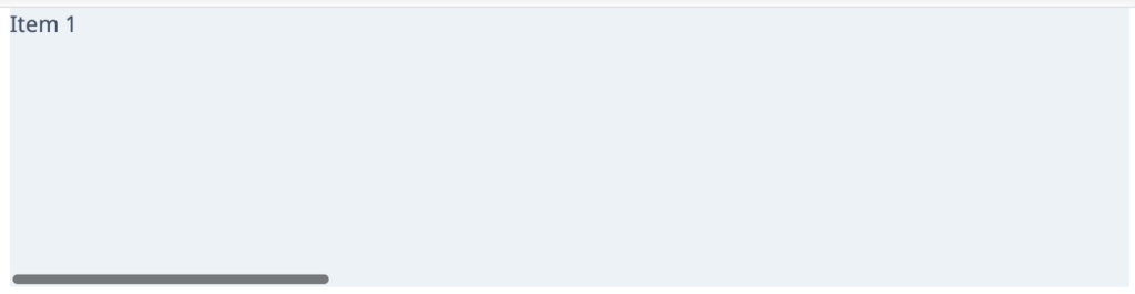
With this, you can see a horizontal scroll section like this.
Scroll Snapping
With CSS scroll snap, it is possible to enforce the scroll position (smoothly moving to the enforced position) once the user stops scrolling. This works by applying two primary properties – scroll-snap-type and scroll-snap-align.
The scroll-snap-type property is applied on the parent container (In our case, it’s the scroller div). It takes two arguments – the snap direction ( x | y | both ) and the snap behavior ( mandatory | proximity ). We need to use x for the direction because we are scrolling horizontally. For the behavior, mandatory means the browser has to snap to the position, while proximity is less strict. We will use mandatory.
The scroll-snap-align property is applied to the child items. It determines the snap point. It takes one or two arguments for x or/and y direction ( none | start | end | center ). In our case, this property can have any value except for none, because our items are 100% width of the parent container. You can dig deeper into the CSS Scroll Snap concept here.
Add these properties to the scroller and item divs.
.scroller {
   /* Existing styles here */
   scroll-snap-type: x mandatory;
}
.item {
   /* Existing styles here */
   scroll-snap-align: center;
}
That’s all you need for the magic! Now check your browser and scroll horizontally. You will notice that the browser strictly snaps to display a full item once you stop scrolling at any point. With this, the primary carousel behavior is achieved.
Adding content
Let’s add some content to the items.
HTML
<div class="item">
   <img src="testimonial1.jpg" alt="Elise">
   <div class="card">
       <p>
           Eu rebum molestie per. No nostrud imperdiet abhorreant qui, hinc incorrupte vix ad. Vel id aliquip oblique. Primis feugait sit an, brute illud convenire duo ea. Graece tempor eripuit sed in.
       </p>
       <span>Elise</span>
   </div>
</div>
<div class="item">
   <img src="testimonial2.jpg" alt="John">
   <div class="card">
       <p>
           Vitae pericula maluisset ut mei, pro eleifend gubergren eu. Et his brute graeci. Affert ponderum ei vel, dolorum accumsan ea has. Sea oblique salutatus ei, simul lucilius pri et. Errem melius temporibus ut eos
       </p>
       <span>John</span>
   </div>
</div>
<div class="item">
   <img src="testimonial3.jpg" alt="Imani">
   <div class="card">
       <p>
           Ne est virtute indoctum, quaeque vituperata cum ut. Te nisl quaeque pri. Vix ex autem latine, mel ne nobis scaevola, ei est dolor utinam commune. Pri unum doctus in, cu primis pertinax eos.
       </p>
       <span>Imani</span>
   </div>
</div>
CSS
Time to style it up.
.testimonials {
   /* Existing styles here */
   padding: 15px;
   text-align: center;
}
.item {
   /* Existing styles here */
   background-color: white; /* Change the value to white */
   margin-bottom: 10px;
   padding: 0 50px;
}
.item img {
   margin: 15px auto -60px;
   width: 120px;
   height: 120px;
   border: solid 4px #ffffff;
   border-radius: 60px;
   box-shadow: 0 4px 6px -1px rgba(0, 0, 0, 0.1);
   z-index: 2;
}
.card {
   background-color: rgb(237, 242, 247);
   padding: 80px 40px 40px;
   border-radius: 10px;
   box-shadow: 0 4px 6px -1px rgba(0, 0, 0, 0.1);
   z-index: 1;
}
.card p {
   font-style: italic;
   line-height: 1.6;
}
.card span {
   display: block;
   margin-top: 20px;
   color: teal;
   font-weight: bold;
   letter-spacing: 0.05em;
   text-transform: uppercase;
}
Our carousel has taken shape. The only thing pending now is the navigation functionality.
Adding navigation
In this demo, I have added simple arrows with < and > symbols for the navigation buttons. You can also use icons or images.
HTML
Add these two lines immediately after the scroller div, but within the testimonial div:
<span class="btn prev"><</span> <span class="btn next">></span>
CSS
Add these to your stylesheet for positioning and styling the navigation buttons:
.testimonials {
   /* Existing styles here */
   position: relative;
}
.testimonials .btn {
   position: absolute;
   top: 50%;
   margin-top: 20px;
   height: 30px;
   width: 30px;
   border-radius: 15px;
   background-color: rgba(95, 106, 117, 0.3);
   z-index: 1;
   line-height: 30px;
   text-align: center;
   color: white;
   font-weight: bold;
}
.testimonials .btn:hover{
   background-color: rgba(95, 106, 117, 0.5);
   cursor: pointer;
}
.testimonials .btn.next {
   right: 15px;
}
.testimonials .btn.prev {
   left: 15px;
}
JavaScript
We need some JavaScript to make the buttons work. Add this script before closing the body tag.
<script>
   const testimonials = document.querySelector('.testimonials');
   const scroller = testimonials.querySelector('.scroller');
   const nextBtn = testimonials.querySelector('.btn.next');
   const prevBtn = testimonials.querySelector('.btn.prev');
   const itemWidth = testimonials.querySelector('.item').clientWidth;

   nextBtn.addEventListener('click', scrollToNextItem);
   prevBtn.addEventListener('click', scrollToPrevItem);

   function scrollToNextItem() {
       scroller.scrollBy({left: itemWidth, top: 0, behavior: 'smooth'});
   }
   function scrollToPrevItem() {
       scroller.scrollBy({left: -itemWidth, top: 0, behavior: 'smooth'});
   }
</script>
In this code above, we have added ‘click’ event handlers to the prev and next buttons. The functionality of moving to the previous or next item is achieved using the scrollBy method. Check out the syntax and examples of element.scrollBy method.
The option behavior: ‘smooth’ gives a smooth sliding effect. Please note that this effect is not supported in IE 11 and a few older versions of other browsers.
Making it loop
You can optionally make this carousel loop – clicking on ‘next’ button for the last item makes the carousel start from beginning and similar behavior for ‘prev’ button, by changing the methods in your script to this:
function scrollToNextItem() {
   if(scroller.scrollLeft < (scroller.scrollWidth - itemWidth))
       // The scroll position is not at the beginning of last item
       scroller.scrollBy({left: itemWidth, top: 0, behavior:'smooth'});
   else
       // Last item reached. Go back to first item by setting scroll position to 0
       scroller.scrollTo({left: 0, top: 0, behavior:'smooth'});
}
function scrollToPrevItem() {
   if(scroller.scrollLeft != 0)
       // The scroll position is not at the beginning of first item
       scroller.scrollBy({left: -itemWidth, top: 0, behavior:'smooth'});
   else
       // This is the first item. Go to last item by setting scroll position to scroller width
       scroller.scrollTo({left: scroller.scrollWidth, top: 0, behavior:'smooth'});
}
Making it fully responsive
What we have now is already responsive. Except that, for browser widths smaller than 480px, the card becomes too narrow and long. So let’s reduce some padding for the item and card for this width using media queries.
Add this to your stylesheet:
@media screen and (max-width: 480px) {
.item {
padding: 0 30px;
}
.card {
padding: 80px 30px 30px;
}
}
This is it! You have successfully created a responsive carousel for your testimonials section with the least amount of JavaScript, and also learned about the new scroll-snap properties in CSS. You can modify this carousel to suit your needs. Try and explore using this carousel for images with varying width and watch how it behaves.
Here is the complete source code for you to download.
This post may contain affiliate links. See our disclosure about affiliate links here.


