Admin dashboards are an integral part of almost any web-based service or product. They form the area where users can interact with a product or service via a password-protected login stage.
Prominent examples include WordPress, Stripe, and Shopify. They typically include a significant amount of options and editable content. As such, the designer of an admin dashboard is tasked with incorporating these options while maintaining usability, design consistency, and simplicity.
Your Web Designer Toolbox
Unlimited Downloads: 500,000+ Web Templates, Icon Sets, Themes & Design Assets
When executed to a high level, the results can be stunning and present some of the very best examples of user interface and user experience design.
You might also like: 10 Free Bootstrap Dashboard Admin Templates.
V – Role Editor
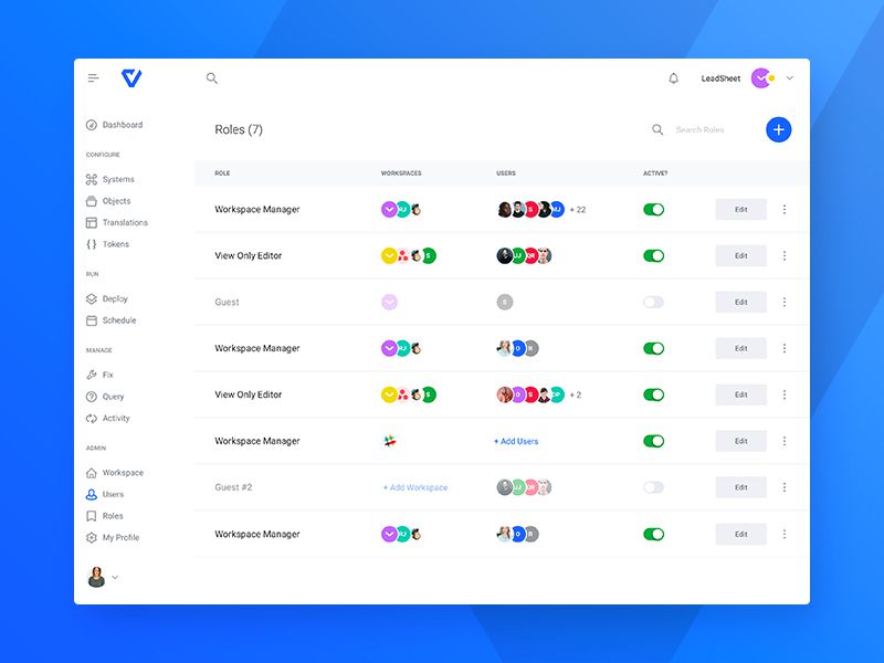
This role editor dashboard uses an abundance of white space alongside a beautifully selected color palette to use across default avatars, icons and buttons.
Pehia Dashboard
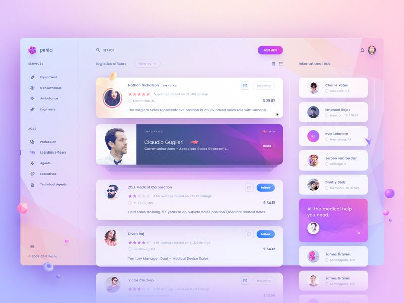
A highly visual example, Pehia’s dashboard utilises subtle pink and orange gradients throughout as well as overlapping shapes, simple icons, and large user imagery.
Project Management Dashboard
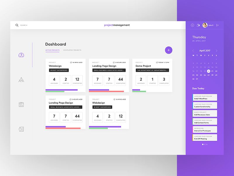
This project management dashboard utilises a card-based user interface with a bold use of color for project status and tracking. The sidebar and cards contrast perfectly with the grey background color.
Zeta Hr Dashboard
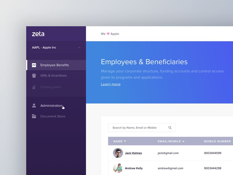
This simple but effective dashboard design by Zeta offers tremendous contrast and a beautifully spacious layout. The colors are on-point and highlight the different dashboard sections particularly well.
Sweetapp
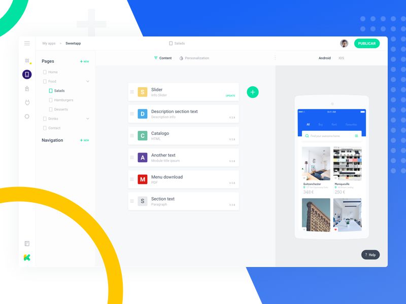
Sweetapp’s user interface focuses on white with a primary green color. Depth is provided via subtle shadows and border outlines. The design is spacious and the iconography is excellent.
Tenory Practice Activity
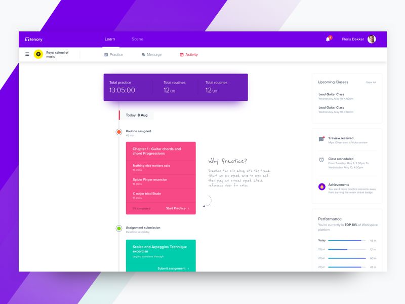
This dashboard design by TenorySync uses plenty of white space and bold card background colors. The timeline has been executed beautifully with great depth and visual effect.
SpendStore
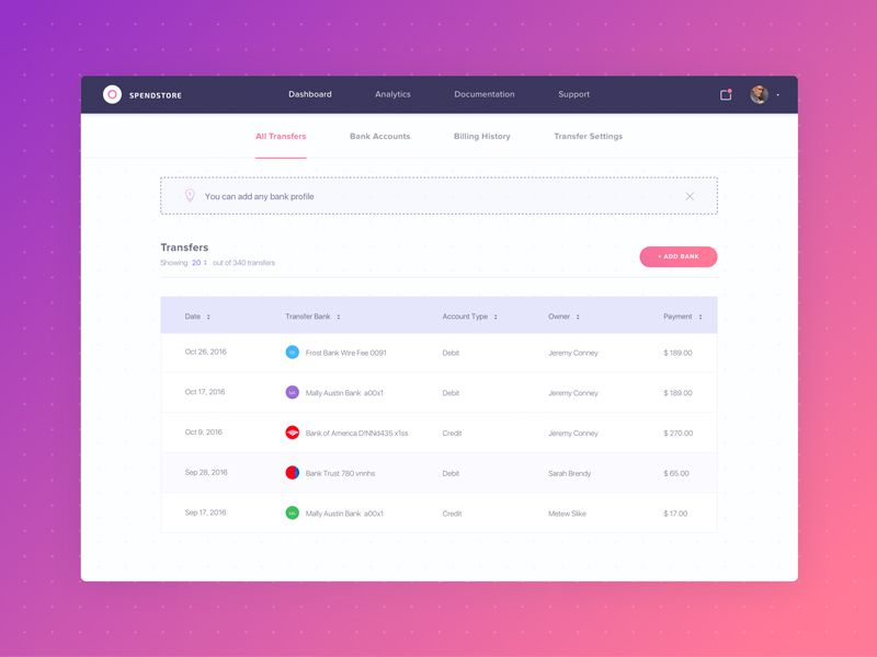
SpendStore has kept their use interface design very simple. It’s highlighted with beautiful gradient buttons and a satisfying off-pink highlight color. The details have been executed with precision in this admin dashboard.
Tapcore
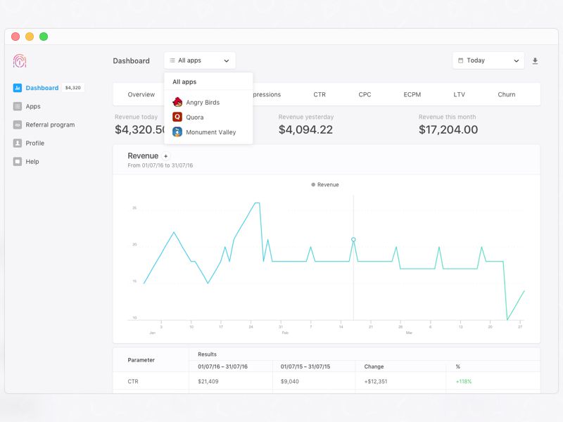
Tapcore’s dashboard is exceedingly clean and uses many aspects of the Material design movement. The content sections use a subtle drop shadow for contrast and the iconography is cohesive throughout.
Metronic
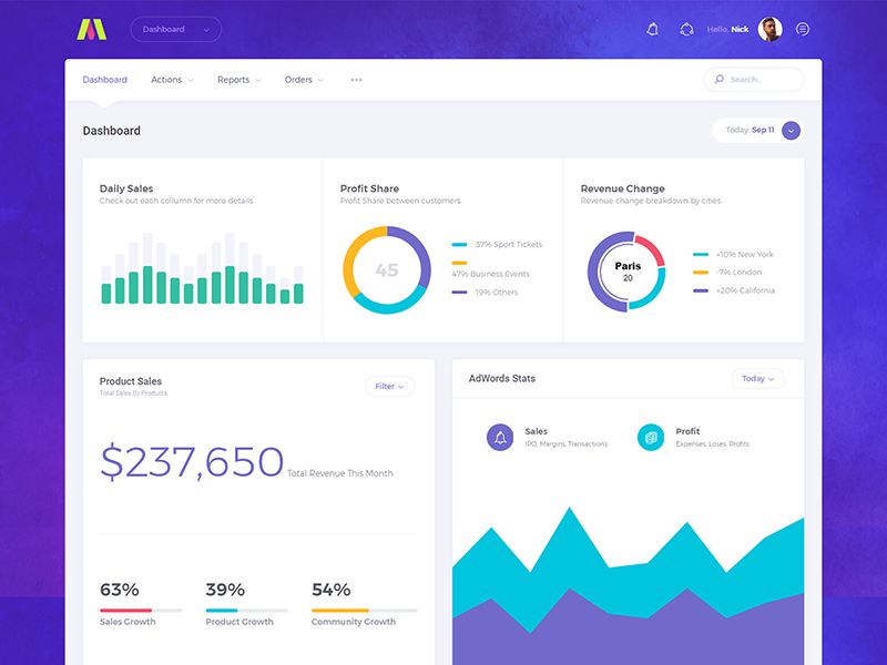
The Metronic admin dashboard template is a standout amongst competition. The navigation is unique but has a high degree of usability. The colors work beautifully throughout the graphs, charts, and typography.
Papanda
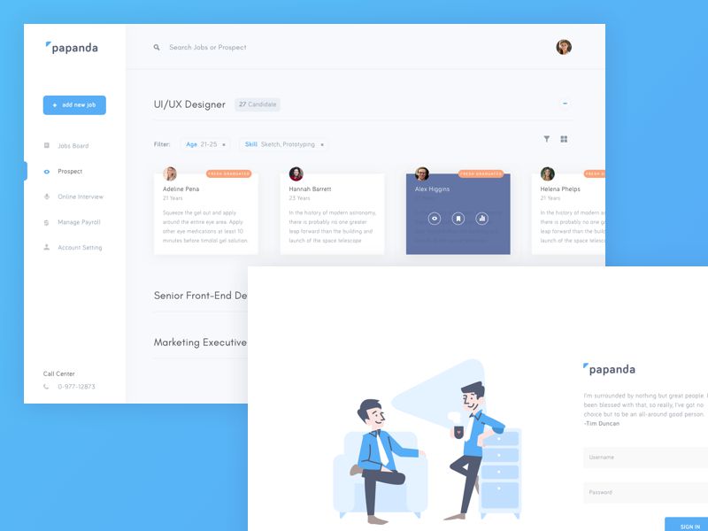
Papanda uses a two-tone color scheme of blue and orange. It also integrates custom illustrations which are a delight to experience and offer extra brand continuity throughout the design.
This post may contain affiliate links. See our disclosure about affiliate links here.

