YouTube has gone dark – dark mode that is. It is part of several website design updates the social media giant has undergone since its recent update, which rolled out in early May.
When YouTube revealed its new site, many noted that it’s already familiar to users of the site’s mobile app, which has used dark mode from the beginning. The redesign also implements a cleaner user interface (UI), new scripting technology, and more intuitive elements.

The Refreshed YouTube Logo
Your Web Designer Toolbox
Unlimited Downloads: 500,000+ Web Templates, Icon Sets, Themes & Design Assets
What Does Dark Mode Bring to the Table?
The Head of User Experience at YouTube, Fred Gilbert, states that the decision to go dark stems from a desire to offer a less-distracting UI. The dark theme cuts down on glare and makes it easier for users to view videos in dark lighting.
YouTube has left the decision to go dark up to users – they can opt into dark mode and opt out at any time. The dark theme is similar to the company’s mobile app, which has always had a black or dark gray background.
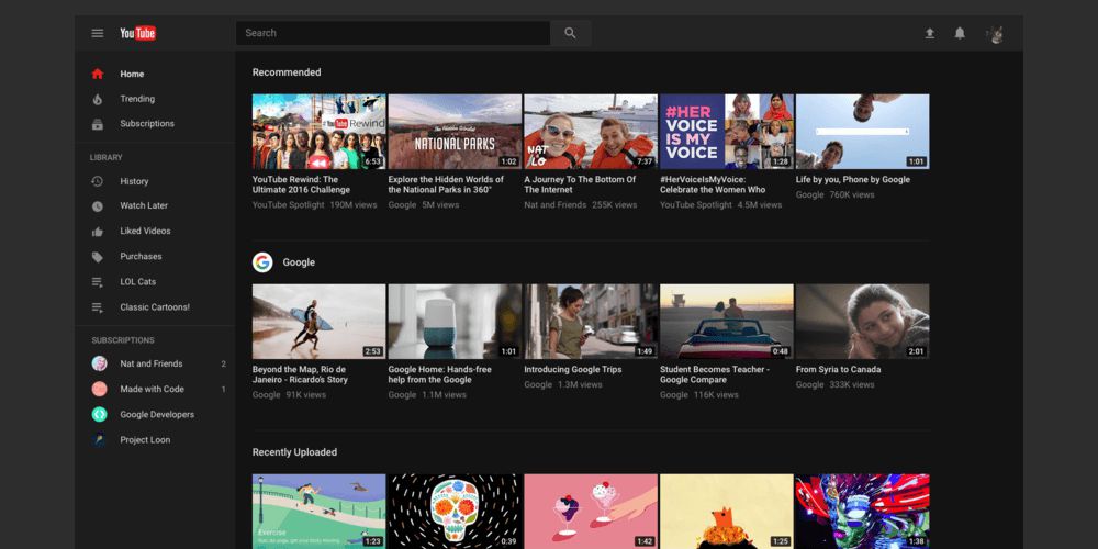
Before, users had to turn on a hidden developer mode to enjoy the darker interface. Now, turning the background black or dark gray is as easy as the click of a button. Dark mode helps YouTube videos and menu options pop, creating more vibrant colors and a better user experience. According to website color psychology, black “elicits glamour and exclusivity” and makes for excellent contrast against other colors.
The YouTube Mobile App
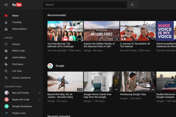
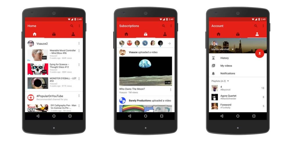
It is a wise color choice for a site like YouTube, which centers on the picture quality of its videos. Dark mode is perfect for nighttime viewing or to reduce the glare on the screen during the day.
Gilbert and his team state that they “Never go from zero to 100,” however. Instead of forcing the new site design on everyone right away, YouTube gave users the chance to give it a trial run and give feedback about the fresh look to the team. Gilbert says there are many new elements the company wants to try out, but not without feedback from users.
To activate dark theme, click on the dropdown menu for your account. Click “Dark Theme: Off” to turn it on. Dark Theme applies to your current browser only. Give feedback about the new design by selecting “Give Feedback” in the account menu.
Flat Website Design
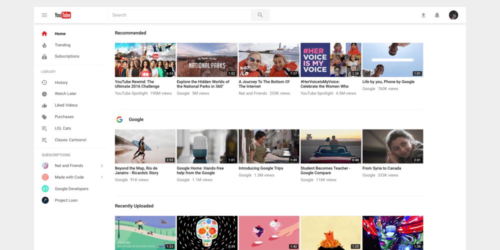
Another major change to the YouTube site is its minimal flat design. This gives the site a more sleek, modern feel. YouTube based these website elements on Material Design, Google’s brainchild that began in 2014. Material Design expands on the “card” look that Google Now debuted, using grids and depth effects to create a familiar yet technologically advanced look. Material Design uses light and shadows to create depth and utilizes responsive animations to improve the user experience.
The new YouTube has its search bar in the center and uses circular icons instead of square. There is more white space (or “black space” if you’re in Dark Mode) between menu items and other site elements, giving the entire page a lighter and cleaner feel.

The site also merged two separate menu bars into one, reorganizing the page to appear less crowded. These are elements sparked by Material Design that make the website look and feel more modern.
It’s called “Material” Design because it resembles pieces of paper – yet unlike real paper, the design elements are flexible and intelligent. Google based the design on traditional ink and paper, but expanded it to fulfill the needs of modern-day web users. To implement Material Design, Google used the web application Polymer. YouTube used the same underlying system to introduce its users to Material Design.
Meet Polymer, the Foundation of YouTube’s New Design
The aesthetic elements of YouTube’s new look are certainly exciting, but they are just the tip of the iceberg. Beneath the surface lies an entirely new foundation – Google’s Polymer, an open-source JavaScript library. Making the switch to Polymer was no small feat for the designers at YouTube, as it presented the need to completely change the underlying aspects of its website design.

Polymer will make it easier for YouTube to update its website in the future, allowing the brand to stay on top of evolving website design trends. Here’s what you need to know about Polymer:
- It is a library for web components, which lends the ability to define your own custom HTML elements.
- It gives browsers that can’t support standard components the ability to do so, with the help of sugar and polyfills.
- Polymer differs from Angular directives. Angular is a system for building web apps, while Polymer is a library for creating components. One can use these components to build web apps, however.
- Polymer has a library of Paper Elements, which are what Google (and now YouTube) use to create its Material Design look.
Polymer focuses on creating in-depth, powerful, and reusable web components. With Polymer as its infrastructure, YouTube can improve its functionality and embrace changes gracefully. Users may not be able to see the effects of YouTube’s switch to Polymer, but the brand will certainly benefit.
It now has powerful new features at its fingertips, and the ability to implement new things faster. Polymer makes the site move faster and smoother, and allows for the use of larger features without functionality disruption.
Faster, More Intuitive UI Elements
With Polymer comes the ability to use more intuitive design elements. The main goal of YouTube’s overhaul is to give users a better experience. Gilbert and his team achieved this mission by updating all the site’s elements.
For example, scrolling down your home page or subscriptions section no longer ends in a “Load More” bar, but simply loads new videos automatically as you scroll. This makes exploring faster and easier for users. Users can also change their language settings from the profile menu, instead of pressing a button at the bottom of the screen. These seemingly minor changes mark major improvements in usability and intuitive UI.
Another UI change is that designers eliminated distractive elements such as the old blue video link titles. In the new design, titles are black. YouTube also cleaned up its sidebar menus and made the YouTube logo and channel icons smaller.
Two menus have merged into one, and there is significantly less clutter on every screen. Banners are now emphasized more heavily, giving users a greater chance to express themselves. These changes make creator content the center of attention, not the brand or even the UI. Now, the videos shine as the most obvious and easily accessible elements on the webpage.
Why You Should Care About YouTube’s Site Redesign
Now that you get the gist of YouTube’s major updates, you may be wondering how it pertains to your business. With over 1,300,000,000 active users, YouTube presents an incredible market for your brand.
Almost every day, 30 million users watch about five billion videos. YouTube’s statistics are only increasing as more consumers opt out of pay TV services in favor of free streaming networks. Digital marketers can grow their audience exponentially by joining YouTube – a fact made even more appealing thanks to the site’s redesign.
Today’s users are sick and tired of seeing pop-up advertisements and static marketing. So sick, in fact, that Google is starting to penalize sites that use pop-up ads.
Take advantage of new SEO requirements and YouTube’s fresh face by focusing more energy on YouTube campaigns instead of other forms of digital video advertisement. YouTube is the second-largest social media platform (behind Facebook). Its new look may push it to number one before long. If you’ve waited to join the YouTube marketing community, now is your chance to jump on the bandwagon.
YouTube’s overhaul is set to make the site even more popular with users, encouraging new subscribers and more time spent on the site and the app. This is good news for marketers, as it makes YouTube’s already enormous audience more easily accessible. Subscribing to channels is simpler, as is discovering new videos and content creators. There has never been a better time to revamp your YouTube marketing efforts.
This post may contain affiliate links. See our disclosure about affiliate links here.

