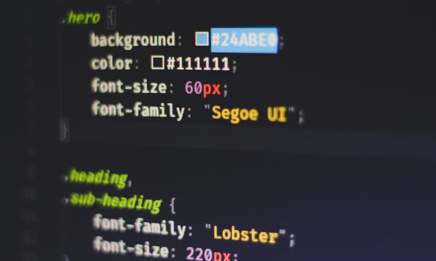
When designing a website, many people think very little of the color scheme. Some people just randomly pick their colors or simply choose their favorite colors whether they go together or not. Some people may think, “How important could the color scheme of my website really be?” This is the wrong mindset.
Truthfully, this is one of the most important aspects of your website. The color will be the first thing the viewer notices and, in that short time, they will make a judgement right then and there about you without any real information. So, take time to think over your color scheme because it is the first thing visitors to your website will see and use to experience your brand.
Having a strong color scheme will make it easier for people to recognize your brand. For example, what are some favorite companies you think of when you think of red and white? If you guessed Coca-Cola or Netflix then you would be like most folks. Neither Coca-Cola nor Netflix own the colors red and white, but when you see those colors together, they are usually the first two brands to pop into your mind.

Why Color Matters
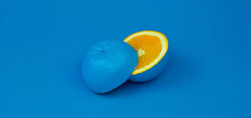
A clever and thoughtful color scheme can give your website a unique and modern feel. A poorly chosen color scheme can make your website feel dated and old school. The impact of a good color scheme cannot be stressed enough. 90% of judgements made when viewing a product in the first few seconds are based solely on color. The color is important because it can impact the user’s ability to read your content and possibly lead to eye strain.
These are very important factors, because you want users to easily be able to view the information you present to them. Eye strain affects how long a user will be able to stay on your website – something that is often overlooked. Bombarding your visitors with a lot of bright colors and visuals may look interesting and cool, but will ultimately impact the amount of time a user spends on your site.
According to HubSpot, 46% of people will judge the authenticity and credibility of your website based on the design and colors. This means that choosing the design’s color scheme should be in the forefront of your mind. Another 40% of people will respond better to visual information rather than plain text. One of the objectives of your website should be to present information that is easily digestible for the reader. A strong color scheme will help you accomplish that.
There are only seven base colors in the world. But once you factor in different shades and combinations, that number reaches well into the millions. You definitely have tons of options at your disposal – which can be overwhelming. But don’t worry, it’s not that hard.
If you are building a new website from scratch and trying to find the right color scheme or you’re trying to give your old website a makeover, then you’ve come to the right place. This article will help you find a color scheme that will both keep up with the trends and give your website the unique look you want it to have.
Hot Reds

Red is a very dominant color that has many different meanings. It can represent things such as anger, love, fire, and passion. With all the meanings this color can convey, the possibilities are endless when using red within your website.
This color will surely draw attention to important elements, but be careful not to overdo it. A little of this hot red can go a long way. Make sure that this color goes with the tone you are trying to convey.
Contrasts
Highly-contrasting colors are a dangerous area when it comes to web design. When done poorly, these designs are an eyesore and will make people look away and perhaps never come back. However, when done correctly you get something so visually striking that people can’t help but look.
The result is a beautiful webpage that draws users in and encourages them to explore. Contrast can be achieved by combining different colors, but also different patterns, which is not as common. In 2019, look to see web designers pushing the creative limit using contrasts to create beautiful web designs.
Earth Tones

Earth tones remind us of the natural world. They offer a modern look to web design when used correctly. They are often muted colors that are best used sparingly, so as to not overwhelm users.
Shades of browns, yellows, tans, blues, greens and many more are great for giving your website that Earthy feel. All of those tones are often found out in nature or within our homes. This helps to give your website a warm and friendly feel to it.
Be sure to keep an eye out for this trend in 2019, as it has already been becoming more popular in website design.
Black on Black

Black is a very timeless color that never goes out of style. It often gives off a very sleek and elegant look. In the fashion world, black is often used to display elegance and luxury. This same principle can be taken into web design.
Using black on black to display your site is a great way to attract people and make it feel as if they are partaking something extravagant. Using different shades on your website is a surefire way to attract attention to it. This look has been trendy forever, and that will surely continue this year.
Make Your Statement
There’s no better way to make a statement than with color. Whether bold and bright, or soft and muted, the colors you choose to display will say a lot about your brand. Take these trends into account and choose wisely!
This post may contain affiliate links. See our disclosure about affiliate links here.