Even if your website manages to consider all these aspects, it can only deliver so much value if it fails to encourage visitors to take action.
Your website’s conversion rate directly impacts your return on investment, so it’s worth researching and discovering how much your current website encourages its users to take the next step in your business relationship.
If you find that your conversion rates are lower than you want, make some simple tweaks to assure that it’s doing its intended job – bringing in new customers and converting customers to your brand.
The UX Designer Toolbox
Unlimited Downloads: 500,000+ Wireframe & UX Templates, UI Kits & Design Assets
Starting at only $16.50 per month!

Conversion Rate Optimization: A Primer
We can’t talk about converting visitors without addressing conversion rate optimization (CRO), which is the practice of making improvements to your website in hopes of getting more visitors to take a desired action.

Examples of these conversion actions include filling out a contact form, making a purchase, or downloading an ebook. CRO can involve something as simple as changing the wording or a message on a landing page or changing the color of a button, to something as complex as redesigning the entire hierarchy of your site. At its core, CRO has two goals:
- To optimize your site’s data to match the way your user approaches information gathering, and;
- To leverage the psychological principles of web design to maximize the chances of continued user interaction.
How Should Businesses Approach CRO?
Now that we have an operational definition of CRO, the next logical question most have is, “How do we make it work for us?”
Conversion rate optimization, like its cousin, search engine optimization (SEO), is an always-evolving multifaceted discipline. What works for one company might not work for another. What makes CRO markedly different from SEO is that it will depend heavily on your market research and desired buyer personas. Your CRO approach will vary from other methods, but generally, it operates on a few principles:
1. Creating a Clear Value Proposition
Often, when a business is facing lackluster conversion rates, it’s because there is no clear value proposition on the homepage. If you optimize your site for search, a new user will come across it looking for a solution to a problem.
Your goal is to convince them, quickly and effectively, that your company is the solution. Businesses often fall prey to the “peacock” trope – they try to fill their homepages with what makes them different and effective, which makes the user (and thus your message) lost.
A better approach is to write a clear, concise value proposition for your homepage. Add this to a clean, simple homepage and an alluring photo, and your user will be encouraged to move on to the next step.
2. Demographic Responsive Design
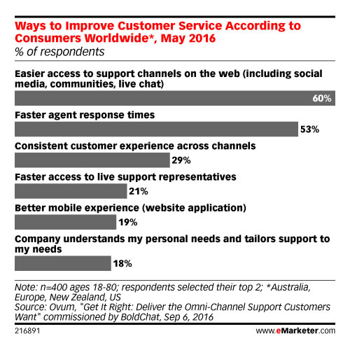
By now, most are familiar with the concept of responsive design and its importance to conversion rates. In case you need a refresher, here is a statistic to whet your appetite: According to the firm eMarketer, more than half the respondents to a recent survey reported they wouldn’t purchase from a brand that offers a poorly designed mobile experience.
In today’s era of data and personalization, our obligation extends far beyond mobile responsiveness. This is where the concept of demographic-responsive design comes into play. We know that each generation has unique qualities – we know millennials as idealists and see Gen Z’ers as being more cynical. With the power of demographic-responsive design, we can accommodate these two dichotomous traits with only a little extra effort.
3. Banish Your Homepage
Is the homepage dead? In today’s world of mobility and personalization, some web designers (and marketers, for that matter) are beginning to think so.
In today’s marketing landscape, the homepage has become less relevant, especially when combined with demographic-based responsive design. Instead of a central homepage, consider creating landing pages indexed by demographics, location, or other relevant metrics.
At its best, a landing page is a one-stop roadmap for your visitor. Provide everything your users need to convert on a tailored landing page, with little navigation required.
4. Make Your Forms Simple
Forms are tedious, and users dread filling them out. This holds especially true in the online sphere, where user attention is diminished even more than in the real world.
Online forms are little more than digital paperwork. Since users already see this as a chore, take steps to minimize the drudgery and create forms that convert:
- Ask only for information that’s absolutely necessary – with no optional fields. There’s no need to lengthen the process with information you don’t need for a business transaction.
- If possible and when it makes sense, use predictive text. For example, addresses and locations can often be auto-filled, which reduces some of the user burden.
- Make your error fields clear. It’s a constant annoyance for users to figure out why their form won’t submit. Strong visual cues and clear instructions will help minimize submission failure and make navigation more intuitive.
5. Revamp Your CTA
If your website is failing to convert, it might simply be because your calls to action aren’t effective enough. A good CTA guides the user to the next step in the business process, telling them they’re on the right track. There might be several reasons your CTA is failing to impress:
- It’s too confusing. Pack too much into a CTA, and your users might wonder if they’re doing the right thing. Worse, they may become convinced that you’re not what they need.
- It’s too generic. Learn more. Contact us. Continue. While these CTAS are simple, they don’t offer as much to a user as a more descriptive CTA might. Enticing users to continue is an important aspect of your CTA.
- They’re too hard to find. You have a well-worded, descriptive CTA, but it gets lost in your webpage. Dominant colors, animated buttons, typography that pops – these are all essential to making your CTA visible. Users shouldn’t have to search for it. Bring the conversion to them.
6. The Argument for Simplicity
In web design, we talk a lot about simplicity and how important it is a site’s success. The reason we harp on this so often is because we’re following a scientific precedent.
Those with a marketing background are no doubt familiar with Gestalt psychology, which aims to explain how our brains maintain order and perception in an otherwise chaotic world. One of the main principles of this discipline is the Law of Pragnanz, or literally translated from German, the law of pithiness. This principle says that we crave order, and thus organize our experiences in the simplest manner possible. Instinctively, we like simplicity because it leaves less room for the element of surprise.

If you want an example of this concept in real life, consider the anxiety associated with a large purchase such as a home or car, which requires reams of paperwork. Contrast that with a website like Amazon, where we can review order history, print return labels, and schedule UPS pickup, even for large purchases or those coordinated through third-party vendors.
We can apply the same scientific principles to boost conversion rates. Simplifying your site in terms of typography, images, and content is a start. Deepen your efforts by simplifying forms and heeding these other tips:
- Use “engagement bots.” This artificial intelligence tool isn’t exactly new, but we’ve expanded their use. Chatbots can answer questions for customers 24/7, automate the return process, and keep users on track for conversion any time of day or night.
- Make your shopping carts intuitive. Cart placement, icons, and coloring should all have one focus – to guide a user easily through checkout.
- Scroll, don’t navigate. Especially on a mobile interface, separate landing pages can be cumbersome. Put all the information a user needs on one landing page and make it scrollable.
Final Thoughts
Increasingly, the internet focuses on user behavior, so understanding your users and the conversations they have is more important than ever. Websites must be more than functional, they must be attractive, with a user experience that focuses on conversion optimization.
Simplicity will always trump pages overloaded with information, as these will confuse your user. To boost your conversion rate, consider using these tips and tricks to tweak your website’s design.
This post may contain affiliate links. See our disclosure about affiliate links here.